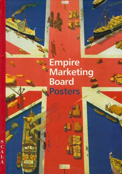
So, time to tackle the vastly overdue heap of new books which need our attention. First in line is a book I have mentioned a while back, Empire Marketing Board Posters by Melanie Horton.
Now I am going to try to be as nice as I can about this book, but it’s going to be difficult given the format it comes in. Because it’s been designed by someone who a) had a rather over-blown sense of his own importance in the process, and b) hates narrative.
Although this book might appear at first to have pages, they’re deceptive.
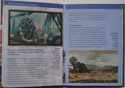
Instead it is laid out like an Ordnance Survey map on acid. Some of the spreads fold out like this.
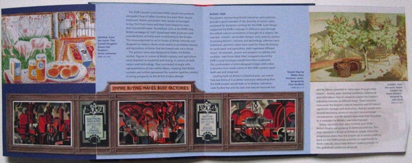
Others fold out like this.
Which makes it almost impossible to follow the text. I think it goes across the unfolded bits first and then into the bits in the middle, but even now I am not entirely sure. The whole experience is like wandering about in a badly-laid out exhibition without any sense of where you are meant to be. No, actually, it’s worse than that, because it’s a book. I’m meant to understand books.
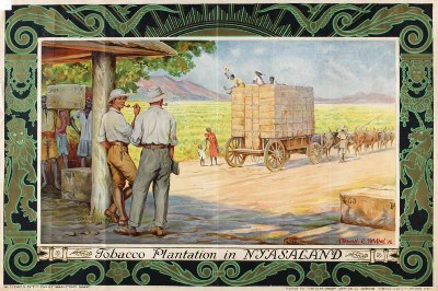
As a result, I don’t even know that I’ve read it properly. Which is a shame as there are some good nuggets in there. Like the fact that the Empire Marketing Board posters had their own special display frames, and posters were designed in sets to make the most of this format and changed every three weeks.
Apologies for the cropping, the picture is bigger than the scanner.
Now this is interesting, because as we’ve discussed here before, the context in which posters are displayed can make a real difference to their meaning. So these posters must have been perceived in a very different way to product advertising – I would imagine that they’d be seen much more as propaganda as a result. But the EMB seemed quite happy with that, as this parliamentary exchange from July 1930 shows.
Mr. MANDER asked the Secretary of State for Dominion Affairs why it is the policy of the Empire Marketing Board not to make use of the ordinary hoardings for their advertising campaign?
Mr. THOMAS The Board have from time to time employed the ordinary hoardings for the display of posters on special occasions. They are, however, satisfied that their own poster frames are better suited than the public hoardings to the special requirements of their main poster publicity campaign.
Although Hansard also tells us that some posters were displayed in other situations too.
The SECRETARY of STATE for DOMINION AFFAIRS (Mr. J. H. Thomas): During the 12 months ended 30th June, 1931, 16 new sets of posters have been displayed by the Empire Marketing Board on their special frames. In addition, one new poster for display on the commercial hoardings, and 12 new posters for display in shops, have been published.
I wonder whether the British housewife was more likely to buy Empire raisins if they were advertised next to other products, or if they were lauded on those fantastic long displays? And I wonder if the EMB ever did the research to find out?
The other interesting nugget is the provenance of the collection itself. It seems the Manchester City Art Gallery collected them as part of an embryonic ‘Industrial Art Collection’, but this idea was short-lived, the posters disappeared into storage and were only rediscovered in the 1990s. I’d love to know what, if anything else, was part of that collection.
But beyond this, I have a problem with the book, and it’s not just caused by the layout. The Empire Marketing Board collection is a very difficult one because Empire is a disputed subject, and because some of the posters can only be seen as racist (for a fuller discussion of the issues, see here).
And as a state-funded museum in a multi-cultural city, Manchester City Art Gallery undoubtedly finds itself in a tricky position. All of which I completely understand. Unfortunately here all of this contemporary background seems to be getting in the way of the analysis.
Because this is a book in which Melanie Horton does everything except look at the posters themselves. It divides into two halves, an explanation of the workings of the Empire Marketing Board, and then a very brief scamper through the different themes of the campaigns. But at no stage does the text ever actually refer to an individual poster, what it shows or how it was designed and what this might have meant then, as well as what it means now. The ideology that the Empire is bad and therefore all of these posters are morally contaminated comes first and foremost, regardless of the posters themselves. Indeed in places, her argument is rather undermined by the illustrations. Asking whether the imagery of the posters was representative of the British people as a whole, she says,
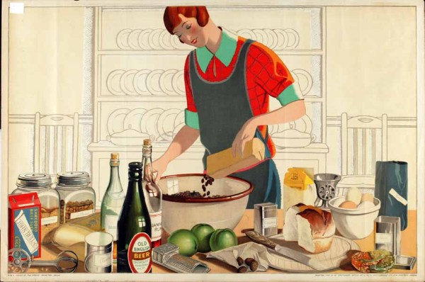
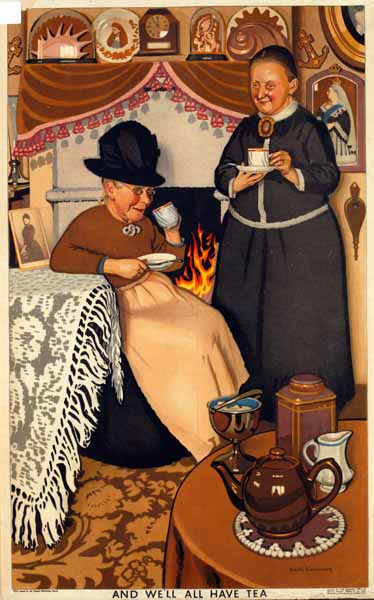
They flattered their implied consumers by representing them as stylish, active and independent…
On the opposite page is this, And We’ll All Have Tea, by Keith Henderson
This sense that the posters are not doing what she wants them to do comes to a head in her conclusion.
The posters gave no space to anti-colonial criticism or to any other inconvenient truths that may have detracted from their message. Neither do they reflect the conflict and tension that had already come to characterise many parts of Enpire.
This is a bit like complaining that Shell posters don’t mention pollution, or that World War Two posters fail to give adequate space to the Nazi point of view. They’re advertising, propaganda; it’s what they do. To expect them to do anything else is absurd, and not a point of view that makes for very good history.
How visual culture like posters and other graphic design is studied is an interesting and unresolved question (there’s an interesting debate over at Design Observer right now). But however we do it, surely we have to look at the objects themselves. If we are only able to view them through the lens of our current perspectives, we’re not going to end up seeing very much at all.


What a wasted opportunity. Clearly the author had a set agenda against the Empire Marketing Board. And to suggest a marketing campaign didn’t reflect the negatives is frankly insane.
Presumably this was written by an academic with no interest in design or posters. Seems the title is misleading.
Great synopsis.
I bought the small paperback (are there other versions?) a month back, yet haven’t been able to stomach trying to read it, with that layout. So, I can’t comment on the content yet! It is a truly terrible attempt at creative book design, though. So inappropriate to the subject matter. The reproductions are so small. And given it’s not too much smaller than a King Penguin and their layout and image proportions are rather sublime. There is no excuse. Bad design over ergonomics, legibility, narrative and sheer common sense.
How we read posters and other graphic design is a really big question right now – the railway poster essay by David Watts that I mentioned a few months ago is an example of can it might be done really well. And I know that Melanie Horton must feel she is between a rock and a hard place. And it is only a small book. But I still don’t think that’s enough of an excuse for letting ideology get in the way of actual history.
And yes, I hadn’t thought of it as failed King Penguin. But that does just underline how completely the design fails the book.