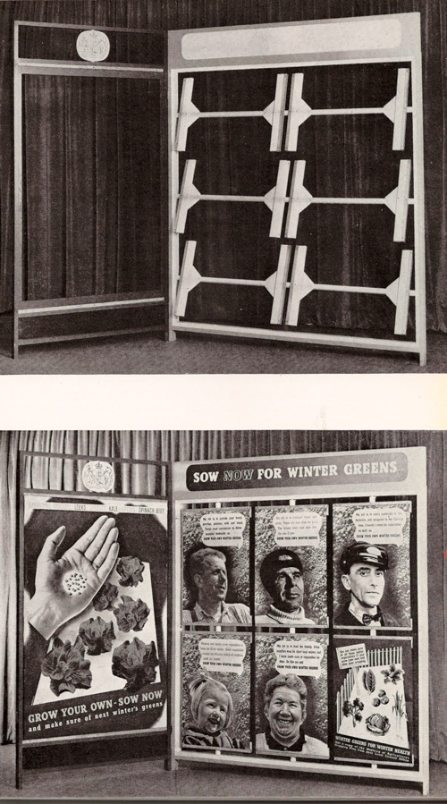
There was more to the Beverley Pick book than could fit into one single post. Ironically, what got left out last time was posters: to be precise their display, as demonstrated in this wonderful illustration by Mr Pick.
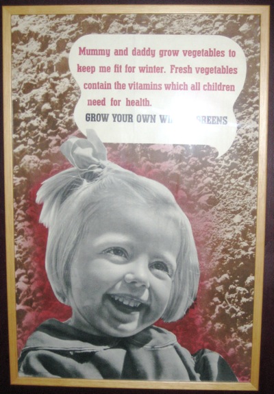
It particularly jumped out at me because we have the poster at the bottom left, which I wasn’t actually certain was by Beverley Pick.
To be fair, the book doesn’t actually say it is either. But given that every other photo in the book of Pick’s own work. it’s a reasonable assumption to make – and the photomontage and deep colour is very similar to his other poster work during the war.
But the illustration of how these posters were displayed is worth a second look too. Pick describes it as follows:
The light and portable poster screen shown here was designed to take seven posters of standard size and one headline streamer circulated at monthly intervals.
It’s a much more organised mean of display than I ever tend to imagine for Second World War posters. More importantly, the experience of seeing seven posters together is very different to seeing one alone. The single poster is much more like propaganda, just giving the viewer the idea that sowing winter vegetables is a good thing to do. En masse, they are much more informative and give the viewer enough basic knowledge – which vegetables and when – to allow someone to go about it.
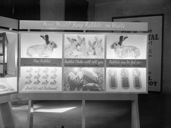
The display panel is a useful reminder that posters appeared in more than one context, not only as solo propaganda pinned up on hoardings, in shops and on the walls of village halls but also in the more organised and didactic context of exhibitions too. It’s not something I’d really considered or read about before but having had that thought, the Imperial War Museum’s photo collection started to come in very useful. Here’s their image of another poster much beloved of this blog.
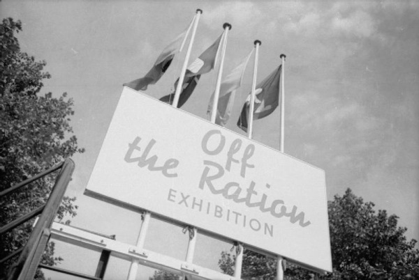
This is, of course, F.H.K. Henrion’s paen to the joys of rabbit meat, which is on display as part of the Off the Ration Exhibition.
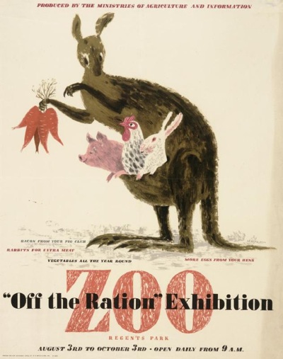
‘Off The Ration’ was originally held at London Zoo, which I always felt must have been a bit unnerving for the other animals, wondering how long it would be before they were designated as steak too. No wonder that Lewitt Him’s kangaroo is feeding up the more likely candidates in the poster for the exhibition.
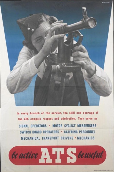
But returning to our subject of the poster displays inside, I have seen both the posters at each end before now, but never the panel in the middle. This may or may not have existed as a single poster – I have no way of knowing and even less means of finding out. And were the Henrion posters commissioned for the exhibition first, or were existing posters incorporated into the exhibition’s design? Again, I can’t tell you.
But these unanswerable questions are a useful reminder that posters during the war weren’t lone objects but were seen by people at the time as part of a whole range of other kinds of of graphic design – and the rest of it can easily be forgotten when we’re telling the story of the posters.
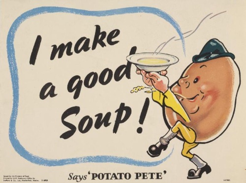
Take Potato Pete, as one of the more obvious examples. He exists on posters, of course.
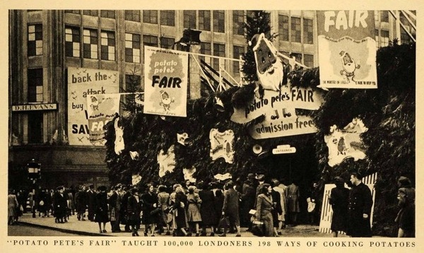
He too had his own exhibition, this time on Oxford Street (this looks like the site of the bombed-out John Lewis store which was used for a number of exhibitions during and just after the war).
But many more people would have seen his image in the daily newspaper Food Bulletins put out by the Ministry of Food and so in many respects the posters and exhibtiions were just adjuncts of that. So the poster was an image of an already well-known character, which meant that it would have been understood in a very different way.
The continuum of graphic design and display can work the opposite way round as well. This woman in Oxford is finding out about salvage.
The displays that she is looking at aren’t, as far as I know, related to any particular poster campaign,although the main panel could quite easily pass as a poster design. But nonetheless, people who’d seen this exhibition or one like it would read posters in a subtly different way, seeing them as just one part of what they were being told about salvage. So perhaps posters had to say less, because they were acting as a reminder, or they were able to use visual symbols which would have been easily understood by the viewer because they’d already been explained in a different context. It’s impossible to prove this, of course but equally it does seem absurd to thing that this overlap would not have happened.
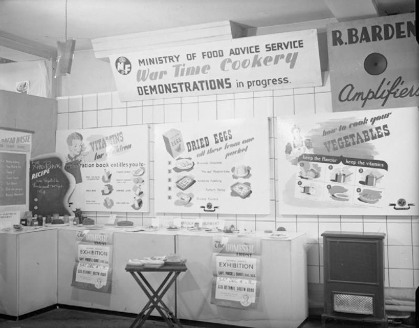
None of this is in the slightest bit surprising to anyone who has any idea how advertising works in the modern world, where campaigns are planned across television, press and sometimes still posters, and now with social media added on too. But these multiple contexts are very rarely considered in terms of wartime posters, even though the Ministry of Information was clearly a very shrewd and sophisticated user of all the means available to it. And there were very many means indeed. You might find a food exhibition in your local furniture retailer.
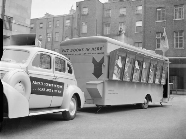
More surprisingly, you might even catch an exhibition being driven down the street.
This highly covetable vehicle is a travelling salvage exhibition in 1943, and I shall let the Imperial War Museum describe it to you.
…the car has the words ‘Private Scrap is in town…come and meet him’ painted on the side. The van itself has a special bin for collecting books ‘for the forces, blitzed libraries, and salvage’, and the side of the van features a series of wooden display panels by artist Bruce Angrave. The salvage exhibition continues inside the vehicle.
Bruce Angrave’s panels aren’t posters and almost certainly don’t exist any more (and if someone wants to tell me I’m wrong on that, I’d very much like it). But they are part of the visual landscape that salvage posters inhabited, and so ought, even if just a tiny bit, to be taken into account when we talk about them.
When I studied Design History, I used to hate entirely abstract phrases like ‘visual culture’ and ‘discourse’; I’m hardly fond of them even now. But they can have their uses sometimes. Now that posters have become objects which are both valuable and collectable, the art-historical impulse tends to take over. They are treated as ‘art’: framed and conserved, and displayed on their own. None of this is wrong, but it can tend to leach into our thinking about them as well and that isn’t a good thing. Posters are the bits of graphic design which were lucky enough to survive, but they were part of a much wider world of print and explanation, and it’s worth remembering that more often.
