And where are we going to do that? At Brighton, of course. At least that’s according to one of these posters (top right, if you’re squinting hard).

The picture has turned up at a forthcoming auction in Nottingham*, and it’s very interesting, because it depicts, apparently, a poster exhibition in Brighton in 1925.
Once again, we’re back into the realms of things we weren’t even aware that we didn’t know. I’ve written before about both the railway companies, Shell and London Transport exhibiting their own posters. But in those cases they were showcasing their companies’ commissioning of culture, and aiming to garner kudos with both the posters and the exhbitions. What’s going on here seems to be a bit different. All of the posters look not only contemporary to the exhibition, but also commercial. So what is this?
I’m not entirely sure. What’s more, the mystery then deepens a bit further, because after doing a reasonable amount of scratching about on the internet, I can’t find a single one of these posters. At first I thought this was, but on closer scrutiny it’s just the same view as the one above.
Peculiarer and peculiarer. But I think there are two possibilities. One is that there are oceans and oceans of tourist posters which were never saved by railway archives or visitors. Which is enticing but even I have to admit, not that likely.
The other – and I owe this suggestion to Mr Crownfolio – is that it’s a competition. Design a poster for Brighton in 1925. I think that’s got to be the answer. Even this gives us food for thought, though. Just look at the sheer number of posters up on those walls; that’s an awful lot of people who either are poster designers or quite fancy their chances at being one. Which is in itself a reminder that the poster, at this moment in time, was the most glamorous and up to date advertising medium there could be.
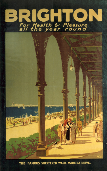
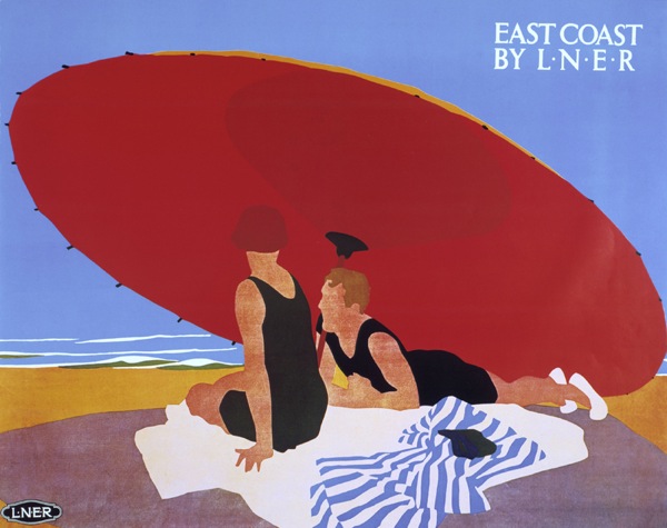
The other aspect which interests me is that it catches the seaside poster in a moment of transition. Some of the posters seem quite old fashioned – referring to Doctor Brighton, watering holes and Regency glories. But scattered amongst them are some bathing beauties who wouldn’t shame a Tom Purvis poster of the 1930s like the one below.
I’m sure it has to be a competition. Even so, I’d quite like someone to prove me wrong by finding one or more of the posters out there in an archive or auction somewhere. Any takers?
*The auctioneers of the picture are worth a footnote all to themselves. They are Britain’s leading auctioneers for Cricket, postcards, ephemera and beer labels. How do you end up with a set of specialisms like that, I wonder.
In further support of Mr C. Look at the poster that is third from the right, top row, with the child on the adult’s shoulders. The beach appears to be cockled, a result of over-generous application of watercolour on a large area all the same colour? The one on the top row, four to the left of the one with the cockled beach, is in pretty sorry condition – or at least, it would be if it were a commercial sample, but less so if it is unique? And then whilst the posters are all the same size, some of them are backed/painted onto a larger piece of paper than the spec; I suspect the latter?
I’m with Mr C. on this one. Posters for individual resorts, if not issued by the railway companies, invariably had an address for inquiries to be made (For further details write to The Town Clerk, etc. etc). These do not seem to have any such embellishments nor do they carry the names of any railway or motor coach operator.
Much though I prefer my idea of an ocean’s worth of undiscovered posters, I think we’re all in agreement here, and Mr Crownfolio wins this week’s spotter’s prize. Which is a pie.
Ialso agree with the idea of the poster competition. I looked at the picture before reading your comments and came to that conclusion based on the same points stated by others above.
I’m a bit surprised at the sheer number of entries (35+) with such a high standard of execution though. Maybe each artist submitted multiple entries?
Bit strange that the “Dr Brighton” idea crops up at least 4 times, as well. I don’t think I’ve heard that before but perhaps it was popular at the time.
Yes, there were a lot of potential poster designers out there.
You’re right, I’ve never actually come across the Dr idea on a poster for a place before, but it didn’t seem like an odd thing to me, given the obsession at the time with the health benefits of sunlight and fresh air. I have also seen something similar from about that period with fruit too. But can we find a real one out there? Perhaps that’s my next challenge.