Last year, I wrote about depictions of the industrial North of England in posters, or rather I pointed out their rather conspicuous absence. At which point I got quite a lot of comments, mostly saying that I was wrong, and pointing me at posters like this.
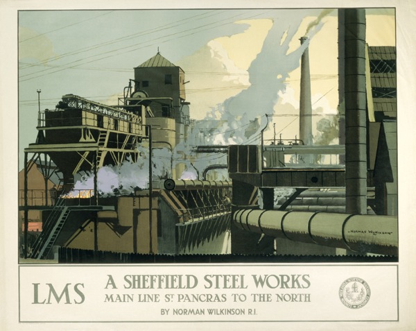
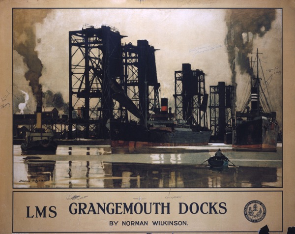
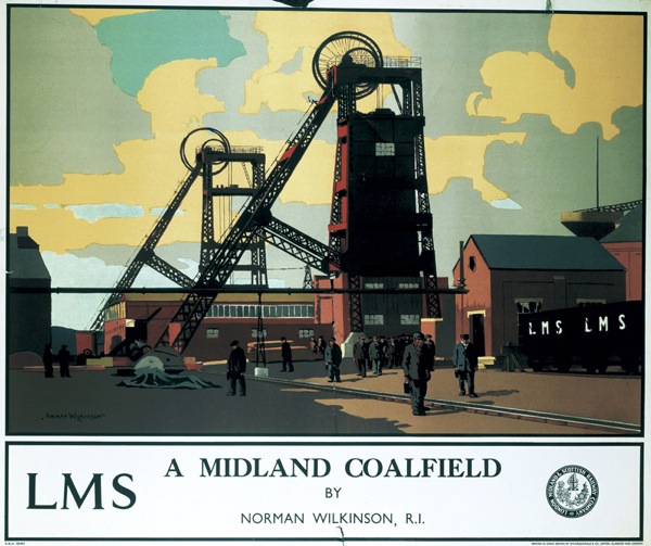
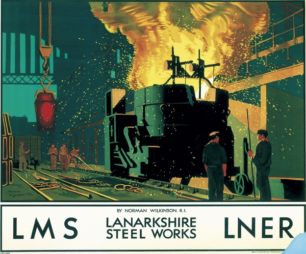
Which is, I am forced to admit, is exactly what I was complaining didn’t exist, a railway poster of Northern industry. There are, as it turns out, a whole series of Norman Wilkinson posters doing the same sort of thing, including the Runcorn design that I included in the original post, and a few more to boot.
I have to say that that last one is the best Norman Wilkinson I’ve ever seen, and if anyone wants to send me a copy feel free.
But Wilkinson wasn’t the only artist working in this series – this poster is by Frederick Cayley Robinson.
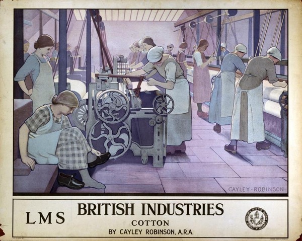
Now on the one hand I clearly am wrong, there are quite a few posters of Northern Industry. At the same time, though, I don’t think this changes the argument. The Cayley Robinson poster is dated to 1924, which is the same date as I have seen given to a couple of the Norman Wilkinson posters. Railway poster dating is not an exact science – the NRM itself dates them to 1923-48 – but I’d hazard a guess that these are all part of the same series. Which means that putting these kind of images on a poster was, possibly, tried once as an experiment and then never done again.
Now this might have been because the Board of Directors of the LMS thought it unseemly, but it might be because they discovered that this kind of poster didn’t play well with the public. And at this time, they were able to be reasonably certain about what was and wasn’t popular, because not only did the company sell copies of its posters to the public, it took some notice of how they were doing too. In 1924, they were able to comment that this poster, by Maurice Greiffenhagen, was selling to the public “in large numbers” (more on this here if you’re interested).
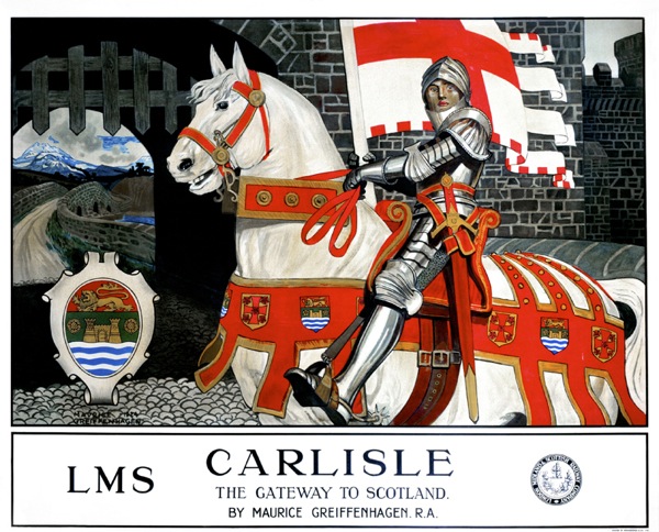
There may be an implicit comparison here with the industrial scenes, or at least I’d like to think so.
None of this can be proven, of course, but what is the case is that this series does seem to have been the only one, which I think means that my overall point about the scarcity of these images (and especially after World War Two when a new technological and manufacturing Britain was going to take over the world) still stands.
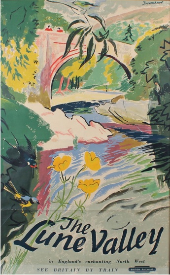
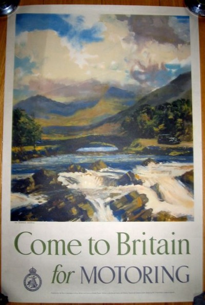
But what about the Lake District and the Yorkshire Dales, people complained in the comments. What about posters like this (any excuse)?
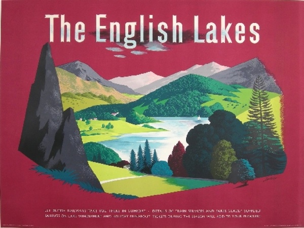
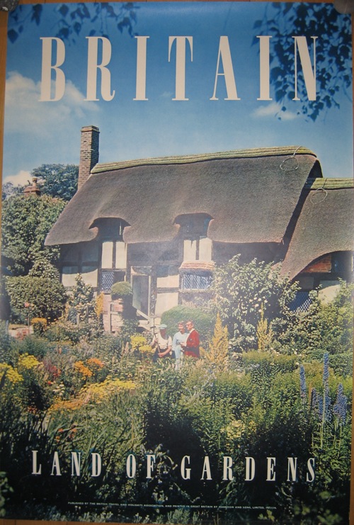
Or indeed these, and many others like them?
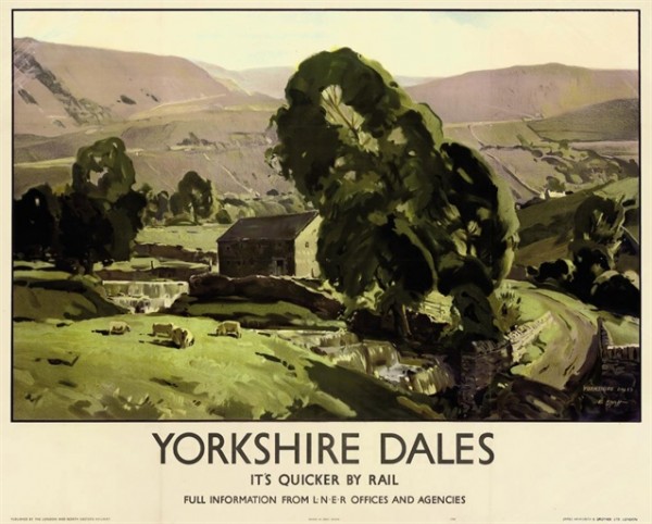
They are northern, granted, but they aren’t industrial which is the real gap in the imagery. But as ‘mm’, who commented, points out there is another interesting divide to be found between northern and southern landscapes. It’s a diversion, but it’s one well worth taking.
Maybe the northern landscapes are too wild and untamed to be fondly remembered in the sense you mean. Perhaps it is a safe, cultivated landscape we yearn for or think of as British!
I think this may be true, and it’s worth remembering that the Lake District only became popular, rather than being seen as a rather frightening and uncivilised wildness at the start of the eighteenth century. There is definitely an ‘otherness’ to these places.
There is something else going on here too, which is a kind of conflation. Englishness becomes a shorthand for Britishness.
While England in its turn tends to be represented by the Southern.
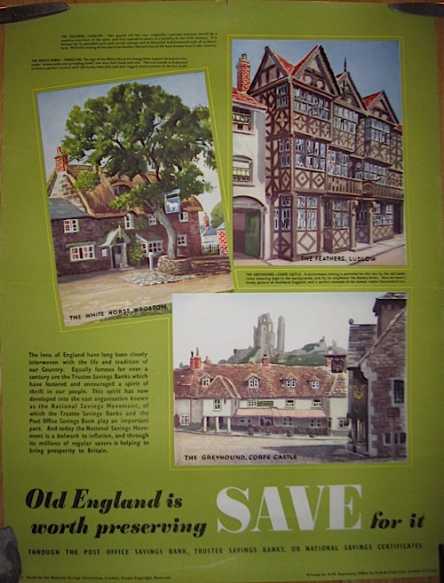
I thought we should have a few dog-ugly posters by the way, as it was all getting a bit safe and pretty further up there.
All of which means that, however much we admire the Lake District, or Scotland, or the Peak District, it would look a bit odd to have one of the images of these areas with ‘Britain’ or ‘England’ stuck at the bottom. Although like all good generalisations, there are of course exceptions.
All of this is covered in much more depth and complexity in David Matless’s peerless book Landscape and Englishness, and now that this has emerged from storage (hurrah) I will have to reread it and, I suspect, post on the subject again.
For the last word, however, I must return to the comments. Nick S posted this wonderful bit of writing by Harry Pearson which comes, it turns out from a book about football. But bear with me on this one, it’s not simply relevant, it sums the whole thing up to perfection.
In the North-East, England, or the notion of England, seems a long way off. The North-East is at the far corner of the country but it is separated by more than just miles. There is the wilderness of the Pennines to the west, the emptiness of the North Yorkshire moors to the south and to the north, the Scottish border. The nearest major city to Newcastle is Edinburgh, and that is in another country. Sometimes the North-East seemed more like an island than a region. And there was more. As a boy, I can remember looking through one of those colour illustrated encyclopaedias and coming upon a full-page picture that caught my attention. There were cottages festooned with hanging baskets, burgeoning gardens, white picket fences, a village green, a duck pond, a cricket match, a district nurse on a bicycle, and, doubtless, a future prime minister sitting outside a thatched pub sipping warm beer. The caption underneath read ‘An Everyday English Village Scene’…. this caption was clearly a mistake. Because I lived in an English village and it didn’t look anything like that!…
“Twenty years later I went to see a friend of mine in Sonning-on-Thames. It was a hot June day and as we walked across the churchyard I realised that this was, spiritually if not figuratively, the village in the encyclopaedia…. This was England. England, their England. It wasn’t like the North-East at all.
Which is why you won’t often find a picture of a Northern scene with the caption ‘England’ or ‘Britain’ on it. And even if you do, it definitely won’t be showing their industries.
hmm, interesting and important points about the romanticisation and commercialisation of englishness, or at least a certain view of what constitutes english landscape. not sure where this (http://www.bonhams.com/auctions/11964/lot/141/ – excuse the link; i can’t seem to attach an image and can’t find a better example online) fits in – it’s both northern, wild and has clear links to industry given what it’s promoting. (it also happens to be the favourite poster in my collection, so i’m biased…!)
keep up the good work.
lasbro – Shell has links to industry? Surely Shell is promoting use of its products in the motor car, hence a purely leisure activity. Remember, back then it was about The Joys of the Open Road.
“Poop Poop.”
The ‘framing’ of the pastoral by the implicitly urban and technological context of the poster, is something that I’ve mentioned before vis a vis railway posters. Like Shell posters, they are positing the rural (and a specific version of the rural, Shell’s being slightly different to the railways’) as a contrast to the reality of a railway. If you’re seeing a poster, you’re most likely at a station, looking at a track, waiting for a train, surrounded by the modern world. The poster suggests you might want to get away from that. If you see a Shell poster, it’s on one of their lorries, camouflaging petrol. Again, that’s all something worth unpicking at greater length one day.
Having waffled on like that, it is a fantastic poster and I am very envious. Is the rest of your collection as good? I must know.
So, yes I agree, only with more verbiage.
I think the first five posters you’ve shown here are superb! (not just because I’m a northerner) Their simplicity, their colouring, their historical value and just the fact that they exist. Thank you for sharing.
Glad you’re enjoying them so much.
The Cayley Robinson and Greiffenhagen posters are part of the same series commissioned by the LMS in 1924. The newly formed company decided to establish their poster designs using fine art . They asked Norman Wilkinson (with whom they already had a strong relationship through his previous work for the LNWR), to approach a number of Royal Academicians to produce a poster design and commissioned 16 artists – a list can be found on the NRM page for the exhibition on this series they held a while back: http://www.nrm.org.uk/PlanaVisit/Events/artgallery_artofadvertising_pav.aspx
This resulted in a wide range of styles and there are some quite unusual choices. This one of ‘London’ by Charles Sims is quite weird and presumably satirical as it depicts a strange creature scattering bags of money while various characters try to collect it:
http://collectionsonline.nmsi.ac.uk/browser.php?m=objects&kv=229099&i=117331
Another interesting choice was the sculptor Sir Bertram Mackennal, who produced a clay sculpture that was photographed for the poster (highly effective as the poster appears to be in relief from certain angles).
http://collectionsonline.nmsi.ac.uk/browser.php?m=objects&kv=230973&i=116376
And just to get back on the topic of northern industry, the series also included this design by George Clauson:
http://collectionsonline.nmsi.ac.uk/browser.php?m=objects&kv=229109&i=117338
Harry Pearson is quite right, ‘quintessentially English’ (horrid phrase) is shorthand for Southern, rural and middle class. And I write this as a middle class, urban Southerner.
Thank you, that’s very helpful. If only someonc could move York a bit further south I wouldn’t miss things like that. All the posters are interesting (although Clauson has a rather more depressing view of industry I think compared to Wilkinson) but that London poster is, truly, insane. As you say, what is the strange thing distributing the money? That may deserve its own post.
I am also a middle-class southerner. I would have liked to have been a northerner but I moved when I was 15 and that was too late apparently.
Top stuff. Interesting you view the Clauson as a more depressing view of industry. As a northerner (who wanted to be a southerner!!) living in the heart of the urban south I see it as more realistic than the more idealised Wilkinsons
I wonder how Wilkinson or Clauson would have portrayed the shiny retail bastion of Meadowhall Shopping Centre that sprung up on the location of what was the Sheffield steel making area… The times they are a changing.
British Railways also produced a few post-war industrial posters in their “Service to Industry” series;
http://collectionsonline.nmsi.ac.uk/browser.php?m=objects&kv=230414&i=115450
http://collectionsonline.nmsi.ac.uk/browser.php?m=objects&kv=230942&i=116357
http://collectionsonline.nmsi.ac.uk/browser.php?m=objects&kv=231018&i=116389
http://collectionsonline.nmsi.ac.uk/browser.php?m=objects&kv=231052&i=116411
http://collectionsonline.nmsi.ac.uk/browser.php?m=objects&kv=231324&i=116478
…and even one familiar reissue;
http://collectionsonline.nmsi.ac.uk/browser.php?m=objects&kv=231038&i=116399
…and perhaps the best…
http://collectionsonline.nmsi.ac.uk/browser.php?m=objects&kv=233373&i=124557
..and the worst, what looks like a corrugated iron shed…
http://collectionsonline.nmsi.ac.uk/browser.php?m=objects&kv=228628&i=124500
I’m not sure that realistic and depressing are necessarily exclusive though. I think the Wilkinsons are idealised, a state of mind which has both advantages (especially if you are designing railway posters which, I suspect, are mostly intended to be uplifting) but also disadvantages too. Like that it’s not entirely true.
I wish I were a good enough artist to produce a poster for Meadowhall in the style of Norman Wilkinson though. Any takers.
Thank you for all of those – I also like that abstract one too, and nearly bid on it in an auction recently, then really wished I had because it only went for £70 or something like that.
They’re an interesting series, though, because apart from the Wilkinson re-issue, the only one which is really depicting the Northern heavy industry is the Glasgow shipbuilding poster. Papermaking and bricks are rather southern, at least in my mind. And the Teeside chemical plant (where my uncle worked once upon a time) is more the home of modern technocrats than burly men breaking into a sweat. But please feel free to argue!