With the summer approaching, beachwear is a topic on the minds of many blogs. Fear not, I am going to spare you my opinion on bikini vs swimsuit; in fact this post is more about suit versus swimsuit. Or, to put things a different way, why we look at so many seaside posters with too much of a modern eye.
Posters like this, for example.
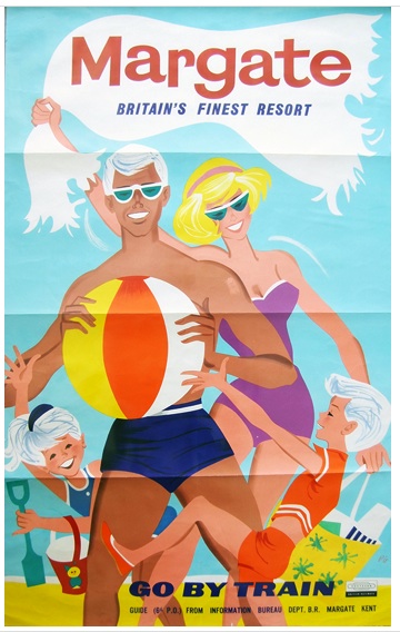
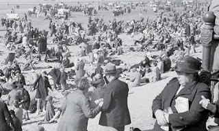
For an audience today, seeing this poster from the distance of fifty years or more, what is being advertised is the joy of Margate beach. And this is true, except that we are missing something very crucial. These people are being daringly modern and middle class, not just in their choice of sunglasses but in their entire choice of beach wear. Because when we take a look at actual people on Margate beach in the 1950s, they look rather different.
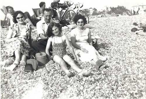
Children and teenagers might wear swimming costumes, but everyone else wears clothes, and quite a lot of them too.
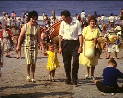
This wasn’t a peculiarity of Margate beach either, smart formal was the dress code up and down the country in the 1950s.
In Filey not even the children got swimsuits it seems.
Now, there are some interesting reasons as to why this might be. Back in the 1950s, your smartest clothes didn’t automatically equal ‘working clothes’. Working clothes were grimy, hard-wearing and, well, blue-collar overalls. So your suit was something that you could relax into, an alternative, a sign that you were no longer at work. More than that, it was a status symbol which proved that you could afford clothes that went beyond the simply practical. In some ways, the suit and smart dresses were the sartorial equivalent of the ‘best parlour’ at home: not necessarily the best use of resources and often overly formal, but essential if you wished to be respectable.
Paradoxically, though, the suit on the beach is at the same time a sign of being working class, of not having unlimited means. Because while it may be telling people that the wearer owns more than just their working clothes, it also indicates that they don’t have the means to afford ‘leisure’ clothing either. These well-dressed beach goers occupy a very particular place in the British class structure, and their clothes speak of it.
All of which puts a very different slant on posters like these.
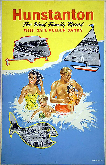
These families are not average, they are modern and aspirational.
And look at this trio, they are so upmarket that they not only have swimsuits but leisure clothes as well.
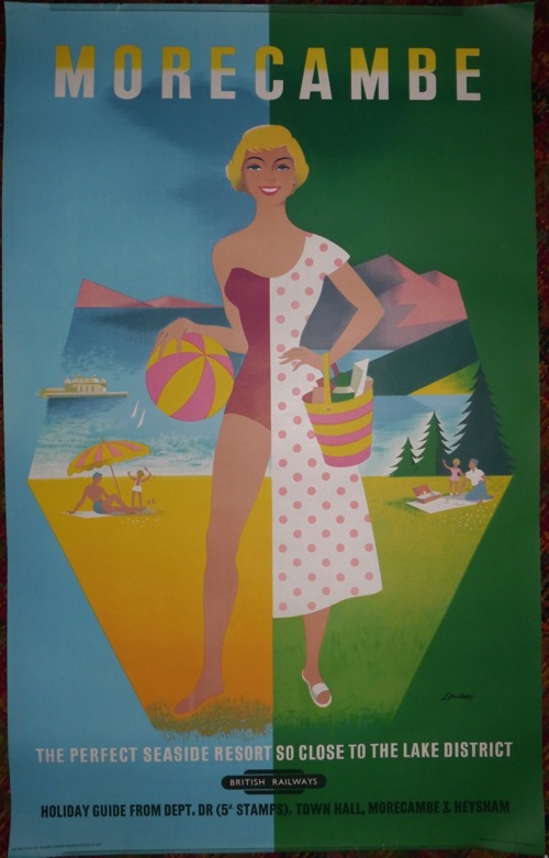
Mind you, Morecambe always fancied itself as an upper-class resort. Although not so posh that everyone was expected to have a cozzie.
The family here are quite happy to conform to the cultural norms of the time, although I do think he must be quite hot in that tank top.
In fact, when I start to peer at the 1950s holiday posters, there is more clothes wearing going on than I had expected.
All of which may help us to look at these posters differently, and so it should, but that’s not the half of it. Because if the swimsuit wearers of the 1950s were middle class and modern.
What does this then make Tom Purvis’s swimsuit wearers of the 1930s?
Very posh and very modern indeed, that’s what. They can afford swimwear at a time when, it seems from the photographs, most people went to the beach in their overcoat.
There are, of course, so many signifiers of modernity in a Tom Purvis poster that one could write an entire thesis about them: the love of the outdoors, the new fashion for getting a sun tan, the flat bright colours – I could go on almost indefinitely, and probably will some other day. Nonetheless I do think the swimming costumes would have been very striking at the time and would have made the poster dramatic and innovative in a way that we simply cannot appreciate today without putting some thought into it.
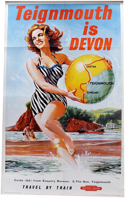
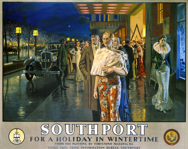
For me, though, the posters that most benefit from this reappraisal are Fortunino Matania’s posters for Southport, which until now I’ve considered to be rather dull workings out of Art Deco which fetch too much money at auction.
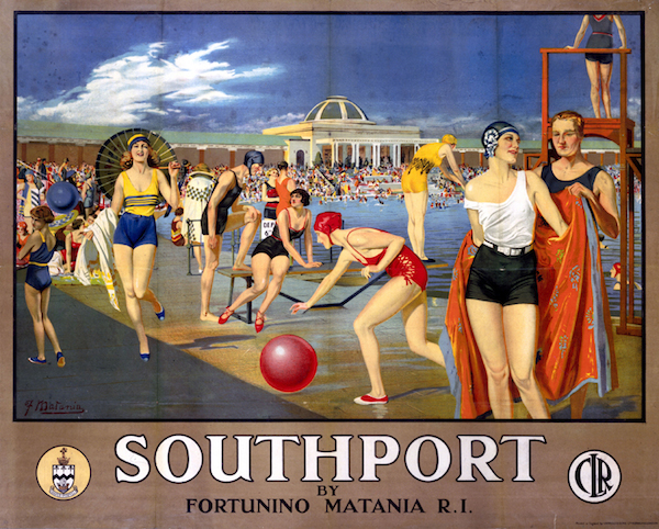
Just look at these people. They have a lido, modern hats, swimming costumes and shorts; they are wearing not enough clothes while outdoors. In short, they could not be more fashionable, upper class and modern if they swanned up to the swimming pool in a Rolls Royce car.
Of course they’re saving that for the next poster, when they get to the hotel.
Southport, like Morecambe, rather fancied itself as being a cut above some other resorts (not least its near neighbour Blackpool) so Matania wasn’t the only poster designer to dress it up in the costumes of high fashion. Here’s Alfred Lambart’s take on a very similar theme.
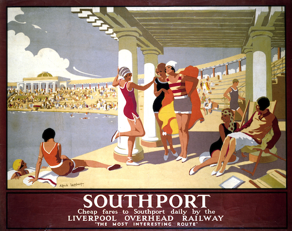
You might have thought that trippers from Liverpool might have lowered the exclusive tone somewhat, but then who am I to say?
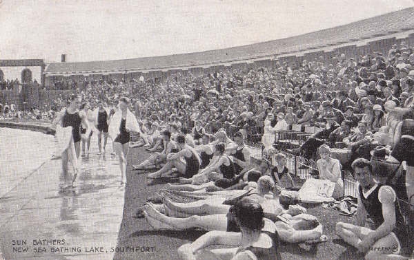
If you want to judge for yourself, this is what Southport Lido looked like in reality; I think there is actually quite a lot of clothes-wearing going on beyond the front row.
Further proof of how exciting and different these swimsuit posters would have seemed comes in the form of other posters of a similar period, which were very happy to show beach goers wearing a more normal amount of clothes, at least by inter-war standards.
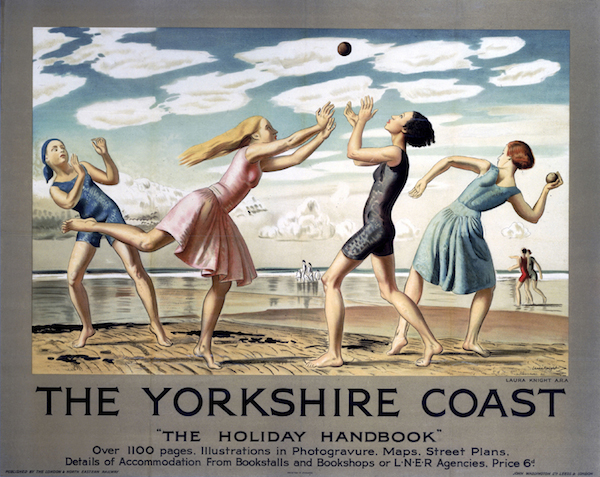
This one is by Dame Laura Knight, proving that you can be modern even without swimsuits for all.
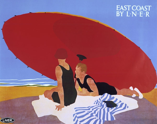
But this is my total favourite, by Stanislaus Brien.
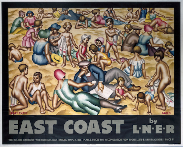
This is not just on account of the fact that all the adults are fully covered in smart clothes and hats, but also because the beach is full, crammed with families and children and grandparents. In fact it’s the only poster I’ve ever seen which bears any resemblance to photographs of a day out at the beach between the wars. And yet it is done in the style of Leger: modern, but clothed and truthful. And, it has to be said, pretty much unique in the poster record. I’m not sure it looks that enticing to modern eyes.
But it is our modern eyes that are the problem. Because just as we fail to see swimsuits as daring and signifiers of the future, we shrink with horror at a crowded beach. (Why the beaches were so crowded is another story for another day, but one which is intimately connected to the railwayness of railway posters.) And in doing so, we completely fail to see these posters, both from the 1930s and the 1950s, as they were intended at the time. Does that matter? In the end, perhaps not really, especially if you simply want an amusing print to hang on the wall. But if we do take the time to see what they might have meant in their own time, how much more interesting they become.
A great post! I don’t ever remember my parents stripping off on the beach in the fifties though I can vividly remember that excited run across the sand to the water in my bathing suit. Mum and Dad preferred to relax in their hired deckchairs reading the papers or a book, Dad in his shirt sleeves and Mum in her cotton summer dresses. Later in the sixties, as teenagers we’d rather die than strip off in public! However I have early 70s photographic evidence of my Mum in swimsuit on the beach. At this date she has recently become a grandmother for the first time – now that’s daring for you! But she did always love to get her feet in the water – as do I now.
Last weekend we were in Llandudno. Fascinating to see sarees, hijabs and burquas on the beach – how times are changing! I watched a young woman in long black dress and headcovering delightedly running down a wooden jetty and jumping into the water then dragging her heavy skirts back up to the sand. She did this three or four times – her face was beaming!
I wonder if you’re missing something when comparing the photographs with the posters. It’s England, so it’s generally too cold not to wear clothes, no matter what the advertising posters say. Children, of course, don’t notice the cold.
And I think the wearing of suits on the beach reflects an English formality, rather than (merely?) as an alternative to bleu d’ouvriers. My father – who having served in India during the war was impervious to heat – was perfectly likely to be wearing a shirt with a stiff collar when on the beach on the French Riviera during the 1960s as my mother lay in a swimsuit soaking up the sun. And he was sitting in his office from Monday to Friday in a suit.
Truly fascinating post though, I meant to say.
Having spent my secondary education years in Torquay, to the social reasons you give I would add a couple of other possible, practical, reasons why many adults were not in swimwear. In the 1950s and 1960s it is likely that many could not swim, and so saw no reason for putting on swimwear. Secondly, when the adults did go swimming, the usual practice seemed to be to change into swimwear immediately before swimming, and then change back again immediately afterwards. Which is where we come to British weather and sea breezes. Even in Torquay, days warm enough to be in swimwear on the beach all day were fairly rare, and windbreaks a common feature [children just kept busy]. I spent one summer further north, in Whitley Bay, and the beautiful beach was largely deserted all summer because of the temperatures. The really well off had always gone to the seaside in southern Europe or the West Indies, and from the 1970s onwards cheap travel meant many more could go abroad, and they did.
It does make me wonder how convinced people were by these posters, and whether they went to the seaside simply because it was the only possibility at the time of getting the whole family away from the often very constricted area where they lived and worked. Many tended to go to the same place year after year. You made a very valid point about looking at old posters through modern eyes and missing the attitudes implied at the time. I would argue that we also fail to appreciate how very much more limited people’s mental worlds were over half a century ago.
On Ann’s comment about the changing times, would the Brien ‘East Coast’ poster be acceptable to our society, if produced today, do you think?
Noel
Yes to all of this. There are clearly lots of reasons why people dressed this way – and why they felt later on that they might be more up-to-date if they wore a swimsuit – and all the ones you’ve suggested probably had something to do with it too. There is an Open University Course text on ‘Dressing for the Beach’ which I should probably get seeing as it is about £2 on Abebooks. But even then, who will ever really know?
The cold is a problem – although not if you are on a poster clearly. One other thing those people are selling is, of course, the warm weather. Look, it’s so sunny here that we don’t even have to wear clothes. But it’s worth remembering that it’s still a problem now. When we were in Devon, on a hot Bank Holiday last year, the beach was still wall-to-wall wetsuits for children.
And is the Brien poster acceptable? Not sure. Would it entice people to the beach? Definitely not….
Great post, Mrs Crownfolio. Interestingly, cartoonists appear to have appreciated the irony of bathing posters at the time. Punch magazine regularly mocked the false images purveyed on the hoardings (if you can be bothered to find a copy, see the spoof set of posters for the fictional Saltlands resort published in the colour supplement for 1923 and drawn by none other than Fougasse). The various staff magazines published by London Undergound and London Transport also delighted in ridiculing the company’s own posters. A cartoon strip entitled Truth In Advertising (1927), for example, set up a series of real designs by Kauffer, Clive Gardiner, Olive Bourne and Alfred Leete promoting attractive days out by Underground against dreary images of the windswept reality. Commercial postcards from the 1910s and 20s often made the same point. I’ve got one showing a typically hen-pecked balding husband admiring the bathing belles on a poster while his fiercesome (and inevitably over weight) wife advances wearing an ill- judged swimming costume. I’m sure there are other examples, too, but just not produced by the rly companies themselves !
Can I boringly point out that the building in the second Southport poster, with the Rolls-Royce waiting outside isn’t a hotel? It’s the Garrick Theatre, which cost someone £120,000 in 1932 and is the only theatre I’ve ever heard of that had a roof-top garden. Obviously it’s a bingo hall now, though a lot of the Art-Deco exterior decoration is intact.
Thanks for that David, I will try and lay my hands on those at some point, they sound great. But yes, it is worth remembering that the viewers were plenty sophisticated enough to see the disparity between image and actual place.
And it’s not boring to point that out at all, it is a fact and therefore innately good. I will go off and find some pictures of it at once.
Come To Sunny Prestatyn
Laughed the girl on the poster,
Kneeling up on the sand
In tautened white satin.
Behind her, a hunk of coast, a
Hotel with palms
Seemed to expand from her thighs and
Spread breast-lifting arms.
She was slapped up one day in March.
A couple of weeks, and her face
Was snaggle-toothed and boss-eyed;
Huge tits and a fissured crotch
Were scored well in, and the space
Between her legs held scrawls
That set her fairly astride
A tuberous cock and balls
Autographed Titch Thomas, while
Someone had used a knife
Or something to stab right through
The moustached lips of her smile.
She was too good for this life.
Very soon, a great transverse tear
Left only a hand and some blue.
Now Fight Cancer is there.
Thank you, that’s brilliant. I did wonder about putting it up on the main blog, but in the end i think it’s one of Larkin’s more vicious poems so I didn’t. But excellent finding there.