Name your price

Shall we talk about this?

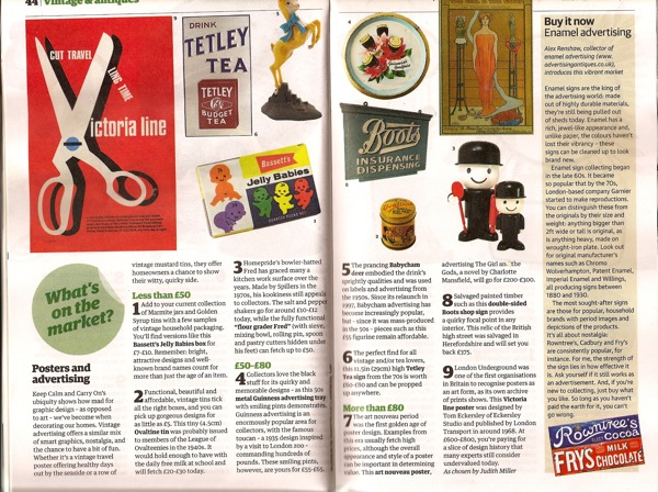
It fell out of my and Mr Crownfolio’s newspaper at the weekend; a handy pocket guide to collectables and antiques.  To my surprise, they even included posters.  Or really just the one.

double page poster spread from guardian guide

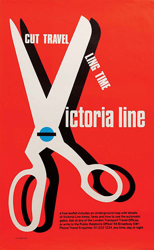
Just in case that’s a bit too squinty for you, here it is, along with the mindboggling / dealer-worthy / under-valued price (delete according to your own opinion) they attributed to it – also online here.

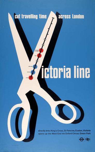
Tom Eckersley victorian Line Vintage London Underground poster

Now, I know this is revisiting lots of things I have said before about the differential between dealers’ prices and the real world and so on, but really.  Eight hundred pounds?  My mind, this time, has been well and truly boggled.

So I went out hunting.  And I genuinely couldn’t find that poster as having been sold anywhere – it doesn’t seem ever to have been auctioned.

But I did find this.

Tom Eckersley vintage poster for Victoria Line - BR version

It’s a year earlier, and I think was published by British Rail rather than London Underground.

Now, I don’t think it’s as good as the later Underground poster – you can see his design evolving to give the poster more impact between the two.  But is it worth ten, twenty times less?  Or even eighty times less?

Because this poster was sold at a railwayana auction earlier this year for just £10.  Yes, you did read that right.  Folded, but VGC.  My mind is now even more boggled than it was before.  So much for the internet flattening out poster prices.  If anyone can explain what is going on here, I’d love to know.

Festival time

Mr Crownfolio has been fossicking in the furthest depths of the internet again.  And he’s found this.
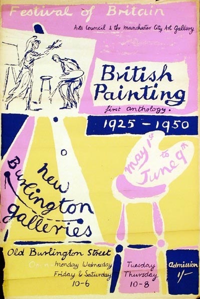
British painting vintage poster for arts council exhibition 1951

And this.

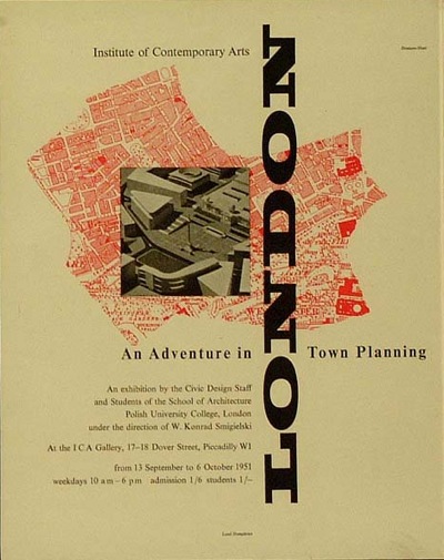
Town planning exhibition vintage poster 1951

As well as this.

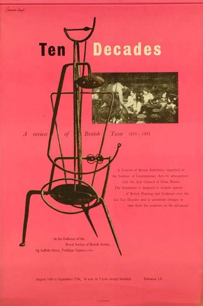
Ten decades of British taste vintage poster 1951

What links them all is this.

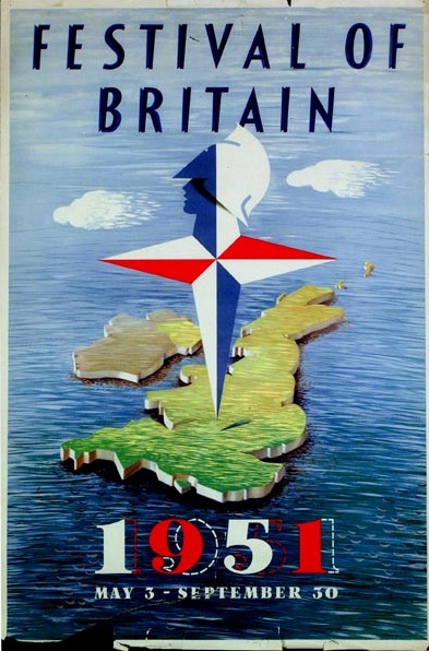
Festival of Britain map poster 1951

The Festival of Britain.  Or, to be more precise, the Museum of London’s rather wonderful Festival of Britain online exhibition and archive.  Not only does it have photos and reminiscences, it also has a searchable catalogue stuffed to the gills with wonderful posters and other ephemera.

Now I fell in love with the Festival of Britain when still in primary school, I have a vivid memory of the Radio Times doing a feature on the Festival in 1976, on its 25th anniversary, and wishing that I could have walked around in all of that primary coloured optimism myself.  It looked a great deal more fun than the 1970s.
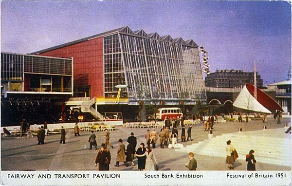
Festival of Britain postcard

This was clearly a formative experience, too, leading to a whole mis-spent life of 1950s collecting, a thesis, and, in the end, here.  The Radio Times has a lot to answer for.

If only I’d had all of this wonderful material to play with then.  The Museum of London’s archive is a result of a gift from Peter Kneebone, who combined being a key player in the Festival Office with being a keen epehemera collector.  Perfect.

There are some great things in there.  Mr Crownfolio says he has seen this Abram Games before, but I’m not sure that I have.

Abram games poster for model railway exhibition 1951 festival of Britain

Or you might want to consider this Reginald Mount.
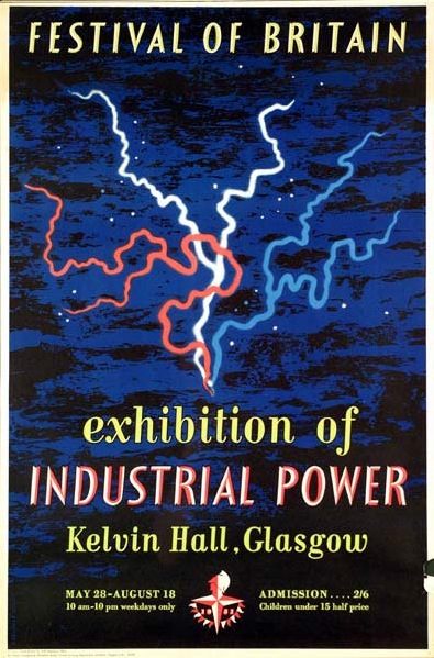
Reginald Mount exhibition poster Industrial Power Glasgow 1951 Festival of Britain

What’s particularly interesting about what Peter Kneebone collected is that it doesn’t always conform to our images of the Festival, which can tend to be stereotypical, generally involving the South Bank and the Skylon, possibly also the Festival Hall if you’re lucky.  The Reginald Mount poster above is a reminder that exhibitions and events were occurring all over the United Kingdom.  In Ulster, you could find out about Farm and Factory as well.
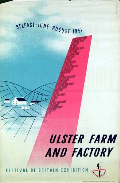
Ulster Farm and Factory exibition poster 1951 festival of Britain

Furthermore, not all of the Festival disappeared in a puff of smoke at the end of 1951.  This ‘Living Architecture Exhibition’ (proof that Grand Designs Live is not a new idea in the slightest),
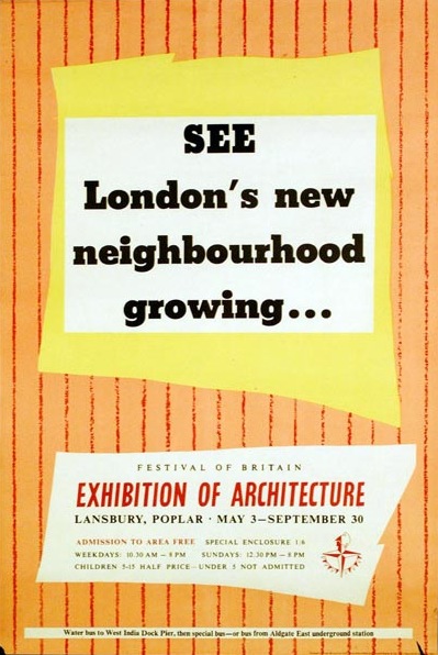
Another poster for Lansbury FoB architecture 1951

became the Lansbury Estate, which is still there.
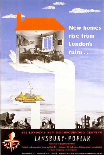
New Homes living architecture exhibition 1951 festival of Britain

The images are also a reminder that, without hindsight, the Festival wasn’t the victory for soft Scandinavian modernism that it now seems to be.  Quite a few designers are harking back to the Great Exhibition of 1851 as much as they were looking forward.
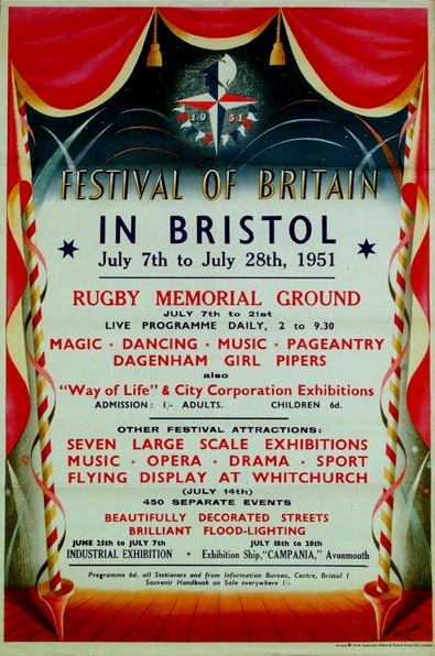
Festival of Britain in Bristol poster Eric Fraser 1951

In this case, Eric Fraser, producing a generic poster to be used across Britain.  Some of the designs seem to refer even further back to the Regency, like this Birmingham leaflet
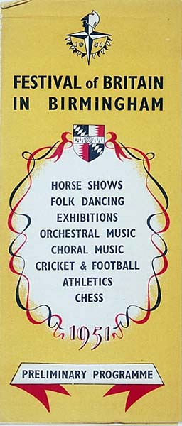
Birmingham city Festival of Britain leaflet

A vein of British  eccentricity and folk art also ran through the whole Festival; corn dollies and unicorns lurked within the modern buildings of the South Bank and elsewhere.  Here’s the incomparable Barbara Jones (about whom I will write one of these days), whose poster combines both Victoriana and whimsy.
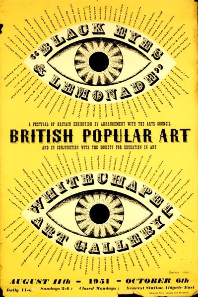
British popular art 1951 exhibition poster Barbara Jones

What’s also great about the archive is the display; these are real, slightly battered pieces of ephemera, rather than air-brushed scans.  It’s good.  (And also reassuring given the condition of most of what we own.)

My only gripe would be that not enough designers are named.  I’m pretty sure that the Ulster Farm and Factory poster is by Willy de Majo, who designed the whole exhibition, but the Ten Decades poster has a signature that I just can’t read, or find anywhere else, and it would have been good to know.  But that’s my only, tiny quibble, so hurrah for the Museum of London, Peter Kneebone and their lovely archive.

Different buses

When I wrote last week about my morbid fear of copies, and how it would infuriate Walter Benjamin, I didn’t expect to generate a debate.  But lots of people made very interesting comments, which have made me think more about how and why we buy posters.  But that’s for another day.
Today is a slightly more nerdy affair, as I am rather amused to report that I can address some of the more, um, detailed points about reproductions vs originals.

‘mm’ asked,

Have you ever had an LT reproduction next to an original? How different are they? Same size? Same paper? Same printer? Why indicate that it is a reproduction?…

Strangely enough, I am able to answer some of these questions, and this is our subject.

James Fenton 1964 London Transport Museum poster

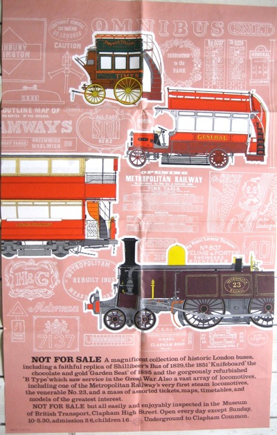
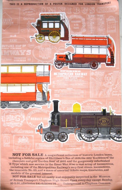
It’s a 1964 poster by William Fenton, advertising the collection of London Buses on show at the Museum of British Transport in Clapham High Street.  (This was the forerunner of both the York Railway Museum and the London Transport Museum; the site is now a Sainsburys, fact fans).

To my surprise – given that it is a rather detailed picture of old bits of machinery – we seem to have two copies of this poster.  One is an original,

William Fenton original poster for London Transport Bus collection 1964

the other the self-proclaimed reproduction.

William Fenton reproduction poster

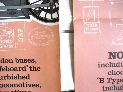
To be honest there isn’t a whole heap of difference between them.  The colour – particularly the background pink and reds – is slightly different, being a bit more orange in the reproduction.

colour difference pic

The paper is also slightly different, but not in a way that I could definitively say was better or worse, most likely just a factor of 7 or more years elapsing between the original and the reprint.

I wouldn’t be able to make a judgement, were it not for the fact that they’ve printed THIS IS A REPRO over it in screaming capitals.  In which case it’s easy, I’ll take the one on the right.  And as for mm’s last question, why do that, I have no idea, absolutely no idea at all.

Paul Rennie also suggested that they might have over-printed the original posters for sale at the museum, but looking at these two, I don’t think it’s the case.  These both have different serial numbers in the bottom left corner, and the reproduction has an (R) after its as well.

But what I do think they did was go back to the original printers for reprints of each poster.  The Fenton poster was printed, in both cases, by the Curwen Press.

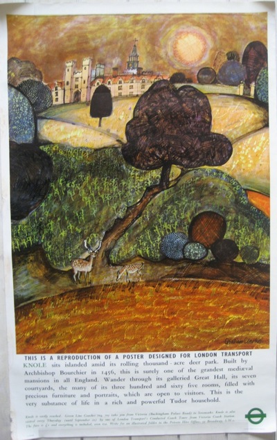
This reproduction of a 1967 Graham Clarke original (I am rather embarrassed about the numbers we seem to have) was printed by  Johnson, Riddle and Co.

Knole 1971 reprint of London Transport poster by Graham Clarke

And a quick glance at the London Transport site tells me that the original was too.

Next week, back to why we collect posters anyway.  (Short answer, because I can’t afford a Picasso; the long answer will involve French sociologists and a bit more theory.  Bet you can’t wait.)

Horses, sorry, modernism for all

Crownfolio is thinking of going to France.  Actually, I’ve been thinking about my holidays for some time, but now it looks as though I’m going to have to plan another trip as well, and all because of this exhibition.

It’s called Art for All, and it’s an exhibition of British transport posters at the Yale Center for British Art, which is a part of the University.

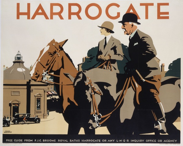
Now at first I found myself a bit surprised and bemused that Yale could be bothered to have a collection of transport posters (a bequest, apparently see below*).  But then I look at something like this 1932 Newbould,

Frank Newbould Harrogate vintage railway poster 1932

and realise that it’s not a million miles away from a Stubbs or a Gainsborough in its depiction of a very specific kind of horsey Britishness.

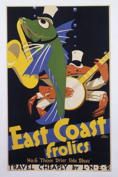
To be fair to them, though, the exhibition – or at least the collection of images that they’ve chosen to promote it – isn’t packed to the gills with landscapes and posh people.  In fact, if anything, it’s more on the side of modernism.    There’s plenty of McKnight Kauffer, and also these delightfully a-typical Newboulds from 1933 (I wonder if he got bored of fields, villages and market towns too).

Frank Newbould, East Coast Frolics 1933

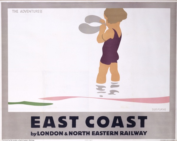
The Jazz Age made incarnate by fish.  You can’t beat that, can you.  Or this Tom Purvis, with an unusually subtle colour-scheme.

Tom Purvis East Coast LNER poster  1928

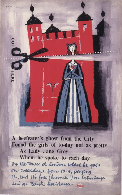
I also like the fact that the curators don’t seem to believe that all good design evaporated after the Second World War.  They’ve included this 1956 Unger,

Unger Tower of London vintage London transport poster 1956

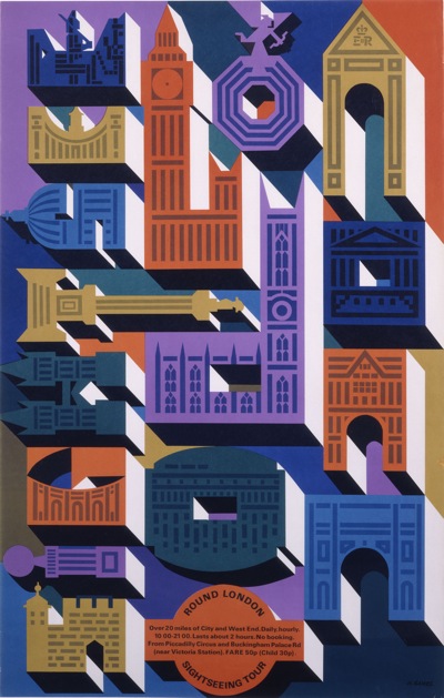
As well as this even later – 1965 – Abram Games.

Abram Games vintage London Transport poster

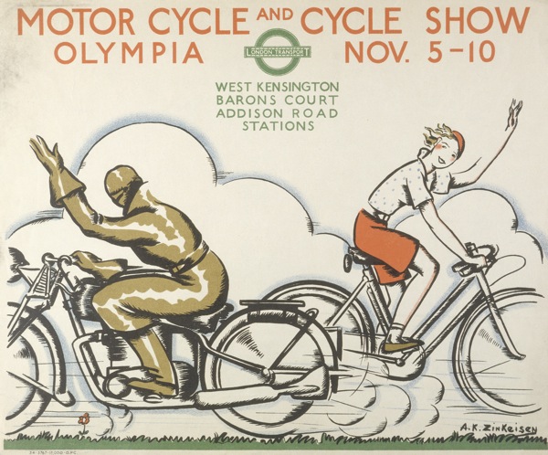
Even better, they’ve not just gone for name designers and known posters.  Also included is this 1933 gem by Anna Katrina Zinkeisen.

Zinkeisen_Mortor-Cycle-and-Cycle-Show, vintage London Transport poster, 1934

All of these were part of the Henry S Hacker bequest to Yale.  I think I rather like his taste.

So, if you are in the U.S., it would be worth quite a detour to see this lot  – and more, there are over 100 in the show in total.  The show runs from next week until August 15th, so you’ve got plenty of time.  And if you do make it, I’d love to hear what it’s like.

If you’ve been wondering in the meantime why I’m thinking French thoughts, it’s because the exhibition transfers to the Musée de L’Imprimerie, Lyon, France: October 15, 2010–February 13, 2011.  Which is slightly more accessible by Eurostar than Yale.

But if even that seems too daunting, there’s also a book – Art for All: British Posters for Transport (Yale Center for British Art).  More on that when it arrives.

*Thanks to a very forgiving email from Henry Hacker himself, I now know that it isn’t a bequest, and that Henry Hacker is still very happily collecting posters.  Which makes his gifts even more generous.

Up, up and away

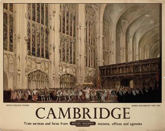
Time, for a quick saunter round the Christies results.  Which were a mixed bag; some things sold, some things didn’t.  Some things sold for way over their estimate (we’ll come to those in a minute), some things for well under.    This Fred Taylor, for example, went for £250, despite an estimate of £600-800.  So far, so like normal.

Fred Taylor, Cambridge, from Christies vintage poster sale
Fred Taylor, Cambridge, British Railways

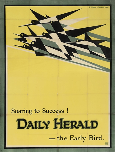
But the real shock – and the reason that it’s worth my saying anything at all – was this one.

Daily Herald, McKnight Kauffer, Christies vintage poster sale
McKnight Kauffer, Daily Herald

£32,450, the highest price in the sale, despite being huge.  I’m gutted.

I know that sounds unreasonable, but I love this poster.  Not only because it’s great (it is) but it was also one of the reasons that I started to appreciate posters in the first place.

Back in the day, it used to hang a little-used back stairwell of the V&A, which ran from the Exhibition Road entrance, past the Twentieth Century Galleries and then up into the Eighteenth Century.  I used to go up and down there quite a bit, and I learned to love it.  But now I’ll never own it (mind you, at 79 x 60 inches, that’s probably a bit of a blessing).

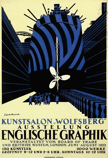
But that wasn’t the biggest shock.  That has to belong to this Edward Wadsworth.

Edward Wadsworth in German dazzle ships vintage poster

Estimated at £4,000-£6,000, it went for £18,750.  Someone must have been chuffed this weekend.

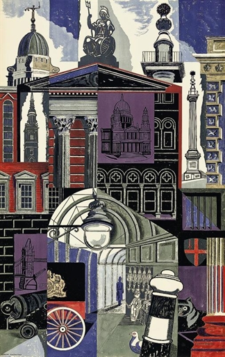
Other than that, it was also good seeing the Edward Bawden and David Gentleman London Transport posters making over £1,000.

Edward bawden London transport vintage poster

Although each lot had been made up with other posters (six more in the case of the Bawden – I wonder which they were).  Before the minimum lot requirements, these would almost all have been sold separately; it’s a shame that they’re all bundled up, unseen and unvalued now.

What will be interesting is whether or not more posters pop up at the next Onslows sale at the end of the month as a result.  Patrick Bogue has just posted up a teasing page of previews at the moment – so it’s hard to tell. There’s a Stan Krol UN poster that I rather like, and I will post that when some larger images are about, and anything else interesting which turns up in the catalogue.

Properly Designed Posters Please

Today, a wallow in some lovely designs for no good reason at all

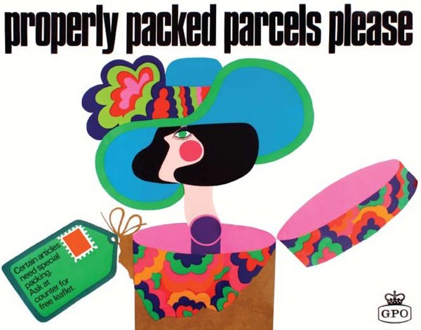
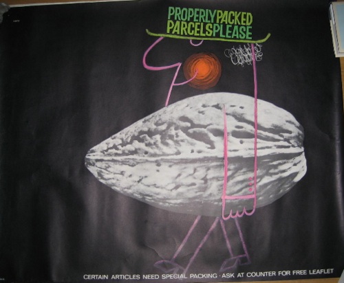
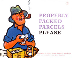
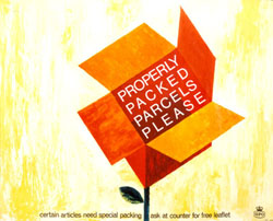
I’ve been meaning to write about the Post Office’s ‘Properly Packed Parcels Please’ series for ages, ever since finding them praised in Design Magazine.

Properly Packed Parcels Please vintage GPO poster woman out of hat

There’s a whole series of these posters (they seem to stretch from 1962 until the early 70s), and what I like about them is that they’re still trying to do great modern poster design at a time when most other institutions have more or less given up.

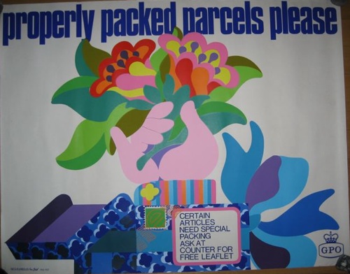
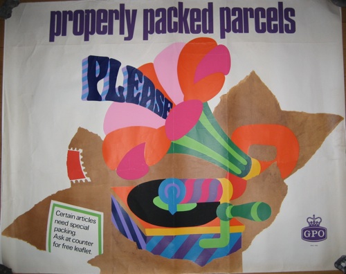
Perhaps the most arresting are this psychedelic series from about 1967-8.

Properly Packed Parcels Please Tom Bund poster 1967

Paul Rennie has the first one down as being by Negus Sharland; ours (hence the rather grim photos, apologies as usual) are signed either Tom Bund or Bund/Negus and Negus, so go figure.

Properly Packed Parcels Please tom bund 1968

Unfortunately I don’t know enough about the organisation of British advertising and design in the 1960s to be able to shed much light on this.  However, a bit of light Googling has told me that Tom Bund is alive and working, so I’ve dropped him a line and perhaps he can help.

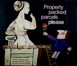
There were also some more cartooony designs by Andre Amstutz and Harry Stevens in 1965 and 1963 respectively (from the BPMA catalogues).

Andre Amstutz Properly Packed Parcels Please GPO 1965

Harry Stevens GPO parcels poster 1963

But I do have to confess to a slight pleasure that we’ve got a few of these posters that the BPMA don’t (I know it’s mean, but they’re a museum, and we’re not, so it’s not something I can often do).  They do have this 1968 one by George Karo.

G B Karo vintage GPO poster properly packed parcels

But not this, from the same year.

George Karo {Properly Packed Parcels please GPO poster

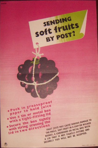
And just in case you’re wondering why people need so much telling about packing their parcels properly, an earlier, 1952 poster by Karo gives us an insight into the strange things that the British public get up to with their postal service.

Karo soft fruit by post genius GPO poster

Remember, fruit juice may cause serious damage to the mails.  Now there’s a lesson to take away with you for the weekend.