Mr Benjamin, is this poster a copy?

Exhibits A and B for today’s argument come from eBay.

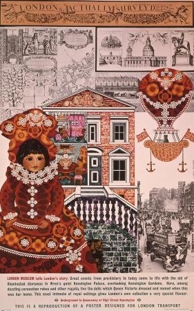
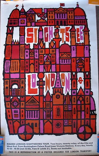
This is a London Transport poster by Abram Games from 1968.

Abram Games London Transport poster repro

Except it also isn’t.  Here’s the description from the listing itself.

“Sightsee London” by Abram Games 1968. This is an authentic LT poster printed by Sir Joseph Causton & Sons in 1971 for sale in the LT shop and carries the line “this is a reproduction of a poster designed for London Transport” – it is not a recent reprint.

So, I don’t want to buy it because it says all over the bottom that it’s a reprint.   An old reprint, true, almost as old as the original poster, but still a copy.

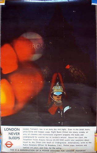
There’s another one too, a rather natty bit of swinging 60s design.

1960s London Transport poster repro

And I’m not going to buy that one either, for just the same reason.

But why should this matter?  It’s still an old poster.  Come to that, why don’t I buy a giclee print of whatever poster I fancy instead of spending time and money in pursuit of the originals?

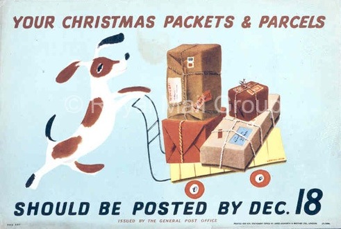
Mr Crownfolio asked that question the other day, and I didn’t have a good answer.  If we buy posters for the good design and because they are lovely images to have around, a reprint, of any kind, shouldn’t be an issue.  I could have this Lewitt Him for £30 from Postal Heritage Prints,

Lewitt Him post early GPO vintage poster 1941

which is considerably cheaper than the amount we actually paid for an original copy.  And yet I still don’t want it.  Why is that?

There are some relatively straightforward answers, like the thrill of the chase and the bargain, and that the originals will make much better investments.  That’s all true, but there’s more at stake here than that.  And to explain it, I may have to use some theory (but don’t worry, there will be nice pictures as well along the way).

Back in 1936, the critic and writer Walter Benjamin (in an often-quoted and pleasingly short essay called ‘The Work of Art in the Age of Mechanical Reproduction’) argued that the original work of art had an ‘aura’ – its presence, uniqueness, history and associations.  Now this, for me, is what an original poster offers.  Its past life, its direct connection with the artist and their times, its apparent authenticity compared to a giclee print, all of these make a poster more interesting than a later copy.
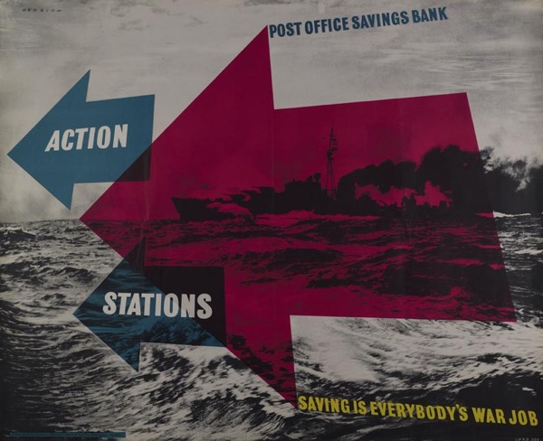
F K Henrion, Post Office Savings Bank poster, 1944

Seems sensible, but it would have had Benjamin foaming at the mouth with fury.  He believed that even fine art works would lose their aura once high quality printing and photographic reproduction could make them accessible to everyone; while modern creations like films and photographs (and, by implication, posters) would have no aura at all, because there could be no original.
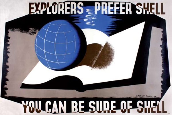
McKnight Kauffer, Explorers Prefer Shell, vintage poster 1934
McKnight Kauffer, Explorers Prefer Shell, 1934

And without an aura, he thought that art would have to change entirely.  Being of a Marxist persuasion, he thought that it would have to be about politics instead of reverence for the individual work.  Which is why he’d be so infuriated by my faffing about, worried about which London Transport posters are original and which are not.  Somehow (the mighty and indistructible powers of capitalism in all probability), we have managed to transfer all of our myths and beliefs about individual art works on to these reproduced, never-original copies.  Benjamin must be spitting tacks.
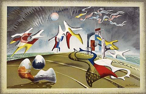
John Tunnard Holiday School Print 1947
John Tunnard, Holiday, School Print, 1947

The sad thing is, he came quite close to being right.  In a very British, watered-down way, ideas like the ‘School Prints’ series were an attempt to put his theories into practice.  In the late 1940s, fine and avant-garde artists including Henry Moore, Picasso and Braque created lithographs that were designed for reproduction and offered to every school in the country, making the best of modern art available to everyone who wanted it (nice article here if you want to know more).  These artworks were designed to be reproduced, in theory infinite in number, just as Benjamin would have liked them to be.  This should have been art without an aura, easily encountered on the walls of schools and hospitals rather than art galleries, in a political gesture very typical of the egalitarian post-war period.
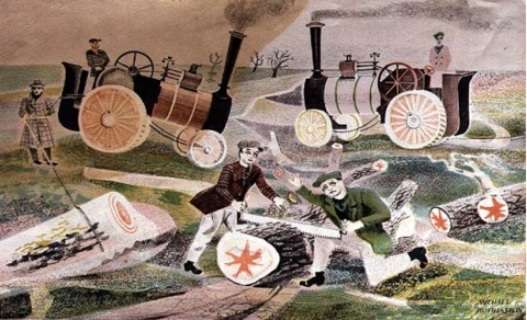
Michael Rothenstein School Print Essex Wood Cutters, 1946
Michael Rothenstein, Essex Wood Cutters, School Print 1946

But, of course, it didn’t end up as he had hoped; we now collect them, value them, treasure them for their limited availability.  The Henry Moore is worth close on £1000.  If you can get hold of a copy of course.

The School Prints were not alone either.  The late 40s and early 1950s were a Benjamin-esque frenzy of art for all.  Lyons Tea Shops commissioned prints from modern artists between 1947 and 1955 with much the same motivation. (Like the School prints they are now valuable, collectable unique items.  There is a slew of them on offer today at the Christies auction, as mentioned a few weeks ago.)
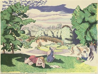
john nash landscape with bathers lyons print 1947
John Nash, Landscape with Bathers, Lyons print, 1947

And I’ve already blogged about the way that London Transport Shell and the GPO commissioned fine artists and avant-garde designers to design their posters both before and after World War Two with some of the same motivations.  Art was no longer the preserve of the privileged, it needed to be made available to everyone in this new, modern, reproducible world.  All these prints and posters were Benjamin’s theories made flesh.
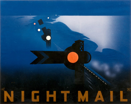
Night Mail Pat Keely vintage GPO poster
Pat Keely, Night Mail, GPO, 1939

But each and every one of these objects are now unique, collectable, valuable.  They’ve all acquired an aura.  And so I do mind whether or not I get a print, whether my poster was printed in 1968 or 1971.  I am, frankly, a lousy revolutionary.

Two other points to bear in mind.  One is that I used to work in a museum, so there are other reasons for collecting old things as well.  I’ll blog about them one day too, when I’ve articulated what on earth they are.

I also need to admit we’ve bought a couple of these reprints before now. Like this Carol Barker.

Carol Barker London for children vintage poster London Transport 1968

(I’d like to blame this on initial naivete, and some slightly dodgy eBay listings, but I think lack of attention to detail may have had something to do with it as well.  Repeat after me: I must read descriptions more carefully.)

Once again, the reprint is only a few years later than the ‘original’ but it still wrong and we’ll probably sell it on at some point.  Walter Benjamin would be very disappointed in me; I just can’t help seeing auras.
Murphy news

After I wrote the post about James Reeve and his brilliant brochures for Murphy televisioon, Dave Grant who runs the Murphy Radio site emailed with a bit more information.

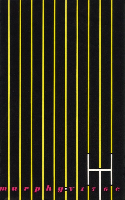
Sadly, he tells me that James Reeve died just a few months ago, so I’m not going to get the chance to quiz him about his wonderful designs.  Here’s another couple from 1949, just because I can.

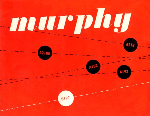
Murphy brochure cover 1949

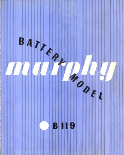
Murphy Battery Model brochure 1949

It turns out that James Reeve wasn’t the only force in favour of good design within Murphy.  Co-founder Ted Power (great name if you are going to go into making electrical equipment) was very interested in modern art.  Not only did he collect avant garde art such are Dubuffet and Beuys almost in bulk, he also became a trustee of the Tate Gallery.  (If you want to know more, there’s a fascinating article about him from the Independent here).  So perhaps that’s why Reeve was allowed to go for such adventurous graphics for the company.

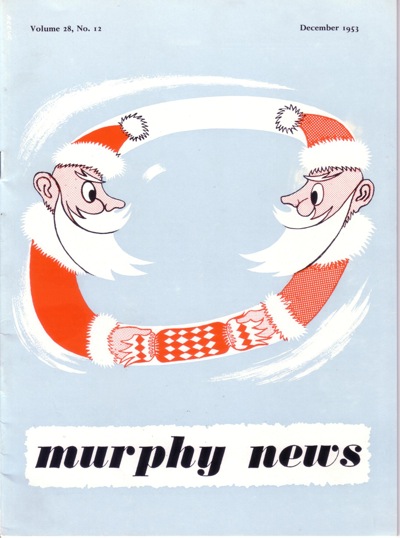
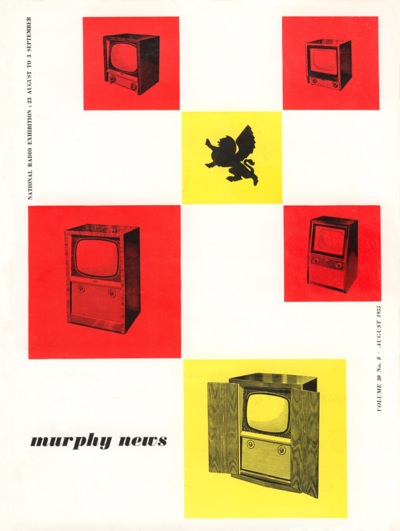
But that’s not all that Dave Grant had to say.  There’s also more stuff – more precisely, Reeve’s covers for Murphy News from the same period.  They’re just as good.  And in some cases – like this pastiche of Abram Games – Reeve is letting himself be a little more playful.

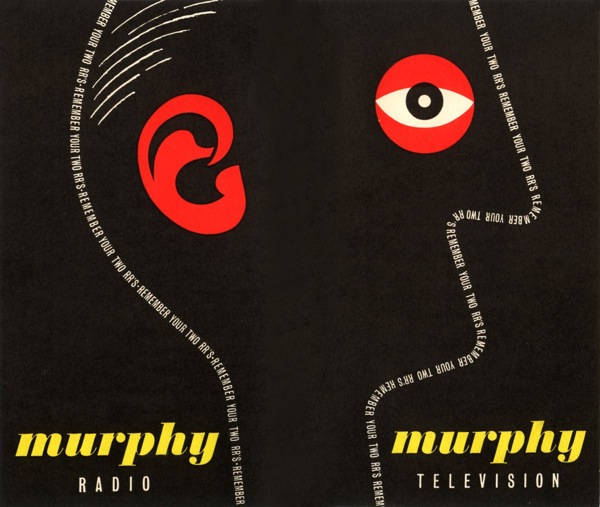
Murphy news Christmas 1953 cover James Reeve

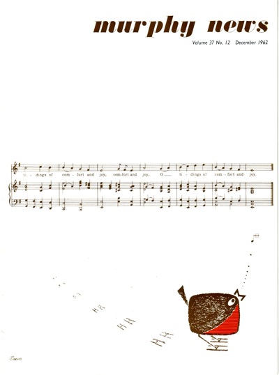
Clearly he let go a bit for Christmas – here’s 1962’s offering

Murphy News Dec 1962 James Reeve

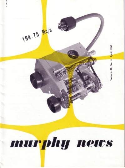
Some of the other covers echo the work that he was doing on the brochures at the time – these two are both from 1955.

Murphy news April 1955 James Reeve

Murphy news August 1955 James Reeve

While others are experiments in different styles.

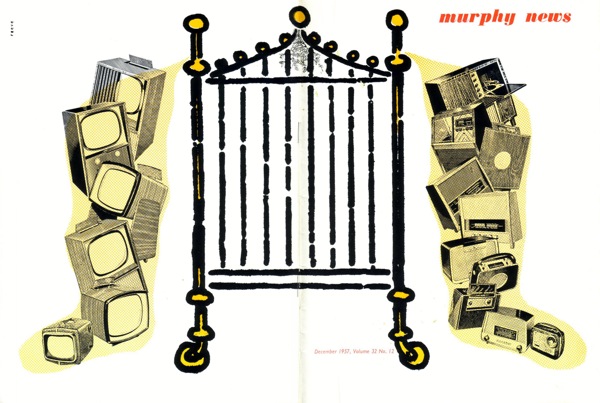
Murphy News Dec 1957 James Reeve

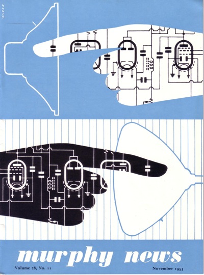
Murphy News Nov 53 James Reeve

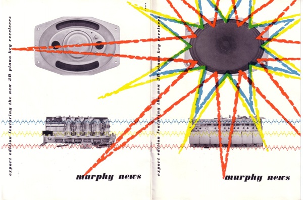
Murphy News undated special edition James Reeve

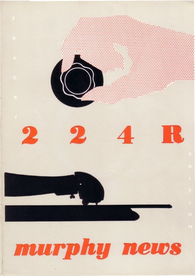
Murphy News TA224R  James Reeve

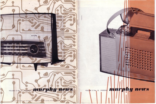
James Reeve Murphy television news cover

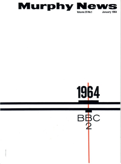
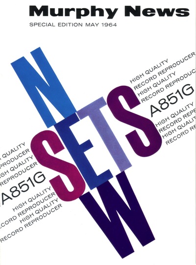
And, lest you think he might be losing his touch as time went on, here are some more typographic efforts from 1964.

Murphy news Cover Jan 1964 James Reeve

Murphy News cover May 1964 James Reeve

Give that man a medal.  Or at very least a posthumous round of applause.

I’m eBay, fly me

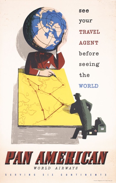
Once upon a time on eBay, it was possible to snag a bargain.  Now, everyone knows the value of everything, nothing’s sold at auction and what little you can get is a very expensive Buy It Now.  But I thought I would point you at this Lewitt-Him poster for the simple reason that I haven’t seen it before.

Lewitt Him Pan Am vintage travel poster eBay

Interesting, but I can’t say that I like it enough to pay $500 for it.

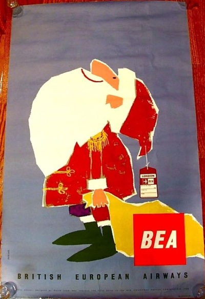
Elsewhere you can find this rather nice 1958 BEA poster.

1958 BEA vintage travel poster from eBay

Which also has an interesting story, as it was apparently the winning design in the BEA Christmas poster competition  for 1958.  But once again, at $350, I don’t think I’ll bother.

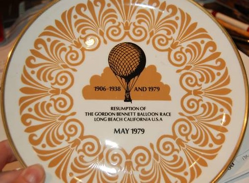
And finally, a curiosity.  It’s by Royston Cooper – but can this be the same one?

It’s from 1979 and it’s a souvenir from the Gordon Bennett balloon race, a fact which almost makes me think it’s a spoof.  Except who would bother.  Anyway, it failed to sell at £5.99, so I’m sure that if you emailed the seller and asked nicely, it could be yours.  And if anyone can tell me that this really is by Royston Cooper, I’d love to know how and why.

See for yourself

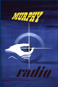
Mr Crownfolio has been doing some searching, in part as a result of the Abram Games Murphy advertisement which I posted last week.  Here’s another, by Reginald Mount, for what it’s worth.

REginald Mount murphy television design

But on the way, Mr Crownfolio came across the Murphy Radio site.  Now, generally, this bears the same relation to poster design as railway name-plate auctions do.  Actually, no, it’s even more frightening; there are circuit diagrams.

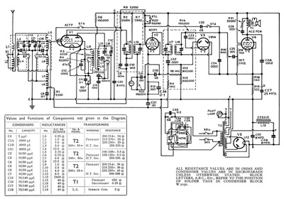
A murphy circuit diagram, don't ask me which one

This is for the Murphy A26 RG radiogram for use with AC Mains, since you ask.

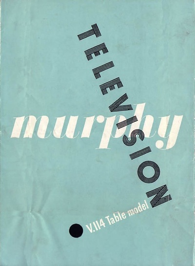
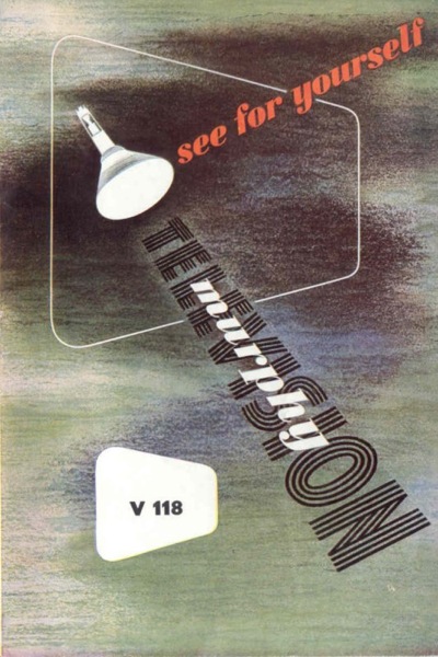
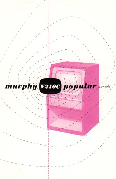
But also on the site are pages and pages of leaflets and brochures.  And they are great.  All of the following are  from 1948-49 and are incredibly sharp for their era.

Murphy leaflet 1

Mprhy leaflet 2

Murphy brochure 3

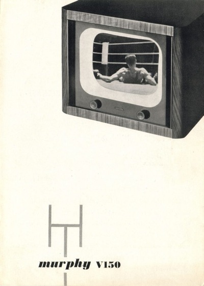
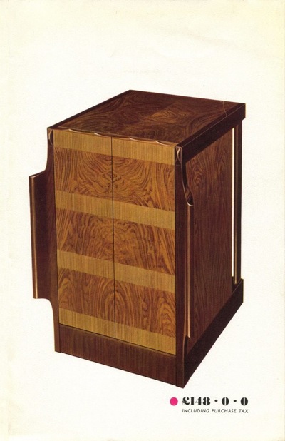
In fact, the graphic design was considerably more modern than the televisions themselves.  This brochure

another Murphy brochure

is for this television.

large wooden television not living up to graphic style

Unlike the brochure, the woodwork hasn’t moved on from the 1930s.  In some ways this is surprising, because much of the company’s graphic design was done by James Reeve, who also designed many of the televisions.  I was going to say that I like the brochures better than the products, but then I would say that, wouldn’t I.

There are plenty more great pieces of design as we go into the early to mid 50s.

yet another murphy brochure

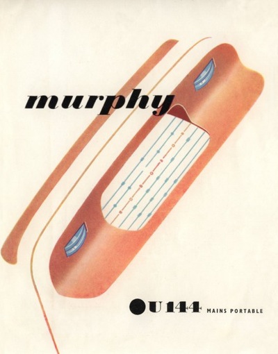
When we also enter the era of the portable (ish) radio.

Another Murphy catalogue cover

Murphy Irish catalogue

best bit of design there is here

I swear, it’s almost like looking at European posters it’s that good.

The great work continues until 1960.

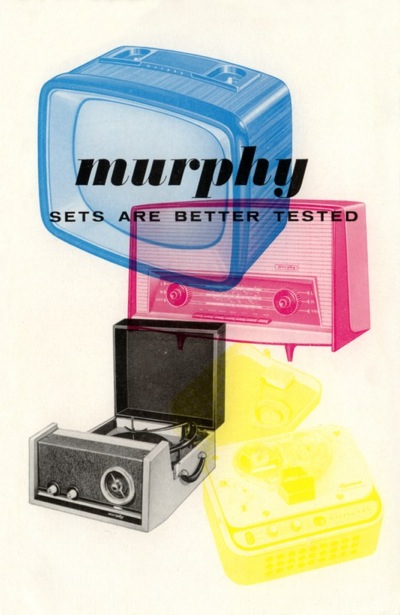
1950 murphy television brochure

What I find extraordinary, apart from the fact that I haven’t seen these before, is that an internal employee, whose main job was designing television sets, produced all of the above. He clearly knew his graphic design – especially considering that the likes of Abram Games and Reginald Mount were designing posters for Murphy television – but that can’t account for all of it.  James Reeve was certainly a very clever man, bordering on undiscovered genius.

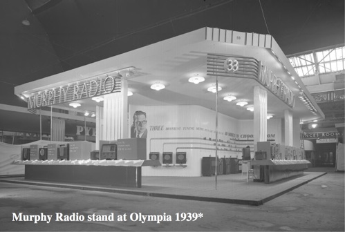
Furthermore, he is definitely hiding his light under a bushel.  He’s written an ebook about his designs – which you can find here – and it’s all about televisions.  Although I can give you this wonderful image of the Murphy stand at Olympia in 1939 – I’m guessing for the Ideal Home Show.

Murphy stand Olympia 1939

But it is possible to find out more.  There’s an exhibition at Mill Green Museum in Hatfield, all about Reeve’s work and including some of his poster designs.  So if someone could pop over and tell me if the rest of his work is as good as this stuff, I’d be very grateful.

Big. But definitely not clever.

Having mentioned posters the size of houses yesterday, I thought I might share with you one of my and Mr Crownfolio’s less sensible purchases.  Which is this.

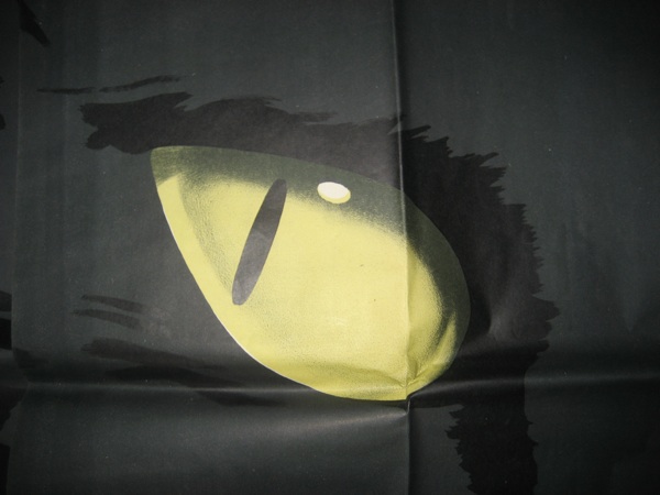
detail from vintage National Savings billboard poster

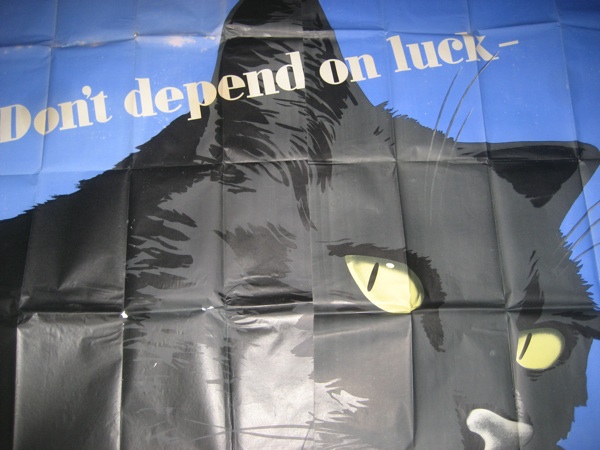
Although I might be less embarrassed if that were all there was.  In reality, there’s rather more to it – here’s the top half.
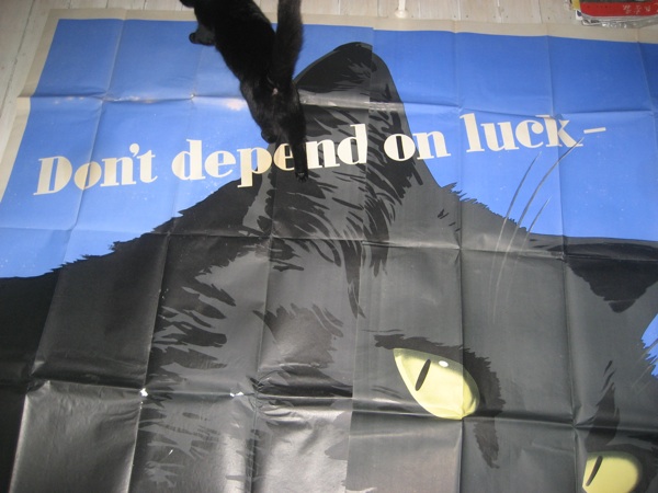
National Savings vintage billboard poster top

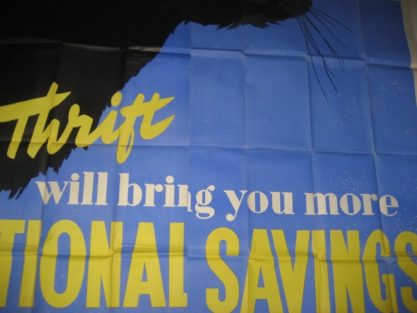
And this is the bottom.

National Savings vintage billboard cat poster lower half

All of which put together is a giant 16-sheet billboard poster for National Savings.   It’s stupidly big.
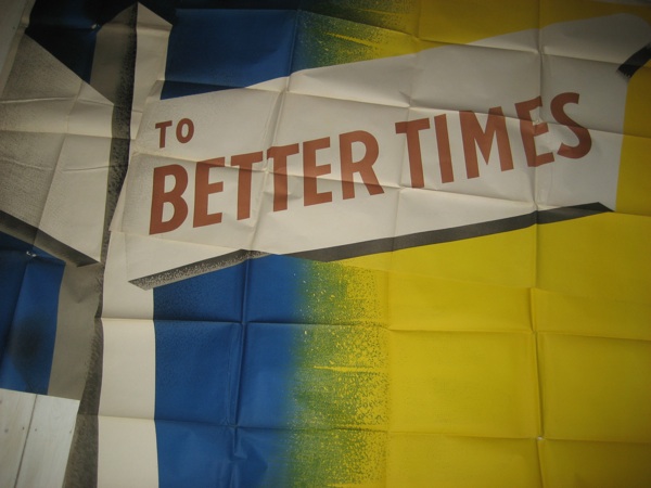
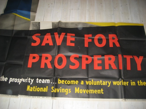
To give you an idea of exactly how huge it is, here it is with a real life (and hence uncooperative) black cat for scale.

Winsor walking on black cat poster

What were we thinking of?  Although, at the time we bought it, we were living in a flat with a double-height end wall that could have fitted this quite nicely.  I think this was my intention.  But Mr Crownfolio said no.  He was probably right.

It gets worse, though.  I dug the cardboard box out (which, I have to say, we haven’t really opened much since we bought it) only to discover – and I really hadn’t remembered this at all – that we seem to have bought three.  Eh?

So we also own this National Savings billboard poster.  Again, I’ve had to photograph it in pieces; I think I could just about  spread it out in this room, but only if I removed all the furniture.

National Savings vintage billboard poster sign top

National Savings vintage billboard poster sign lower

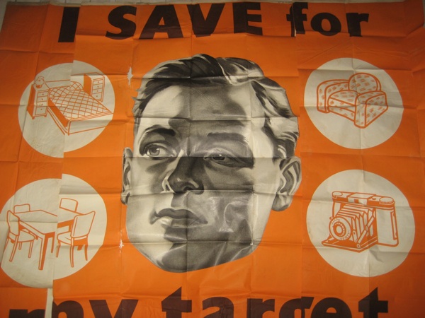
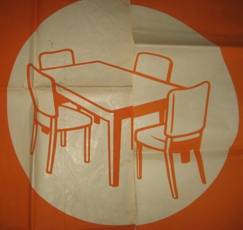
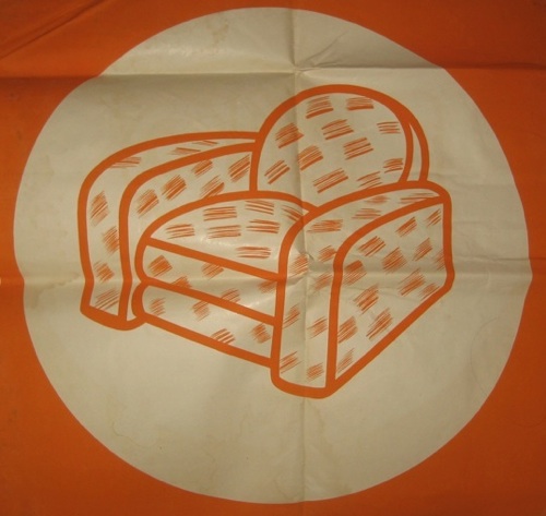
Finally, there’s this one, which I am rather delighted to find, although I am not sure whether I like it because of its Orwellian style or despite it.

National Savings vintage billboard poster man main

There is another strip of text which goes along the bottom, but it doesn’t make sense on its own, and, again, I just don’t have the space.

The graphic bubbles are great though

National Savings vintage billboard poster man detail chairs

National Savings vintage billboard poster man chair

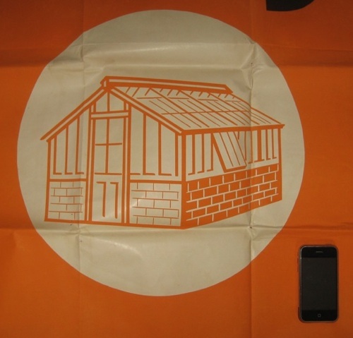
Here is one with a (more co-operative) iPhone for scale.

National Savings vintage billboard poster greenhouse detail iPhone

I can’t tell you a whole heap about them, I’m afraid.  Judging from the serial numbers, they are from 1951, and we bought them from eBay.  And they’re not in quite as good condition as they look – there is a lot of foxing and watermarking on the back, and quite a few holes along the folds.  But the colours, as you can see, are pin-sharp.  More than that I do not know.

But now that I’ve rediscovered them, I feel a bit guilty about just putting them away and letting them sit when we’re never ever going to put them on a wall and I can’t imagine that many other people are daft enough to actually buy them.  At the moment, our thought is to donate them to the History of Advertising Trust.  Unless someone else has a better idea.

Take your Pick

I was going to ignore the second Wallis and Wallis auction of World War Two posters, on the grounds that they mostly illustrate the same truth as the first auction, which is that there were far more bad wartime posters than good ones.

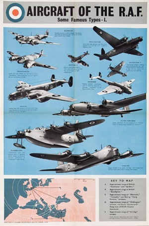
Once again in this auction, pictures of aeroplanes and excerpts from Churchill’s speeches are by far the majority.  Posters like this.

vintage World War Two poster RAF aircraft types wallis and wallis

There’s perhaps one classic,

womens land army vintage world war two poster

And a couple which I quite like for no real good reason.

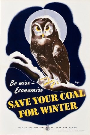
Save your coal for winter owl vintage world war two poster

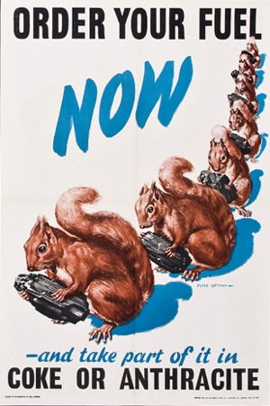
Squirrel coal order fuel now vintage world war two poster

They’ll all go for a lot of money, though, so who cares what I think.

But then Serena, who had clearly been reading the catalogue more closely than I had, pointed out that lot 588 was quite interesting.

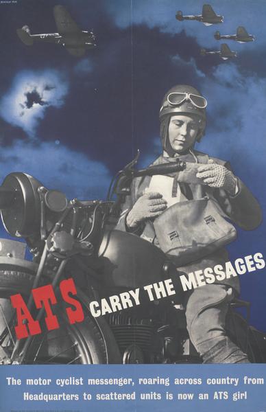
588 2 WWII ATS recruiting posters: “ATS as Signal Operators” 3 operators, one with morse key (51-9700) and “ATS carry the messages”, despatch rider on motor cycle (51-9796); in a sleeve. VGC

To be precise, at least one of them is by Beverley Pick and is rather good.

ATS carry the messages vintage world war two poster beverley pick

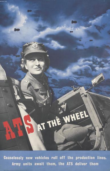
I’m guessing that the other one is also from the same series, but I can’t find an image of it.  Pick also did this one as well.

beverley pick vintage world war two poster ats at the wheel

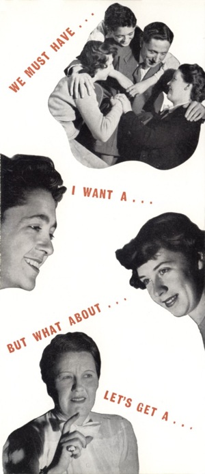
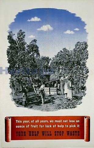
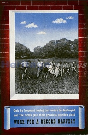
I rather like the mixed photo-montage and text – Pick did the same sort of thing in these two great posters (apologies for not very good images).

'Lend A Hand On The Land - Your Help Will Stop Waste', World War II poster, c1939-c1945.

Lend a hand beverley pick vintage world war two poster

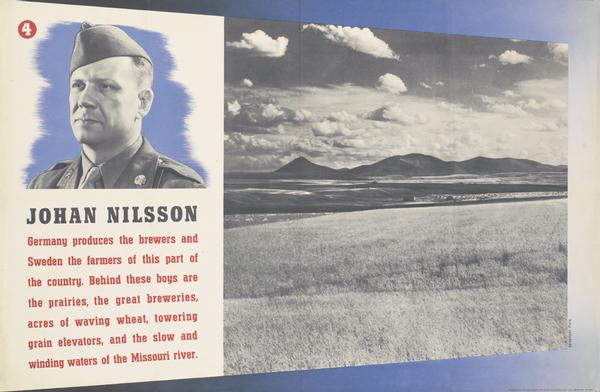
I can find a few other things in the same sort of style, like this wartime one whose point I can’t entirely grasp.

Beverley Pick Nillson vintage world war two poser

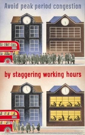
And a few other things which are entirely different.

Beverley pick stagger working hours vintage london transport poster

Then that’s about your lot.  I think that, after the war, Pick concentrated on exhibition and industrial design rather than posters, including parts of Britain Can Make It and the Festival of Britain, and I ought to do some more research when I am less pressed for time.  More on this later then, and thanks again to Serena for flagging the poster up.

Meanwhile, elsewhere in the world of auctions, this Abram Games has come up on eBay.

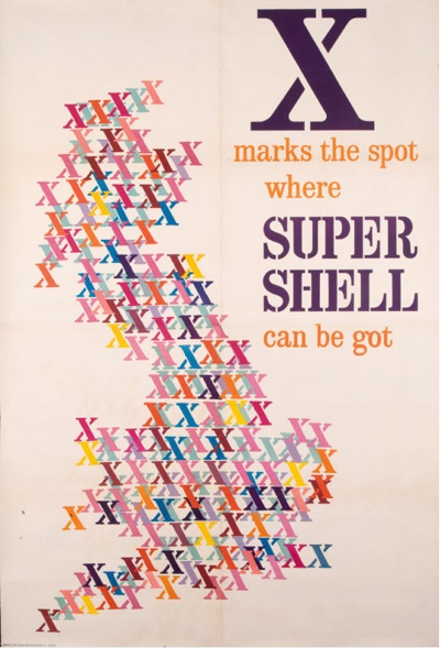
Abram Games super shell poster

It’s lovely, it’s backed on linen, I’ve never seen it before, but it is still eye-wateringly expensive at $1,700 Buy It Now.  You can make a best offer, though; perhaps I will go for £150 and see what they say.  There on the other hand, as it’s almost 80″ x 120″, and I don’t have an advertising hoarding to put it up on, perhaps I won’t bother.