Different trains of thought

Another online archive of lovely posters for your education and enlightenment today.  But, nothing is straightforward in this world, so this is another archive with its own quirks and priorities.  Here, though, they’re more understandable, because this archive isn’t meant for the likes of you and me.  It’s the National Railway Museum poster collection, and it’s designed for railway buffs.

Andre Amstutz Whitley Bay vintage British Railways poster

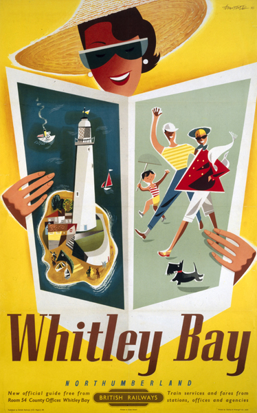
Whitley Bay, Amstutz, 1954

Wondering what I am talking about?  Try here.  This is the main search page for the NRM’s poster collection, your gateway to more than ten thousand railway posters.  Now I might want to search these by date, or by the subject of the poster, or even by the designer.  Not a chance.  I can filter them by category (of which there is only one, All, which is philosophically quite interesting), or I can sort them by railway company.  So should I ever want to see every poster for the Axminster and Lyme Regis Light Railway, I am fine.  Should, however, my life not be organised in terms of various railway operators I am rather up the Swannee.

Morecambe vintage British Railways poster from NRM

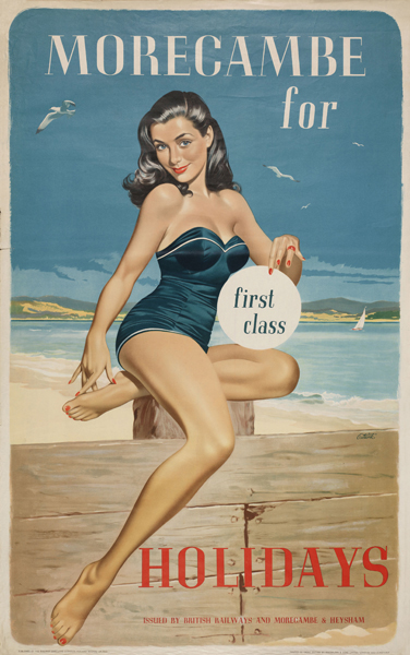
Morecambe, Lance Cattermole, 1960

It’s such a radically different perpective on the world that it makes me laugh rather than drives me to fury.  Although this is mainly because there are  a couple of get-arounds by which I can find what I am looking for.  The first is the search box in the top right corner.  Although this searches the entire site, not just the poster collection, “Morecambe poster”  or “Amstutz poster” generally gets you a full list of results, even if in text form, usually including several repetitions, and with only about half a chance of an image when you click on the individual object.

Tom Purvis Lincolnshire LNER vintage poster

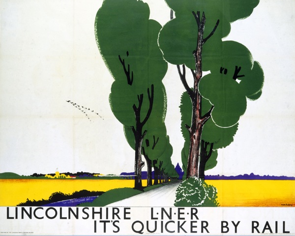
Lincolnshire, Tom Purvis, no date

But not even this isn’t as infuriating as it might be.  Because, elsewhere, there is a much better search engine.  The National Museum of Science and Industry runs not only the NRM, but also the Science Museum and the National Media Museum.  And it too has a search engine – although, wierdly, I can’t find any way of accessing it from their home page.  Perhaps it’s a secret and I’m not meant to be using it.  In which case, apologies.

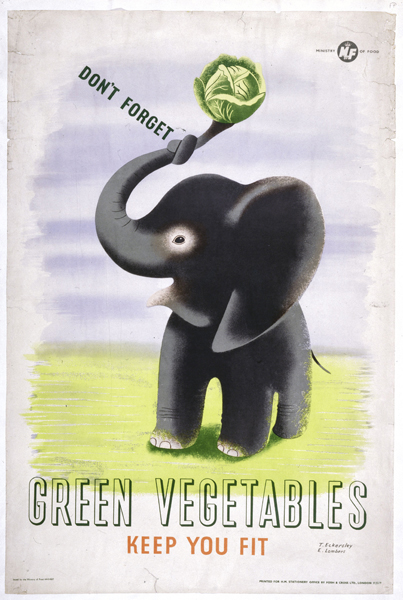
From this, you get a much neater page of search results, with thumbnail images where they exist.  Plus, as an added bonus, your search can also turn up some additional Science Museum holdings, like this cheerful little Eckerlsey Lombers for the Ministry of Food.

Tom Eckersley Eric Lombers vintage WW2 poster for the Ministry of Food

What’s odd about these two search pages though, is that they don’t turn up the same results.  (This next bit may end up being a bit geeky, so if you’re not interested, skip on a bit).  The NRM search will miss out lots of items.  Say you run a search like “studio seven”  (I would recommend it, incidentally, as you can see from the results below).  This 1958 Studio Seven poster appears when you search on the NMSI.

Studio Seven vintage poster Dover British Railways

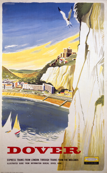
But doesn’t when you search the NRM – only if you search for “Dover Studio Seven”.  And even then, there isn’t an illustration or a date.  The same happens with this poster.

'Please Remember my Ticket', BR poster, c 1950s. Studio Seven

From which we could perhaps conclude that the NMSI search engine is a superior thing and the NRM one a  bit random.  Which is probably true.  But what is more than passing strange is that even when each search engine comes up with the same thing, the pictures are different.  The NMSI has proper scans.

Studio Seven Minehead British Railways vintage poster 1962

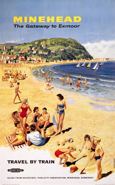
Studio Seven, Minehead 1962

Whereas the NRM have flattened the poster with a bit of perspex, taken a picture and said, will this do?  (Much like we do, I admit, but then we’re not a national institution in charge of a major archive.)

same again but with reflections on

Now I’m not just doing this to poke fun at the NRM, there is a point.  The pictures show that these two search pages aren’t just different ways into the same database, they’re totally separate entities.  Which means that all of this information, on ten thousand posters and lord alone knows how many engines, sprockets and pictures of stations, has been catalogued twice.  At best it’s a waste of time, at worst it must have cost an awful lot of unnecessary money.  Or maybe there is a good reason for this, and I have missed it, in which case I’d like to know.

'Sunny Rhyl - The Family Resort', BR (LMR) poster, 1955.

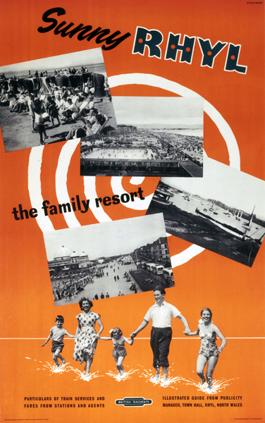
Studio Seven, Rhyl, 1955

So, nerdy bit over, there is still a rather wonderful and under-used collection to be found at the NRM, whichever search engine you view it through.  And it’s another example of how the internet can do things for museums that a building can’t.  If you go to the NRM hoping to see posters (as Mr Crownfolio and I, sad cases that we are, did on our honeymoon) you will be disappointed, as only a tiny proportion of what they hold will be on show.  Surf the archives though, and you can look at whatever you like.  If you can find it.

'By Train to London', 1960. British Railways poster Studio Seven

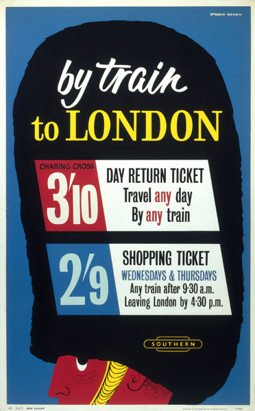
Studio Seven, By Train to London, 1960


This good design, it’s just not British

I haven’t finished with the Artist Partners AP2  brochure/catalogue/thingy, not yet.  There’s a large chunk of its content that I’ve been ignoring so far, and that’s the sheer number of foreign designers who are represented in the book.  Designers like Savignac, for example.

Savignac times poster Artist Partners brochure

Or Andre Francois.

Andre Francois shell ad from Artist Partners book

Now in itself, that’s perhaps not so surprising – it’s good for Artist Partners and good for the designers.  But it leads to a couple of interesting thoughts.  The first is that these renowned designers are clearly working for UK agencies and firms as well as in their own country, which I didn’t know.  These two images above aren’t the only examples, the book contains plenty more in black and white.

Here’s Francois working for Mazda, Gillette and Taylor Walkers Ale.

Andre Francois advertising in Artist Partners brochure

Then Jean Colin for WH Smith and Nestle, as well as in French.

Jean Colin from Artist Partners Book

I haven’t turned up any examples of these designs anywhere else, even though all three artists are highly collectable, which once again shows how much our view of these graphics is based on the very partial sample of what has survived.

On top of this, it is also surprising just how many foreign designers there are in AP2.  On top of those who mainly lived and worked abroad, (and the AP book also includes Herbert Leupin, Donald Brun and Saul Bass), several more of those represented are emigres who came over as a result of the war – designers like Hans Unger and George Him.

There’s also Heinz Kurth, who gets a double-page spread in the book and may well belong in this category too.

Heinz Kurth from Artist Partners book

He also did the really excellent photography illustration that I’ve illustrated before (currently pinging its way round the web thanks to Martin Klasch)

Heinz Kurth image for AP2 book

But I can’t seem to find out anything more about his story and whether he actually worked in Britain or not – I’m guessing he did from the AP images, which are pretty much all British.  He did also do this.

Heinz Kurth film poster for Norman Wisdom Just My Luck

which does rather suggest he was based in the UK, and which you could buy if you wanted for just £100,  a bit of a bargain if you ask me.

Which leads me to a further, bigger conclusion, about just how much modernism really was a foreign import  in Britain.  But that’s another thought for another post, not least because there are a few books I need to read before I stick my opinions on the line.  If you’ve got anything to say on this, please do let me know.

Rather forgeta-bull

A curiosity today.  This.

Cover for The Vegetabull book Lewitt Him

It’s a 1955 childrens book by Jan Lewitt, one half of the brilliant Lewitt-Him graphic design partnership.

It’s not, I have to say, a great book, but makes it in here mostly because it is clearly a spin-off from one of my favourite posters, a Lewitt-Him design from 1943.

Lewitt Him Vegetabull vintage WW2 ministry of food poster

I’m rather tickled by the fact that Jan Lewitt liked the idea so much that ten years later he decided to give the image an entire backstory, rather like an author being forced to write a sequel because he’s created characters who just won’t leave him alone.

Jan Lewitt vegetabull book illustration 1

It’s just a shame that the plot (which involves far away islands, mandolin trees and a bull called Yorick) isn’t a bit more gripping.

Jan Lewitt vegetabull book illustration two fish

Although the illustrations are rather wonderful, in a grown-up kind of way.

Vegetabull book illustration Jan Lewitt sailors with telescopes

Should you fancy your own copy, it’s pretty widely available on the second hand book web, at prices ranging from £10 – £100.  You choose.

Two other incidental facts while I am here.  Lewitt-Him also did a couple of other children’s books as a partnership.  One is The Little Red Train, written by Diana Ross (not that one, I don’t think)

Little Red Engine Lewitt Him cover

which you can find here (via Martin Klasch).  Both the story and illustrations are better if you ask me,

Lewitt-Him Little Red Engine illustration

to the extent that I might consider reading it to a real life small child.

There’s also Locomotive, The Turnip and The Birds’ Broadcast, which I’ve never seen but a very nice man has posted the complete set of images on Flickr, so you can take a view for yourself.  My view is that it looks like the most delightful of the lot.  It is, however, as rare as hen’s teeth and proportionately expensive, so I may never get to find out.

Lewitt-Him loco book image

And finally, the Vegetabull poster wasn’t the only poster that Lewitt-Him did in this style.  I wanted to post one of the others simply because I never see it anywhere else.  So here it is.

Lewitt-Him Vitamin overcooking WW2 vintage poster ministry of food

Turning over several new leaves

I’ve always liked James Fitton.  And I can say that with some confidence, as I had this postcard on my wall at university (quite some time ago now).  It’s one of his designs for the Ministry of Food, from just after the end of the war.

James Fitton Turn Over A New Leaf WW2 vintage poster

I’ve still got the postcard; more pleasingly, we also now own one of the original posters too.  It may have taken me twenty years, but I’m still quite chuffed about that.

Even a cursory look at his poster designs reveals a man who had a whole range of styles at his command.  This Ministry of Food poster is from the same period, but can hardly be recognised as coming from the same hand (slightly pallid image from the Design Council Slide Collection).

James Fitton WW2 vintage poster clear plate

This milk poster is also from that era (and, trivia fans, is the one that you can see in the front of these images from Britain Can Make It).

James Fitton Ministry of Food vintage milk poster

What that last poster does particularly show is Fitton’s use of really luminous colour (which must have been particularly hard to achieve with wartime/utility paper and printing materials).  His 1941 posters for London Transport (also here) have the same almost supernatural, and very appropriate, glow,

James Fitton WW2 poster london transport outside it's dark

By 1948, they’re almost dazzling.  And of course in an entirely different style.

James Fitton The Seen London Transport vintage poster 1948

All of the above would, you’d think, would be more than enough to make him a revered and often-mentioned designer.  But it turns out that’s not the half of it.  The following is just an outline of what he achieved, the full shilling lives can be found here, here and here.

Throughout the 1930s, he was probably best-known as a cartoonist for left-wing periodicals such as the Daily Worker and Left Review.  His work was influential and seen as avant-garde at the time (as in the use of real newspaper print in the cartoon below).

James Fitton Cartoon for Left Review

After the war, he continued working as a cartoonist and illustrator for magazines such as Lilliput.

James Fitton Cartoon for Lilliput

Then there was the painting.

James Fitton 1948 painting Brixton street scenet

(This 1948 Brixton street scene is now in the Museum of London).

And he taught, he served on official bodies, and the Design Council slide collection suggests that he even found time to design some fabric too.

James Fitton fabric design Design Council slide collection

All of this while holding down a day job as the Art Director of Vernons, which he helped make into one of London’s leading advertising agencies.  I’m exhausted just reading about it.

It may be that being able to work in so many disciplines is one of the reasons why he’s not so well known today; the collectors and writers about Lilliput don’t know about his posterworks, the cartoon historians have no idea that he’s also in the collection of the Tate Gallery and so on.  I think it’s a pity, and also unfair, as his poster designs are not only the equal of those by better known designers, but also have a haunting quality which perhaps carries over from his artworks.  In some ways I’d rather live with a Fitton on my wall (if anyone would like to send some, please feel free) than with many other posters.  Am I alone in thinking that?  Answers in the comments box below if you please. After this last rather lovely London Transport poster from 1937.

James Fitton vintage London Transport Poster Ballet 1937

It’s Easter, don’t move

We seem to own a piece of railwayana, how did that happen?

Wartime Easter travel vintage railway poster

Fortunately, this didn’t end up being as relevant as it might have been this Easter.

But it still has a purpose, as you can also buy its cousin in a few days time in Chertsey.  If that makes its estimate of £150-250, there may be another one coming onto the market quite swiftish.

Railway Executive committee vintage railway poster stay at home holidays

The auctioneers have this down as 1930s, but they’re both published by the Railway Executive Committee, who ran the railways from the start of WW2 in 1939 until nationalisation created British Railways in 1948.  And the ‘don’t travel’ message pretty much has to be wartime, I should think.

By way of completeness, here is a third from the National Railway Museum collections.

Railway Executive Committee vintage WW2 poster

They’re all by Reginald Mayes, who was staff artist for the London Midland and Scottish Railway before the war and so presumably stayed on to produce a wide range of anti-travel and propaganda posters for the Railway Executive Committee.  What’s interesting is that I can’t find any traces of anything he designed for the London Midland, so it looks as if he only started signing things after 1939.  If anyone can tell me any more, please do.

In other auction news, Dreweatts in Bristol are selling a second collection of works by Percy Drake Brookshaw, once again being sold by the family of the artist (I blogged about the first sale in February).  Some are the same posters,

Percy Drake Brookshaw bognor regis vintage poster

and quite a few are in the same style as those in the last sale (i.e. with the colour turned up to 11).

Percy Drake Brookshaw Prestatyn holiday camp vintage poster

But there are also a couple of interesting ones.    This 1958 London Transport poster is rather lovely, and you’d get two copies for an estimated price of £50-70, which seems entirely reasonable to me.

Percy Drake Brookshaw London Transport vintage football excursion poster

Meanwhile the big estimate of £300-400 is on this Summer Shell poster.

Percy Drake Brookshaw Summer Shell vintage poster

The Shell Poster Book tells me that it’s from 1933 (there, incidentally, is an archive that would really benefit the world were it online) so it may well go for more.  Happy shopping.