Art for all

Tracking down a bargain is hard work these days.  There aren’t many to be found at Onslows any more, and even on eBay, something has to be pretty well hidden not to make good money.  So pretty much the only pleasure left are the local auctions.

For example this picture and description in Battle:

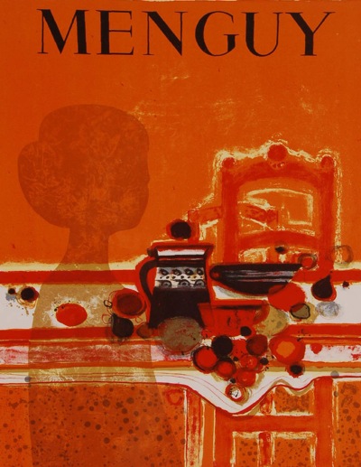
MEnguy poster Battle auction

E R BARTELT London Transport poster print Circa. 1960s, and MENGUY, Colour lithograph poster print, (2), unframed.

also hid this 1961  gem:

Yours for £45, which isn’t bad.  And if anyone knows anything about Mr Bartelt, please let me know, as I don’t.  (The sale also had a smattering of original railway poster artwork, but it’s hard to get worked up about that at the best of times, and especially not after the art-fest that was Morphets day two.)

There on the other hand, not everything that is hidden turns out to be treasure.

This listing in Essex:

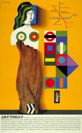
A 1966 Underground poster, by Hans Hunger
30 to 50 (GBP)

(I make no comment)

Could have been one of these two:

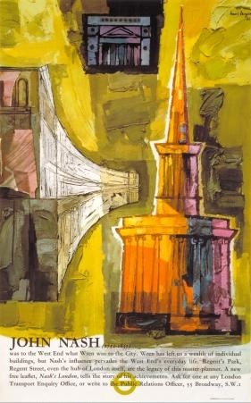
Hans Unger nash architecture London Transport poster

Hand Unger art London Transport poster

Mmm, lovely John Nash architecture.  I got quite excited for about ten minutes.

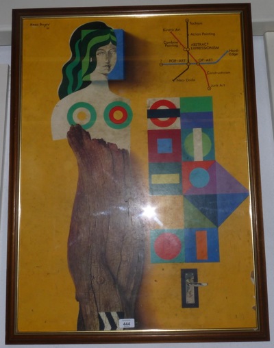
But what was on offer was this.

Sworders Unger London Transport Poster

Still went for £42 though, despite the nibbled edges and unprepossessing frame, which goes to show something, even if I don’t know quite what.  Does anyone have any views on what Unger is worth?  I rather like the late 50s and 60s underground posters (with the exception above), but perhaps that’s just me.

But of course the real lesson from all this is that, thanks to internet listing and on-line bidding, because we can find these things , everyone else can too.  So soon there won’t be any bargains at all.  Then what shall I do?
Vintage design for modern times

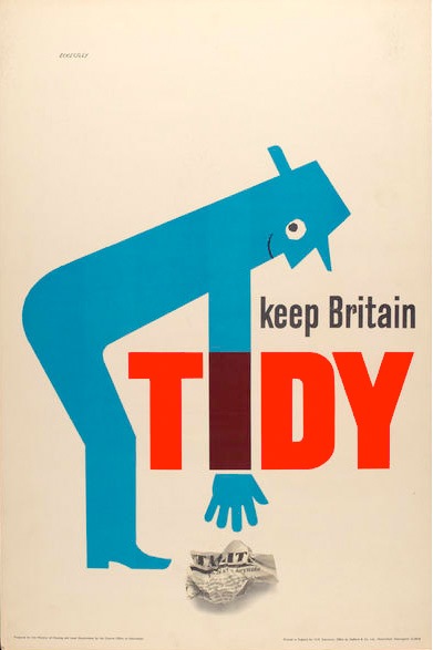
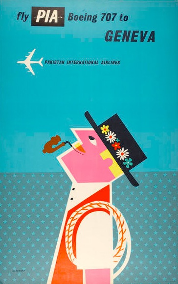
Tom Eckersley is all over the web at the moment.  Yesterday he was here on Grain Edit (and hence tweeted and reposted hither and thither).  And over the last few months, he’s also been herehereherehere and even all the way over here in Italy.  (There are loads more, I just lost the will to look at them all).  The two images below are currently spreading across the web like a virus.

Tom Eckersley Keep Britain Tidy vintage poster

This is in part – a big part – because the Eckersley Archive is both so big and so available.  But it must also be because there is something about Eckersley which is particularly appealing to today’s designers and students.

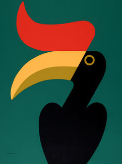
What’s noticeable about the posters which have, mostly, been chosen from the archive is that they tend to be Eckersley’s much more simple and graphic work, from the 60s and later.

Tom Eckersley Pakistan Airways vintage poster

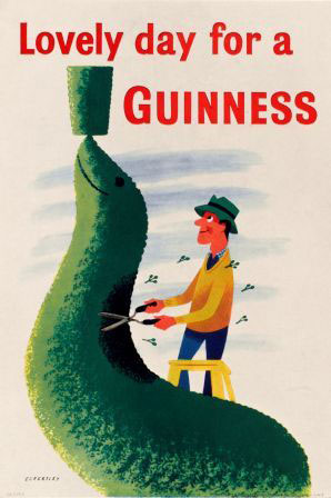
What’s missing from the tides of Eckersley’s work ebbing and flowing across the web are the earlier, more whimsical posters.  Posters like this one:

tom eckersley seal guinness vintage poster

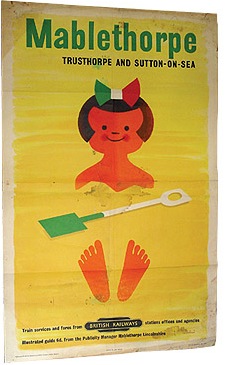
Or even this:

tom eckersley mablethorpe vintage poster

(This just went for £110 at Talisman Railway auctions, which is a bit of a bargain, even if it is a bit battered).

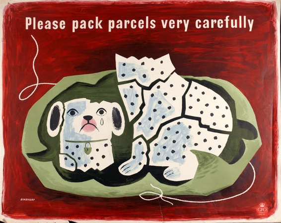
There is one exception to this, which are his Please Pack Parcels Very Carefully series, which the BPMA have been using quite a bit recently.  If I am truthful, I’m a bit cross about this.

Tom eckersley china dog vintage poster

It’s not that it’s not a lovely poster, it is, and of course everyone should get a chance to see it, if only to prove that Tom Eckersley did a bit more than just sparse modernism.  But it’s mine.  This was the first poster I ever bought (more on that some other time) and it’s sitting watching me as I write right now.  So hands off everyone.  Go and find another poster to tweet about please.

Here’s one to start with, another lovely piece of sparse modernism.

Mr Crownfolio and I are off to turn this into a twitter button.  We may be gone some time.  In the meantime, you can follow me on Twitter here.

Britain Can Make Lovely Posters

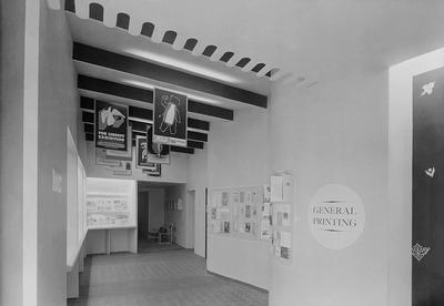
A further digression here.  I’ve spent the morning assembling the first draft of the links page, and in the course of it have rediscovered this wonderful photograph:

Britain can make it poster exhibition

It’s the General Printing part of the 1947 Britain Can Make It exhibition at the Victoria & Albert Museum.  The aim was to showcase the consumer goods which would lead the country’s manufacturing recovery after the war.  Although the show was wildly popular, it was generally known as ‘Britain Can’t Have It’ as the country was still under heavy rationing, and almost all the goods on display were designed for export.

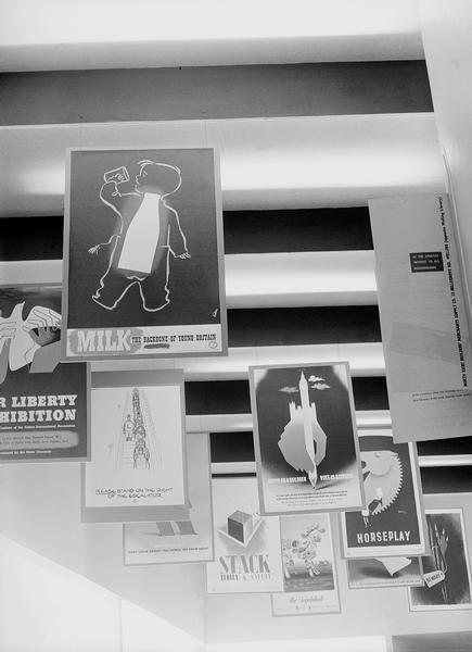
Britain Can Make it posters wuder

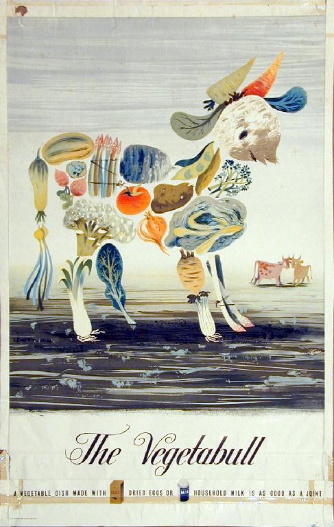
At least the posters above would have been an exception to this.  I can identify a Games, the Lewitt-Him Vegetabull (below, any excuse) and a Fougasse.  The caption also tells me that the front poster about Milk is a James Fitton.  If you can identify any others, I’d love to know.

Lewitt Him vegetabull poster

The image comes from the VADS archive, which is a collection of more images and resources than one person can reasonably use in a lifetime.  They’ve got a good (if slightly over design-historical) introduction to Britain Can Make It if you’re interested in learning more.  I’d just like to have a wander round the exhibition really.  And then take the posters home, of course.

On the buses (or not)

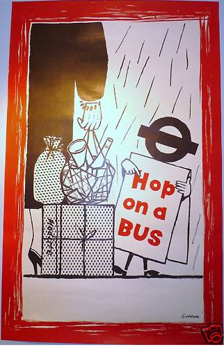
I keep planning posts, but then they get taken over by events.  Like this, another interesting poster that’s popped up on eBay.

vintage bus strike LT poster

This isn’t, I will freely admit, a classic piece of design, but it is an interesting piece of social history.  I can’t explain much better than the seller has.

This is one of a series of 3 posters issued by London Transport in 1958 to encourage passengers back onto the buses after a disastrous strike by crews. All 3 posters were drawn by Lobban and featured humorous scenes of people in inclement weather being encouraged onto a bus by a figure with its head made up of the London Transport bullseye.

A brief bit of investigation means that I now know that the 1958 bus strike went on for seven weeks and, everyone seems to agree, had a huge impact on London commuting.  In an age of increased car ownership, many people went to work in their car, and never went back to the buses (hence the slight desperation of this poster).

Because of this, many less popular bus routes were axed and garages closed, driving even more people onto their cars or the Tube.  And so we arrive at the overcrowded and gridlocked London of today.

So there you go.  I have been educated by eBay and now know something I didn’t before.  Even if I don’t necessarily want to buy the poster.

Modernism to go

Right now, you can pick up the bargain of the year so far on eBay.  It’s this:

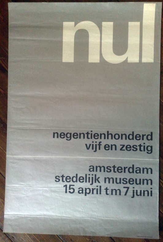
Wim Crouwel vintage poster stedelijk museum

and this

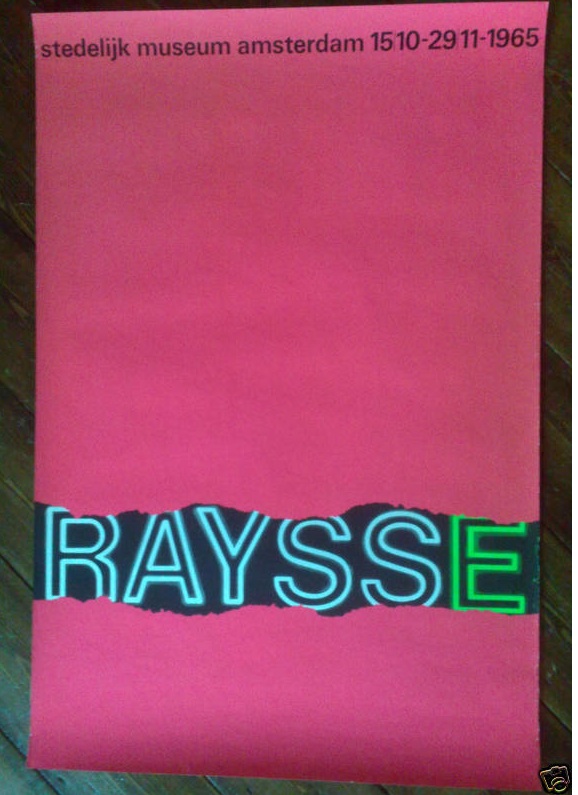
wim crouwel vintage poster raysse museum

and also this

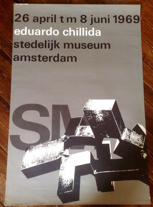
wim crouwel vintage poster 3 stedelijk museum

In fact it’s five posters designed by Wim Crouwel for the Stedelijk Museum in Amsterdam in the 1960s, and as I write, they are currently going for under £10 for the lot.  Which is madness.  They’d be a bargain just for five anonymous pieces of good design, but for five pieces of Wim Crouwel’s work, it’s a crime.

We simply don’t have designers like Crouwel here in the UK.  This isn’t only because we didn’t do this kind of formal, grid-based, type centred modernism.  (To get a sense of how mainstream it was in Holland, just imagine the British Museum or the V&A commissioning a poster like this in the 60s, and then go and have a lie down to clear the resulting headache.)

It’s also because, for some reason, very few designers in this country have achieved the ubiquity managed by Crouwel.

“It was actually quite difficult to avoid Wim Crouwel’s work. In the 1960s the Netherlands was inundated with posters, catalogues, stamps designed by him, even the telephone book.”
– Karel Martens

Who can match this?  Abram Games did design the Festival of Britain symbol, it’s true, but he hardly styled the entire 50s.  Perhaps Hans Schleger is the only one who can come close* – with his work for Libertys and MacFisheries (of which more later), the John Lewis logo and even the London Transport bus stop roundel to his name, it would have been easy to live, travel and shop in a Schleger-shaped world.  But did many people ever notice they were doing this? I rather doubt it.

Anyway, this is a bit of a distraction from the business in hand, which is that there are five brilliant pieces of design for sale for not very much money at all so far.  Proof that eBay can still come up with the goods sometimes.

*I am disregarding Pentagram as I find most of their designs a bit safe and dull.  Perhaps I was living a visual life shaped by Pentagram in the 1970s and 80s, but if I was I didn’t care much either way.  But if you think I am in need of correction on this – or you’ve got a better example – please do say.

A lesson in poster sizes – from Tom Eckersley

I got told off the other day for being poncey, because I described the Post office ‘Properly Packed Parcels Please’ posters as Quad Crowns.  Now this is close to being a fair point, but at the same time I think the proper names for poster sizes are lovely things and should be used more.

So, in the spirit of inclusivity and fairness, here is a brief guide to the commonest poster sizes.  Then I can keep being poncey when I talk about posters, and everyone will know what on earth I mean.  And there’s the added benefit that the title of this blog, and my posting name, may make a bit more sense if you’ve just stumbled here at random.

Our tutor for this lesson will be Tom Eckersley OBE (courtesy of his 1954 book on Poster Design).

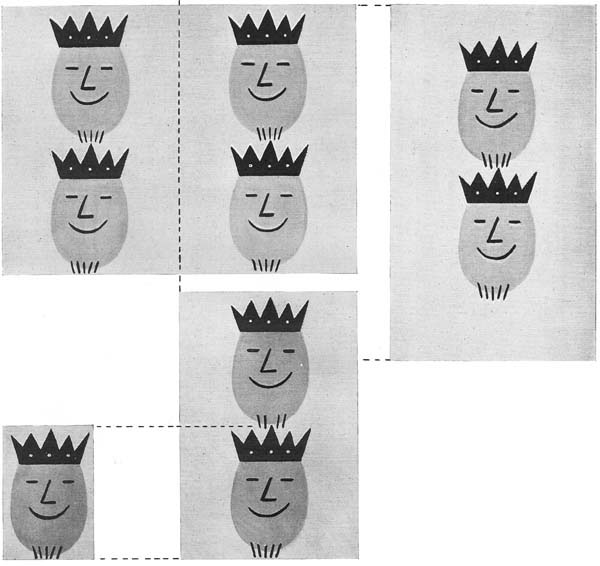
Tom Eckersley vintage poster sizes

The most general proportions of poster sites in Britain are illustrated here:
Extreme lower left: Crown (15 x 20 inches)
Lower left: Double Crown (30 x 20 inches)
Top left: Quad Crown (30 x 40 inches)
Right: Double Royal (40 x 25 inches)

Most of the advertising, GPO posters, film advertising, public information posters and so on were made in the left hand sizes and their variants.  They also went bigger – many advertising posters were a 60″ x 40″ single sheet.  (We accidentally bought one on eBay once.  It’s big. Very big.)

Mr Eckersley has also left out the half size Crown Folio, which I love so much that I have not only taken as my name but will blog about properly one day.  This seems to have been the default size for display advertising in Post Offices, and so you find National Savings posters this size, as well as the GPO’s own.

Meanwhile, on the right, the Double Royal (and its bigger sibling, the 40″ x 50″ Quad Royal) were mainly used by the railways and London Transport.  I believe that LT posters are still Double Royal these days, although I haven’t actually ventured onto the tube with a measuring tape to verify this.  So pretty much any railway or LT poster will be one of these sizes.

Eckersley also mentions two other poster sizes which don’t fit these proportions.  One is the London bus poster (as seen for sale elsewhere), which is 10″ x 13″.

Clifford Barry Dairy show vintage bus poster

And the other is a “long van strip poster”.  I’ve only really mentioned this so that I can include a colour version of the poster he uses as illustration (with thanks to the BPMA once again).

Lewitt Him post earlier GPO vintage van poster

It’s by Lewitt Him, from 1940 and I want it.  But I’ve never ever seen one of these van posters for sale – they were presumably just chucked out when they went out of date.  Unless anyone happens to have one that they might want to get rid of…

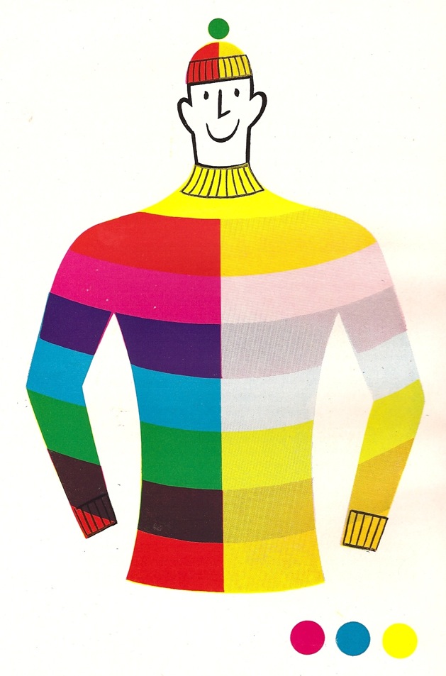
And a final word from Mr Eckersley.  This is how he illustrates lithographic colour printing.  It could have been a poster in its own right.

Tom Eckersley colour printing image