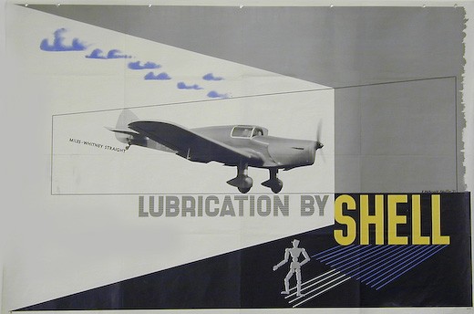
That’s modernism, that was
This may not be the cause of great excitement for many of you, indeed it may not even be news, but the Journal of Design History is now freely accessible online. Which has let me get hold of an article that I’ve been wanting to read for ages, John Hewitt on ‘The ‘Nature’ and ‘Art’ of Shell Advertising in the 1930s’. Fortunately it turned out to be as interesting as I’d hoped.
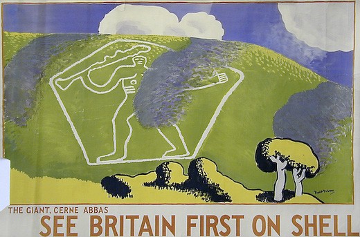
Frank Dobson, 1931
One idea in particular struck a chord, as it links in with the themes that I’ve been mulling over here recently.
By 1930 Shell had come to realise that any whole-hearted endorsement of modernisation was problematical. The transformation of the environment, occasioned by increasing suburbanisation and expanding commerce and predicated on a dramatic expansion of the motor car industry intensified during the 1920s and 1930s provoking vigorous and sustained resistance from influential lobbies of middle class opinion.
All too soon it had become impossible to see the brave new modern world – as epitomised by the car – as wholly good. Even worse, advertising itself was seen as a problem of modernity, as enamel signs and billboards sprouted. So Shell’s advertising changed round about 1930, something which is often ascribed to the arrival of Jack Beddington at the company. He was part of it, but as Hewitt points out, there was also an important cultural shift taking place. Hewitt’s essay explores how Shell reconstructed its public image in terms of art and nature, making the threatening motor car seem much more part of a wholesome and quintessential British identity.
Which is undoubtedly true, but there is also another way of seeing it. Because the change in their advertising was also a flight away from modernism.
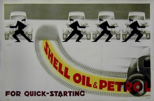
Vic, 1930
Until Beddington’s arrival, Shell had primarily been selling its products on their technical qualities. And the underlying language of that was very often modern.
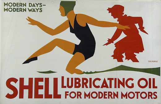
Tom Purvis, 1928.
But when Jack Beddington arrived, he instituted a very different approach. There was almost no direct selling of the qualities of the product; instead he tried to build up an image for the brand. And this image was initially based on the English landscape and nature.
The clearest expression of this is in the ‘Quick Starting Pair’ posters. Before 1930, these had used images of animals, but often treated in a very schematic way.
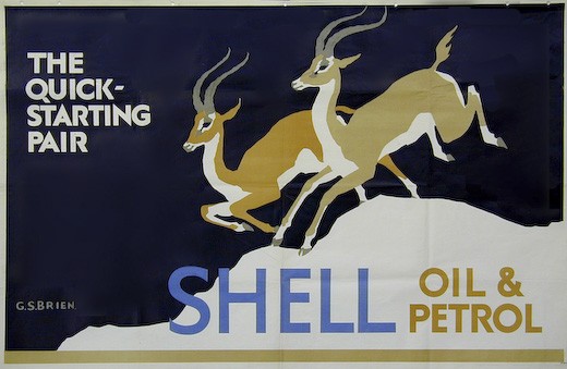
G S Brien, 1929
But these were then replaced by much more naturalistic images.
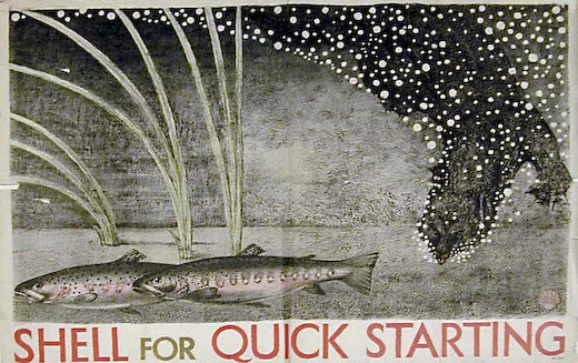
Kennedy North, 1931
As Hewitt points out, there is a tension between the technological idea and the imagery here which doesn’t necessarily make for successful advertising.
But it was the major landcape campaigns that Beddington, and indeed Shell posters in general, are most associated with. These began with See Britain First on Shell.
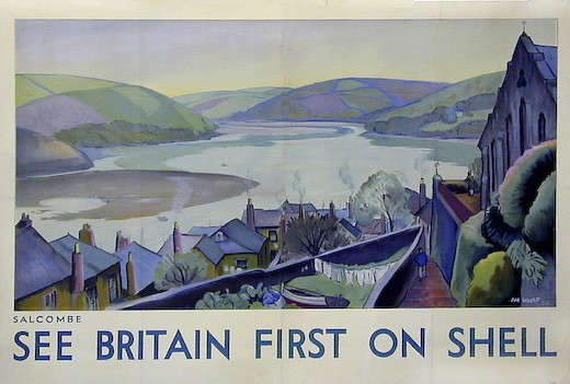
Hal Woolf, Salcombe
Followed in turn by ‘You Can Be Sure of Shell’.
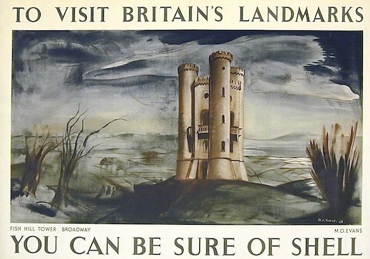
Merlyn Evans, 1936
This is not only a very different kind of advertising, it is expressed in a very different visual language. But it’s not simply a retreat back to traditional landscape painting. This is still a very living idiom in the Britain of the 1930s, and the posters tap into the vein of British romanticism identified by Alexandra Harris and others before her.

Lord Berners, 1936
Which is why I think this essay, and the changes it describes, are worth going into at such length. Because this retreat from modernism doesn’t just happen in Shell posters. I would argue that it is happening in many other places – and not just the graphic arts. Romantic Moderns contains a discussion of Virginia Woolf’s Between the Acts which shows how modernist writing was shifting as well.
I find it hard to be surprised by this, though. Living in Britain in the 1930s, between the Great Depression and the onset of war, it must have been almost impossible to maintain any faith in the endlessly improving effects of modernity. The evidence against it was easy to see. And if you don’t believe in modernity, perhaps the jagged edges of the machine age aren’t going to feel very comfortable either.
Of course, reality is always much more complicated. But by looking at some of the exceptions within the Shell posters, it becomes possible to see how some of these complexities worked. Because there were still modernist posters being commissioned – here’s an example from McKnight Kauffer in 1937.
Celebrating its achievements of this sleek new aeroplane is still, perhaps a safe place to use a modern visual vocabulary. Even if only one was every produced in the end. Other technical advertising was done in this style too.
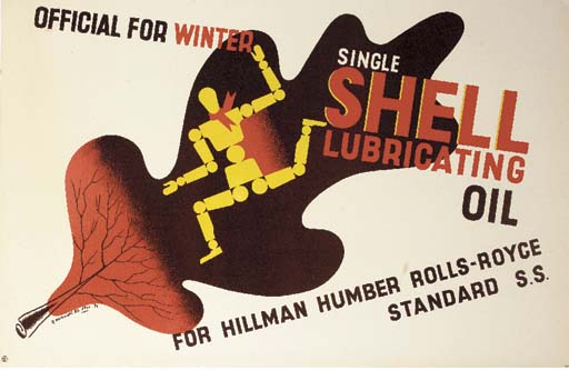
McKnight Kauffer, 1936
But campaigns that could be construed as selling a technical advantage didn’t necessarily use modernism as the decade progressed.

Percy Drake Brookshaw, 1933
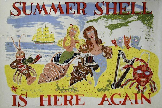
Jack Miller, 1936
The other way in which Shell could be said to be using modernism was in its choice of artists like Graham Sutherland, Ben Nicholson, Paul Nash and Tristram Hillier. But as Hewitt points out, these artists might be called modernist, but that wasn’t really the way they were being used by Shell.
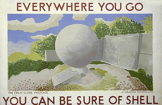
Graham Sutherland, 1932
Nor was the use of modernist artists a means by which Shell could celebrate its identification with modern technology… They were involved in the campaigns that played down any references to the modern qualities of speed and power.
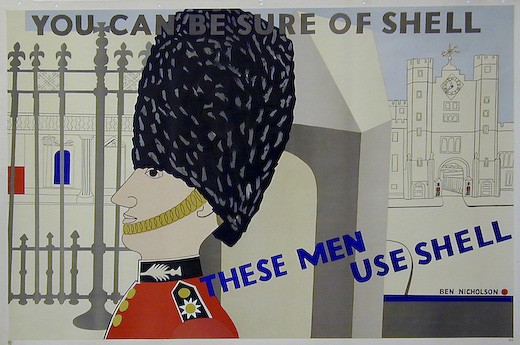
Ben Nicholson, 1938
The visual language was hardly defiantly modern either; none of these posters were very likely to frighten the horses as they raced past on a Shell lorry. The modern artists had moved on too.
Hewitt also points out that these artists were not in a majority. For every poster extolling the modern charms of film stars in an equally modern style,
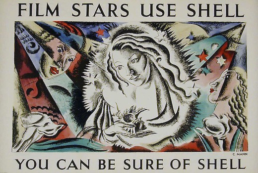
Cathleen Mann, 1938
there was at least one with a much more traditional point of view.
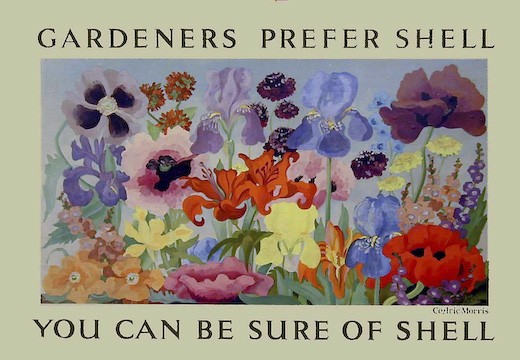
Cedric Morris, 1934
This is possibly another case where hindsight gives us the wrong view of a period. The ‘modern’ Shell posters – particularly the ones by the modernist artists – are much more interesting and collectable for us now, so we tend to privilege them and make them seem more normal than perhaps they were at the time. But in writing this I’ve been through the online images from the Shell Collection. And what’s there is a very different set of posters to the ones that are normally reproduced, whether in a book or a Christies catalogue. Sometimes the hunt for modernism can be a self-fulfilling prophecy.
One final footnote. Shell’s advertising did take on a much more modern tone again in the 1950s.
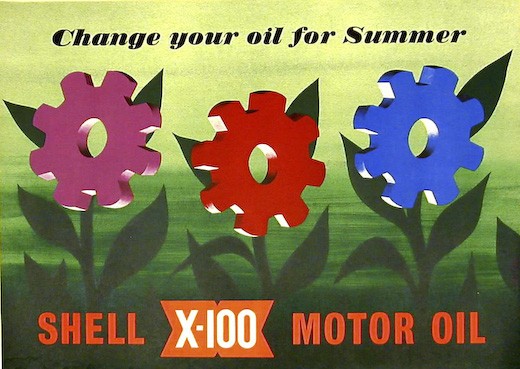
John Castle, 1952
Machinery and technological progress had become not just acceptable, but worth celebrating, one way or another.
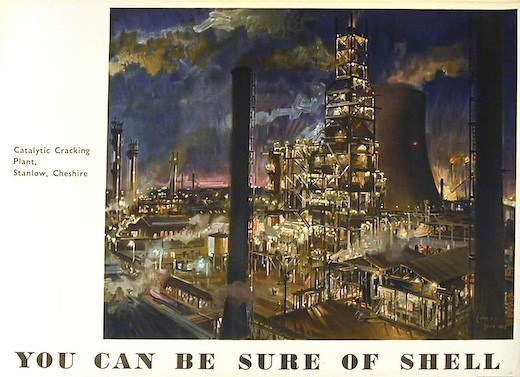
Terence Cuneo, 1952.
Modernism was once again possible in the 1950s . Which is a thought I will be coming back to again one day.
