One of the real joys of writing this blog is getting a response on a subject from People Who Really Know. So after my post about long thin posters, it was very good to hear from Michael Wickham who gave me a lot more information about where these kind of posters were displayed. Along with illustrations, and permission to share it with everyone here. I don’t really need to say much more, do I?
Posters were/still are produced for the timetable panels on bus stops. These are very close to A4 size (or double that or treble that, vertically) and have been produced since the late 1920s. Until quite recently, they were produced with two punch holes in the top cormers and hung on screws inside the frame. Nowadays, they are laminated. The 1974 Harry Stevens you mentioned on 9/3 is one of these, as you suggested.
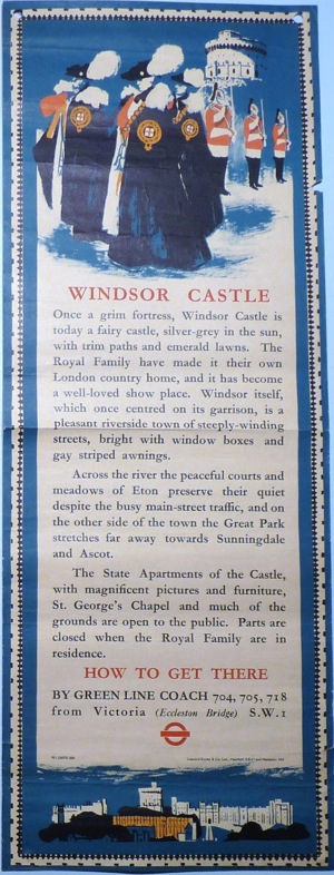
Of course, the vast majority of these posters were timetables, in tabular form without any artistic element whatsoever. However, LT filled unused spaces in the frames with other material, eg exhortations not to drop litter, to avoid rush hours, queue properly etc and, occasionally to advertise attractions which could be reached by bus. For some of these, an established artist would be employed. Here area couple from my collection, both by Clifford Wilkinson – London’s Country Houses from 1953 (triple A4 vertical)
and Windsor Castle from 1951 (double A4 vertical).
The timetables have survived in reasonable numbers because bus enthusiasts have collected them but the “artistic” posters are quite rare survivors.
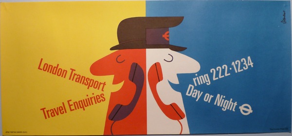
Other posters have been produced for interior use inside buses (above the seats). There are two standard sizes of these: 25″ x 8″ used from the 1930s until the present and a larger size (25″ x 11″) used on more modern types of buses. Below are a 1944 issue of the first type, by Midge,
and a 1976 issue of the second, by Harry Stevens.
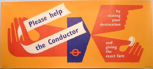
In addition, there were sundry-size posters for the buses in the 1950s-70s for specific panels, eg on the front bulkhead, above the front windows on the upper deck and on the staircase panel. Some examples of these:
A 1960 Galbraith – “Please help the Conductor” – 20″ x 9″
A 1959 Galbraith – “Avoid Rush Hour Travel” – 24″ x 5″
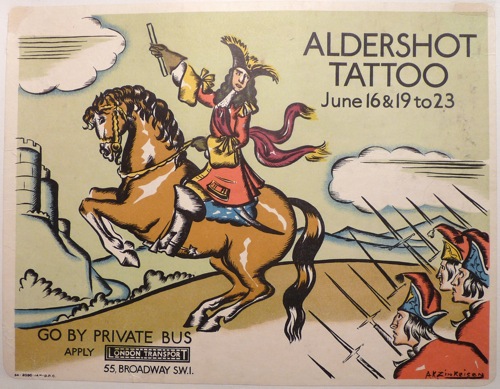
A 1934 Zinkeisen – “Aldershot Tattoo by private bus” – 12″ x 10″
The 12″ x 10″ size was also used on the Underground from the 1930s until the 1970s. The Underground ones had a non-see-through backing, usually dark grey, because these posters were affixed to the glass vestibules by the train doors.
There are two other common sizes on the Underground: the cards which go in the carriages above the windows and the portrait type used on the escalators. I don’t have any “artistic” ones of either of these as they are largely used for commercial advertising.
All of which is comprehensive, brilliant and very much appreciated. What’s more, he’s also very happy to answer any questions if you have any. So thank you very much, Michael Wickham.


