Early days

Anonymous chemist’s poster, c. 1880
The origins of the poster are confused (some understatement here) and obviously depend how you define a poster in the first place. Generally, posters are believed to emerge just before the turn of the century, although this does rather beg the question as to why British cities were already covered in advertising hoardings by about 1860. It turns out that when people say poster they don’t just mean a piece of shouty text with a dozen different typefaces on but something with a large lithographed picture on, preferably of a saucy lady. A poster, in fact, as done by the French. But is that what actually happened over here?
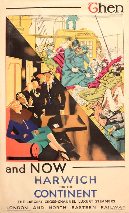
The first ever poster:
John Hassall, c. 1889.
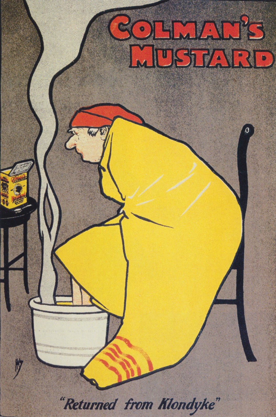
In which we consider some candidates for the first ever poster, and why they don’t count – for example, because they were so obscure as to need a newspaper campaign to explain them. Or they were an oil painting, doctored to advertise soap. Until eventually we come to this one. Why posters are inextricably linked to the great explosion of national brands in the 1880s, and what this shows about how the British became one nation. Also, how a good poster works on visual inference – and why in this case we don’t understand any of them any more, leading therefore to an explanation of both mustard baths (a long lost British tradition that dates back to the Romans) and the Klondyke Gold Rush, plus how Dorothy L Sayers ended up writing recipes and why mustard is always the (masculine) signifier of Great British Food.
The classic
John Hassall, 1908.
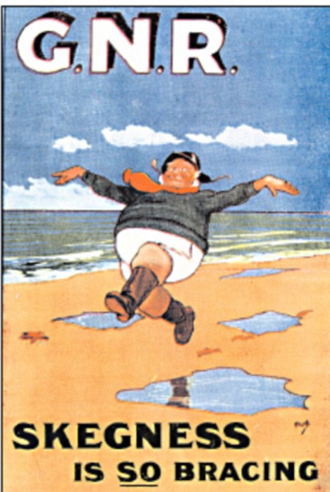
One of the strange things about the poster is that designers got it right so quickly. Every single British person has this image on file somewhere in their brain despite the poster being over 100 years old. Hassell’s jolly fisherman is of the most successful posters ever, being reused right up until the 1950s. But it was designed in 1908, as poster artists were still very much finding their feet. Why railway companies were such enthusiastic adopters of posters and what they thought they were doing with them, along with the story of how this particular poster has literally run and run, being parodied and altered right up until the present day. Sadly, however, it failed to provide for Hassall who, despite setting up the first ever school for poster designers and teaching Bert Thomas and H.M. Bateman amongst others, died penniless in 1948.
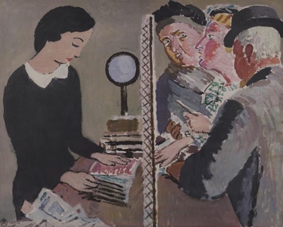
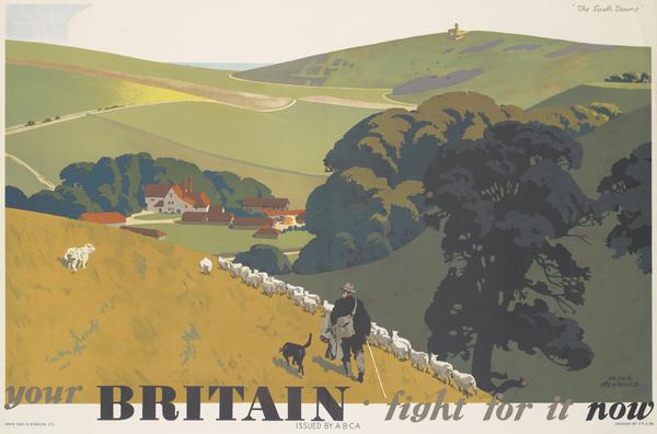
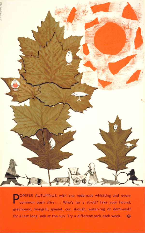
Posters and the city
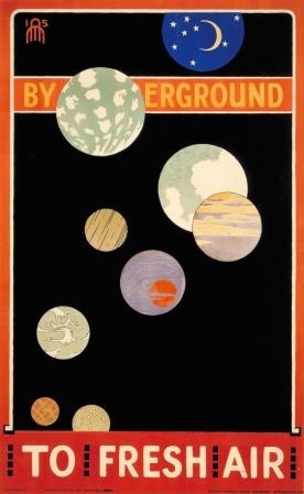
You can’t have posters without the city, not least because you need a mass of people to see them in order for them to work, so in the early days they are very excitingly modern. In part this is to do with the association of hoardings with massive redevelopments in both Paris and London. But right from the start, the British have a very ambivalent relationship with modern city life, as this poster shows. The artist, Armfield was a modern man who trained in Paris, married to a modern wife who wrote novels about being a suffragette – so just what did modern feel like as World War One came into view? Also, why you want pictures of the countryside underground, not simply to get people to use obscure bits of the network but also perhaps to stop people panicking from claustrophobia. And, not for the last time, we meet Frank Pick, the Lorenzo Medici of the Underground.
World War One
What did posters do in the war, Daddy?
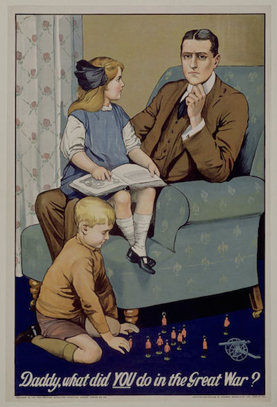
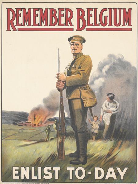
Saville Lumley, 1914
World War One saw the first general use of the propaganda poster and they were seen as the key way to get soldiers to enlist before conscription was introduced in 1916. Unfortunately they were mostly produced by a potent combination of brass hats and jobbing printers, leading to questionable design decisions which would have very long lasting influences – including on Adolf Hitler. This particular one was highly successful but later not only reviled by George Orwell but disowned by its originator, despite the fact that designing it caused him to sign up for the army. And why feminism means that it is almost impossible for us to read this poster as it was originally intended.
The Point
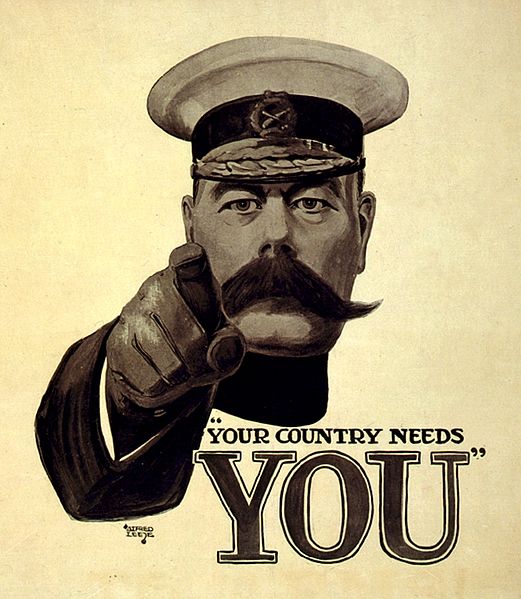
his is the single most famous poster of World War One, the poster that caused millions of men to sign up to fight in the trenches. Or so we like to believe now, but in fact, it almost none of this is true. It certainly wasn’t popular – no picture of it on display has ever been found. In fact, it may not even have existed as a recruitment poster at all, and owes its fame to being the cover of the London Opinion magazine. As will often turn out to be the case, False Memory Syndrome applies to posters – quite literally in this case as returning servicemen swore blind that this poster caused them to enlist. Our first dismembering of a myth, along with Uncle Sam and why a pointing person will always get your attention and the rise and fall of Kitchener’s always controversial reputation.
The Reality Gap
Anonymous, 1915
After the war had ended, the enlistment propaganda produced during the conflict was condemned. People thought that they had been delusionary, playing on concepts of honour, patriotism and fair play in a war that had no heed of any of these things. This wasn’t the fault of one particular poster, more a cumulative result of the torrent of officers, John Bulls, Britannias, weeping patriotic women and the playing fields of England. Why old symbols didn’t work any more in a country that had learned to read new images from posters, and why posters ended up being the lightning rod for so much fury about the war. And how the backlash meant that, when the time came to fight Germany again, it would be hard for the government to produce any kind of propaganda at all.
Anonymous, 1915
The Golden Age of the Poster (part one)
In a world that wanted to radically remake itself after the war, posters were one way in which modernity could be embraced and so they came into their own. Although it took a few years, when it did happen, the change was remarkable.
The Drier Side
Tom Purvis, 1923.
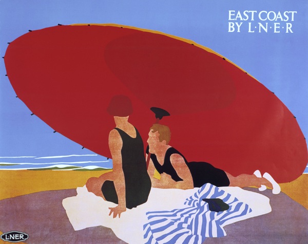
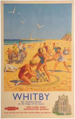
Tom Purvis’s brilliant designs are what we think a railway poster ought to look like, and his contemporaries agreed, calling them the greatest posters that ever appeared on the hoardings. But why do they give us so much pleasure? In part this is because Purvis was the greatest poster designer of his generation who reinvented what the modern looked like in a brand new style that owed something to the French and a little more to the Japanese. But it’s also because railway posters are different. Because they were displayed in railway stations, they didn’t need to talk about trains, it was the destination that mattered. And so they ended up being a bit less commercial and a bit more like art – one of the reasons they were so acclaimed then, and also why we like displaying them today. But there are questions – did this allusive form of advertising really work? And has the English seaside ever really been this glamorous? Or sunny?
The underground gallery of modern art

Edward McKnight Kauffer, 1927
f you think the railway posters were modern, you should see what was going on at London Underground, where after the war Frank Pick was suddenly putting the most modern trends in design on display. One of his most prized designers was the American Edward McKnight Kauffer, but he borrowed from the very British style of Vorticism and created something entirely new. But his posters also represent the democratisation of art – Charles Ryder in Brideshead Revisited puts up a Kauffer when he is a student, to Waugh’s disapproval. The class and taste resonances of this – whether you are the kind of person who buys their own furniture and what this implies, then and now. And how do you go about buying a poster anyway?
Empire Marketing Board – an argument between two posters
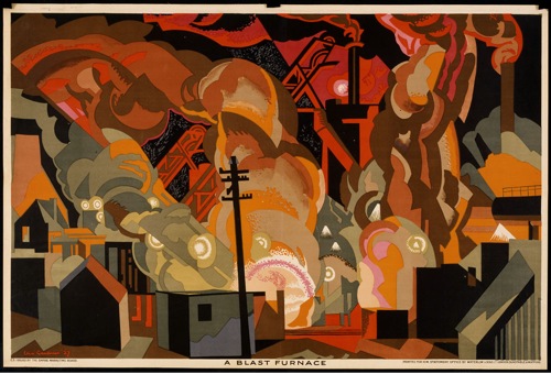
Clive Gardiner, c.1930
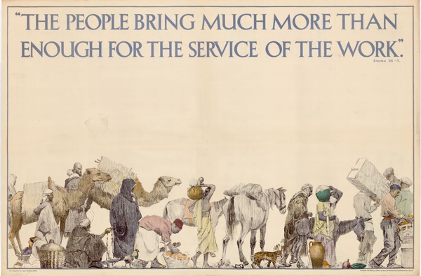
Anonymous, 1927-1933
he Empire Marketing Board was the government’s attempt to rescue its economic policy by persuading the nation to buy goods from its Empire, but the EMB turned posters into a very particular kind of display, with extraordinary posters displayed on specially-build hoardings. This isn’t just an argument between the modern and traditional styles of poster, but between the very different attitudes encoded within them. How do we feel about these posters today when we have grave reservations about the Empire – and when, in honesty, some of them are extraordinarily racist. It it possible to separate the artwork from the (sometimes unpleasant) intention behind it, and what this tells us about the Volkswagen Beetle, amongst other things.
Unpeopled
A. R Thomson, 1931.
The bright young things of the late 1920s and early 30s spend much of their time on railway posters, particularly at the seaside. But as time goes on, these posters also reveal the anxiety of the railways that they may not, in fact, be that modern any more. Fear runs even beneath this too, as this brittle gaiety is hiding the fact that lots of people are missing after the war. H V Morton on the different meanings war memorials had then. The bawdy life and times of the 6’ 5” poster designer Thomson, and why being deaf might actually help you design better posters, as well as an explanation of what the typographer Eric Gill is doing on the footplate of the Flying Scotsman.
Menagerie
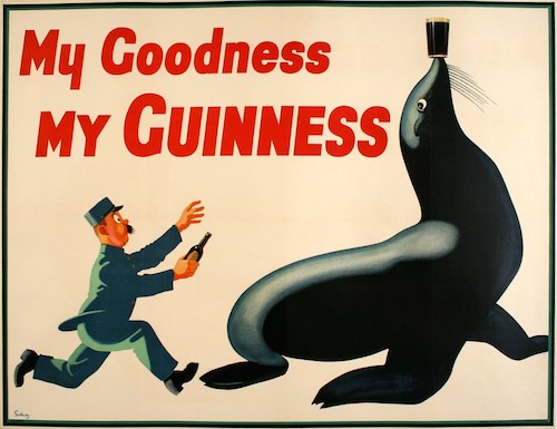
Gilroy, 1934
While public bodies are solemnly trying to ennoble the national character through the meaning of art, there are things to be sold out there, and these things need posters. In this case they clearly need posters of animals, produced by John Gilroy for the mighty Bensons Advertising Agency at a time when brand characters were all the rage (with varying degrees of success). How the Guinness animals went multi-national and even, nearly, went Nazi; social class and the poster, along with why it isn’t a good idea to put an advertising hoarding on top of the White Cliffs of Dover.
Lines of Communication
Vanessa Bell, 1934
Frank Pick was far from the only person who believed in the improving power of art for the masses, it was almost a truism of the time. Another government body that believed in it wholeheartedly was the GPO of the 1930s, where a civil servant called Stephen Tallents turned it into a rehearsal for the Arts Council, commissioning not just artistic posters but also films like Night Mail. Just how unimaginably huge and influential the GPO was at this time. But what was the purpose of bringing fine art to the masses and how was it meant to improve the general public? Why so many institutions thought that they needed to be artistic patrons, why contemporary society was afraid of the power of the poster, and whether fine artists are any good at making posters anyway.
See Britain with Shell
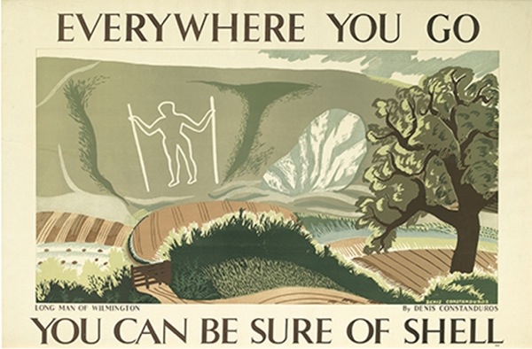
Denis Constanduros, 1932
Shell see themselves as some kind of quasi-public body, and hence want to perform the same trick of being uplifting and artistic, but they are also playing a more complicated game too. There is a curious tension at work throughout their posters between the modern and the traditional, as avant-garde artists depict traditional landscapes. These images are then used to sell a modern product, petrol, and one which is seen as potentially destroying exactly the unspoiled countryside shown on the posters. Shell are, in short, having their cake and eating it, and doing this very well. But they are by no means alone -this mood of going both forwards and backwards is endemic in the early 1930s. And how the posters are addressing anxieties that we no longer have – like will there be a petrol station when we get there. Further digressions may also include the Bugginses on radio and the chalk figures of England in art.
Britain vs modernism
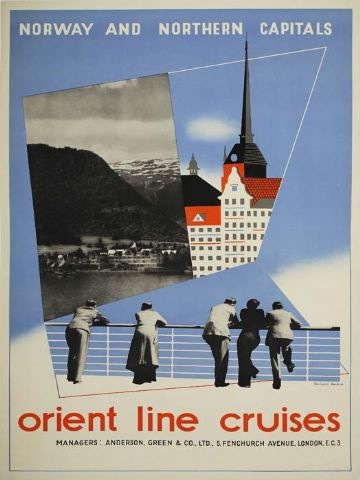
Richard Beck, 1937
Or why, again, can’t we be more like the French. So far we’ve seen lots of modern posters, but very few that were modernist. Does this matter? It bothers design historians a lot; they are always looking for modernism in British design history but failing to find it, which is a bit like wondering why your cat doesn’t run when you throw a stick for it. But there was some out there – almost always designed by people who had spent some time on the continent (pay attention, this will become important later). Why cruises were so modern that even architects liked them, and a digression on the fantastic and little known artistic world of P&O, including their early 1960s youth club on the SS Canberra, the ‘Pop Inn’ designed by David Hockney, bar. And also, in contradiction, how some modernism was hiding in plain sight on London Transport.
Romantic and modern
Dame Laura Knight, 1938
How London Transport and other people didn’t only put their posters up on hoardings, but sold them too, which allows us to take some kind of opinion poll on what people actually liked. And despite the best efforts of all the design improvers, this tended to be something more traditional. But this is not just a reflection of popular vs elite taste, but also an indication of a new movement in pre-war Britain, one which arises out of the question as to whether it was every possible to be British and modern at the same time. How this movement includes not just obvious suspects like poets but also the Tudorbethan suburban semi-detached.
Prelude
Edward McKnight Kauffer, 1938
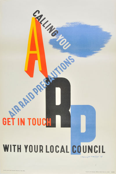
Preparations for both civil defence and propaganda began well before 1939, but only the Civil Defence measures could be made public, the fact that there was an organisation preparing posters about Civil Defence had to be kept totally secret. Why people believed that propaganda was wrong and wasn’t British. The forgotten build-up to the war – these few years are mostly ignored but must have had a very particular atmosphere as the world headed inevitably towards conflict. How bombing was so inevitable that it infected the poetry of not only Auden and Spender, but even John Betjeman, and how the government held rehearsals as early as 1925 to prove to people how awful aerial attack would be. And why these particular posters were often kept because people thought they had historical significance, and the randomness again, of how historical ephemera survives.
World War Two
In which the poster was king. A short intro on how, very quickly, the government and its agents were in charge of all posters ever and producing them at an almost unimaginable rate.
Careless Talk Costs Lives
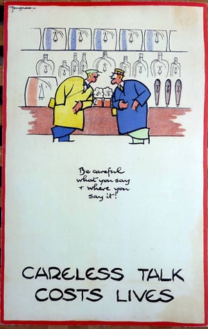
Fougasse, 1942
A poster that was the exception rather than the rule. We think of this as the epitome of great British propaganda, particularly in its humour which is one of the things that makes our nation special, or so we like to think. In fact this was one of the few great posters produced in the early years of the war – also Fougasse’s unique take on how to make a poster work. The sit-com like set up of Kenneth Clark and Harold Nicholson bumbling round the Ministry of Information trying, and mostly failing, to communicate with the lower orders. Whether propaganda could really do anything in the darkest days of the war. Also the recurrent image Britons as individuals standing against the massed ranks of Nazis – note that the Hitlers are almost always multiples in Fougsse’s designs – and what this tells us about what Britons thought they were fighting for in 1940.
Coughs and Sneezes: an argument between two posters
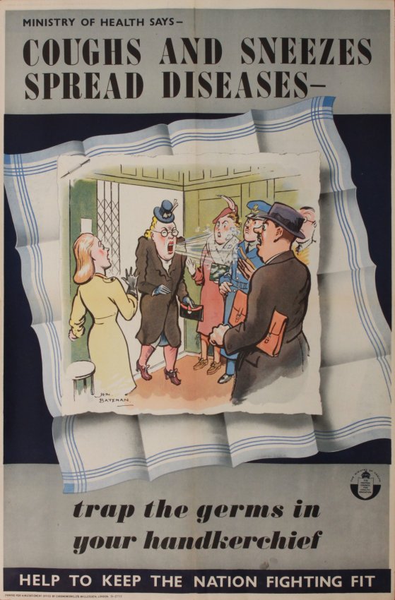
H M Bateman, c.1941
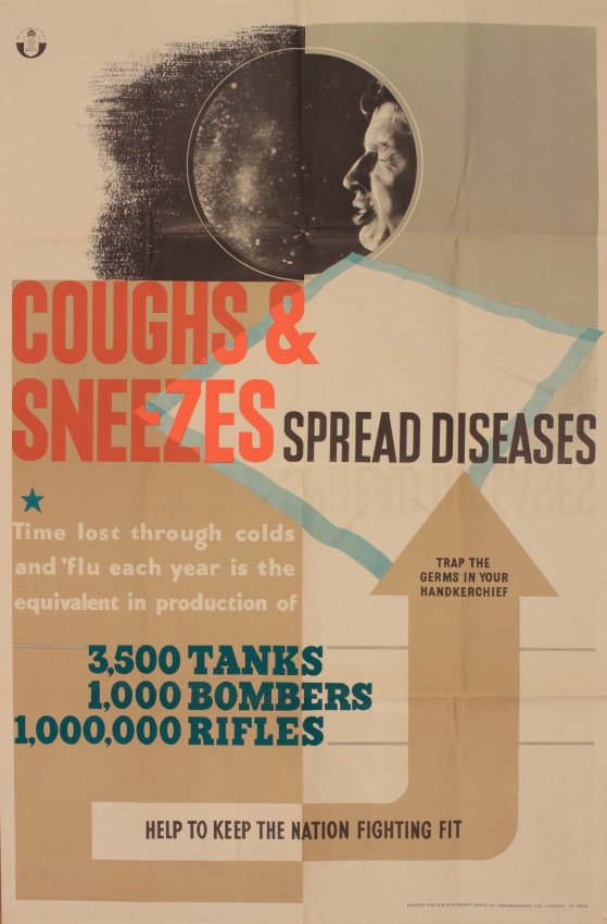
Anonymous, World War Two
Three years into the war a much needed change in policy put an end to posters preaching morale and limited them to the plain supply of information instead. Ironically, this shift results in everything we now think of as a propaganda poster today. The almost infinite range of subjects that posters need to talk about, and how they needed to reach every single person in the country, hence the the vast range of styles. As a result it’s almost impossible to make any generalisations about them at all. What did it feel like to be at the receiving end of this barrage of bossiness? Fortunately Mass Observation asked people, and so we know. And did the posters actually work?
Whose Britain? And which bit do you mean exactly?
Another classic and familiar poster. But worth looking at, because when posters are reproduced this much, they are often telling us something quite profound about ourselves. Why does this even exist when propaganda was now banned? The answer is, it was produced by the Army, and so slipped under the net. How a few other posters did this too. But also, our archetypal ideas of what England looks like. So does this poster work if you come from Scotland, or even Norfolk? How does this vision of ‘deep England’ arise, and what are its accidental side-effects, even today?
Them and us, once again
Lewitt Him, 1944
The posters of wartime did more to introduce Britain to modern design than anything else. They were modern because they were quite often produced by foreign designers, who couldn’t be conscripted, and yet could, as in this case, manage British idioms and humour better than we could. And, as Lewitt Him and the Guinness Clock show, they continued to define Britishness for many years after the war had ended. The story of how at least some posters really did make a difference during the war by keeping factories safer. And finally, why this poster is a singular exception to the total disappearance of surrealism during the war, when real life contained more than enough strangeness of its own.
The war is over, but the posters aren’t
Like rationing, posters went on long after the war had ended, partly through need and partly because the government was just too used to admonishing people, all the time. How Orwell represents these omnipresent instructions flapping in the wind in 1984. The way that in wartime and after, all sorts of unlikely characters, like left-wing cartoonist and artist James Fitton here, were recruited to produce posters. The story of the Britain Can Make It exhibition – known to the public as Britain Can’t Have it, and the problem of paying for the war. Precisely how tough and grim the forgotten years of the late 1940s were.
The Golden Age of the Poster (part two)
For a few brief years in the 1950s the poster was again king, and Britain’s designers could hold their own against any in the world. But these days could not last forever
Blue Sky Thinking
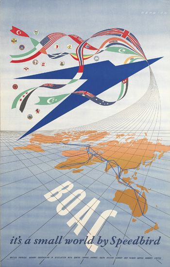
F H K Henrion, 1947
In general this second golden age takes some time to get going; after all, in a time of rationing companies don’t really need to advertise. But the airlines are advertising, and these are some of the few posters to regularly survive from this period. The modernity of airline travel, which has now taken over from the cruise as the way to travel. But also the profound meaning of those blue skies. Once airline trails in the sky had been a frightening symbol of the war, but now they need to be seen as glamorous and above all safe. The many surprising ways in which the world has to be reordered after the conflict.
Festival of Britain: An argument between two posters
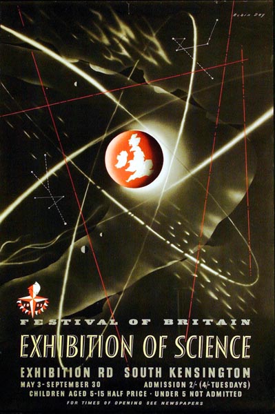
Robin Day, 1951
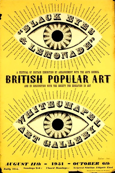
Barbara Jones, 1951
We like to think that we’ve got the Festival of Britain nailed these days: Skylon, bright primary colours and some spindly legs on furniture. The moment when Britain, briefly, decided to be modern. But the reality is, as always much more complicated. For every streamlined new sofa there was an equal and opposite piece of Victorian retro expressing Britain’s fears about a post war world in which it might not be Great any more. So a look at the internal contradictions of the Festival and the early 1950s, as well as a chance to consider the quirky and under-appreciated genius of Barbara Jones.
Smiling, 1947-57
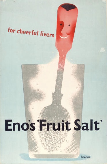
Tom Eckersley, 1947
The posters of this time loved to smile, and continued to do so for many years. Tom Eckersley’s people were the epitome of this post-war joy. It’s easy to dismiss this aspect of the decade as being naive, even stupid, but that would be patronising of us in turn. The emotions of this time were undoubtedly more complex, as a nation that had been through the traumas of war rediscovered simpler pleasures like seaside holidays and just being alive. Perhaps, in fact, they were more alive than we are now? But the euphoria didn’t last forever; Eckersley later said that the whimsy (a word very much of those times) made him angry.
Why would I want to do that anyway?
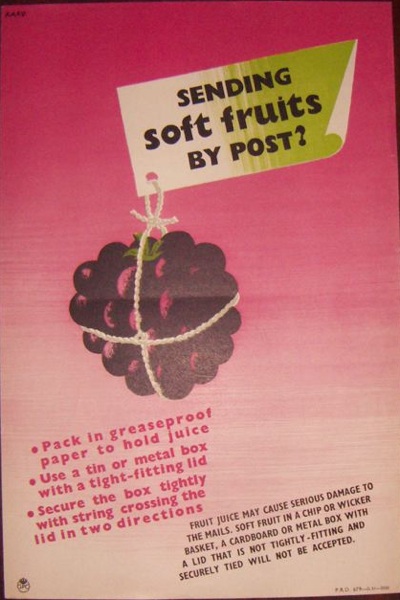
Karo, 1952
Sometimes we can be looking for good design in the wrong place. After the war, the GPO continued its morally improving adverting, which consisted of oil paintings, for example painted by John Minton, clearly framed in the poster, and which people could apply to buy. Fine art, clearly, was still good for you. But at the same time they produced reams of functional posters reminding you to post early for Christmas, write addresses clearly, and, as in this case, follow the correct procedures for posting fruit. The surprise is that these are by far the better posters. Also, thoughts on the lost art of tying parcels with string and how fruit gets to us now.
How we finally learned to love the French (or at least their poster designers).
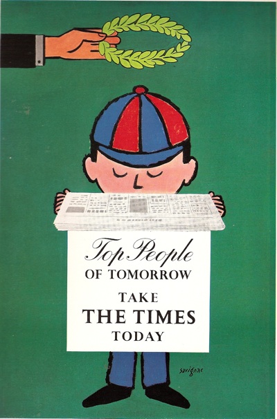
Savignac, c. 1954?
Posters weren’t just good in Britain at this time, the 1950s were also a high point in design on the Continent too. And, for once, designers like Savignac were working in the UK. Proof that a truly visual pun can transcend language, but also a sign that our relationship with our near neighbours is changing as we start to long for Continental chic in the form of smart clothes, scooters and pictures of Parisian cafes on plates. Although in part this is because we are fearful of creeping Americanisation. This chapter may also include the story of how I finally get into the deeply inaccessible WH Smith archive to find the Jean Colin-designed treasures within. Or not. And the Artist Partners agency – like Mad Men or in continentally-chic Soho. It’s a sign of the times.
Maximum meaning, minimum means
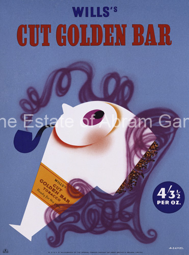
Abram Games, 1954
That was the slogan of Abram Games, master of both the visual pun and less being more, whose work is the equal of any foreign poster designer then or now. How he became the most self-possessed poster designer that Britain has ever seen, and also the master of economy and the visual pun. This takes us to the psychology of how posters work and why the British are as a rule not very good at thinking in images because of the Reformation, when we lost our connection with pictures and became people of the Word instead. And how that fear of pictures still manifests itself in diatribes against advertising.
This poster is ordinary
Anonymous, c. 1957
A brief reminder that not all posters were good. Far from it. Here is a very dull one. Remember the posters of Notting Hill Gate? Quite a lot of them looked like this.
Beer
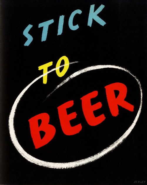
Simply because I can. Who can fail to love this poster? And, if you like, the story of Ashley Havinden, profoundly glamourous advertising man. But perhaps we don’t even need to say that. But why did beer need advertising in the first place? What was going wrong for one of the traditional constituents of the British character?
Oh I do like to be beside the seaside.
Anonymous, 1950s.
The Ladybird books style of hyper-realism as used on the 1950s seaside poster. The style is partly a function of the way these posters were produced, part-funded by local councils who didn’t want to frighten the horses with new-fangled styles of art. But it is also clearly popular. Note the change in the way that the coast is represented from Bright Young Things to the family. And some thoughts about who is meant to be looking at these posters, men or women? This turns out not to be as clear cut as the art theorists would have us believe. All this and the glory days of the British Seaside too.
Giving it away
Patrick Tilley, late 1950s
The importance of food, in vast quantities after the end of rationing – another one of the simple pleasures that we can sometimes fail to understand from this distance. Also why 1950s women are always giving their food away in a gesture that almost becomes ritualistic. Despite the evidence of the railway posters above, a woman’s place in advertising during the 1950s wasn’t always a good one. Why I have to use a really bad photograph of this poster because Britain has a very odd attitude to its graphic design heritage. And how not everything was cool in the fifties and we must be careful how we recreate it in our heads.
1950s otherwise
FHK Henrion, 1956
We like to think of the 1950s as conventional, in comparison to the non-conformist 1960s. But in some ways they were very strange and surreal, and this aspect appears in posters too. The Goon show, and anarchy and absurdity as a reaction to both the war and the constraints of National Service, and how we forget the importance of the army at this time. Also a history of surrealism and why it works so well in posters (strangeness sells), along with how this poster can be seen as the precursor to all pop art in this country and thus reveals the very moment when consumerism appears after the shortages of the war.
Something fishy
Hans Schleger (‘Zero’), 1958
How these designs are both the work of a genius – Hans Schleger, also known as Zero, and the beginning of the end, because their design is now conceived only as part of a whole graphic identity for the company, a development which will end up making a lot of things very dull indeed. Although not buying fish, clearly. How poster designers also started to turn themselves into corporate entities and why this wasn’t fun either. The appearance of the self-service supermarket which would change not just shopping but the High Street forever, and how the process of branding – as seen in the very first poster -was now making new strides across the country as the tide of prosperity washed further and further in.
Coached: a polite chat between two posters
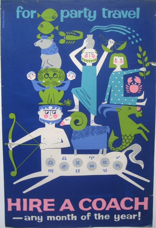
Daphne Padden, late 1950s

Royston Cooper, c. 1959
Daphne Padden and Royston Cooper have a lot in common: they designed many coach posters and so aren’t as well known as they should be, both gave up poster design for fine art in later life. Oh, and they are both brilliant. But Cooper – the larger-than-life artist balloonist was a very different character to the self-contained Padden, who learnt her trade at her father’s knee. Why coach posters, and these two designers, have disappeared from the record – the answer being that they don’t have an archive or a museum to tend to their reputation. The amazing collection of Malcolm Guest, without which even more would have gone forever and how Padden shaped the look of our lives at Marks and Spencer, even if we had no idea at the time.
Out of the carriage window
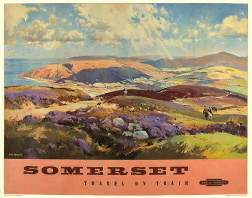
Jack Merriott, 1960.
Despite the changing times, British Railways are still producing posters, albeit less successfully. But the railway poster both old and new is now not simply commercial art, it is in some ways an alternative to art. Fine art is now abstract, and quite challenging, but the British people have always hungered for pictures of their country and this urge is now fulfilled by railway posters. So as the decade comes to an end, their production dies out but the demand for them grows and grows. Some of this is nostalgia for the railways, and for our own childhoods. But a part of this is also the unquenchable desire for a picture of England on our walls. The final sign that the railways are modern no longer.
Art and commerce
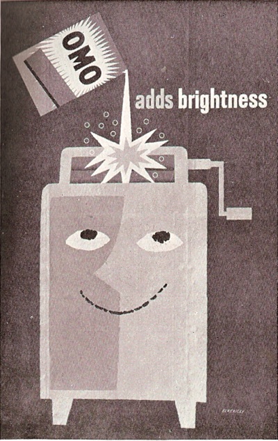
Tom Eckersley 1962
Curiously, this is a very rare poster. Not because few were produced, far from it, they were churned out in their thousands. But only very few were kept – a contrast with the continent where these kinds of commercial posters were collected. This is a story which goes right back to the origins of the poster and will inevitably end up in a discussion of art and class, and why trade is always a bit beneath the British, or at least they’d like to think so. Feminist objections to the cult of domesticity, the joy of the washing machine and whether this is just another subset of the post-war pleasure in small things.
Decline and Fall
Even while some of the best posters of the 1950s were being produced, the seeds of their decline were already being sown, in the form of commercial television. Soon the poster would become a footnote, only used by advertisers who couldn’t afford the price of a commercial or who were, for various reasons, not able or permitted to advertise on television.
Go to work on an egg
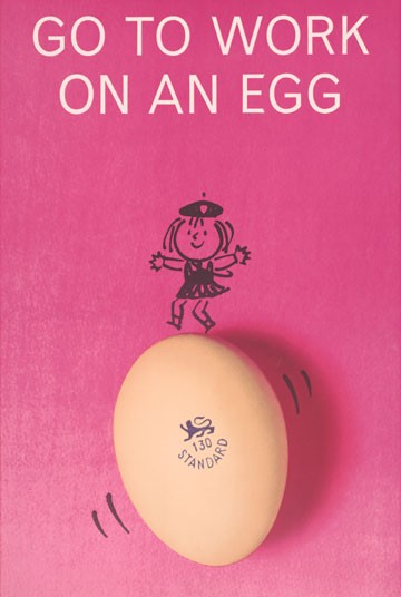
This is a classic poster, but the award-winning campaign also included TV commercials featuring Tony Hancock. The twin horsemen of photographic reproduction and television would very soon put an end to the glory days of the poster. The argument about whether Fay Weldon invented the slogan or not, why advertising agencies were filled with authors and poets, along with the decline and fall of the Great British Breakfast and why arguments about our national cuisine always seem to revolve around meat. Still, breakfast was one way in which, finally, we were becoming more Continental.
These hoardings aren’t going to fill themselves.
John Burningham, 1961
Posters were still being produced, and a few good ones too. But quite often these were being done by people like London Transport and British Railways, people who it just so happened had hoardings to fill. And a look at how the integrity of the poster is now starting to fall apart – the separation of text and image an index of that. This is an illustration more than it is a poster. But the idea of posters and a shared culture – would we recognise the Shakespeare quote these days? Has the nature of the poster changed, and in particular the way that LT relates to artists – right up to the present day.
Provocative
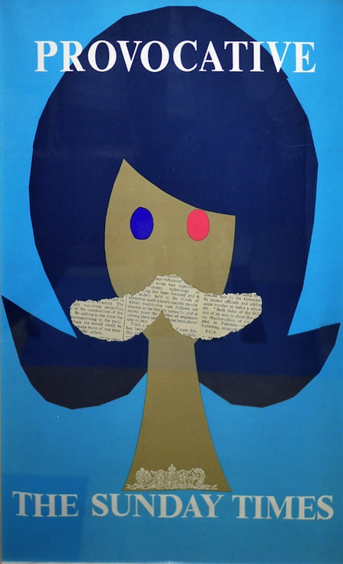
Patrick Tilley, 1962
A brief glimpse of how posters might have developed had they not been overtaken by television – and also a reminder as to why newspapers prefer posters, most can’t manage a good tv advert even today. Although these posters were utterly reviled at the time, they are now considered to be design classics. The amazing career of Patrick Tilley, who epitomises where the bright young creatives are going these days as he moves from poster designer to screenwriter and then popular novelist. A very 1960s life, also featuring the Ipcress File and milk.
Force of circumstances
Some advertisers had no choice but to produce visually interesting posters. Tobacco advertising had been banned on television since 1965, but in 1986, posters and magazine adverts could no longer show a person smoking either. Which meant that the advertising agencies had to use their ingenuity…
The end
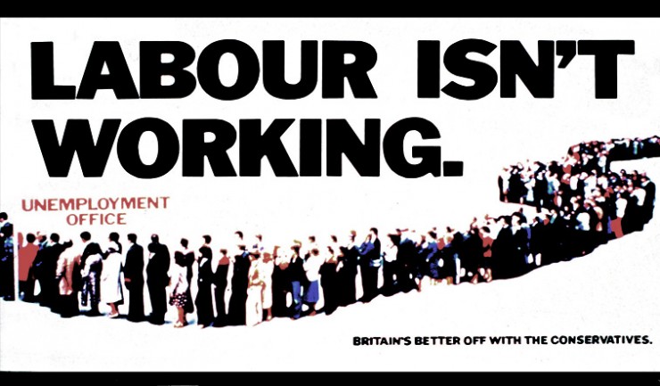
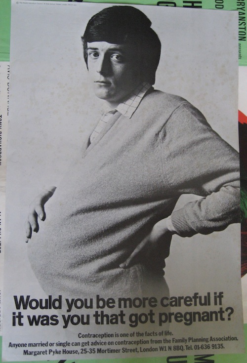
These are probably the last two posters to have a significant social impact, and in both cases they were created for clients who couldn’t advertise any other way. In the first case, political parties weren’t allowed to advertise on television, while the second poster was created when a client with a tiny budget crossed paths with a very ambitious advertising agency that wanted to make its mark. The agency went on to become Saatchi and Saatchi (and to produce the first poster as well). the poster went on to be famous.
Coda: Keep Calm and Carry on
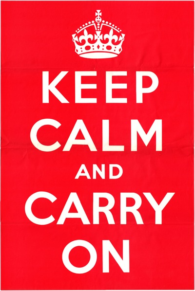
The final saga of misunderstandings and misrepresentation as we tell the actual history of this poster, which isn’t the example of wartime stiff upper lip that we like to imagine. Far from it, the poster was initially designed because in 1939 the powers that be believed that the British people would have a collective nervous breakdown as soon as the bombers arrived. But this tells us more about ourselves now than the war – and how we use World War Two posters in particular to think about who we are today. Why posters still matter to us, and how they permit us to think thoughts that are otherwise just beyond our grasp.