Modernism to go
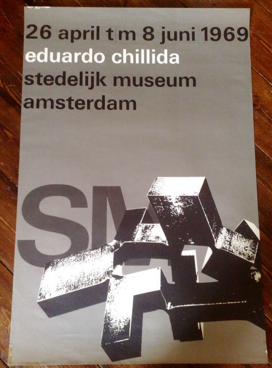
Right now, you can pick up the bargain of the year so far on eBay. It’s this:
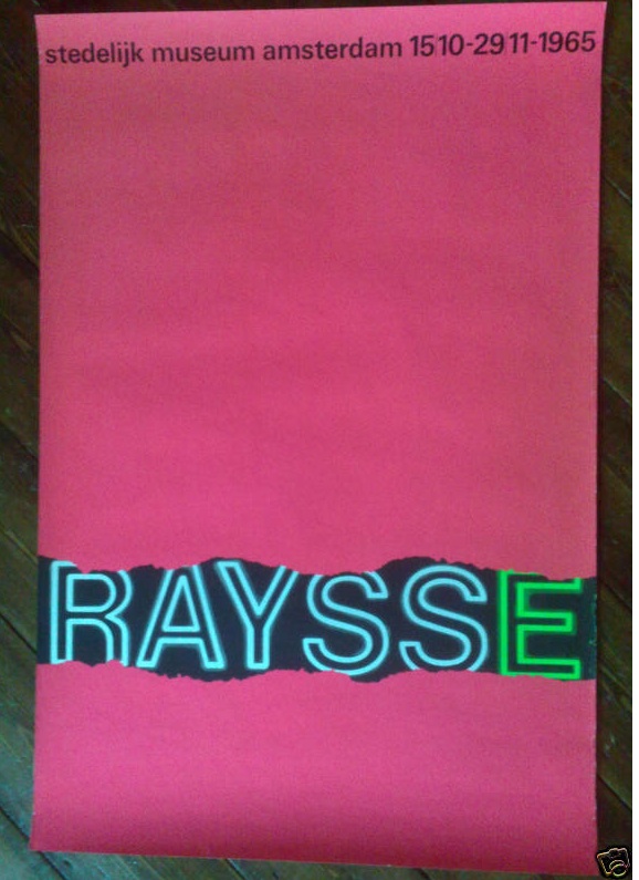
and this
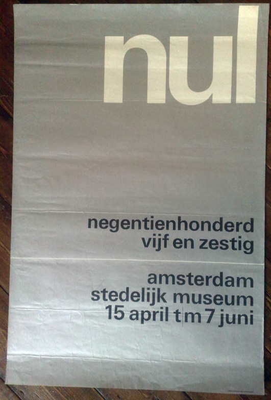
and also this
In fact it’s five posters designed by Wim Crouwel for the Stedelijk Museum in Amsterdam in the 1960s, and as I write, they are currently going for under £10 for the lot. Which is madness. They’d be a bargain just for five anonymous pieces of good design, but for five pieces of Wim Crouwel’s work, it’s a crime.
We simply don’t have designers like Crouwel here in the UK. This isn’t only because we didn’t do this kind of formal, grid-based, type centred modernism. (To get a sense of how mainstream it was in Holland, just imagine the British Museum or the V&A commissioning a poster like this in the 60s, and then go and have a lie down to clear the resulting headache.)
It’s also because, for some reason, very few designers in this country have achieved the ubiquity managed by Crouwel.
“It was actually quite difficult to avoid Wim Crouwel’s work. In the 1960s the Netherlands was inundated with posters, catalogues, stamps designed by him, even the telephone book.”
– Karel Martens
Who can match this? Abram Games did design the Festival of Britain symbol, it’s true, but he hardly styled the entire 50s. Perhaps Hans Schleger is the only one who can come close* – with his work for Libertys and MacFisheries (of which more later), the John Lewis logo and even the London Transport bus stop roundel to his name, it would have been easy to live, travel and shop in a Schleger-shaped world. But did many people ever notice they were doing this? I rather doubt it.
Anyway, this is a bit of a distraction from the business in hand, which is that there are five brilliant pieces of design for sale for not very much money at all so far. Proof that eBay can still come up with the goods sometimes.
*I am disregarding Pentagram as I find most of their designs a bit safe and dull. Perhaps I was living a visual life shaped by Pentagram in the 1970s and 80s, but if I was I didn’t care much either way. But if you think I am in need of correction on this – or you’ve got a better example – please do say.


