Books and Canons
Right, back to the bookstacks once more. In a way I’m rather pleased that there’s a backlog of things I need to write about, it shows that posters and graphic design are starting to be taken seriously. But more than most, today’s book is both necessary and useful.
It’s GPO Design by Paul Rennie, a neat guide to the posters of the GPO. Evem better, it’s reasonably priced and available. That doesn’t sound like much to ask, but in this case, it’s about time. Because until now, the only book ever written on GPO design was published by a private press in a limited edition, and went for £320 at auction the last time I saw a copy. Which makes me particularly grateful for this.
What you get is a fairly straightforward run through the history and structures of the GPO as it affects poster design, the varying kinds of GPO posters and what they were meant to achieve, and a look at some of the artist and designers who worked on the campaigns. Plus of course, lots of lovely posters to look at.

Tom Eckersley, 1957
It’s simple, but given that absolutely nothing else is available, it’s exactly what’s needed.
So, for example, I now know why so many GPO schools posters survive compared to the commercial campaigns: they were sent out in their thousands to schools, where they were so much more likely to be kept, or at least thrown to the back of a cupboard, compared with the ones sent out to Post Offices.
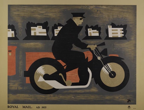
John Armstrong, educational poster, 1935
Although, I have to say, I don’t find the designs of the school posters half as satisfying as the commercial ones, as they have a tendency towards the dreary. The only exceptions being the McKnight Kauffer ones, which are rather fine.
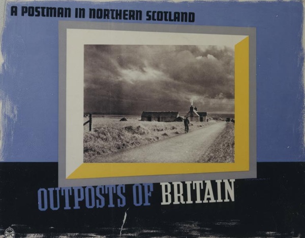
McKnight Kauffer, educational poster, 1937
The book has provoked me to some thoughts, though. Although they’re not really criticisms of the book itself, as it is meant to be a brief and straightforward run through. My target is probably more design history as a whole, as reflected in this particular text.
What is starting to bother me is the existence of an established hierarchy of designers. At the top of the tree are those who were also fine artists. The chapter on individual designers here begins with Paul Nash, and moves on to ‘fellow member of Unit One, theatre designer and surrealist’ John Armstrong’, only later moving on to the poster designers themselves.
Implicit here is the idea that design itself is not enough, it is better (whether that is aesthetically more pleasing or simply more worthy) if it has been touched by the hallowed hand of fine art. Alone, it does not deserve the attention.
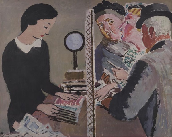
Perhaps it is possible that posters designed by artists are generally better, although I’m not sure I subscribe to this point of view. But where it really gets irritating is the continual reproduction of this Vanessa Bell design. It turns up everywhere that GPO design is discussed.
Now, this is a failed poster. It was rejected by the GPO and never used. Even Bell herself didn’t think the design worked.
I don’t know why it has been so, but for some reason it has taken me ages to do anything I thought would do at all – I think partly because of the difficulty of getting several figures into a small space and yet making them tell at a distance. I have stood about in Post Offices until your employees looked so suspicious I had to leave! – and yet I don’t know that in the end what I have done has much resemblance to a Post Office. However, there it is…
Letter from Vanessa Bell in BPMA archive, quoted in essay by Margaret Timmers
It is possible to see the design as an example of where art and commercialism failed to meet, and Rennie does discuss it in this context briefly. But I don’t think that this alone is enough to account for its ubiquity. Because this isn’t just art, it’s Bloomsbury art. And Britain loves the Bloomsberries, to the extent that it can skew our critical and historical judgement sometimes.
But even when we get the artists out of the way, the book still chooses to comment on the prevailing list of designers, from Austin Cooper and McKnight Kauffer at the top, then moving down to the post-war brigade of Eckersley, Henrion, Schleger et al. (How and why this canon has developed is an interesting question and one I’ll come back to another day as this post is already quite long enough as it is.)

Hans Schleger, 1945
Partly this annoys me because I got my critical grounding in English Literature during the late 1980s, where any belief in the Canon of Dead White Males was to be stamped on as a sign of a backward and outmoded way of thinking. I’m probably not so extreme about it now, but the ingrained urge to stamp hasn’t quite gone yet.
But again, I also think that it can get in the way of us seeing what is really there.
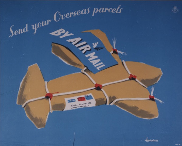
Pieter Huveneers, 1954
Because one of the joys of the GPO Archive is that they commissioned a wide range of artists, some of whose work I’ve never seen anywhere else. (The illustrations of the book do reflect this, by the way.)
For example, I was furtling around in there this morning for another reason altogether and came across this, which I have known and liked for ages.
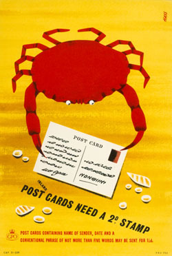
Derrick Hass, 1954
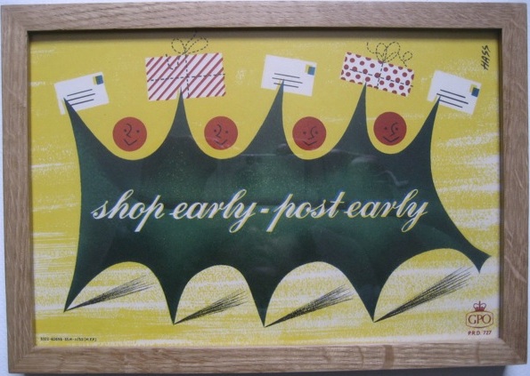
It’s by Derrick Hass, who also did this Christmas design, as seen on here before.
Now it turns out, after I got curious, that Derrick Hass went on to have an extraordinary career in advertising, working as an art director in most of London’s top agencies for almost forty years, and winning prizes for his work into the 1990s. His life and work is an important part of graphic design history, and one I’d like to know more about.
But if we only keeps looking at what we already know, histories like that will fall by the wayside. So it’s fantastic that one book on GPO Design is at last available, but now we need a much bigger one too. One which tells all the stories.

