I found these while looking for something else altogether on the LT museum poster site. And I’ve never seen them before.
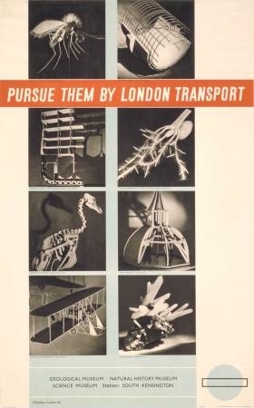
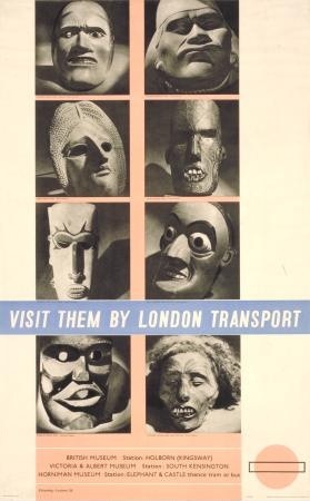
They’re a rather surprising departure by Eckersley-Lombers and date from 1938.
The design reminds me more of book covers of the period than posters. But it’s great.
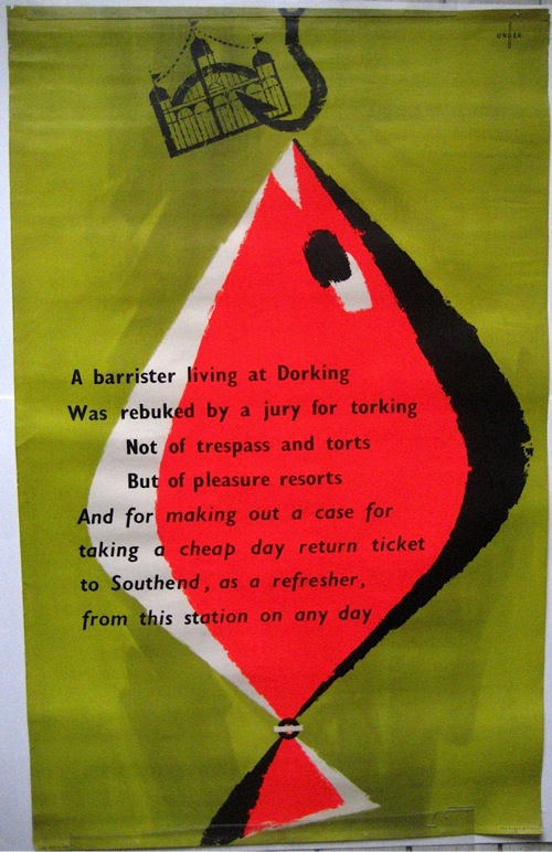
While we’re in the domain of London Transport design, there’s also this post-war Unger.
It came up on eBay, and so Mr Crownfolio and I thought we’d invest some of our selling proceeds in it. But then who could resist a poster which, as well as showing a fabulous and only marginally relevant fish, also manages to rhyme Dorking and torking? Not us, that’s for sure.
Next time, unbelievable quantities of posters for sale on eBay and elsewhere. So many in fact that I don’t have enough time to fit them into a post today. See you then.


Ahh…So it was you who outbid me! Good buy… or good bye, for me.
The posters by Eckersley-Lombers are interesting because they exemplify the difficulties of
incorporating photographic elements into the poster language of the 1930s. These posters seem a bit rigid and formal…
The proportion of poster (double royal size, 25×40 ins) that is printed photo-mechanically is about half, I think, or slightly less. Printing photographic tone by lithography requires that all the mid-tones of the photograph be transformed into a pattern of black and white. This was made possible by the half-tone screen. These screens remained crude (right up to the 1950s) so that, above a certain scale, the enlargement of photographic elements would degrade so as to be visually useless. This was a particular problem for poster designers, who wanted to use large scale photography in their designs.
Throughout the 1930s, designers were trying to figure our how to make use of photography in poster design and art-direction. In Russia, they learnt to draw photographically! In Germany, they devised montage techniques. In Britain, Kauffer and others “framed” smaller photographic elements within the existing “painterly” styles of poster design.
There’s an important distinction to be made between the scale of typo-photo elements designed for magazines and those experiments with posters.
Eckersley-Lombers were also open to surrealistic potential of the scientific and “primitive” themes of their image selection.
There’s a Shell poster, by Eckerlsey-Lombers, with a letter, hand and mitten that promotes Winter Shell. The mitten is printed as a photographic element. In the original art-work, the mitten is knitted and stuck into the design as a piece of 3D collage. The mitten was knitted by Daisy Eckerlsey.
You can see quite a few examples of these kinds of poster experiment in Modern British Posters.
Best
P
Sorry about that! I fear this will happen more and more until we can’t buy anything without disappointing someone else.
Paul – thanks for the info. I know the Eckersley poster you mean and will look at it again with new eyes.