See London

Onwards and upwards then, onwards and upwards.   Which today means London Transport Auctions, whose next auction is on November 1st.

As ever, along with the opportunity to buy a conductor’s hat or the radiator grille from a Routemaster, there are also a fair number of posters, some of them being rather good.  Really rather good – I would quite happily buy any or all of the posters on today’s blog, the only exception being the one we already own.  So this is going to be a relatively straightforward scoot through what’s taken my fancy, with the posters being allowed to speak for themselves.  For a change.

As I’ve been mentioning John Bainbridge quite recently, shall we start with him?

Original 1953 London Transport double-royal POSTER 'Buckingham Palace' by John Bainbridge (1919- 1978) who designed posters for LT from 1953-1957.
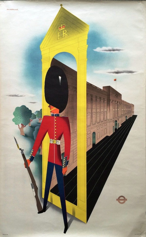
John Bainbridge, 1953, est. £75-90

Original 1956 London Transport double-royal POSTER 'Epping Forest' (Dick Turpin) by John Bainbridge (1919-1978) who designed posters for LT from 1953- 1957.
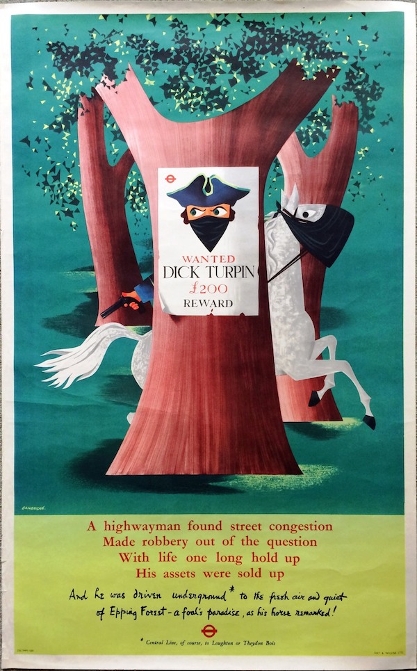
John Bainbridge, 1956, est. £40-60

And look, we have not only dates but proper estimates too from these lovely people.  Although the estimates, even allowing for some edge wear, do seem quite conservative, so it will be interesting to see what these actually go for.  I’m less likely to live with a royalist guardsman, but I’d happily pay £60 for Dick Turpin any day.

There are a couple more posters from the same year as the second Bainbridge, both excellent, which makes me wonder if someone went on a buying spree that year, and the results have just emerged from the attic.

Original 1956 London Transport double-royal POSTER 'The Tower' by Hans Unger (1915-1975)
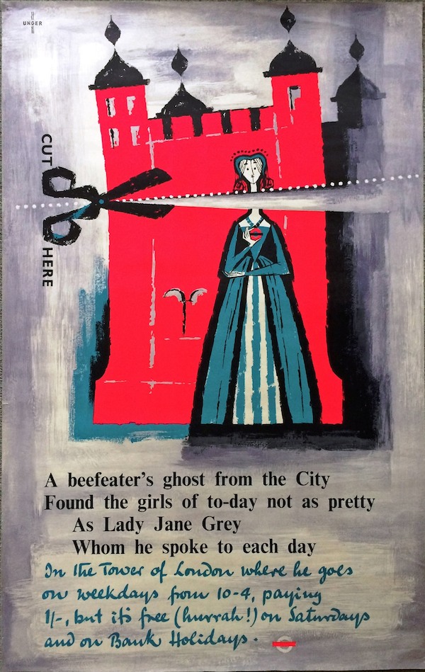
Hans Unger, 1956, est. £75-100

Original 1956 London Transport double-royal POSTER 'Visitor's London' by Frederic Henri Kay Henrion (1914-1990) who designed posters for LT from 1942-1956.
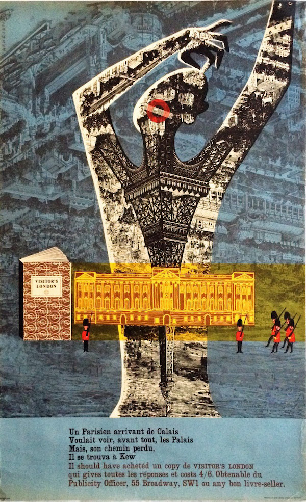
F H K Henrion, 1956, est. £75-100

I have, briefly, written about this Henrion series before, but they deserve some more attention really, for being both insane and at the same time very, very ahead of their time.  But now is not the moment.

And that’s not the end of the 1950s classics either; there are also these two to take into consideration.

http://vintageposterblog.com/2010/09/17/ahead-of-his-time/#.VFEX_4d3agQ
Victor Galbraith, 1959, est. £75-100

 Original 1953 London T ransport double-royal POS TER from Coronation Y ear 'Kensington Palace' by Sheila Robinson (1925- 1987) who designed posters for L T 1951-53.
Sheila Robinson, 1953, est. £70-90

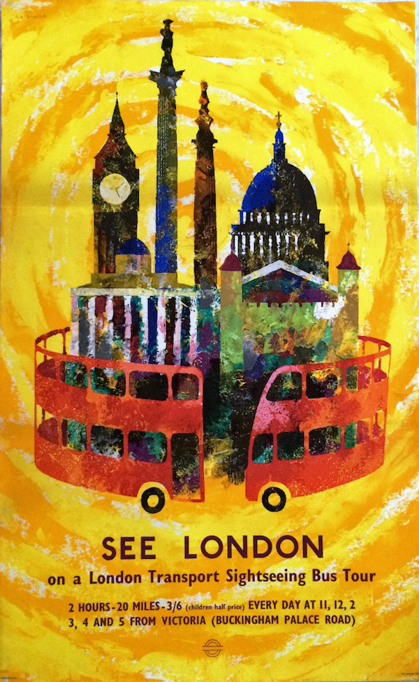
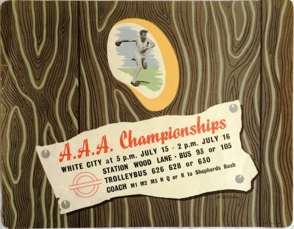
Or if you fancy something smaller, there is this Harry Stevens bus poster for the Lord Mayor’s Show.

Original 1959 London Transport POSTER 'Lord Mayor's Show' by Harry Stevens (1919-2008)
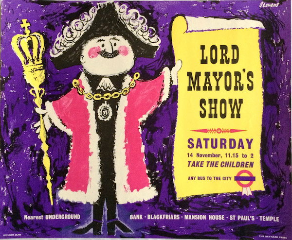
Harry Stevens, 1959, est. £50-100

On a price per square inch value (I’m estimating here, I haven’t actually worked it out) I don’t think that Stevens is worth that much more than Unger – or indeed than most of the posters I’ve already mentioned above.  But, as ever, I am quite prepared to be proved wrong.

Now I do tend to prefer post-war graphics but I’m not leaving out the earlier posters from the sale, it’s just that there really are very few of them in comparison.  There are one or two wartime ones, of which this Bruce Angrave blackout poster is probably my favourite.

Original 1942 WW2 London Transport POSTER 'In the Blackout.....make sure it is the platform side' by Bruce Angrave (1914-1983)
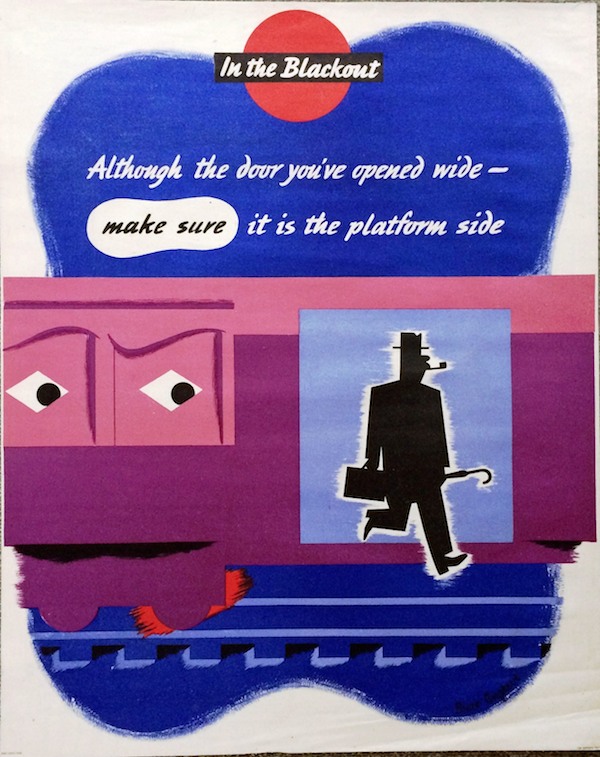
Bruce Angrave, 1942, est. £75-125.

Plus there is also this rather lovely little 1938 bus poster, but I’m sure I like it because it’s not so much of the thirties as pointing the way forward to the Festival of Britain styles of the early fifties.

Original 1938 London Transport POSTER 'A.A.A. Championships, White City' (Amateur Athletics) by Harry Blacker (1910-1999) who designed posters for London Transport in 1938/39.
Harry Blacker, 1938, est. £75-125

Apparently after being a designer before the war, Blacker gained fame in the 1960s as a cartoonist, particularly for the Jewish Chronicle.  But he did a number of posters, so I will keep an eye out for him.

Meanwhile, these were issued in the early 50s, but aesthetically are a product of the decade before.

Pair of original 1951 London Transport POSTERS 'Men Conductors Wanted' & 'Women Conductors Wanted' featuring an illustration of a speeding double- deck bus with a conductor hanging on to the platform pole. By an unknown artist.
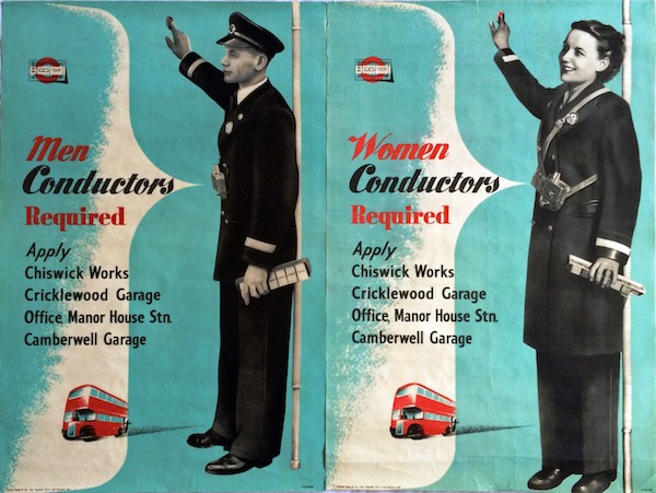
Anon, 1951, est. £60-75

And obviously, you need two, because no man would become a bus conductor if the poster were addressed to women, or vice versa, would they.

There are, as ever, more posters, so do go over and have a look at their catalogue.  Meanwhile, I will be back next week with the Christies auction, and, possibly, some more thoughts too.


String Theory

This has recently arrived in the post, contradicting my previous assertion on here that there are no more eBay bargains to be had.

Lander british railways luggage poster
Admittedly it is not an outstanding piece of graphic design history (although I quite like it) and is rather battered round the edges too.   But it’s by Lander, which is always a good thing, and it’s also a rather intriguing bit of social history.  Because it’s a reminder of the days when things had brown labels and were tied up with string, or in this case cord.

Nobody does that any more, do they?  I have sometimes been known to wrap a parcel up in brown paper, but I don’t think I’ve ever tied it up with string.  This is something I’m sure that my mother could do though, coming as she does from an age before jiffy bags and sellotape.

Without all these modern parcel technologies, it was clearly possible to wrap a parcel very badly.  At least that’s the only conclusion I can arrive at from the sheer volume of posters that the GPO put out on the subjects.  Most of these are quite general, and I’ve written about the Properly Packed Parcels series on here before.  But there were plenty of other similar exhortations too, and here’s just one.

Tom Eckersley cow jug pack parcels carefully GPO poster

Actually, seeing as it’s Tom Eckersley, let’s have two.

Tom Eckersley cat ornament poster GPO pack parcels carefully

Judging from the posters though, (these are all from between 1950 and 1953) there was a Post Office standard approved way of packing parcels carefully.

Caswell 1953 GPO poster

Dennis Beytagh 1952 parcel wrapping poster

So that’s two pieces of string round the long side, one round the other, although I still have no idea how to knot it.   Hans Unger, meanwhile, is even more specific about rigid boxes and string in 1950.

Hams Umger 1950 poster wrapping parcels GPO

This one, though, is the most instructional I have managed to find (it’s artwork by the way, artist not known).

Artwork for a poster. Subject: Careful packing of parcels. Artist: Not known. GPO 1950

I think even I could have had a go at the process now, although I still don’t know how to knot the string.

Of course (and you might have guessed that the whole post has been leading up to this) the real challenge that faced the Post Office was blackberries.  Sent in a non-approved fashion.

Karo soft fruit by post genius GPO poster

Did people really send them in a basket?  And expect them to get there?  I am boggled at that thought.  But the GPO weren’t, they produced more than one poster, which means that it must have happened at least twice…

soft fruit packing gpo poster

The GPO weren’t alone though, British Railways also had problems with parcel packing and addressing.

'Address your package clearly and help the Railway Staff to help you'. Poster produced for Great Western Railway (GWR), London, Midland & Scottish Railway (LMS), London & North Eastern Railway (LNER) and Southern Railway (SR) to remind customers to address packages clearly, as illegible addresses cause delays. Ar'Address your package clearly and help the Railway Staff to help you'. Poster produced for Great Western Railway (GWR), London, Midland & Scottish Railway (LMS), London & North Eastern Railway (LNER) and Southern Railway (SR) to remind customers to address packages clearly, as illegible addresses cause delays. Artwork by Miles Harper.twork by Miles Harper.

The problems might have been similar but it has to be said, the GPO’s poster design was infinitely superior.

You also get the feeling from their posters that they don’t actually like parcels that much.  They’re just trouble really, when your main business is really running trains.

British Railways staff poster. 'Don't Accept Packages which are Unfit for Transit', BR staff po'Don't Accept Packages which are Unfit for Transit', BR staff poster Artwork by Frank Newbould.

That, incidentally is apparently a late Frank Newbould from 1960,  It’s also quite mild in tone compared to some.

But nothing gave them an excuse like the war.  At last they could say what they really thought.

Fewer parcels World War two christmas poster british railways

Can you even send a parcel by railway now?  Probably only if it is tied up with string.

Is Your Letterbox Efficient?

I was just thinking that it had all gone very quiet on the auction front, when what should come along but a whole auction full of posters at Bloomsbury.

It’s an interesting hotch-potch with almost every form of poster you can think of represented in the mix.  So there’s foreign posters and railway posters.

PIPER, Raymond NORFOLK BROADS railway poster
Raymond Piper, est. £200-400

Alongside ski posters and London Transport posters.

FITTON, James (1899-1982) CIRCUS, London Underground lithograph in colours, 1937 London Transport poster
James Fitton, 1937, est. £200-300

UNGER, Hans (1915 - 1975) PIMLICO, London Underground offset lithograph in colours, 1972 poster
Hans Unger, 1972, est. £200-300

I’ve never seen that Unger before, although it’s not, in my book, one of his best.  The pricing is a bit, well, interesting as I can’t see that the Unger and the Fitton are in any way comparable in quality, but according to the estimates, they are.

In addtion, there are plenty of poster types that have been mentioned on here before, such as David Klein posters and aeroplane posters with lots of blue skies in them.

Note the increasing prices for David Klein; had I had the foresight and money to buy some a few years ago, I would be thoroughly quids in.  But I didn’t, and anyway, I would only have wanted to keep them.

KLEIN David (1918-2005) SAN FRANCISCO, Fly TWA offset lithograph in colours, c.1958, poster
David Klein, 1958, est. £1,400-1,800

LEWITT-HIM LEWITT (1907-1991)HIM (1900 - ) AOA USA lithograph in colours, 1948 poster
Lewitt-Hi, 1948, est. £150-250.

Another poster that I keep mentioning on here is this McKnight Kauffer from 1938.

KAUFFER, Edward McKnight ARP lithograph in colours, 1938,
McKnight Kauffer, 1938, est. £140-180

As ever, it turns up with the matching Pat Keely.

KEELY, Pat Cokayne (?-1970) ARP lithograph in colours, 1938 poster
Pat Keely, 1938, est. £140-180

My theory about this – and I have said this before but I think it’s worth repeating – is that these posters come up so often because they were deliberately saved.  They were, I believe,  the first propaganda posters issued by the government in advance of World War Two.  So they were a novelty, and also a harbinger of a great event that I am sure quite a lot of people could see coming.  So, if the chance arose, they saved them for posterity, or the grandchildren, or for all the other reasons that make people keep otherwise insignificant pieces of paper.

Move forward two years and the whole British population is drowning in slogans and propaganda, coming at them from newspapers, leaflets and the radio, as well as from posters.  So the last thing they want to do is keep one as a reminder.  In any case, there are so many, which one to choose?  So the latter posters survive in dribs and drabs, mostly saved by accident.  But these first ones, people knew they were important and they kept them.

Fortunately, not everything in the auction is something seen before.  This, for example, has to be one of the least obvious posters ever.

ANONYMOUS BETTER BROWN THAN LILY WHITE offsetlithograph in colours, c.1960ANONYMOUS BETTER BROWN THAN LILY WHITE offsetlithograph in colours, c.1960 poster
Anonymous, c. 1960, est. £200-400

Artist not known, but more than that I have no idea what it is on about either.  Nor, it appears, does Bloomsbury.  Any ideas anyone?

Most exciting, for me at least, are these.

ECKERSLEY, Tom (1914-1997) POST EARLY. GPO lithograph in colours,  poster
Tom Eckersley, est. £150-200

This is just one of five, yes count ’em, five sets of GPO posters, each with ten posters in them.  Including, in this lot, a reminder of what a good designer Harry Stevens is at his best.

STEVENS, Harry (1919-2008) BY AIR MAIL. GPO lithograph in colours, 1951,  poster
Harry Stevens, 1951, est. £150-200

I would bid on them, but judging from our last experience with the Dorrit Dekk lots, these will go for a lot more than the estimates.

AITCHISON YOUR LETTERBOX…GPO lithograph in colours poster
Aitchison, est. £150-200 

And I’m not surprised.  This values them at £15-20 a poster; I reckon they’d go for more than that on eBay.  Although I don’t, to be fair, know what the other posters are, they may all be dogs of the first order.

BROMFIELD FOREIGN LETTER. GPO lithograph in colours, 1951 poster
Bromfield, 1951, est. £150-200

We’ve emailed Bloomsbury to ask what they are, and when we get an answer, I’ll let you know.

Deja vu all over again

I seem to have come back from holiday only to wander into a fold in time, because at least some of the posters on offer out there seem strangely familiar.

Lets start with Dreweatts in Bristol, who are once again selling the work of Percy Drake Brookshaw.

Percy Drake Brookshaw Boat Race poster 1927 London Transport
Percy Drake Brookshaw, 1927, est. £150-200

This is not a new thing, in fact it’s something which has been going on almost since the very beginning of this blog.

Percy Drake Brookshaw Wimbledon tennis London Transport poster 1928
Percy Drake Brookshaw, 1928, est. £200-300

The only real change being that they have got slightly more realistic in their estimates.

Percy Drake Brookshaw shell poster cricket just out 1933
Percy Drake Brookshaw, 1933, est. £300-400

Although I can’t remember these posters ever coming up before.

Percy Drake Brookshaw Green Line posters 1936 London Transport
Percy Drake Brookshaw, 1936, est. £200-300

Once again, they are provenanced from the artist’s family by direct descent.  I can only imagine, with some envy, the stack of posters they must have had before they started selling.

Elsewhere in auctionworld, a curiosity in Bloomsbury’s British Art Sale.  Even they describe it as ‘a macabre vision’.

Betty Swanwick RA (1915-1989) Safety First!' a macabre vision for a Ministry of Transport poster
Betty Swanwick, est. £1,000-1,500

It’s a design for a poster, although not one I’ve ever seen.  Maybe even the ministry thought it was a step too far.  There are some examples of her painting up for sale too – I rather like this.

Betty Swanwick RA (1915-1989) The Gardeners
Betty Swanwick, est. £1,500-2,000

Although the price is once again a reminder why we collect posters rather than fine art.  I’m sure there are lots more wonderful things lurking in that auction too, but I don’t dare take a very close look in case I start spending money which is meant to be used for house renovation.

Meanwhile on eBay, there’s more on offer than I’d normally expect to find in the doldrums of August, and they’re proper posters too.  The kind that you might normally expect to find in auctions.  Let’s start with a handful of classic railway posters.  Well, post-war classics at least.

British Railways poster

That – by Ronald Lampitt and dating from 1952 – is my favourite, but there’s also this Lander, which I don’t think I’ve ever seen before.  Or at least not noticed.

Lander British railways poster 1952 Northern Ireland

But it’s this Kenneth Steele which seems to be the most popular with the bidders so far.

British Railways poster loch ness Kenneth Steele

The price as I write stands as £221, with more than four days to go.

Also doing well are a set of three Empire Marketing Board posters from the 1930s.

Chas Pears Empire Marketing board poster Gibraltar

The Gibraltar example above, by Chas Pears, has already reached £122, but you can still have his version of the Suez Canal for a bid over £5.59 if you like.

Chas Pears Empire Marketing board poster  Suez Canal 1930s

Finally, an oddity from our old friends PosterConnection.  I don’t suggest that you actually buy this, what with it costing $400 and all, but it’s worth a look.

London Transport poster Music in London, by Hans Unger and Eberhard Schulze, 1964

It’s by our old friends Hans Unger and Ebhard Schulze, but it’s not a plain mosaic, rather it’s a collage with a bit of mosaic in.

The poster is also missing the text beneath  – here is the LT Museum copy by way of comparison.

Music in London, by Hans Unger and Eberhard Schulze, 1964

Although whether that makes it worth more or less I have no idea. Any thoughts?

It’s 1959, OK

This has been sitting on my desk for a few weeks.

Furnishing Your Home 1959

Now, I’ll be the first to admit that it’s not a great example of graphic design nor interior styling.  But it has been making me think.

Because this is Autumn 1959, the calendar is about to turn over into the 1960s.  That’s not the only thing which is going to change either, as there’s a new design style in the offing too.  You can see it here, the splayed legs of the contemporary have become straight, the acid bright colour contrasts have become more muted, the typefaces starting to go less Victorian, more sleek (although that yellow script is still hanging on grimly from the jollier 1950s).

In short, what seems to be happening here is that Britain is, finally, getting the hang of International Modernism.  Here’s another dose of it for you, a G Plan room from from 1962 (and while I’m here, I can’t commend its source, the High Wycombe Furniture Archive, too highly, at least if you want to look at industrial quantities of G Plan and Ercol furniture).

High Wycombe G PLan room 1962

Robin Day was doing this kind of thing even earlier than that, as I’ve mentioned on here before.

Robin Day exhibition stand for ICI Royal Agricultural Show

It’s the Mies van der Rohe Pavilion reconfigured in Shepton Mallet; not something which happens often enough really.

Seeing as this claims to be a blog about graphics, here’s a a couple of more relevant examples, by Reginald Mount from 1962 and Hans Unger from 1966.

Reginald Mount vintage CoI poster 1962 home safety

Hans Unger vintage 1966 GPO poster

I also think the Sainsbury’s graphics also represent a similar trend – no, they are what a modernist supermarket ought to look like, albeit one modulated through the idiosyncratic colour choices of the 1960s and 70s.

Sainsburys Own Label biscuit genius

and cornflake modernism

Now – and this may be a deficiency in my reading rather than anything else – I don’t think I’ve ever seen the 1960s described in these terms.  As Pop art, yes, as Mod, that too.  But not as modernism. Have I missed this somewhere?  And can you point to it if I have?  Because I think I’d like to know some more.

Having said all that, in the interests of balance I do have to report that a cruise through our posters, at least, also reveals a huge quantity of design which does not conform to this theory in the slightest – take this 1967 London Underground poster as just one of many examples.

Vintage London Transport poster 1967 Christopher Hill Chalk Downland landscape of the gods

The British love of both landscape and whimsy tends to trip up the modernist impulse in graphic design perhaps more than in other places.

Then there was psychedelia to take on board shortly afterwards to boot.

Properly Packed Parcels Please tom bund 1968

So perhaps the argument holds more true for interiors.  Or perhaps it’s not the case at all.  But I would like someone elses’s thoughts please.

Far Away

I have been ill this week and am still not quite up to writing cogent sentences about anything that I said I would.  So apologies for the gap in service, but I can offer you something very nice to look at instead.

Motif 4 vintage graphics Hans Unger in Africa

This is Motif 4.  Hans Unger has been travelling in Africa.  Here’s the back cover too.

Motif 4 vintage graphic magazine rear cover Hans Unger

The covers are perhaps the best thing about this very lovely magazine.  But there is more inside too.

Motif 4 vintage graphic magazine Hans Unger illustration


Perhaps not quite what you’d expect from him, but still rather good I think.

Motif 4 vintage graphic magazine illustration Hans UngerMotif 4 vintage graphic magazine illustration Hans Unger

Normal posting will, I hope, be resumed next week.