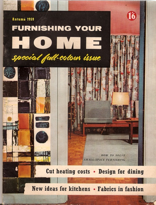
This has been sitting on my desk for a few weeks.
Now, I’ll be the first to admit that it’s not a great example of graphic design nor interior styling. But it has been making me think.
Because this is Autumn 1959, the calendar is about to turn over into the 1960s. That’s not the only thing which is going to change either, as there’s a new design style in the offing too. You can see it here, the splayed legs of the contemporary have become straight, the acid bright colour contrasts have become more muted, the typefaces starting to go less Victorian, more sleek (although that yellow script is still hanging on grimly from the jollier 1950s).
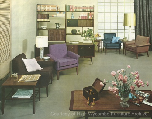
In short, what seems to be happening here is that Britain is, finally, getting the hang of International Modernism. Here’s another dose of it for you, a G Plan room from from 1962 (and while I’m here, I can’t commend its source, the High Wycombe Furniture Archive, too highly, at least if you want to look at industrial quantities of G Plan and Ercol furniture).
Robin Day was doing this kind of thing even earlier than that, as I’ve mentioned on here before.
It’s the Mies van der Rohe Pavilion reconfigured in Shepton Mallet; not something which happens often enough really.
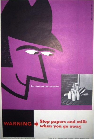
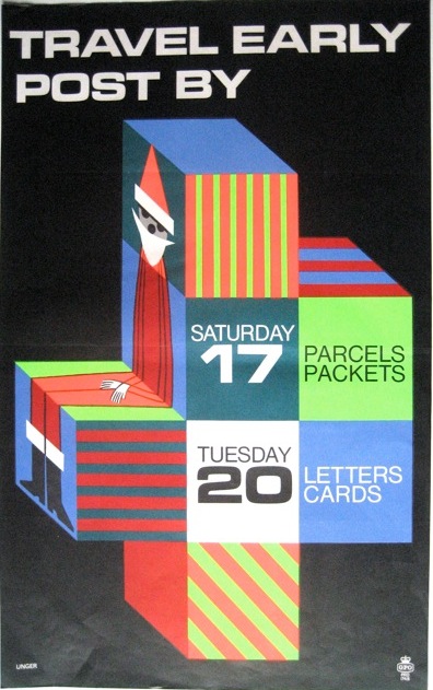
Seeing as this claims to be a blog about graphics, here’s a a couple of more relevant examples, by Reginald Mount from 1962 and Hans Unger from 1966.
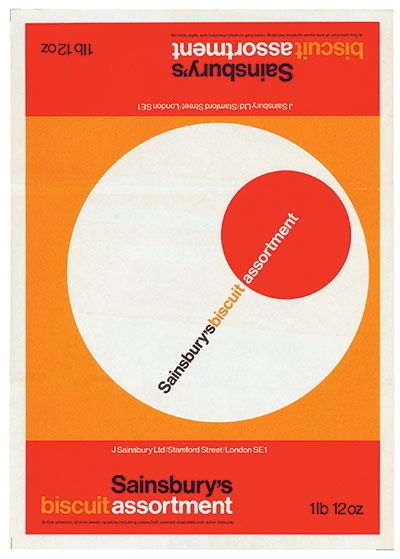
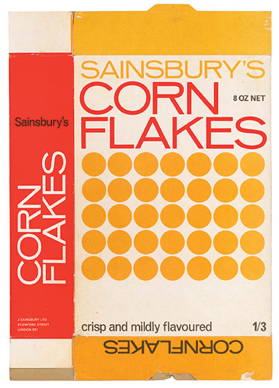
I also think the Sainsbury’s graphics also represent a similar trend – no, they are what a modernist supermarket ought to look like, albeit one modulated through the idiosyncratic colour choices of the 1960s and 70s.
Now – and this may be a deficiency in my reading rather than anything else – I don’t think I’ve ever seen the 1960s described in these terms. As Pop art, yes, as Mod, that too. But not as modernism. Have I missed this somewhere? And can you point to it if I have? Because I think I’d like to know some more.
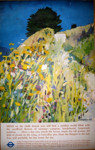
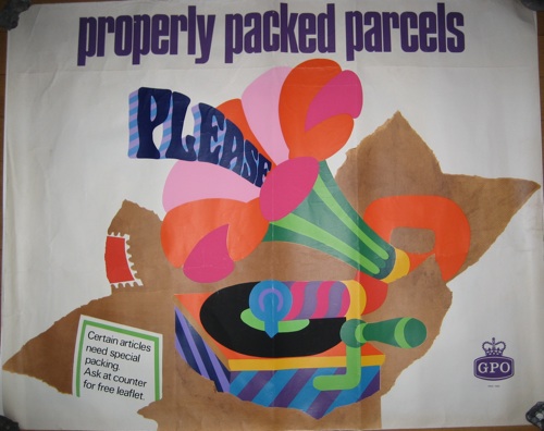
Having said all that, in the interests of balance I do have to report that a cruise through our posters, at least, also reveals a huge quantity of design which does not conform to this theory in the slightest – take this 1967 London Underground poster as just one of many examples.
The British love of both landscape and whimsy tends to trip up the modernist impulse in graphic design perhaps more than in other places.
Then there was psychedelia to take on board shortly afterwards to boot.
So perhaps the argument holds more true for interiors. Or perhaps it’s not the case at all. But I would like someone elses’s thoughts please.

Very interesting subject, and one I remember discussing during my Design History degree in seminars. Gaining a true and accurate view of post war design as a whole picture we need to include a wide range of stylistic themes, which often get brushed under the carpet by design history writers, in favour of looking for the ‘modernist’ linear history. For instance, I argued that the rustic ‘Tavern’ style, so popular in working class homes in post war Britain (e.g. horse brasses, stone clad fireplace. fishing nets & glass floats, pottery shire horses..etc) never gets mentioned, although I distinctly remember this being very much part of my childhood home and other friends homes.
I think the likes of The Deign Council & the Design Research Unit http://www.creativereview.co.uk/cr-blog/2010/october/design-research-unit-1942-72
had an impact on design by almost creating a ‘modernist puritanism’ agenda, which in theory was stripped down beauty in simplicity, more akin to scientific data research than aesthetics.
The Sainsburys graphics are a classic example of this ‘good taste’ DRU aesthetic wrapped in a MOD colour palette.
Food for thought?
It’s funny, I completely agree with you that the modernist version of history is always the one that I found myself fighting against. And yet, when it finally comes to the point where the modernists get what they want, they seem to swerve it entirely. At least I can’t find them dancing a wild jig of celebration anywhere, they get diverted by America and Pop and all sorts of glittering baubles like that.
I love the idea of 60s Tavern as a design style, that’s very true. The National Gallery did an exhibition a while back on The Haywain in domestic interiors, which exhibited everything from tea trays to lampshades. I think that’s part of the same, almost unreported, thing.
Funnily enough, I’ve just been writing about similar things in the 1950s (for my forthcoming Shire book, plug plug plug). Then the design elite were promoting neo-Scandewegian contemporary design, and that’s pretty much all you read about now. But there were all sorts of other things going on, from John Piper romanticism to American realism, but they don’t get mentioned