A slight digression today, but as I shall be producing a wide range of 1950s graphics to support my case, I think it’s probably allowable.
For the last few months I’ve been writing a small book for Shire about 1950s Modern, looking at all the different ways that being modern was expressed in the design of the time. And frankly, my retinas have been so seared by all the technicolour involved that they are only now starting to recover.
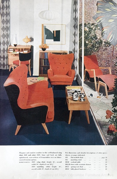
This is G-Plan in the mid 1950s, adhering to the then universal tenet that one colour simply isn’t enough, and that the real fun in interior design is to be had with contrast, the bolder the better.
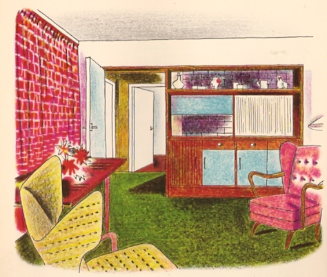
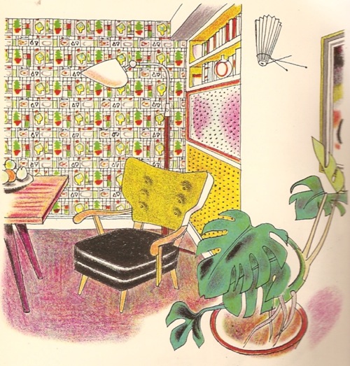
Want more proof? Here is my prize exhibit, Noel Carrington’s 1953 book Colour and Pattern in the Home, which is so wonderful that I could quite happily scan the whole thing for your entertainment.
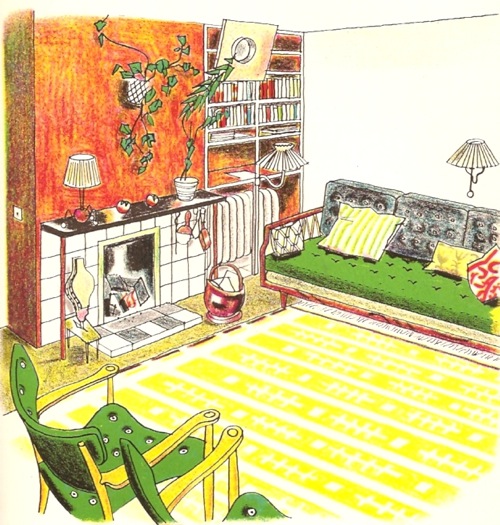
The illustrations are lithographs by Rowland Collins and are wonderfu in their own right. But he’s not off drawing only the most avant-garde of houses – the interior above is in a doctor’s house in Tunbridge Wells, hardly a hotbed of revolution. While below is the living room in a Georgian house in Norfolk.
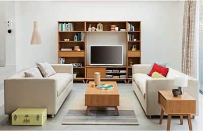
What struck me most after a couple of weeks of staring at this kind of thing, is how completely we have managed to forget 1950s colour. There is a complete deluge of splay-legged, contemporary-styled furnishings out there to be bought, so much so that it’s a wonder that the retro antiques trade still exists. But almost none of it is bright. Here’s John Lewis’s current contribution to the flood.
While here is another one by a company called Plumo.
By way of reminder and contrast, here’s another image from Noel Carrington.
There seems to be an almost complete amnesia about the high colour levels of the 1950s. Instead, they have been replaced with a palette of grey, oatmeal and a slightly sludgy moss green. The irony is that these are the colours that 1950s designers set themselves against, as one designer remembered. ‘The days of varnish, brown paint and porridge wallpaper were served notice in 1951. We were no longer afraid to start with white and then use any colour or combination from the rainbow.’
Does this matter? On one hand it doesn’t at all. Of course fashion revives things with a different twist, and styles never come back quite the same. But I find it interesting for a couple of reasons. The first is a very simple one, which is that it’s a reminder that history isn’t a fixed account, but always being rewritten and reinterpreted. This applies to the visual sphere as much, if not more, than any other version. So when the 1950s were first characterised, the kitsch appreciation of the style focussed on atomic design and eccentric pattern choices, along with New Look clothing. Now there’s a demand for a more sophisticated kind of 1950s, that which would have been created by an architect furnishing his first house in Canonbury. But even then, it’s not a complete recreation, because the colour has definitely been drained away.
And I think this also tells us something about how we perceive history. Back in the 1950s, colour was seen to be the most modern thing there was. Not only did the birth of polyeurethane paints make it easier to put on the walls, new plastics meant it could also appear on everything from kitchen tables to dustpans for the first time.
This is Wareite, the British challenger to Formica, and one which got its name because it was made in Ware, Herts. I do wish people still named things this way.
So the home was bright then, very bright. But the thing is, colour is still something we see as modern now. Should you go shopping in John Lewis to find your retro furniture, you will also discover some pretty bright objects in there too (in some cases, like silicone kitchenware, also born from new materials too).
So if colour is modern now, it definitely couldn’t have been modern 60 years ago. Therefore we must look at the 1950s through a sepia-porridge filter in order to see what we want. Even if the reality was actually somewhat different.
I do think that the patch of pink at the back is the extra touch which marks out this design as being truly 1950s in its pursuit of contrast.
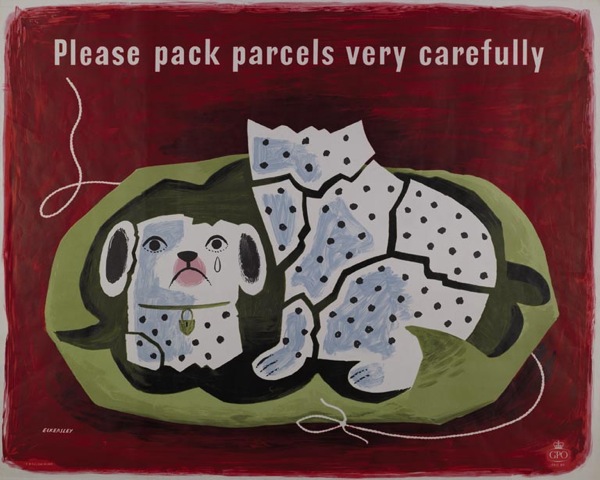
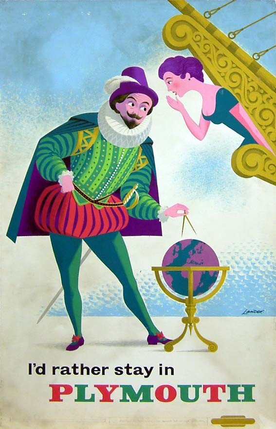
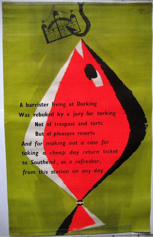
One final thought, is that despite years of looking at 1950s posters, I still find these illustrations startlingly bright. Which suggests to me that although poster artists of the time did use a fair amount of colour, unsurprisingly for an object which is meant to grab people’s attention, they never got quite as contrasty as the interior designers did.
There are a couple of exceptions to this. Lander was quite fond of some near-fluorescent colours on occasion.
As was Hans Unger.
But I wonder whether, perhaps, it just wasn’t the done thing. A good poster was meant to arrest the viewer’s attention by the wit and economy of its design. To do that by just using a bright colour or three would have been the easy route. In fact it would have been close to cheating. Not the done thing at all.



Interesting. I’d always thought of Designers Guild products as bright, but actually they are not when compared with your lithographs. http://www.designersguild.com/furniture-gallery/sofas/orbit
Whilst we’re on 50s furniture, I think you should treat yourself to a new kitchen in your next house. (This one has sold, but they come up regularly enough…)
http://www.ebay.co.uk/itm/English-Rose-Kitchen-1950s-Complete-Red-Retro-/200717588267?pt=UK_Collectables_Vintage_RL&hash=item2ebbb3572b#ht_500wt_1202
You are more right than you can possibly believe – I did used to have one of those kitchens in my old flat, but with a kind of tealy-turquoise worktop and handles, accessorised with a formica cabinet, tall 50s kitchen unit and black and white check floor.
I am now a respectable housewife, however, and so will probably end up with something very dull and practical from IKEA. If we ever find a new house for me to put one in that is.
A friend has just bought a 1950’s house and I am preparing to make quilt to suit the era. As baby boomers my husband and I tried to think of the colours of our childhood. Navy,black,grey,brown and of course camel (essential coat colour). Gradually though colour came into our lives with the shocking pinks greens etc of the petticoats. It just took our parents a time to catch up after the austerity of the war and to use the colours available.enjoyed looking at the mixtures of colour and pattern. Enough to make your head spin!
Hello there,
I was doing a bit of research on exactly this topic – colour in the 1950’s compared to the greige representations of MidCentury Modern we are currently seeing as “1950s style” – I totally agree with you! Would you mind if I attribute some of your thoughts in our own blog on Galapagos?
Thanks & Best wishes
Lucy
Thanks for both the comments – it’s always great to hear from people who actually experienced the times and the colour. And yes, of course, please feel free to use whatever you like!