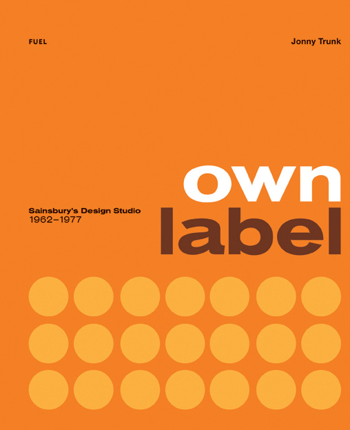
Today something alarming but also brilliant, the Sainsbury’s Own Label book by Jonny Trunk.
It’s alarming because I’m now old enough for people to be digging up forgotten bits of my past and selling it as retro. In this case, supermarket packaging.
We always shopped at Sainsbury’s when I was small, so these designs do have a Proustian whiff of being six years old for me.
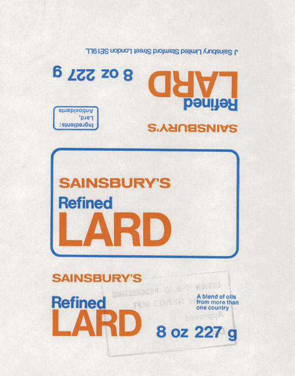
As for brilliance, the design speaks for itself, even if I wouldn’t fancy eating too many of the contents. But in a way, that’s a further compliment to the vision of the design. Who would feel today that a lard wrapper was worth spending good design time on? Not many people I suspect. (If you want to follow this thought further, there’s an interesting Creative Review article which compares the designs in the book to what’s on offer today, even if it does wimp out of the conclusion that most design now isn’t half as good.)
The book is also an interesting portal into a moment in design which doesn’t get spoken about as much as it ought to, particularly in terms of graphic design.
I’ve always thought of the period between about 1962 and 1967 as the brief moment when ‘proper’ modernism was finally taken on board by British designers, even if it was only an interlude between Scandewegian light wood and psychedelic curliques. This book is a reminder that while it might not have lasted for long, the takeover was total. What’s more, it wasn’t just high end manufacturers and poncey magazines embracing the style; instead it was part of the design of everyday life, just as good modernism should be.
Imagine a whole supermarket full of design of this force and ambition. It’s something I will probably never see again, and never properly appreciated when it was in front of me either.
The Sainsbury’s designs in the book start in 1962 but go all the way through to 1977, although I imagine that the most striking designs here date from the earlier period of the studio’s work (somewhere I have an early 1970s Party Dip package which is definitely more psychedelic than anything on show here). But I haven’t read the book yet, so will doubtless have more to say when it does arrive. Here’s a preview of just a few of the delights inside.
I thought I’d mention it in advance though because it is a limited edition print run. A few copies are available from the designers, Fuel, or you can wait until Amazon get their copies in. But once they’re gone, they’re gone.
While you wait for your copy to arrive, it’s also worth reading Jonny Trunk’s account of how the book came to be. I tend to believe that the most interesting ideas come out of people following their own eccentric enthusiasms rather than making a calculated decision about what other people are interested in, and this is a classic example of that happening. Well done that man.
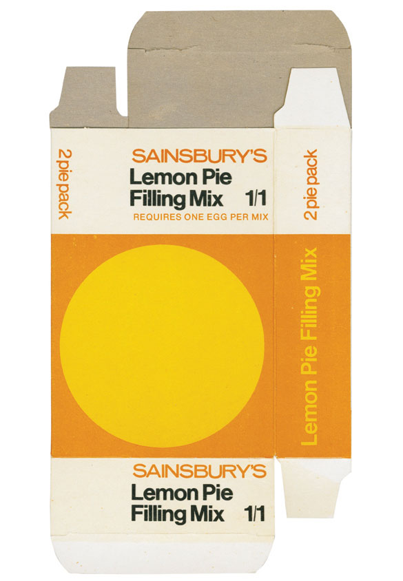
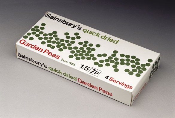
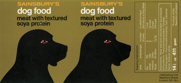
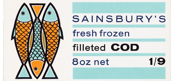
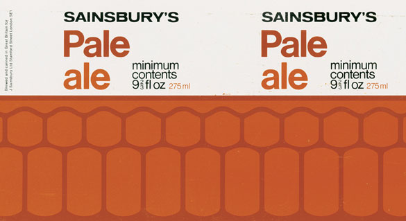
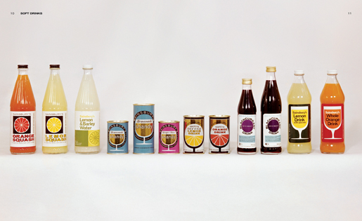
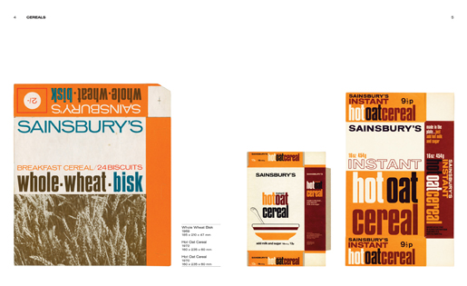
The Sainsbury’s designs are so stripped back at times they verge on being all but minimalist though for me the (over) use of orange limits the impact a little. In the examples like the peas and some of the drinks lables where green or lilac is used the designs really shine.
I think I agree with you there. In an amazing piece of speed delivery the book, ordered yesterday, came in the post this morning, and there is actually a lot more variety in the designs than the previews might lead you to believe. There is a wider range of colours (and a greater minimalism in the earlier stuff, while the tide of orange and brown really just spreads over the 70s designs. But then that was what the 1970s looked like.
True and I guess orange was/is the Sainsbury brand colour. May have to order a copy myself
It’s has provided us with a fair bit of entertainment today, some of a graphic design variety, some of a ‘who on earth would want to eat that??’ kind.
But the orange and brown poses an interesting chicken and egg kind of question. Did Sainsburys use it in the 1970s because it was such a 1970s colour scheme, or did the 1970s partly look so orange and brown because of Sainsburys?
Oo. The shelves are creaking in anticipation of this addition.
There’s a lot to like when you get the actual book. Not just the packaging, or even the paper and plastic bags, but also some wonderful period photographs of brand new modern supermarkets in the 1960s.
The book is already ‘Temporarily out of stock’ according to the Fuel website – so you’ve clearly done some good free advertising for the author!
I’m ashamed to say that it never crossed my mind that supermarket own brands would have their own teams of designers. I thought these slabs of oranges and browns just happened – it is slowly dawning on me that someone consciously chose to colour the seventies brown and orange. What was this person thinking? Did this person ever realise that they would ‘colour’ a decade in the minds of thousands of people?
My instinct was that many of the individual packaging designs are overly simplistic or even childish. When, however, you see some of the product ranges, you start to see some of the cleverness of the designs – almost like a jigsaw puzzle whereby the individual pieces can’t be appreciated. I can’t think of many other instances where the more you see of it, the better it seems to be – am I alone in this view?
The only criticism I might have of the book is that it would have been nice to see even more photos of the products on the shelves, for exactly the reasons you say.
And there’s a brilliant comment about this on the Creative Review article, too:
“as a former employee i can attest that there was no finer way to spend thursday and friday evenings, and saturdays in the mid to late seventies manifesting physical warholian repeat patterns stacking bracknell’s shelves regimentally with sainsbury’s own label products “.