Not small.

Having said that nothing new and interesting has turned up for a while, I am just about to prove myself wrong.  But that’s probably a good thing.  At least I think it is.

Anyway, I was looking at the V&A’s collection of Empire Marketing Board posters (as anyone might do on a quiet afternoon) and my search turned up this.

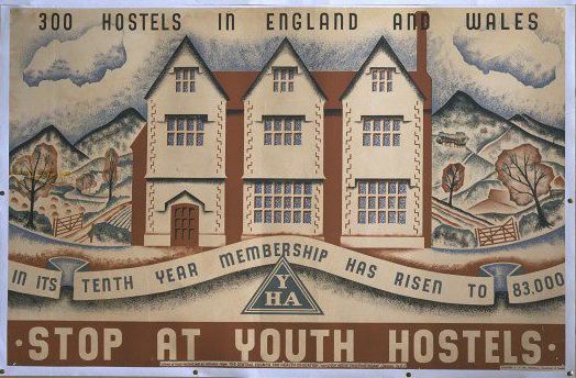
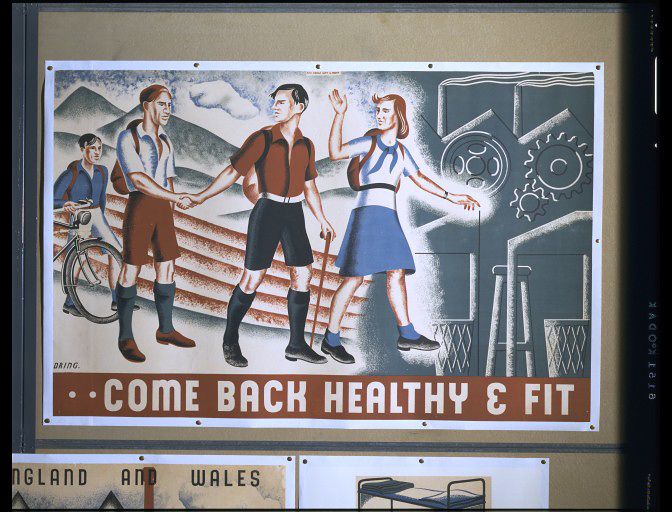
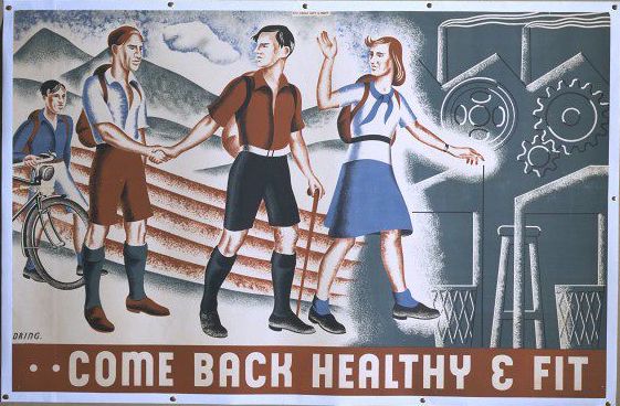
Lilian Dring Youth Hostel Poster 1940

Or rather these, as there are three images in the one record.

Lilian Doing Youth Hostel Association poster 1940

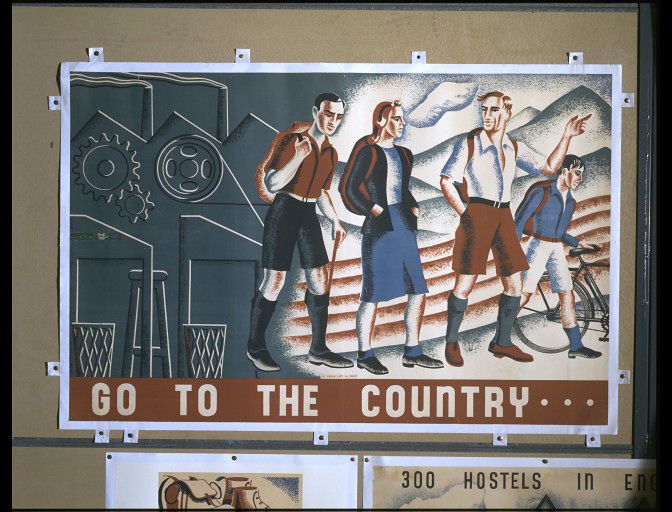
Lilian Doing Youth Hostel Association poster

The description is:

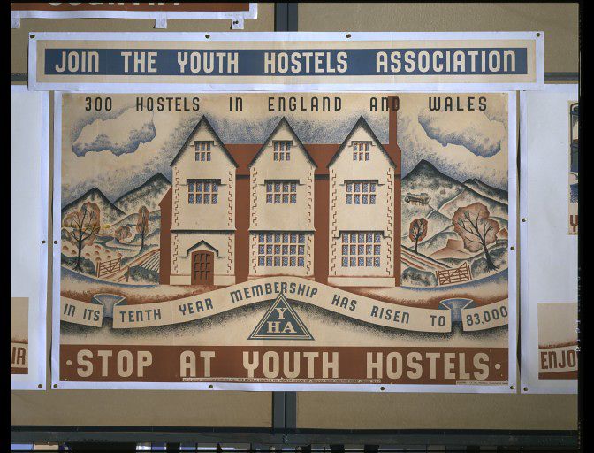
Join the Youth Hostels Association. Poster, originally printed on 7 sheets, 2 of which were later cut by the artist, issued by the Central Council of Health Education through the Agency of Abbey Arts Ltd.

They were designed by Lilian Dring (which auto-correct wants to change to everything but her actual surname), and produced in 1940, all of which is fascinating for at least three reasons.

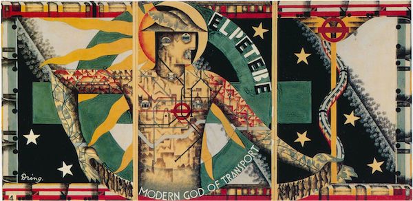
Firstly, there aren’t enough posters out there by Lilian Dring.  I’ve seen very few examples of her work at all, and yet she designed this amazing, albeit never used poster for London Underground.

Lilian Doing modern god of transport London Transport poster

It’s brave, it’s heroic, its modernist – and by a woman designer.  I think she should have been as famous as McKnight Kauffer.

On top of that, these posters were produced in 1940.  At this point, almost all commercial poster advertising was prohibited, and the Ministry of Information was pumping out posters of every which kind telling the British population what to do, join, eat and save.  It’s really quite surprising to find another government body engaging in what could be seen as inessential postering on this scale; I genuinely had no idea that this had happened.  It makes me wonder what else got advertised in the first year or two of the war – and that’s quite an important question.  In the later years of the way, people complained about the omnipresence of propaganda.  But if, in 1940, the government’s poster efforts were surrounded by other kinds of messages, it would have made their impact very different.

But one more interesting detail – to me the most fascinating one of all – is lurking in the object history note.

The poster was printed to the same format as the Empire Marketing Board posters on the hoardings for which it was placed in November 1940.

Now one of the many notable things about the Empire Marketing Board poster campaigns were that they were designed for their own, unique, set of hoardings.  I’ve written about them in detail elsewhere but they were elongated and set apart, designed to take a very specific set of formats.

Austin Cooper vintage Empire Marketing Board poster set Order by Telephone

That’s three 60 x 40″ 4-sheet posters, two 40 x 25″ Double Royals and then a title strip at the top, in this case by Austin Cooper.

And if we look at the full pictures in the V&A’s catalogue, not only do the Dring posters work as a sequence in just the same way, there are clearly three more in the collection which I’m guessing would fill the remaining slots perfectly.

Lilian Dring YHA poster 1940

Lilian Dring YHA poster 1940

Lilian Dring YHA poster 1940

All of which raises some ideas which I’d never really considered before.  The Empire Marketing Board had something like 1700 of its own poster sites in towns and cities across Britain, but it only produced posters between 1927 and 1933.  So what happened to those hoardings after the EMB ended?  Did they get taken down, or did they moulder and rot?  Or, as these posters suggest, were they used by other semi-official, non-commercial advertisers?  Because these posters were produced in 1940, seven years after the EMB stopped using them.  That’s a long gap, and suggests it was filled by something in the meantime. Will I ever know the answer to that?  Probably not.  But it’s still an interesting question.

When I started writing about these posters, that was the sum total of my thoughts.  But then, I thought, I should probably find out a bit more about Lilian Dring.  So I did.

Despite being one of the first students on the Royal College of Art’s Poster Design course, she ended up working in textiles.  Now, maybe textiles were always her one real love, I don’t know, but at the same time it’s a course which quite a lot of women end up following.  Step away from the big, dominant poster work, that’s for the men – instead why don’t you go off and do something a bit more, well, crafty?

I can’t help reading that kind of narrative into the story of how she changed direction.

She began stitching in 1931 on her mother’s hand-operated 1912 Frister & Rossman machine.  […]  Her early work, undertaken during the Depression and using scraps, included rag dolls, given as presents to friends’ children, and later the ‘personal pillows’ and ‘music cushions’,  which always illustrate articles about Lilian. Recycling thus became a major influence in her life and work.

Now Dring did go on to be quite avant-garde in her use of recycled stuff and I really like the sound of what she was doing.

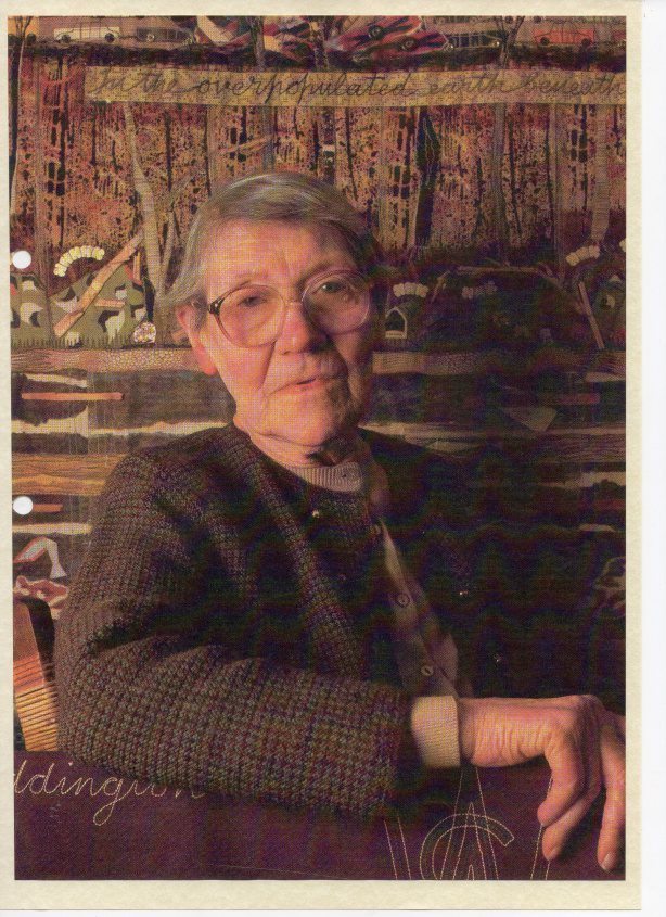
Her reaction to WW2 was illustrated by a piece called ‘Parable 1’ made in 1941 to cover a bombed out window, by then she may have been living in Twickenham, where she died in 1998.  It was in three layers with quotations from Exodus (20, v.4.): In the Heavens above: fighter planes and barrage balloons; In the Earth beneath: bombed-out buildings & ambulances; ‘And in the Shelters (sic) under the Earth: people sleeping in air-raid shelters.  She appears to have been deeply disturbed by both the destruction caused by warfare, and later by that caused by pollution of the environment.  Most of her work featured appliqué – […] and in a similar work, ‘Parable 2’ made in 1972 (the year after she made a red presentation stole for Canon Blair-Fish, the then Vicar) she used can-pulls, dead gladioli stems and even fur from her kettle.

Parable 2 is behind her in this picture, although I can’t identify the kettle fur in there.

Lilian Dring

I really hope she did exactly what she wanted to do – that textiles were her choice and decision, not something forced upon her by circumstance and the lean times of the 1930s.  At the same time, I can’t square those small scraps of reused fabric with the woman who created a set of posters too dramatic and expensive for even Frank Pick to produce, or even the expansive YHA posters.  Perhaps she had art in her that had to come out somehow, any which way she could find, and the world told her textiles, not posters.

Women artists and designers are so often made small in this way, pushed into work which can be marginalised or even ignored.  All that talent unseen, when it could have been stretched across the biggest billboards in the land; instead it hangs in private houses, or the far end of dark churches.  I hope she was happier than I am about it.


All quotes, and the picture of Lilian Dring, are from this website about embroidery in Surbiton, where St Mark’s church contains a number of ecclesiastical embroideries that she designed and made.
Pieter Huveneers

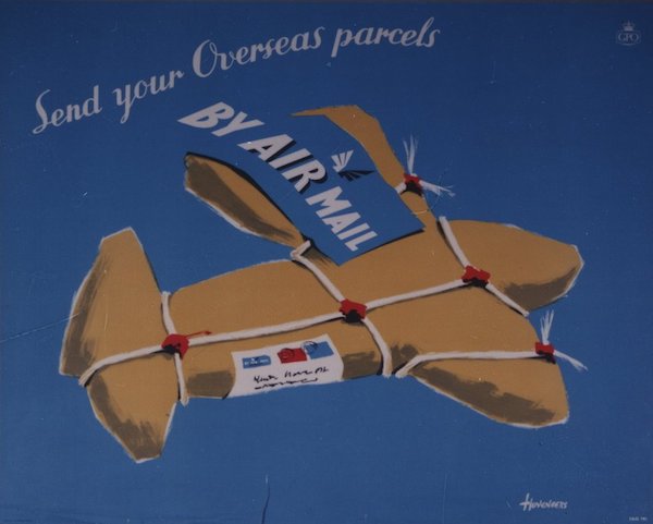
I’m really sorry to have to share the news that poster designer Pieter Huveneers has died on 14th June.

He was 92 and died in Australia, where he’d become one of the country’s leading design consultants, creating logos and corporate images for some of the biggest companies there.

During his time in Britain, he also designed some truly excellent posters.

Pieter Huveneers Royal Mail airmail poster

If you want to know more, I’ve written about his career in both posters and beyond here.

Two lives

Few things please me more than finding other people writing well about posters and poster people, particularly when it tells me something I didn’t know.  Which means that today I am very happy, because I can point you at not one but two interesting bits of the internet.

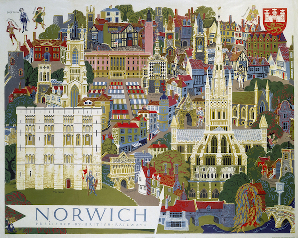
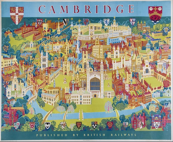
'Norwich', BR poster, c 1950sPoster produced for British Railways (BR) to promote rail travel to the city of Norwich, Norfolk. The poster shows a pictorial city view of Norwich's famous characters and buildings. Norwich Cathedral, the Norman castle and the cityÕs many medieval churches are all included. Artwork by Kerry Lee.

A while ago, I mentioned map poster artist Kerry Lee in passing.  This ended up in a conversation with Dick Raines, who has a number of Kerry Lee posters and very easily persuaded me how lovely they are.

Cambridge BR poster by Kerry Lee

Dick got back in contact a few weeks ago to say that he’d found a very good blog post about the life and work of Kerry Lee, on the blog of a small gallery that specialises in maps.

It’s a great piece of proper research, so much that it turned into two posts worth.  And as an added bonus, Kerry Lee seems to have been a really lovely man too.

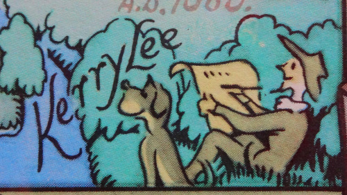
I won’t regurgitate it all here, because you really should go over and read it on the Bryars and Bryars website, but I do like the fact that he apparently included a small picture of himself, with a dog, in all of his maps.  Here’s their image of just one of these.

Kerry Lee and his dog

Now I want to go and look at every single other poster close up to find out if that’s really true.

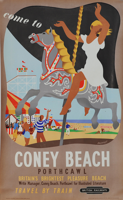
More recently, after the poster below came up in an auction, I also promised you a look at the life of the designer Mario Armengol, whose work it is.

Poster British Railways 'Come To Coney Beach, Porthcawl - Britain's Brightest Pleasure Beach' by Mario Armengol 1952, double royal 25in x 50in. Depicts a happy holidaymaker riding the carousel with the beach beyond

It turns out that Armengol was originally Catalan (and now I know that I can see Spanish echoes in the style of the girl on the fairground horse; she has little resemblance to anyone else on a British seaside poster).  After a complicated set of events involving the Spanish Civil War and the French Foreign Legion, he ended up in Britain as a refugee in 1941, then stayed in the country for the rest of his life.

As well as designing the poster above, he was a talented and prolific cartoonist, and worked for the CoI during the 195os, so may well have designed other, anonymous, posters.

Again, I’m not going to say a great deal more than that, because someone – I am guessing a family member – has put together a website of his life and work which includes a comprehensive biography which includes a great deal of information about his rather complex love life.  I can’t improve on that, so why don’t you go over there and read it instead?

Twinning?

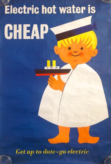
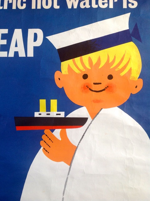
I do like a sharp-eyed reader.  Sheila got in contact to show me this poster, which she’d just bought on eBay.

Electric hot water is cheap poster 1950s

It’s great, isn’t it.  But I can’t tell you anything definite about it, because it isn’t signed.  Sheila, however, has a theory.

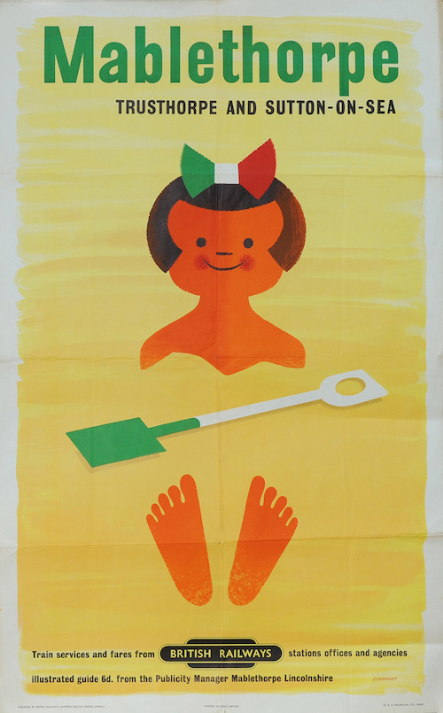
Compare and contrast with this, which is a Tom Eckersley classic.

Poster - 'Mablethorpe - Trusthorpe and Sutton On Sea' by Tom Eckersley (1959) double royal 25in x 40in. Depicts a smiling cartoon girl half buried in the sand. Published by British Railways Eastern Region

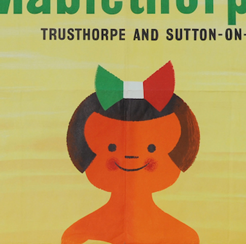
These children are, if not twins, then certainly close relatives.

cheap electricity head shot

mablethorpe head shot

So is this a hitherto unknown Eckersley?  Well it might be.  The construction of the faces are almost identical, and so little is known about British commercial posters of this period that I wouldn’t be at all surprised at all if an entirely new poster turned up.

Equally, though – and this is Mr Crownfolio’s theory – it’s possible that another graphic designer saw Eckersley’s poster and rather liked the way that the face had been done.  So when he or she got the right commission which involved drawing a child, they took some inspiration from the Mabletherpe little girl.

One possible way to sort this might involve going through a complete set of graphic design and poster annuals for the late 1950s and seeing whether the electric hot water poster is mentioned at all.  Sadly I can’t volunteer, as we don’t have a full set.  But if anyone else wants to have a go, or has any other theories or knowledge about this poster, do let us all know in the comments below.

Sunny Cheshire by any other name

After more than four years, I have to admit that Quad Royal rambles on a bit.  One day I must make some kind of attempt to index it or at least make it easier for the casual visitor to find their way around.

But the advantage of there being so much back catalogue is that, every so often, Google brings in an unexpected visitor and I discover something new.  Which is what happened recently on a perfectly workaday post about a long-since-departed railwayana auction.

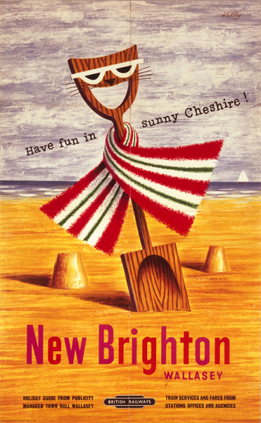
I was writing about these posters.

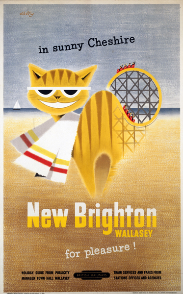
New Brighton/Wallasey - Have Fun in Sunny Cheshire', 1956.British Railways (London Midland Region) poster. Artwork by Ken or Felix Kelly

New Brighton, Wallasey, for Pleasure!Õ, BR (LMR) poster, 1954. Felix Kelly

They weren’t even in the auction but I do love them so and would still very much like to own them, but I digress.

Almost exactly three years after I wrote the piece, this appeared in the comments.

The Sunny Chesire posters were not done by Felix Kelly but rather Kenneth Roy Kelly MBE, my grandfather. I have the original artwork hanging on my wall. He also did TWA advertisements as well as designing the Popsicle logo.

This surprised me quite a bit, because these two posters are ascribed to on the NMSI database (which I use because it works better than the NRM one, but I’ve gone on about that before now and may well do again some day).  But then when I looked a bit closer, the attribution did look a bit suspect, because this is the only other poster down as being his work.

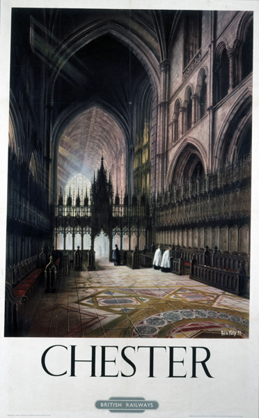
ÔChesterÕ, BR (LMR) poster British Railways (London Midland Region) poster. Interior of cathedral with choir stalls and organ front in north transept. Artwork by Felix Kelly.

You’d be hard pressed to claim it as related in any way.

And in fact when I read the NRM blurb very carefully, the maker may be down as ‘Felix Kelly’ but the description says it is by ‘Ken Kelly’.  So we are all very confused.

Google knows very little about Kenneth Roy Kelly, except that he got his MBE for services to defence heritage.  And there’s a fantasy artist called Ken Kelly so that’s any more detailed searches on the subject doomed.

Nonetheless, between the Quad Royal archives and the magic powers of Google, we have added very slightly to the sum total of human knowledge.  And I’ve written back to Roy Kelly’s grandfather to see if we can have a look at some photos of that original artwork and then perhaps I will be able to tell you even more.

Further Krolleries

A brief post today, simply to share something which came in via email this week.

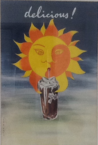
Stan Krol artwork for iced tea

It’s an original piece of artwork by Stan Krol, designed to advertise Iced Tea (at least there’s a piece of paper pasted on the back, saying Iced Tea, so that seems like a reasonable assumption).

Now as I have said very many times before, it’s always great to see an original piece of artwork, simply because so few survive.  And in this case, it’s doubly lucky because it was found in a charity shop by a couple, Delia and Mike Allen, who realised that they had something interesting and did a bit of research to find out what it was.  So I think we can all give a hurrah for things surviving and being recognised.

But I do have to admit that my heart is not entirely full of joy.  Because do you know how much the finders paid for that lovely piece of original Stan Krol artwork?  Three pounds.  Three whole pounds.  I cannot tell you how envious I am.  Nothing goes for three pounds in the charity shops round us, never mind then getting an original piece of art work for that little.  If anyone knows where there might be other bargains like that,  can you let me know.  Please.