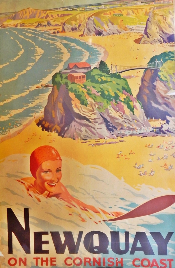
Palaver

In writing about Lilian Dring, I returned to the subject of Empire Marketing Board poster hoardings with their fantastic and unique layout

Empire Marketing Board posters as complete strip

It’s been a while since I considered this properly , so I set off into the internet to see if there was new research and the change to find out more.  I have now returned, clutching information.

The first thing to tell is that there were lots of hoardings, and they were all over the place.  By 1933, the EMB had their specially designed frames in 1,700 locations, which were always in towns and cities to maximise the number of people who saw them.

Cheap ‘solus’ sites were preferred, at railway termini and outside factory gates, government and municipal buildings, avoiding the need to book space on ordinary, commercial hoardings.

But these mammoth poster boards weren’t the only means of publicity.  Much like government posters in the Second World War, the Empire Marketing Board put posters wherever they could.  They produced window bills and cards that could be placed in car windows, Scouts and Guides were recruited to distribute their material, and posters were sent to schools, post offices and theatres.  In many ways the poster campaign does look like a dress rehearsal for the poster onslaught of the war.

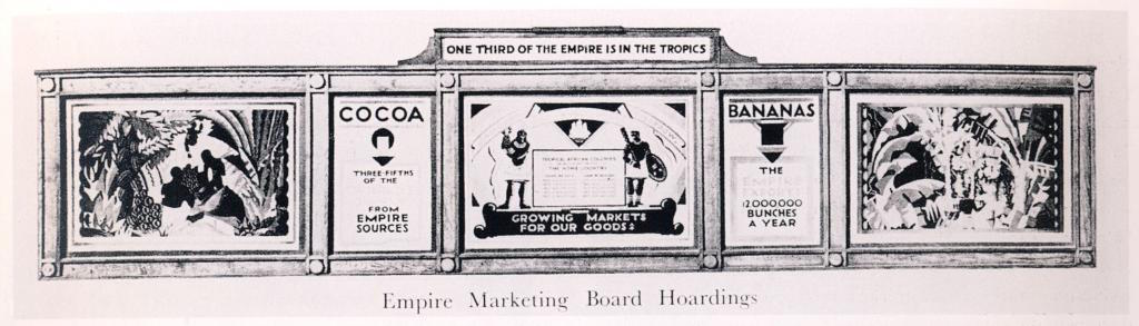
But the most exciting thing I found is this picture.  It’s an actual photograph of an actual Empire Marketing Board poster site at work – taken, it seems, by an individual rather than for publicity purposes.

Empire Marketing Board poster on street

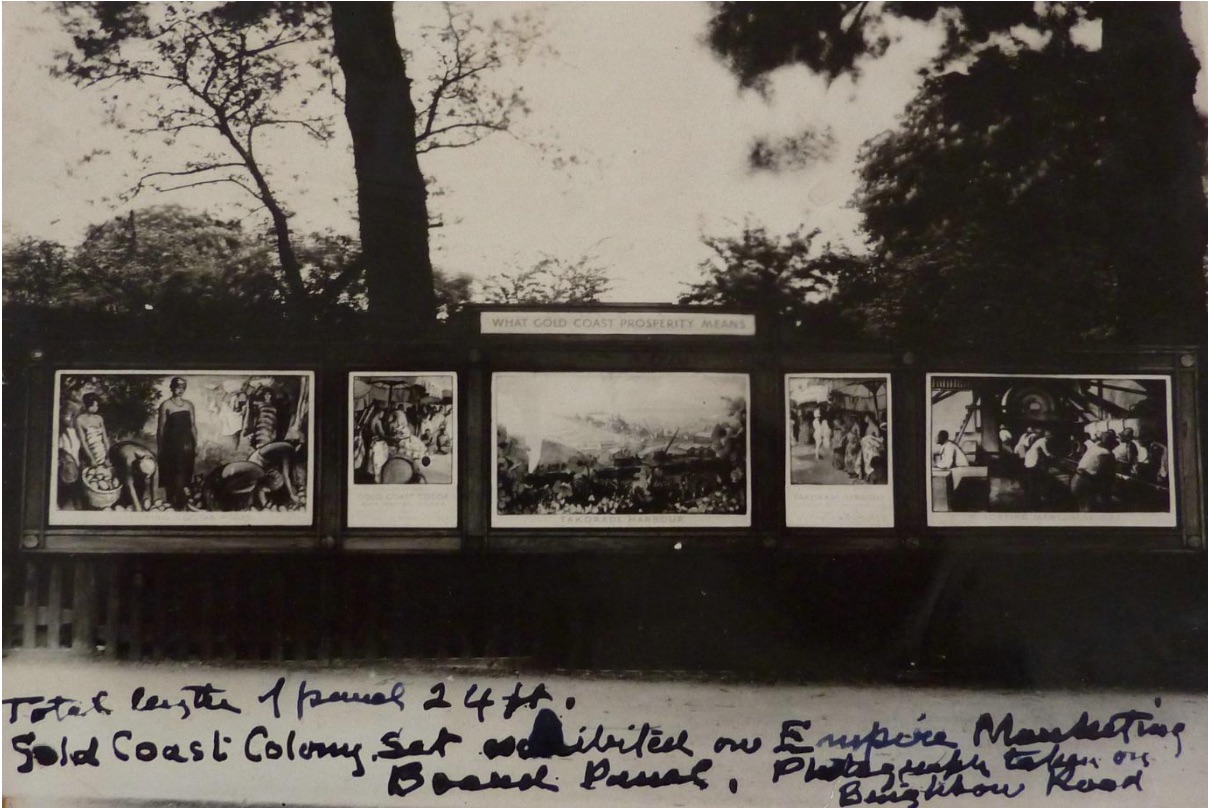
Clearly an interested individual though, judging by the notes about length and the individual posters.

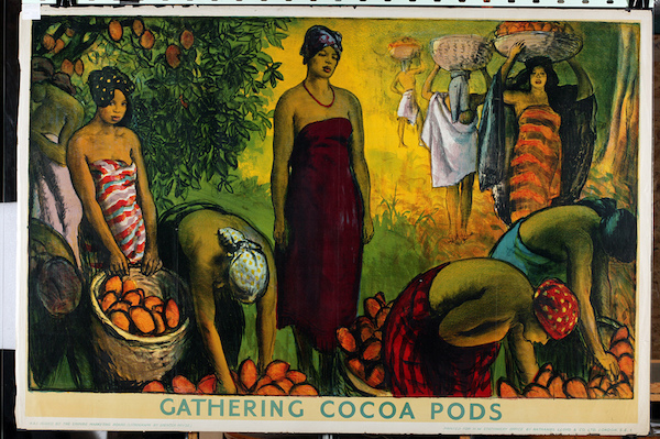
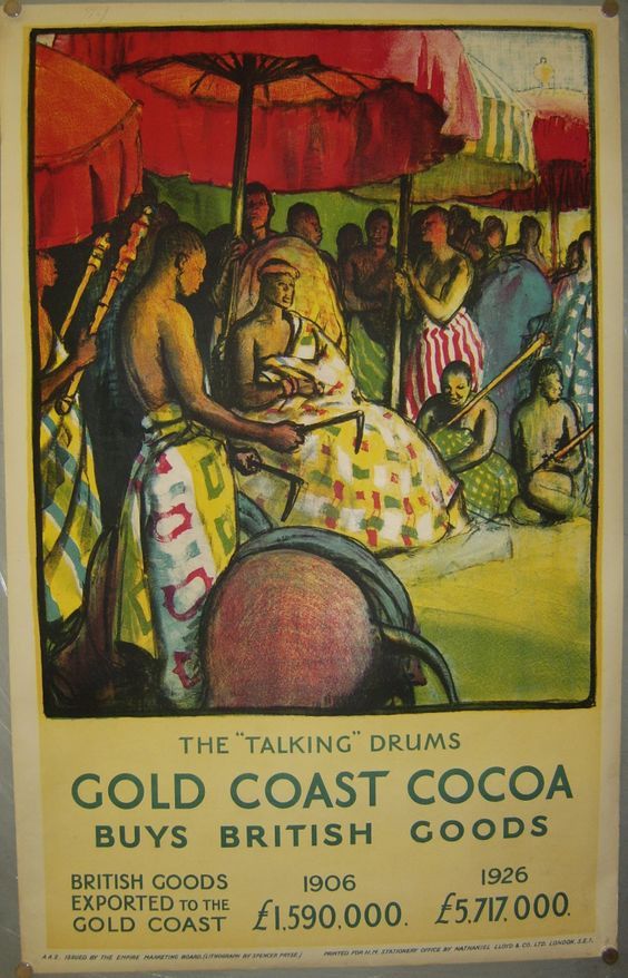
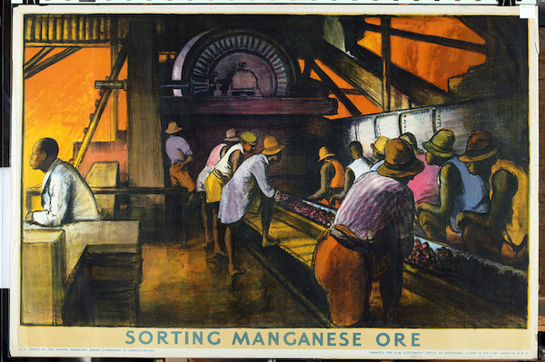
The series on display here, about the Gold Coast (now Ghana), and how it was being improved by the actions of the British Empire, is the work of Gerald Spenser Pryce.

Sorting Cocoa Pods - - Empire Marketing Board poster Gerald Spenser Pryce Gold Coast prosperity

Three of the posters are in the collection at Manchester City Art Gallery who have, in a pleasing act of openness, put all of their Empire Marketing Board collection up on Flickr.

Talking drums Gerald Spenser Pryce Empire Marketing board

I’ve managed to find a fourth on Pinterest, so am currently only missing the central image, but the photograph shows the title which is Takoradi Harbour, and it seems to be a wide shot of the harbour buildings, which, the next poster tells us have been bought by the British.

What’s really interesting about seeing this set in situ is it makes me realise how the viewer is meant to interpret the posters.

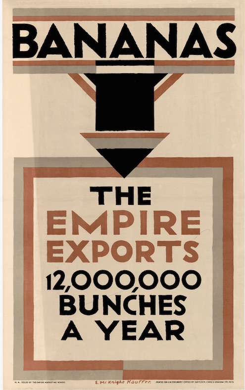
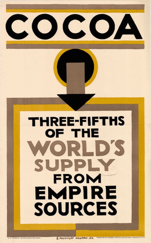
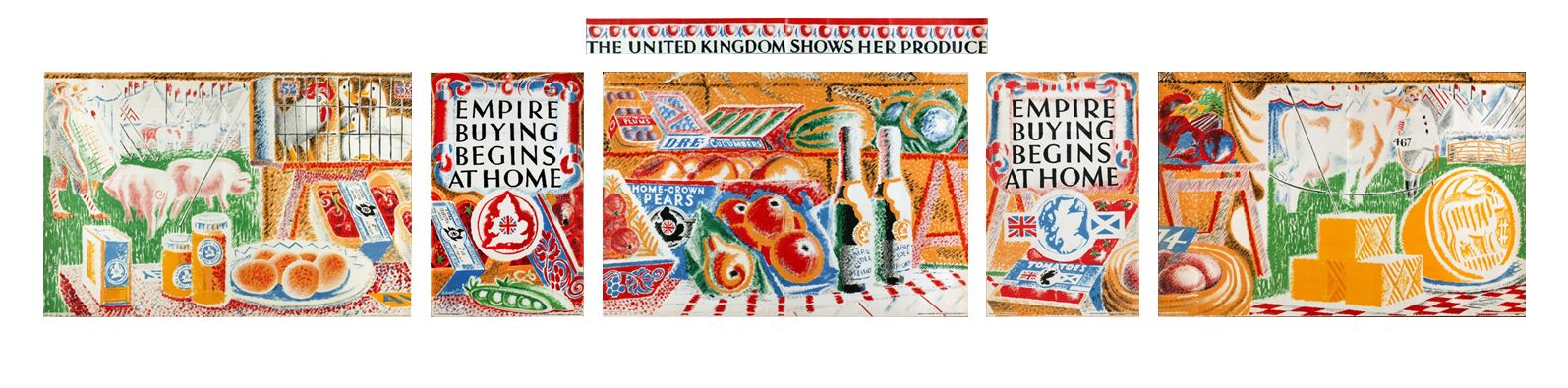
Many of the Empire Marketing Board’s artists turned the set of posters into one giant display, like the Paul Nash above, or this Austin Cooper.

Austin Cooper vintage Empire Marketing Board poster set Order by Telephone

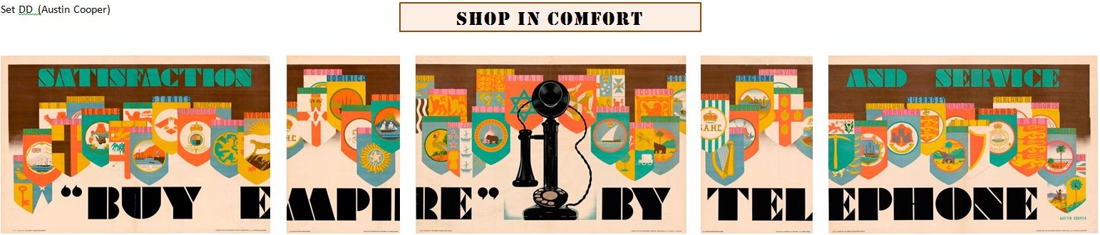
Both of these connect the whole design across the poster, and are conveying a very simple idea about how to shop.

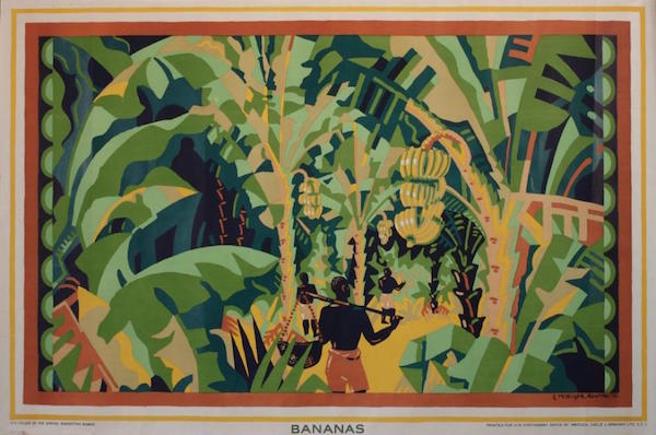
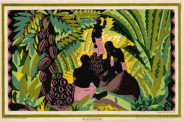
Pryce’s message is more complex, and so is the way his series of designs work.  Instead of being unitary, the viewer is meant to read them from left to right, taking the sequence of posters as though it were a comic strip.

So as well as all the facts about Empire Trade and harbour building, they are also telling a story.  This begins with the hard and basic labour of harvesting cocoa pods, and we see a relatively un-modern society which communicates by the talking drums.  But then the British arrive and build a modern new harbour, and the Empire, in the form of an officer in white tropical uniform with a particularly unfeasible hat, now talks to the native chiefs as well.

Takoradi Harbour - - Empire Marketing Board poster Gerald Spenser Pryce Gold Coast prosperity

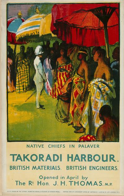
The result, in the final poster, is that the inhabitants of the Gold Coast, the lucky recipients of the benefits of Empire, have been brought into the modern, mechanised world.

Maganese Ore - Empire Marketing Board poster Gerald Spenser Pryce Gold Coast prosperity

They are so lucky that they have also acquired hats, and more Western clothing, along, it seems with a managerial class – seen on the far left of the poster.

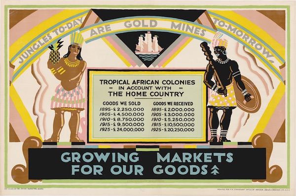
Now, generally, my feeling has been that the advertising of the Empire Marketing Board has received more flack than it deserved.  Yes it was the product of a colonial and unequal society, and yes some of its posters were undeniably racist.  But many of its posters appear to be more neutral and egalitarian – and this is particularly true of the more modern sets of posters, by people like Cooper and McKnight Kauffer which are the ones, inevitably, which I and other design historians tend to gravitate, because we are like crows and like shiny glittery things.

This series makes me more uncomfortable, because it’s dramatising the underlying ideology of empire and of empire trade.  It’s easy to dismiss simple racism when it crops up in the images, because we don’t do that any more.  But Spencer Pryce’s posters tell of a more subtle process, of exploitation and asset stripping, which is in some ways harder to look at.

The lesson is, look harder at the things which we think are unworthy, or which don’t fit our narrative of modernity.  Sometimes there are more interesting things to be learned than the bright slogans of modernism can show us.


This post is brought to you almost entirely by firstly a paper called ‘Food and the Empire Marketing Board in Britain, 1926-1933’ by Peter Atkins, and also by a PhD thesis written by Tim Buck.  He’s the person who found the picture, but I can’t trace him anywhere, so I hope he doesn’t mind me borrowing it.  His thesis also suggests that Spencer Pryce may have had some reservations himself about the process of modernisation when he undertook a research visit to Africa, but that’s a whole other kettle of fish.  The final poster picture comes from Books And Things, via Pinterest.

For Their Eyes Only

I’m battling with a post about auctions at the moment, but sense is eluding me.  So while I sort myself out, why don’t you take a look at this pair of posters.  Although they’re not very cheery.

Protect and Survive residential street before bomb

Residential street after bomb damage 1958 civil defence poster

The images were sent to me by Mark T, who found them in an old hospital over twenty years ago and has hung onto them ever since.  He actually has the full set of eight – here’s another happy image (borrowed from this website which has a thoroughly comprehensive exposition of the Protect and Survive programme of that era).

civil defence bomb damage poster 1958

I’d never seen these posters before, although when I search for them, they are in the collection of the Imperial War Museum, which tells me that they date from 1958.

But quite apart from the shock value, they interest me for two reasons.  One is that you can’t look for something if it’s not there.  What else are we missing that we do not know is there?  I suppose means that one day I should just put the keyword ‘poster’ into the IWM collection and see what turns up.  If I’m gone for a long time, you’ll know why.

The other point, though, is that not all posters have the same audience.  What is fascinating about this set is that unlike most posters they were definitely not meant to be seen by everyone.  At a time when government advice for what to do in a nuclear attack was to put two doors against a wall and batten them with luggage, these posters are telling the unvarnished truth about what would actually happen if a bomb did fall.  Look at this poster.

city centre nuclear bomb damage civil defence poster 1958

A door isn’t going to be much use there, is it?

It’s no surprise really then that these were found in a hospital.  These are the people who would have needed to know the scale of the damage and how many people would be injured; quite possibly this was where the Civil Defence Planning Meetings were held.  But very few would have seen the posters at all, because only a very select few were meant to know how bad it was going to be.

A Bauble

I am here really, just rather busy.  There is a post imminent, but in the meantime, have this.

Harry Stevens Christmas Greetings BPMA 1956

It’s an unfinished Harry Stevens design, courtesy of the BPMA.  Circa 1956, apparently.

Sunny Cheshire by any other name

After more than four years, I have to admit that Quad Royal rambles on a bit.  One day I must make some kind of attempt to index it or at least make it easier for the casual visitor to find their way around.

But the advantage of there being so much back catalogue is that, every so often, Google brings in an unexpected visitor and I discover something new.  Which is what happened recently on a perfectly workaday post about a long-since-departed railwayana auction.

I was writing about these posters.

New Brighton/Wallasey - Have Fun in Sunny Cheshire', 1956.British Railways (London Midland Region) poster. Artwork by Ken or Felix Kelly

New Brighton, Wallasey, for Pleasure!Õ, BR (LMR) poster, 1954. Felix Kelly

They weren’t even in the auction but I do love them so and would still very much like to own them, but I digress.

Almost exactly three years after I wrote the piece, this appeared in the comments.

The Sunny Chesire posters were not done by Felix Kelly but rather Kenneth Roy Kelly MBE, my grandfather. I have the original artwork hanging on my wall. He also did TWA advertisements as well as designing the Popsicle logo.

This surprised me quite a bit, because these two posters are ascribed to on the NMSI database (which I use because it works better than the NRM one, but I’ve gone on about that before now and may well do again some day).  But then when I looked a bit closer, the attribution did look a bit suspect, because this is the only other poster down as being his work.

ÔChesterÕ, BR (LMR) poster British Railways (London Midland Region) poster. Interior of cathedral with choir stalls and organ front in north transept. Artwork by Felix Kelly.

You’d be hard pressed to claim it as related in any way.

And in fact when I read the NRM blurb very carefully, the maker may be down as ‘Felix Kelly’ but the description says it is by ‘Ken Kelly’.  So we are all very confused.

Google knows very little about Kenneth Roy Kelly, except that he got his MBE for services to defence heritage.  And there’s a fantasy artist called Ken Kelly so that’s any more detailed searches on the subject doomed.

Nonetheless, between the Quad Royal archives and the magic powers of Google, we have added very slightly to the sum total of human knowledge.  And I’ve written back to Roy Kelly’s grandfather to see if we can have a look at some photos of that original artwork and then perhaps I will be able to tell you even more.

Dispersed

There’s an undervalued poster coming up at a provincial auction in Cheltenham (and the auction’s tomorrow – Tuesday – sorry about that).

Harry Riley (1895-1966) 1950's British Railway advertising poster "Newquay on the Cornish Coast", 63cm x 101cm

Given that this Harry Riley poster usually goes for well north of a grand, I am expecting it to fetch more than the £100-200 estimate, even taking into account its charming mis-attribution to British Railways and the 1950s.  There are another two Harry Riley posters thrown in with it too, just to make it even more of a bargain.

There’s another of his posters on offer too, with a similarly daft estimate.

Harry Riley Ilfracombe railway poster

But that’s not the real news story.  Lurking further down the listings is an entire world of Harry Riley items.  There’s artwork, paintings and a multitude of family portraits.  These pictures are him in his studio with his daughter, Barbara.Harry Riley in studio with his daughter barbara sketches

There are cartoons and sketches.

Harry Riley national service cartoon

Scrapbooks and advertising material.

Harry Riley advertising sketch mens clothes

And even a gigantic pile of ephemera including his complete correspondence with the BBC.  I have to give you the complete description of that one because it’s fantastic.

Quantity of Harry Riley (1895-1966) ephemera including 1940’s letters from The British Broadcasting Corporation, Southern Television, Savage Club, 78rpm gramophone record “Harry Riley Cartoonist Corner”, quantity editions of Sketchpad and other Periodicals, quantity dinner menus and entertainment programmes including 40th Anniversary London Sketch Club and others and large quantity of Harry Riley illustrated menswear catalogues and other advertising material and ephemera (1 bag and 1 box)

But the auction is also very sad.  What’s on offer here – in a multitude of tiny lots – is an entire archive.  And it’s going to be broken up, which is heartbreaking, because once sold like this it will probably never be assembled again.  I hope the NRM are there and bidding, and bidding hard.  It would be a crime to let this disappear.

Hoarded

I’ve posted about the Empire Marketing Board posters before, both the ideological problem that they present, and their rather special hoardings.

I can’t even remember why I was searching for them again the other day, but in doing so, I turned up something I’ve never seen before, which is this.

Empire Marketing Board Hoarding with posters by McKNight Kauffer in place

It looks like some kind of contemporaneous photograph of an Empire Marketing Board billboard, with posters in place.  (This isn’t an ideal format for the blog, so do click on the image to enlarge it a bit).  But I have no real idea where it came from as it was on a forum with no provenance at all.

I can tell you however that the posters on there are by McKnight Kauffer and date from 1926.  The one on the right was sold at the last Onslows auction.

Kauffer Bananas Empire Marketing Board poster 1926

It went for £800, which is quite a lot of money, especially for something which is quite arguably racist.

And thanks to the Canadian archives that I mentioned in my previous post, I can also show you not just the other pictorial poster.

McKnight Kauffer Bananas Empire Marketing Board poster 1926 Cocoa image

But also the two text posters as well.

McKnight Kauffer Bananas Empire Marketing Board poster 1926 text poster

McKnight Kauffer Bananas Empire Marketing Board poster 1926 cocoa text

All that’s missing is the banner along the top, so you’ll just have to imagine that.

My searches also uncovered this Kauffer, which I have never seen before.

McKnight Kauffer gold mines Empire Marketing Board poster

And perhaps that’s not a surprise, because it not simply racist but imperialist and exploitative to a degree that is really quite shocking today.  All the more reason to look at it really.  Perhaps it needs to be in a few more books.