It’s not you, it’s me. Or maybe it’s them.

Even the least attentive people will have noticed a slight absence of content on Quad Royal recently.

A fair amount of this is because my brain has been tangled up in other things, like hoarding and the world of objects in general, as opposed to the tiny sub-set of that constituted by British posters and their designers.

The life of stuff - cover image

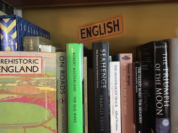
Now that the book has gone out into the world, I have moved on to wrestling with a whole mess of thoughts to do with paths, grass, chalk landscapes and Julian Cope, along with how we think of ourselves as British.

And yes, I know what you’re thinking and right now it doesn’t make much sense to me either. But I live in hope that it might yet turn into a communicable idea.  Perhaps.

None of this has left much time or spare head space for thinking about posters, but equally, whenever the guilt overwhelms me and I think I should write something, I don’t know what to say.  And I don’t think this is entirely my fault.

Some of it undoubtedly is the result of all my other distractions, and some of it is down to circumstances.  The more posters and poster-related stuff I see, the less chance there is of something new and surprising turning up.

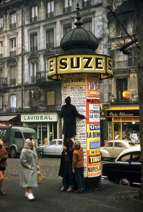
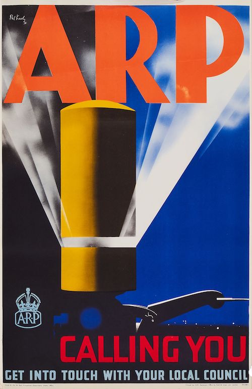
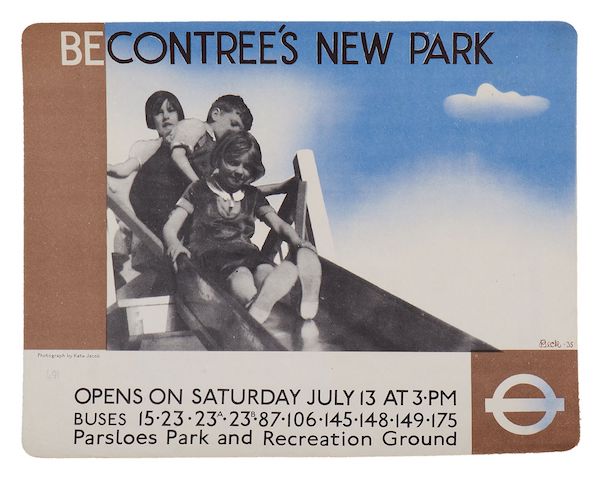
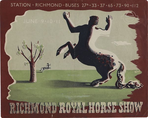
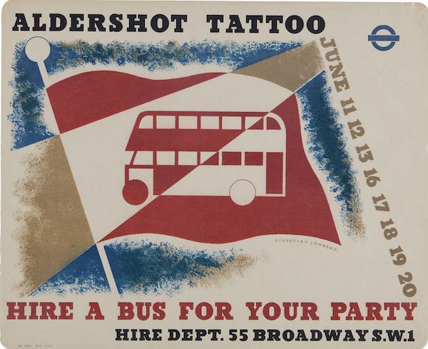
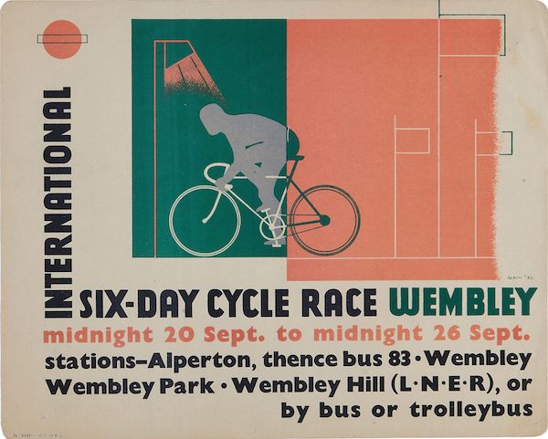
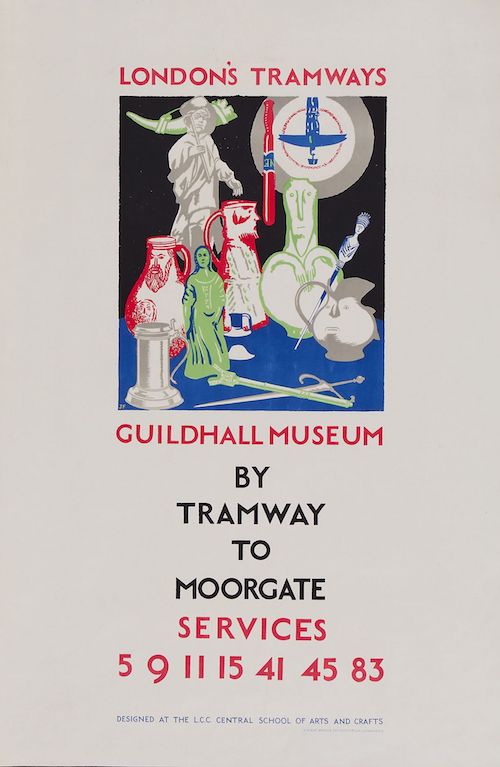
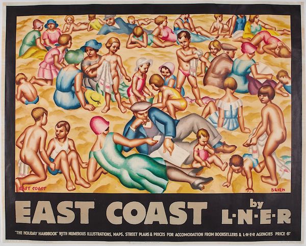
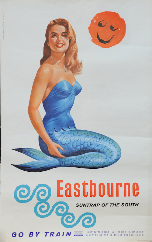
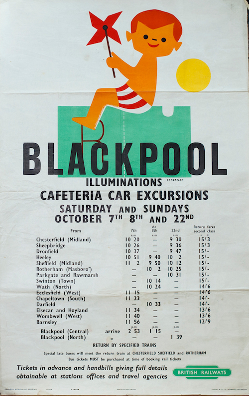
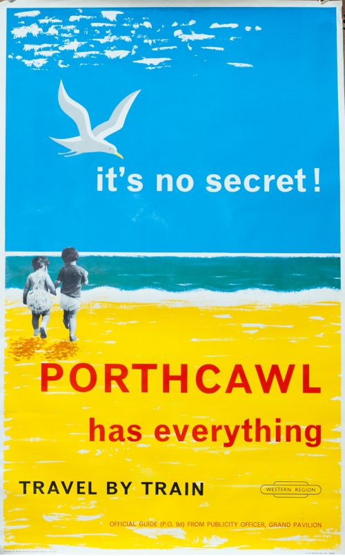
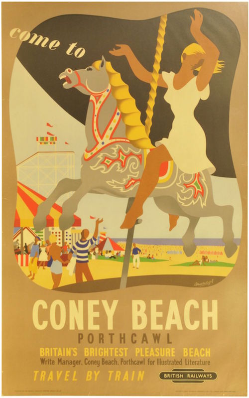
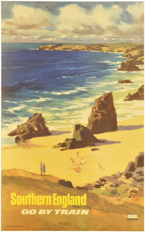
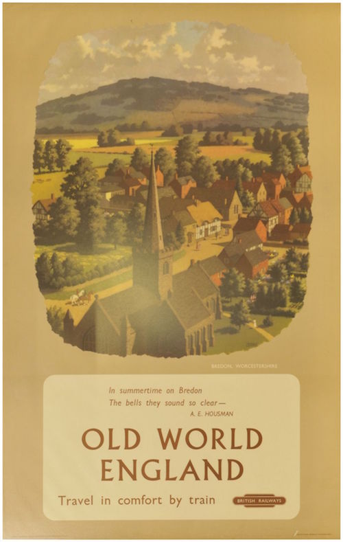
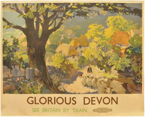
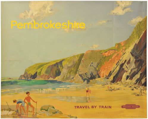
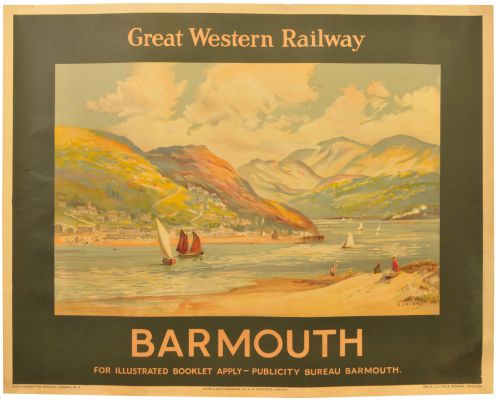
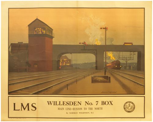
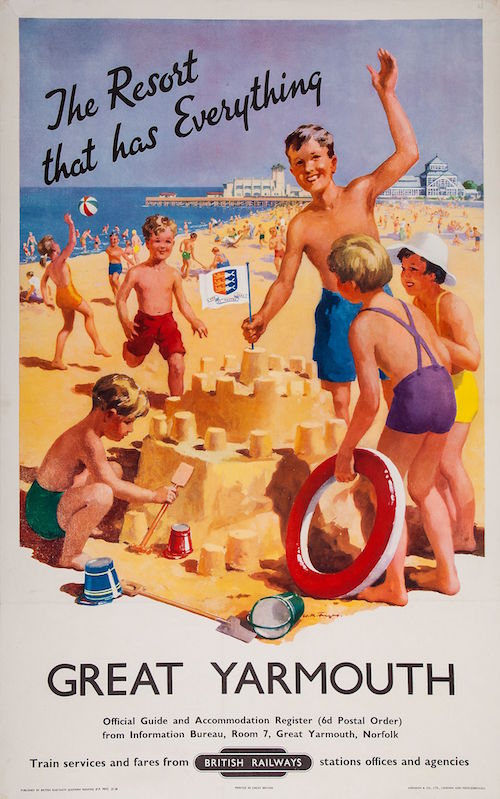
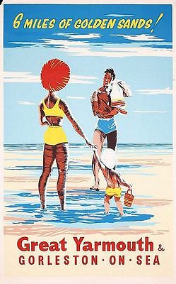
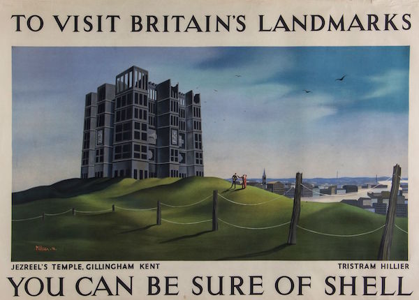
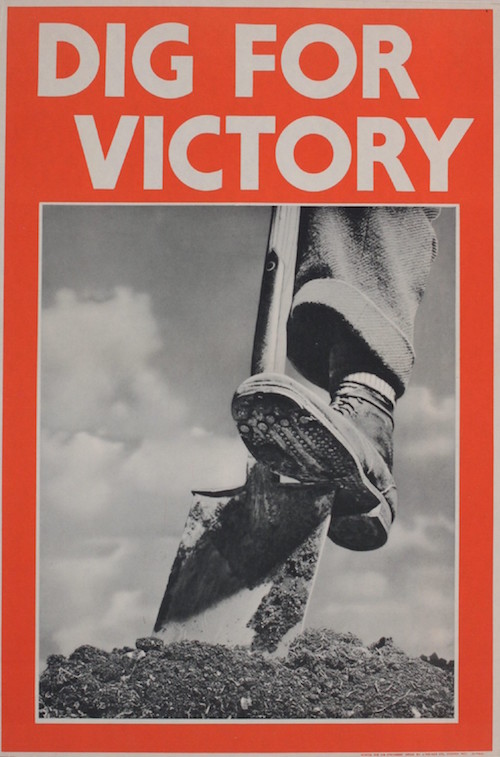
At the same time – and I’d be interested to see what the rest of you think about this statement – I think there is a shortage of new and surprising posters out there for me.  To my mind it feels as though, more and more, auctions are choosing safer and more predictable posters: so pictorial railway images and London Underground bankers are doing well.  World War One posters, thanks to the centenary, are staple auction fodder (although I don’t think I’d ever give one houseroom myself) and World War Two propaganda seems to have settled in as a regular as well.

Dig for victory world war two propaganda poster 1941

But again, what this means is that the same posters turn up over and over again, while the more niche ones seem to have disappeared entirely.

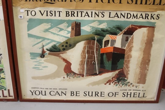
There are some practical reasons why this might be happening.  Back when we started buying posters, by far the most interesting sources were usually when designers either died or downsized, and their own collections came on the market.   Inevitably that has pretty much come to an end – although  over the last year or so a whole cache of works by Clifford and Rosemary Ellis appeared across a selection of sales.

ellis clifford and rosemary giant panda design

They’d both died twenty or more years ago, so I am guessing that these had been handed down once already.

Clifford and Rosemary Ellis appledore shell framed

Designers seemed to have a habit of not only collecting their own stuff but also the work of other designers that they admired, and in the past this was one of the ways in which some of the more interesting and rarer posters I’ve seen have come up for sale.

Amstutz camping coaches railway poster

On top of this, though, I also think that the market itself has changed.  Obviously, offering tried and tested posters which you know are going to sell is a pretty good way to make money if you are an auction house, so I can’t blame them for what they’re doing.  Stick with the familiar and nothing will go wrong.

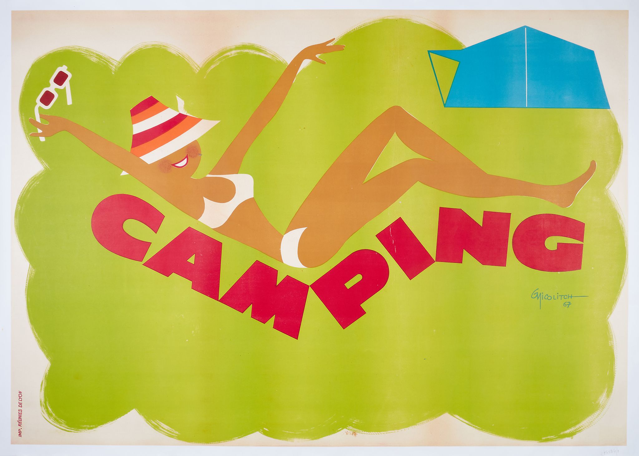
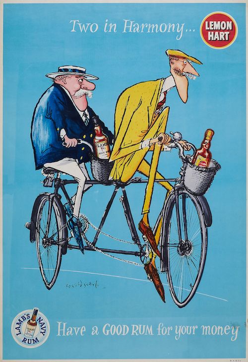
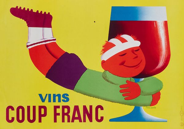
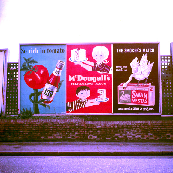
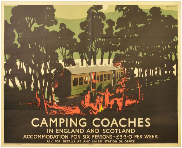
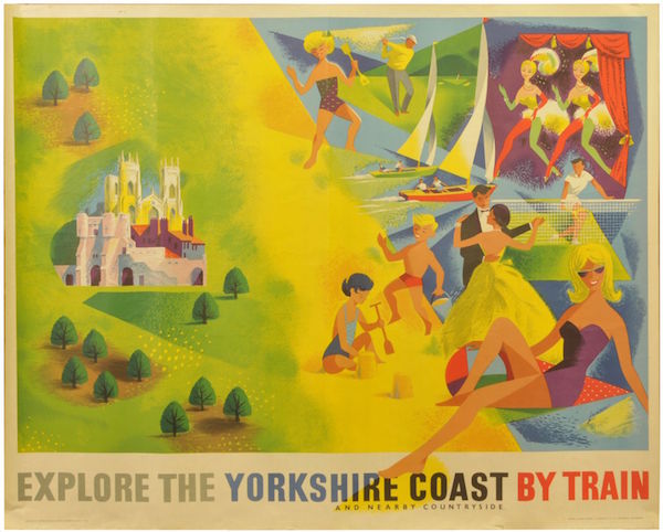
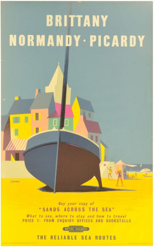
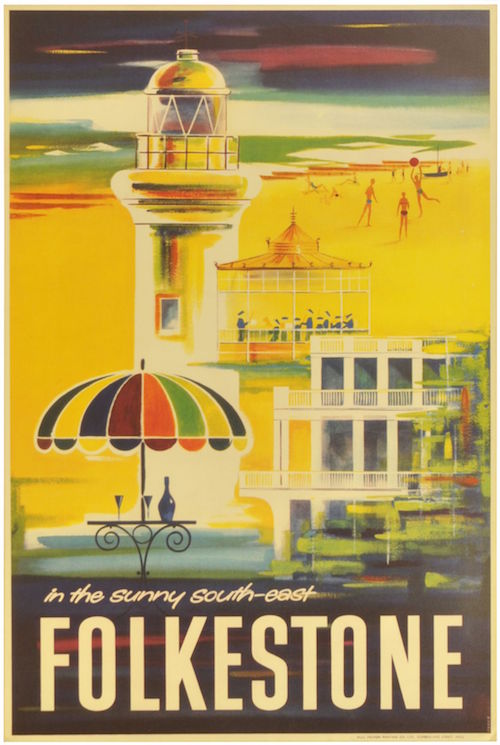
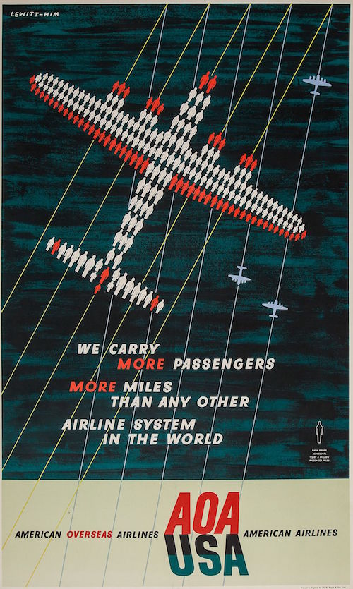
But what’s failed to happen – and I have to say that I am fairly disappointed in this – is for other, newer markets to emerge.  Specifically, people don’t seem to be interested in buying the modern post-war posters which I love possibly above all others.

Tom Eckersley properly packed parcels please dog

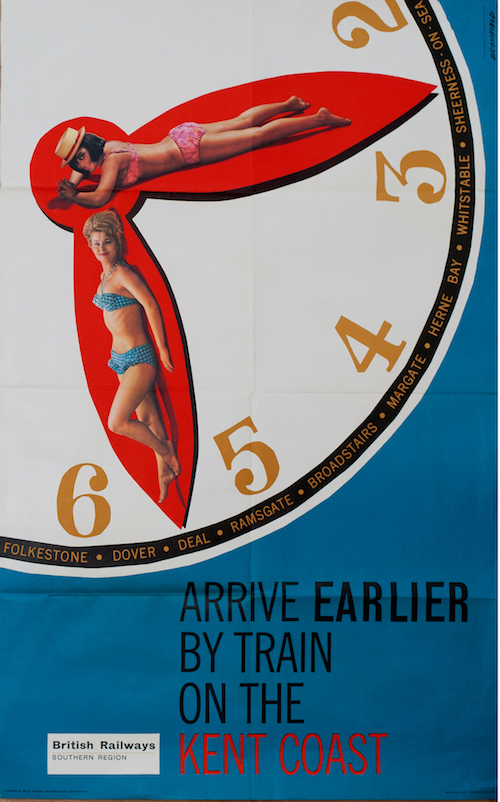
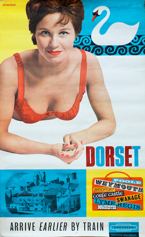
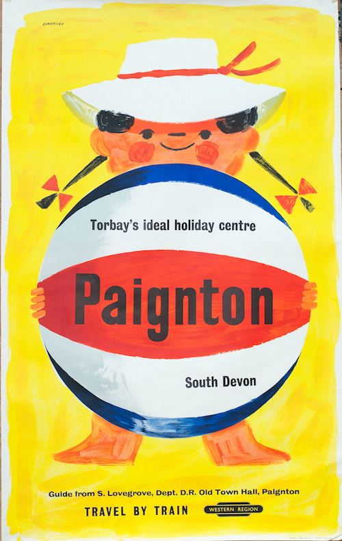
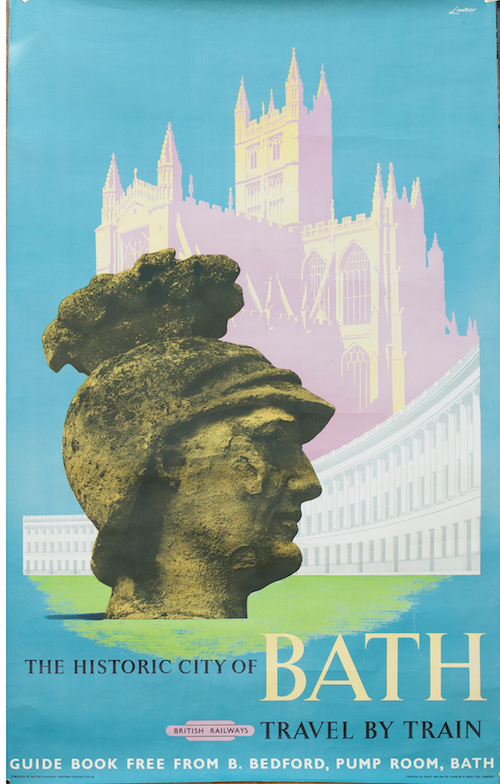
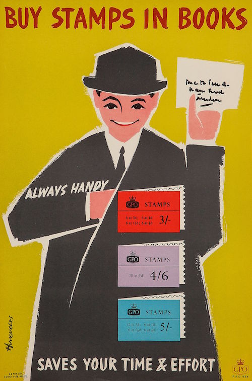
When I first started writing this blog, the work of Hans Unger, Tom Eckersley, Hans Schleger and Harry Stevens would pop up regularly in amongst the other, more usual, offerings.  But now this doesn’t happen very much at all.

Such Turkeys Macfisheries Hans Schleger Zero poster 1950s

I really don’t understand why this is happening.  We live in a world where all the dark brown furniture of our parents and grandparents has been cast to one side in favour of Danish teak and Ladderax; every furniture shop is full of pastiches of 1950s contemporary armchairs, and reproduction fabric prints of the time are available in even the smallest of fabric retailers.  And yet no one, it seems, wants the posters.  Their worth is, at best, the same as it was six or eight years ago.  And it’s all wrong.  But nonetheless, it is.

Mr Crownfolio has a theory that there were never that many of these posters available in the first place, a first wave of interest flushed them out into the market place and auction house and now they are all in the hands of people who love them and don’t want to sell them on (and we can possibly plead guilty to this).  So it’s only the less desirable posters which come back onto the market.

It’s certainly a more cheery thought process than mine.  Really, though I have no idea – and this is very much an introductory set of thoughts, so if anyone has any better ideas, or actual experience of what is going on, please do say.


Irregular column

At last, something which looks remarkably like a full-on poster auction at Dreweatts/Bloomsbury in a couple of weeks time, even if it has been achieved by the now-standard cutting and shunting of posters and film posters into one big, mis-matched sale.  Still, there are enough delights in the first half to entertain us, such as this frankly wonderful French poster from 1967.

NICOLITCH, G CAMPING lithographic poster in colours, 1967

It’s foreign, so I’m afraid I don’t have anything to say apart from how lovely it is, and also how distant the image is from my own experiences of camping.  I may be making the mistake of doing it in Britain of course.

Probably the most surprising item in the sale is this Ronald Searle poster for Lemon Hart and Lamb’s Navy Rum.

SEARLE, Ronald (1920-2011) TWO IN HARMONY, Lemon Hart offset lithograph in colours

It’s an example of that rare thing, a British commercial poster.  I’ve never fully got to the bottom of why so few of these survive in comparison to the continent, where commercial posters, selling products, are the mainstay of their auctions.    Even this sale has managed to dig out several examples, of which this is just one.

french wine poster GENIES, Saint VINS COUP FRANC lithographic poster in colours

I can think of several reasons why this disparity between Britain and the Continent might happen, of which the main one is poster sizes.  Whenever we see commercial posters of the 1950s and 1960s in the UK, they are most often in giant billboard formats.  I’ve posted various pictures of these on Quad Royal over the years, but this image gives you the general idea.

More Posters on Walls including Patrick Tilley and Donald Brun

In contrast I used to think that Continental posters were made, more, for the kind of poster-display pillar that you still find all over Paris, which, I have discovered in the course of writing this, are called Morris columns.

colonne morris paris 1957

Or Colonnes Morris if you are one of the people in that picture.  The result of them, though is that posters mostly survive in a format which people can display on the walls of their houses (I wrote before about buying a billboard poster, it’s not an experiment I propose to repeat).

The problem with this is that commercial posters were made in the same convenient sizes in the UK, for display on London Transport and the railways.  The posters of Notting Hill Gate are the best demonstration of this.

wide of disused passageway Notting Hill Gate tube station

As well as LT’s own posters, there are commercial advertisements as well.

Vintate pepsodent toothpaste ad Notting Hill Gate

If the French wine poster is sale-worthy, then so is the Pepsodent.  Yet these British examples very rarely turn up in auctions.  The differences must be cultural rather than practical, and I suspect are to do with reasons which means that the posters were never saved in the first place.  I will mull these thoughts over further another day.

Meanwhile, there is an auction to attend to.  You will be pleased to hear that it contains many of the usual suspects including Lewitt-Him airline designs, Guinness posters, and the two ARP wartime posters that are contractually obliged to be sold at least twice a year. Here’s the Pat Keely one, you can guess the other.

keenly pat arp siren 1937 poster Ww2 home front

If you do want to know more about them (along with my theories about why so many survive), it’s all here.

There are also a range of London Transport posters, most of which I like rather than love, the one exception being this clean and slightly chilling piece of Proper Modernism by Richard Beck.

BECK, Richard (1912-1985) BE CONTREE'S NEW PARK offset lithographic poster in colours, 1935,

Unusually, there are quite a few of these lovely, small (cheap, frameable) panel posters in the sale, including this fantastic Zero, where modernism is starting to shade into surrealism and romanticism, both movements that would come to a stuttering halt at the war.  Although the lettering managed to wait and make a delayed return in the early 1950s.

ZERO,Hans Schleger (1898-1976) RICHMOND ROYAL HORSE SHOW, London Underground lithographic poster in colours, 1938

Or you could go for this Eckerley-Lombers.

ECKERSLEY, Tom & LOMBERS, Eric ALDERSHOT TATTOO, London Underground lithographic poster in colours, 1936

Both the last two posters come with four other panel posters in the lot and an estimate of £100-150.  And they’ll fit on your walls.  What’s not to like.

I have always been interested in Beath, mainly for the reason that he produces a classic species of clean-lined modernism and I know nothing whatsoever about him, although the catalogue tells me that his middle names are Myles and Fleming.

BEATH, John Myles Fleming (1913-1991) INTERNATIONAL SIX-DAY CYCLE RACE, WEMBLEY. London Underground lithographic poster in colours, 1936

In addition,  this extremely atypical and early James Fitton is worth noting, if not loving.

FITTON, James (1899-1982) LONDON'S TRAMWAYS,Guildhall Museum lithographic poster in colours, 1925

Elsewhere, out of a small selection of railway posters, my preference is for this Stanislaus Brien, which is bonkers and about as close as railway posters get to modern art in the 1930s.

BRIEN, Stanislaus G EAST COAST by LNER lithographic poster in colours

It also features people wearing their best clothes on the beach, which is one of my recurring obsessions.

Finally, your best bet for a slightly damaged bargain is this Union Castle Line travel poster, which is like the offspring of Daphne Padden and Harry Stevens.

Union castle line cruise poster has

The auction has it down as anonymous, but I’m pretty sure that the torn top right corner reads Hass.  Whatever, it’s a great design and not one I’ve ever seen before, which is always pleasing.

It’s no secret

Today’s auctions are of the general railwayana type, which means that I am likely to get distracted by glittering treasures such as ticket inspector’s hat badges, armchairs and, naturally, giant gherkins.

Heinz enamel sign, in shape of gherkin

The sign is 51 inches across, a figure worth bearing in mind before you buy it.  Although I do think it would look rather wonderful above my desk.

This is on offer at Great Western Railwayana, along with a quite extensive selection of posters, none of which, as usual, have estimates.

A brief survey of their last sale reveals them to be not quite as expensive as GCR, unless you are buying very old posters.  Although there were a couple of anomalies, like this 1961 mermaid who went for £380, which was rather more than some ‘conventional’ railway posters.

Kenneth Bromfield Eastbourne railway poster mermaid

While this went for a mind boggling £420.

Poster GPO 'This Is Stanton In The Cotswolds' by R.O. Dunlop RA, 36 x 29 inches.. 1951.

I don’t know what that goes to show really.

To my joy, the new sale includes a Tom Eckersley I’ve never seen before.

Tom Eckersley Railway poster Blackpool

This may not be quite as good, but it is still fun.

Porthcawl Railway poster children on beach 1962

The way prices are going at the moment, it will probably end up as one of the most expensive items in the sale.  Although it might get pipped to the post by this Bromfield from 1963.

Bromfield Kent coast Railway poster 1963

Or even this Bromfield from the very same year.

Bromfield dorset railway poster 1963

As far as I can tell, there aren’t that many railway posters for Dorset at all, and I don’t think I’ve ever seen one for Weymouth on its own.  Presumably this is because the civic authorities didn’t want to cough up for a poster campaign.  But I’d love to be corrected if anyone does know of any posters.  (Double points for anything that’s not by Bromfield, as he did do at least two for Swanage, possibly more)

All of those ought to be knocked into a cocked hat, price wise, by this Eckersley, but may well not be.

Eckersley Paignton Railway poster

Such times, my friends, such times.

Other than that, there are various views of town, country and seaside, a handful of bathing beauties and this RM Lander of Bath.

Lander Bath railway poster

Also this piece of wild optimism – just look at those continental parasols –  which looks as though it might be by Lander but at the same time has odd lettering.

Aberdeen railway poster

Can anyone shed any light?

All I have managed to turn up is this, from 1958, which suggests that they had previous for dodgy lettering in Aberdeen, along with an artist who’d set his style very nicely in 1937 and wasn’t about to change for just anyone.

aberdeen2

Apart from railway posters, there are also these three World War Two posters.

careless_talk

I’ve written about the top and bottom posters before, when a set were put up for sale by the family of the artist, Freddie Reeves.  I was surprised to see them then, but this auction puts them a bit more into context, as apparently they have gummed backs and were intended for use inside carriages.  But there are still some interesting questions that need answering here.  Were the Railway companies printing their own propaganda posters, being the main one.  Because if they were, it’s not mentioned in any of the books.  There’s some research there for anyone who wants it.  Just don’t ask me to do it.

Furthermore, there are these coach posters.

Newquay and racing coach posters
Something terrible seems to have happened to Newquay though, but I can’t work out if it’s atomic fallout or acid rain.  Whichever, it’s probably best avoided.

There’s lots more, but you’ll have to go and look for yourself.

Also coming soon is an auction from Transport Auctions of London, but so far they’ve only sent me a PDF with teeny-tiny pictures in, so small that I can barely tell what poster they are talking about, never mind show on here.  So that’ll have to wait for the moment.


great expectations

Great Central Railwayana have a new auction coming up on 4th June, and the catalogue is now up on The Salesroom if you want to take a peek.

There are a couple of quite desirable items on there, my favourite probably being this Tom Purvis because – as any regular readers may have worked out – I am somewhat obsessed with the idea of camping coaches.

Railway Posters, Camping Coaches, Purvis, LNER: An LNER quad royal poster, CAMPING COACHES, by Tom Purvis, a classic 1930s
Tom Purvis, 1930s, est. £600-900

That does make it look particularly fun though.

I’m always a sucker for a nice Lander, and there are two good ones up this time round.

Railway Posters, Yorkshire Coast, Lander: A BR(NE) quad royal poster, EXPLORE THE YORKSHIRE COAST, by Lander.
Lander, 1950s, est. £100-200

Railway Posters, Brittany, Lander
Lander, 1950s, est. £100-200

This, meanwhile, is of the same kind of vintage but a) is by someone called Harris about whom I know nothing, and b) isn’t actually a railway poster at all.

Harris Folkstone promotional poster in the sunny south east Folkestone
Harris, est. £80-120

Meanwhile, after years of invisibility, another copy of this has popped up six weeks after the last one.  I will tell you all about Armengol one of these days, I promise.

Railway Posters, Coney Beach, Armengol: A BR(W) double royal poster, CONEY BEACH, PORTHCAWL, by Mario Armengol, 1952
Armengol, 1952, est £150-300

You need to pay attention to this one too, because I also will be writing more about this series in the next week or so.  And it’s rather good to boot.

Railway Posters, Southern England, Langhammer: A BR(S) double royal poster, SOUTHERN ENGLAND, by Langhammer.
Langhammer, c.1960, est £150-300

Meanwhile this one may not be the best bit of design ever, but seeing as it both dates from 1946 and isn’t actually a railway poster, I reckon it’s probably quite rare.

Railway Posters, Butlins, Orr: A Butlins poster, EARLY HOLIDAYS, Luxury Holiday Camps, 1946 Season, by Orr. The size a little less than the usual double royal
Orr, 1946, est. £150-300

Finally, this is worth a mention simply for making explicit the thought process behind so many landscape-depicting railway posters.

Railway Posters, Bredon, Lampitt: A BR(M) double royal poster, OLD WORLD ENGLAND, BREDON, WORCESTERSHIRE, by Ronald Lampitt
Ronald Lampitt, c. late 1950s, est. £100-200.

In an interesting development, Lampitt has his own Twitter account.  Life is a perpetual source of surprise to me.

While all those posters are very lovely, they’re not the most interesting discoveries about this auction.  When I went onto the Great Central site to look at what posters they had, the link, accidentally, took me to the auction just gone past in March.  It took me a few clicks to work out what had happened, which meant that I ended up looking at quite a few sold prices.  And those turned out to be really rather interesting.

Quite a lot of ‘classic’ railway posters went pretty much for their estimates.  I’ve pulled this one out simply as an example.

A BR(W) quad royal poster, GLORIOUS DEVON, by L.A. Wilcox

The estimate was £200-350, and it sold for £260.  All fine and well there.

Here’s another, later example, which went for £360, with a top estimate of £300

A BR(W) quad royal poster, PEMBROKESHIRE, by Leech

I reckon that a good two thirds of the sale went in this way.  A couple came in under and only one failed to sell at all.  A normal day at the auction house.

That is, except for the posters that remained – perhaps ten or fifteen – where the bidding went mental.  Estimates were being smashed all over the place.

Sometimes this can be accounted for by a poster being old and rare.

Hewins Barmouth GWR railway poster
Hewins, est. £400-600, sold for £1,300

While others were design classics of one kind or another.

An LNER double royal poster, EAST COAST FROLICS, THE LOBSTER, by Frank Newbould
Frank Newbould, est. £150-300, sold for £1050

A BR(M) double royal poster, THE LANCASHIRE COAST, by Daphne Padde
Daphne Padden, est. £80-120, sold for £270

This is a really stylistically interesting and unusual poster, and the only example I’ve ever come across of the design at auction, so I can see why it went so high.

A quad royal poster, BLACKPOOL, by Dickens
Dickens, 1960, est. £150-300, sold for £780.

Other posters behaved less explicably.  Why is this seaside poster better than any other?

A BR(M) double royal poster, MORECAMB
Anon, est. £100-200, sold for £460.

These boats don’t look particularly exceptional either, but people seem to want them.

A BR(M) double royal poster, MORECAMBE & HEYSHAM, by A.J. Wilson.
A J Wilson, est £100-200, sold for £500.

There is a theme developing here, which is that posters of the Lancashire coast go for a lot of money.  It’s a good theory, but doesn’t account for everything.

A LNER double royal poster, THREE NEW SHIPS, by Frank Mason, showing the Amsterdam, Prague and Vienna
Frank Mason, est. £150-30o, sold for £540

While nothing at all can account for this.

A LMS quad royal poster, WILLESDEN No.7 BOX, MAIN LINE, EUSTON TO THE NORTH, by Norman Wilkinson, R.I. A dramatic image, part of the, From the LMS Carriage Window Serie
Norman Wilkinson, est. £250-400, sold for £1800

I know, people like pictures of trains, and signal boxes, but I still find it bewildering.

So what have we learned from my trawl through auctions past?  I’m not entirely sure, to be honest.  One interpretation might be that the market is moving upwards a bit.  That’s certainly true from the point of view of the railwayana auctioneers.  Ten or fifteen years ago, posters were a small and rather disregarded sideline for them: now they are bringing in serious money.

But making a generalisation about values as a whole, I’m less sure about.  The other piece of auction news that has come in recently is that Christies are closing down their entire poster department.  On the one hand this, to paraphrase Morrissey, says nothing to me about my life.  I can’t afford the prices, and don’t want most of the posters in their sales.  I’m not even sure it’s a vote of any kind about the market; I suspect this is more about posters being small fry compared to the Very Expensive Art that they would prefer to sell.

So all I am left with is questions?  Are posters getting cheaper or more expensive?  Who’s going to sell the expensive posters now – are they all going to go at Railwayana auctions?  And where will the London Transport Museum get rid of their surplus holdings now?

Any answers, please do type them out in the box below, because I certainly don’t know.


Accidental Indexing

Right, there’s an auction on at Bloomsbury Auctions right now (or at least it will be by the time I post this).  Quite why anybody has a poster auction at this time of year – there’s Onslow’s next week as well – I don’t know.   Not only has any spare cash I might have gone on presents and turkeys, but I don’t even have time to think about what’s on offer.  As the lateness of this post shows.

Nonetheless, we’re going to take a cruise through the catalogue, not only because it’s a rather pleasing selection of posters, but they also form a kind of index to some of the things that have obsessed this blog here in the last few years, which amused me.  So, in no particular order,  here goes.

First is an AOA poster by Lewitt Him.  These are a constant in any auction worth its salt, and I’d be intrigued to know why quite so many survived (there are another two in this catalogue alone).

vintage airline poster LEWITT-HIM - AOA USA, we carry more passengers.... lithographic poster in colours, pinted by W.R. Royle & son Ltd., England

This is my favourite, though, as the one which perhaps best proves the point that the airline posters of the late 1940s and very early 50s are still engaged in a quite intense conversation with the war.  How much does this remind you of an aircraft recognition poster? And radar?  Quite a lot, I’d say.

In an equally unsurprising development, women are still getting to relax on holiday while their families have fun on the beach.  In this case, both parents have absented themselves entirely while the children get on with running riot.

vintage railway poster F ? W.M. - GREAT YARMOUTH, British Railways offset lithographic poster in colours, c.1957, printed by Jordison & Co. London

The catalogue dates this poster to 1957, but what 1930s faces those children have.  The designer has signed in an illegible scrawl, and the poster doesn’t seem to be in the NRM collection, so I can’t tell you if he’d been working since then, or what.  But in trying to find out, I did discover this gem.

vintage british railways poster great yarmouth

Here the woman is so relaxed that her head seems to have exploded.  It’s a risk.

It’s pleasing to see a small selection of Shell posters, which are appearing less frequently at auction these days, for reasons I cannot pretend to understand.

vintage shell poster HILLIER, Tristram (1905-1983) - YOU CAN BE SURE OF SHELL, Jezreel's temple, Gillingham lithographic poster in colours, printed by The Baynard Press

This one is by the strange and wonderful Tristram Hillier, who deserves much greater fame than seems to be his lot.  I now see that there is a biography of him.  I will read it and report back in the new year.

In amongst the railway posters, this blazes.  The image didn’t come up at all when we were debating depictions of industry and the North, although it definitely should have.

JACK, Richard RA. (1866-1952) - BRITISH INDUSTRIES, LMS, Steel lithographic poster in colours, 1924, printed by Staffords, Netherfields vintage LMS railway poster

It’s always good to be reminded about the sheer joy that are the posters of Pieter Huveneers.

 BUY STAMPS IN BOOKS, GPO lithographic poster in colours, 1958

While in the London Transport section, we are also reminded that Harry Stevens is a much better designer than he is sometimes given credit for.

STEVENS, Harry (1919-2008) - MILES OF PATHS.... London Underground offset lithographic poster in colours, 1965

Finally, there is also one London Transport gem which hasn’t come up on here before.

DEIGHTON, Leonard Cyril (b.1929) - IN LONDON'S COUTRY; VILLAGE LIFE lithographic poster in colours, 1957, printed by Curwen Press cond B

It’s worthy of inclusion just for being a great bit of 1957 design, but it’s also by Len Deighton.  A man of many talents, clearly.

More thoughts about auctions to come over the next couple of weeks, along with some pictures of cute dogs, because it’s Christmas.

Sunny Cheshire by any other name

After more than four years, I have to admit that Quad Royal rambles on a bit.  One day I must make some kind of attempt to index it or at least make it easier for the casual visitor to find their way around.

But the advantage of there being so much back catalogue is that, every so often, Google brings in an unexpected visitor and I discover something new.  Which is what happened recently on a perfectly workaday post about a long-since-departed railwayana auction.

I was writing about these posters.

New Brighton/Wallasey - Have Fun in Sunny Cheshire', 1956.British Railways (London Midland Region) poster. Artwork by Ken or Felix Kelly

New Brighton, Wallasey, for Pleasure!Õ, BR (LMR) poster, 1954. Felix Kelly

They weren’t even in the auction but I do love them so and would still very much like to own them, but I digress.

Almost exactly three years after I wrote the piece, this appeared in the comments.

The Sunny Chesire posters were not done by Felix Kelly but rather Kenneth Roy Kelly MBE, my grandfather. I have the original artwork hanging on my wall. He also did TWA advertisements as well as designing the Popsicle logo.

This surprised me quite a bit, because these two posters are ascribed to on the NMSI database (which I use because it works better than the NRM one, but I’ve gone on about that before now and may well do again some day).  But then when I looked a bit closer, the attribution did look a bit suspect, because this is the only other poster down as being his work.

ÔChesterÕ, BR (LMR) poster British Railways (London Midland Region) poster. Interior of cathedral with choir stalls and organ front in north transept. Artwork by Felix Kelly.

You’d be hard pressed to claim it as related in any way.

And in fact when I read the NRM blurb very carefully, the maker may be down as ‘Felix Kelly’ but the description says it is by ‘Ken Kelly’.  So we are all very confused.

Google knows very little about Kenneth Roy Kelly, except that he got his MBE for services to defence heritage.  And there’s a fantasy artist called Ken Kelly so that’s any more detailed searches on the subject doomed.

Nonetheless, between the Quad Royal archives and the magic powers of Google, we have added very slightly to the sum total of human knowledge.  And I’ve written back to Roy Kelly’s grandfather to see if we can have a look at some photos of that original artwork and then perhaps I will be able to tell you even more.