Today is going to be an interesting challenge. As no one seems to have been able to track down the poster I was asking about last week, I’m now going to try and write a post whose culmination is going to be a poster that I don’t have a picture of, well except in my head. Let’s hope my powers of description are up to the task.
But there is plenty of ground to traverse before we get there, because today’s subject is how we look at railway posters. I’ve covered a small bit of this terrain before, in talking about David Watts’ work on railway companies displayed posters and how this affected their design and reception. Today, however, our guide is John Berger, and the subject gender and the railway poster. Posters like this to be precise.
The subject is something I’ve been wondering about for a while, but it was only when I mentioned John Berger in a post earlier this summer that the idea finally clicked together. His Ways of Seeing was one of the books that profoundly influenced the way I thought in my teens and twenties. I can’t actually remember when I read it, but his ideas about the male gaze permeated the atmosphere when I was a student. To squash quite a lot of complicated thought into a very small paraphrase, Berger’s argument is that in both fine art and popular culture men look and women are looked at. The viewer is always presumed to be male, while the image of the woman is always aware that she is being viewed.
Berger was writing in 1972, and I’d like to think that things had changed a lot since then, but he’s still as right as he ever it was. Take the business pages of the Guardian for example, a newspaper that I would like to think knows better. This is a section of the newspaper in which women don’t feature very heavily, but their images are still everywhere. I’ve lost count of the number of times I’ve seen stories about chairmen or company boards which are not illustrated by pictures of the people concerned, as you might expect, but of models on a catwalk or a female pop star. Because the reader of the business pages of a newspaper is very strongly presumed to be a man, and so these pictures serve to reaffirm this. A prime example was when Guy Hands’ investment company took over EMI. Much of the story revolved around Hands’ management style and personality, but did we ever get a picture of him? Not much – far more often the illustration was of Katie Perry or Kylie Minogue , like the example below which illustrated a story in 2010.

As a result of reading Berger, I spent quite a bit of my MA research trying to see if I could find examples where women simply looked, rather than with the constant double-think awareness that there will always be a man looking at them. To this end, I trawled through acres of 1950s women’s magazines in the British Library’s archives in Colindale, thinking that as no man would ever have deigned to read Woman then, this might be the place.

As it turned out, I was completely wrong. The defining image in advertising and editorial of the period is of a woman giving or serving, either to a man, or to children, or sometimes to the invisible viewer, who is, therefore, presumed to be a man. Far from being a safe haven, the women’s magazines were actually proof of how right Berger had been: even in an entirely female space, women are always intensely aware that that they are there as objects of a man’s gaze, not the subjects of their own.

Infuriated, I gave up on the thought for a while, apart from occasional bouts of resentment towards The Guardian. But gradually over the last few years, I’ve started to realise that post-war railway posters might just be the place I had been looking for. I don’t think for a minute that they were meant to be looked at by women alone, but I would argue quite strongly that these posters are a place where men and women are at least looking on equal terms.
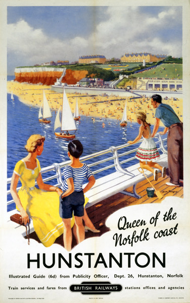
Of course very many railway posters of this period are of landscapes, and whether a male gaze can be said to apply to depictions of the countryside is a whole can of theory that I really don’t want to open. And pictures of trains probably are designed for the male gaze. The posters I’m interested in are the genre which depict family holidays on the beach. Here, just who is looking at whom?

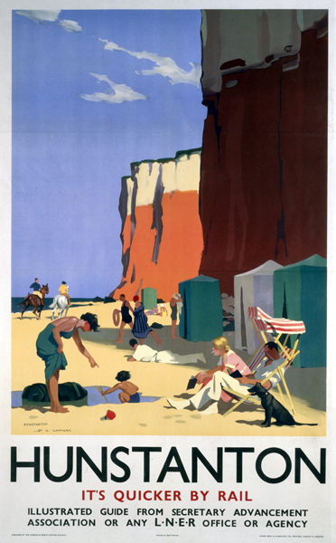
As a rule, the whole family is shown having a good time.
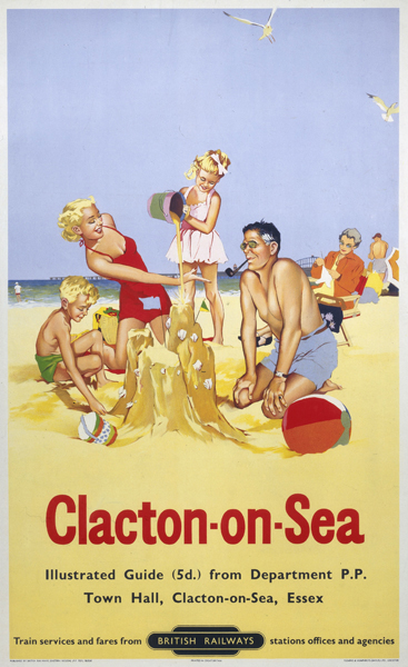
Quite often right down to the dog as well.
It’s worth noting that this genre doesn’t arrive out of nowhere in the 1950s, here’s a pre-was LNER example, also with contented dog.
Now you could argue that the imagery of some of these posters is designed to resemble a snapshot, and so the implied viewer is the father of the family looking down the lens. I’d argue that the majority are more informal than that; but it’s also true that some of the layouts are not anything like a photograph.
Who is doing the watching here, and from what perspective? Hard to say, but it’s certainly not a family photograph.
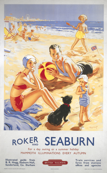
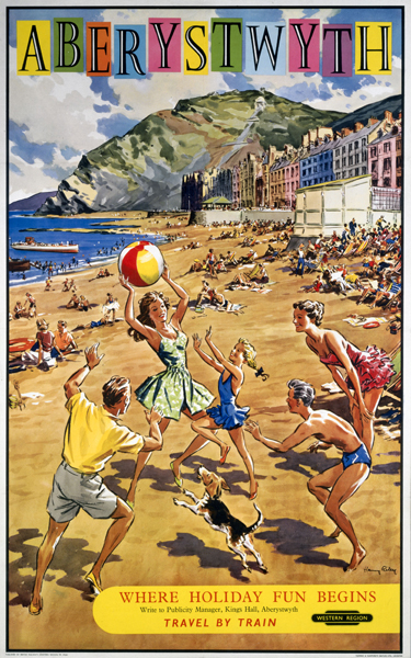
Now you could argue that the viewer in this case is nonetheless intended to be male. It’s true that shapely women in swimsuits do tend to be foregrounded in some of the beach scenes, as in this Harry Riley, where the girl with the beach ball is the undoubted focus.
Then of course there is the whole sub-genre of swimsuit pin-up on the beach, which again suggests a male viewer.
 poster, 1950s. Artwork by Derek Lucas.")
There are plenty enough of these about, but in looking at them, it’s worth remembering the Alan Durman series, which I’ve posted about before, although not in any serious way.
The first poster from 1955 is a definite pin-up.

But as the posters progress, the red-bikined bombshell is gradually drawn into the conventional narrative of the railway poster.

One in which families are happy together on the beach, and men and women are both meant to be viewing the posters.

All of which suggests that the pin-up approach is the deviation from the norm, but also that it perhaps does not work and so has to be brought back into the ‘normal’ terms of reference for these posters.
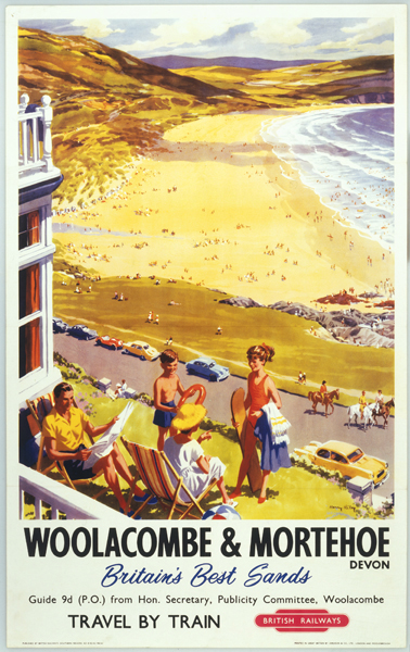
There are other clues which suggest that women are very much part of the intended audience. One is who is entertaining the children?

In quite a few of these posters, it is actually the husband who is doing most of this while the mother stares vaguely away into space in a manner which I imagine is meant to imply relaxation. All of which rather suggests to me that it is women who are being targeted here.
The same is true in the poster above, where it’s the man holding the little girl’s hand. But this doesn’t just mean that women are being sold to – these images are also imagined from a woman’s point of view. One in which they are seeing themselves as they would like to be, not just seeing themselves being looked at. Taken this way, these posters are far less conventional than they look – in fact they are revolutionary.
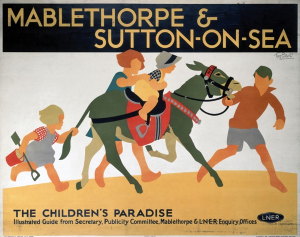
As an aside, there is also a sub-genre of these posters which just involve the children being entertained with no adult visible. Again these can be found both before and after the war, as excemplified here by the Toms Purvis and Eckersley, both advertising Mablethorpe.
At this point in time, I don’t think it would be wrong to argue that children are very much the mother’s responsibility, and so selling a holiday on the basis that the children will like it is a tactic aimed mainly at women.
Now here it does get more complicated, because images of happy children, designed to appeal to women, do appear elsewhere, most notably in women’s magazines. So it’s possible to argue that a woman’s own gaze has been present all along. There are ways of seeing in which she is an agent, not an object, but only when she is acting as a mother, in a space in the culture where there are no adult men involved.
In the railway posters, which are out there in the world where the viewer would normally be expected to be male, these images of children work very differently. Here they are reminding us that these posters are designed to be looked at by both sexes, at the very least on equal terms. But I would argue that these posters are if anything aimed more at women than at men. It’s just unfortunate that one of the best arguments for this is the poster that I can’t blooming well find.
So, the picture is something like this. A classic beach scene – a small cove with cliffs and various families on the beach having fun. In the foreground are a mother and children sitting around on the sand. At the very front, just entering the frame is the husband, who is bringing some tea and cakes over from the beach cafe for his family. With china cups and plates too, those were the days.
Now, back before I had children, my idea of a good holiday involved traveling to new places, sightseeing, good food – all the sort of things that you get in the Sunday supplements. Since the advent of Small Crownfolio, however, my requirements are much more simple. I would like to relax, perhaps even read a bit of a book, but most of all I would like not to have to think about where every single meal is going to come from. From the point of view of a mother, that railway poster looks like absolute bliss. So don’t tell me that poster is designed to be viewed by the male gaze. Or I’ll eat the entire cream tea.
I haven’t read the blog in detail – but I’ve got the gist – a very interesting theme.
I wonder how this one fits into your debate:
http://collectionsonline.nmsi.ac.uk/detail.php?type=related&kv=230644&t=objects
It’s a 1925 poster advertising the delights of Bridlington, by Barribal. It appears to feature around 20 women and only four men – a few children and a dog, of course. And, yes, all the women are remarkably similar as Barribal habitually used his wife as a model.
And I think I can see a man carrying a tray of tea in the background – just joking!
http://collectionsonline.nmsi.ac.uk/detail.php?type=related&kv=227174&t=objects has the heroine relaxing and the hero doing the child work. No tea though.
James, yes absolutely. Note also contented dog once again.
Dr G – that poster is so, um, different, that it almost needs an entire post to psychoanalyse it. It looks like a hen party outing more than anything else. But I think what’s complicating the issue here is the way in which young bobbed women in the 1920s become a shorthand for ‘the modern world’ – not just on posters but also in bronze statues, novels and I am sure elsewhere. (They have to symbolise the modern world because the men in the main aren’t there to do it, while the few that are have looked down the barrel of its failure). So what that poster says to me more than anything else, is that Bridlington wants to be modern.
But this isn’t my natural era – I am sure someone must have written something more lucid about this?