What do these four posters have in common?

John Burningham, London Transport, 1961
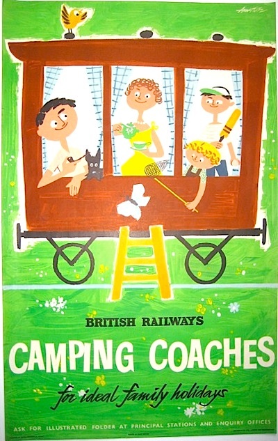
Andre Amstutz, British Railways, 1956
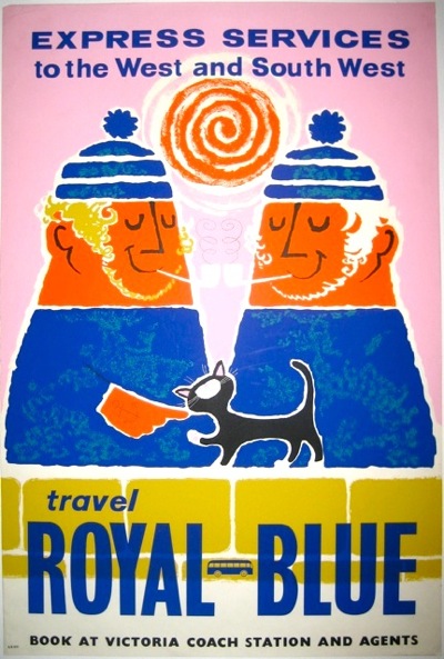
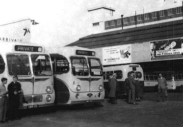
Daphne Padden, Royal Blue Coaches, c. 1957
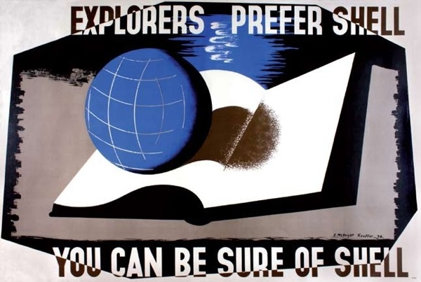
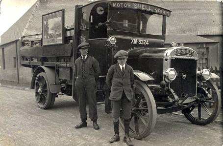
Edward McKnight Kauffer, Shell, 1934
Well, three out of the four of them are on the walls here, but you’re not really expected to know that. Perhaps more to the point is that they represent four out of the five areas of ‘collectable’ posters: railways, London Underground, Shell and coach* posters (the fifth for me would be World War Two posters, for what it’s worth).
*This may be wishful thinking on my part, but we do seem to have quite a lot of them now (thanks to Malcolm Guest, mainly) and so they are at very least collectable by us. Anyone else?
But those four areas also share something more than just being collectable. In each case the companies they are advertising owned the hoardings that the posters went on.
That’s reasonably obvious for the bus, tube and train stations – but Shell posters were also designed to be displayed on the vans which delivered petrol to the garages.
Now set down like that it doesn’t seem like so much of a blinding revelation. But it isn’t, as far as I know, something which has been much commented on. And yet it had a big impact on their posters.
The most obvious example is that all of these companies had a much greater incentive to produce posters than anyone else. Not only was this in effect a subsidised form of advertising for them, but they also needed to churn them out in order to fill up spaces when they hadn’t sold enough commercial advertising.
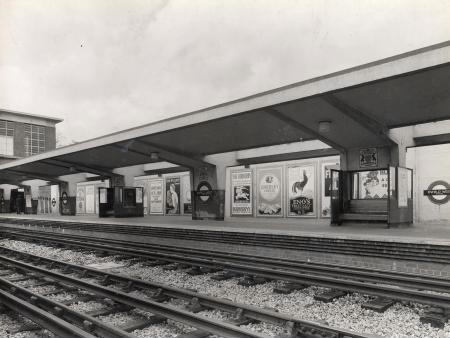
Here’s Enfield West Station in 1934, with a McKnight Kauffer poster for Eno’s Salts clearly visible on the hoardings.
They also continued to produce posters in great numbers later on, when the poster had ceased to be the main medium for advertising, because the spaces were still there and still needed filling.
In addition, there may have been more reason for the companies to produce ‘artistic’ and possibly also more subtle posters, because this will have a very direct effect on the station environment. Although this probably worried Frank Pick more than it did the owners of Victoria Coach Station.
I’ve also read an interesting suggestion that in the early days, London Underground commissioned lots of posters of wide open spaces to counteract the perceived claustrophobia of the tube, but I don’t think there’s any proof of that.
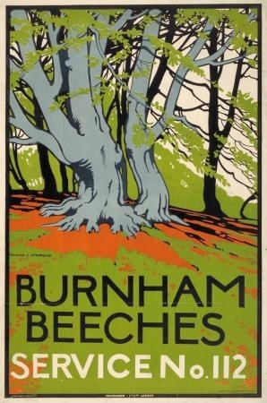
Burnham Beeches, Walter Spradbury 1912
Now originally this was going to be my only point, that all of these people owned their hoardings and so had to invest more in posters and poster design than other companies, which in turn may be one reason why their posters are collectable. And that this hadn’t really been noted until now.
But then I found a really interesting article by David Watts (insert Jam or Kinks record into your head here as you wish) about pre-war depictions of Yorkshire in railway posters. It’s an exemplary look at how posters worked and were consumed, rather than just what they looked like, and backed up by a ton of research. The world of posters could do with a lot more of this kind of rigorousness (not that I’m volunteering to read 200 volumes of railway company internal correspondence, you understand).
One of his points is that the context of railway posters is all-important. They didn’t need to have pictures of trains on, because they were posted up in stations. The fact that they were advertising railway travel rather than just the location pictured could be asssumed.
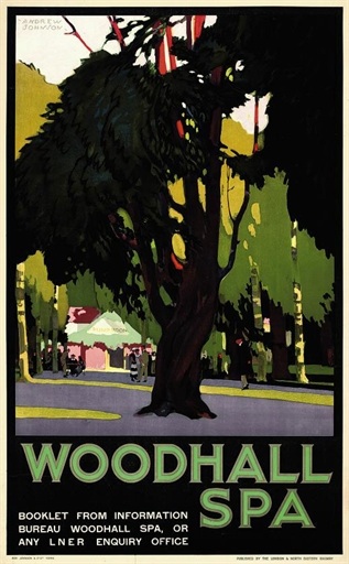
Andrew Johnson, no date
The same is true of London Transport posters. They can just say Go to Uxbridge.
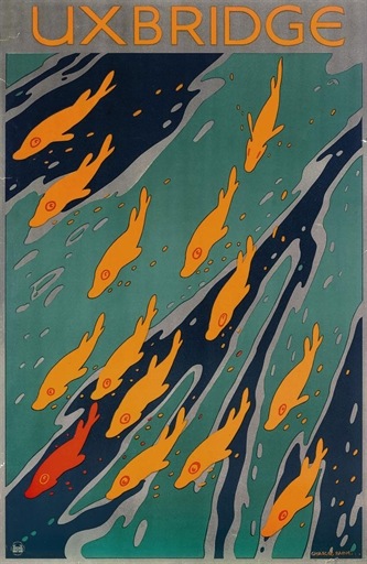
Charles Paine, 1921
That you’d use the underground to do so is implicit in the fact that the poster is displayed at a tube station.
But, as Watts points out, this contextualisation of the posters has other implications.
…omitting any visual reference to rail travel allowed posters to be detached easily from their ‘mundane commercial purpose’.
So the companies, as I’ve mentioned before, could promote their posters as examples of good design for the masses, and even as fine art, in part because they didn’t need to say Go By Train in large letters at the bottom.
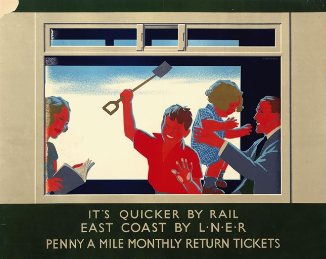
Now Watts argues that this made railway posters at least a rather poor form of advertising. And he does put forward some evidence that the train companies themselves thought this way by the early to mid 1930s too. Images of trains, or at least the idea of train travel did become more prominent after then – as in the Tom Purvis that is coming up at Christies next month.
But he also says – and I think that this is entirely right – that the fact that the posters were semi-detached from their commercial purposes is one of the factors that has made them so collectable. They exist in a limbo between fine art and outright commercialism, and are so more appealing than an advertisement for Eno’s Fruit Salts or Gilette Razors.
Although it is worth remembering that it’s only because the companies were promoting them as ‘art’ that these posters are available to collect at all. Shell, Underground and railway posters were all available for sale to the public when they were first produced, so they do survive in attics and collections, while the most commercial billboard posters weren’t and so aren’t. (I’ve mentioned this in passing before, but really ought to pull together all the sources on this one day, because it’s not said often enough. Even here.)
But I think there’s also another way in which the context affected railway posters in particular (although the same is probably also true of London Transport and coach posters to some degree as well). Watts points out how much the railway posters are selling an image of ‘deep’ England, by which he means an archaic, un-modernised and highly rural vision of the countryside. Now whenever this vision is called up at this time, it is almost always intended as a direct contrast to the modernity, ribbon development and speed of the 1920s and 30s.
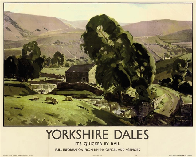
Edwin Byatt, 1940
But in the railway station, that contrast is always there anyway. Most of these poster would have been displayed in an urban setting, and even where they were put up at local stations, there was the machinery and bustle of the railway itself. So the posters are also using their context to suggest that there is an alternative, an escape. And that’s something else that they don’t need to spell out in words at the bottom.
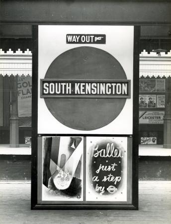
Hmm, thoughtful stuff. Do you know where and how the companies sold the posters on to the public? At stations? By post?
I know a bit; there were exhibitions of railways posters which sold, and I think a special LT shop at various points in the 20s and 30s. But for once the information all resides in books rather than on the web, so I will sit down with them and post about it properly when I get a chance.
And I realised that I left the GPO out too – their posters were designed for display in post offices, or on vans, or even in phone boxes. But I don’t think they ever sold on to the public.
Hello Shelf Appeal and Corwnfolio
London Transport had a shop at their Broadway headquarters. Otherwise, I think posters were generally mailed out. Mostly, the posters seem to have been sent out to schools (large walls etc). This continued until quite recently. My school’s french classrooms were covered with travel posters to “La Belle France!”
There’s a whole bunch of stuff about poster prints for schools and teashops – Contemporary Lithographs, School Prints, CEMA prints and Lyons lithos – published by Ruth Artmonsky.
Relatively few people would have purchased posters and prints of this kind. Most survive by having been saved by people connected with their production or display (cf Malcolm Guest etc etc).
There is a short passage in Waugh’s “Brideshead Revisted” were the modernist decoration (including posters) of is lampooned as slightly contrived and self-conscious. This is Charles Ryder ostensibly describing his younger self (p27 – I displayed also a poster by McKnight Kauffer…)
The implicit effort taken in “aesthetic” decoration is evidence of “trying too hard” and is contrasted later, by Waugh, with the effortless and “natural” taste of the gentleman aristocrat!
The subtext here is of a complex set of anxieties attaching to social mobility. People don’t know how to behave and inevitably betray themselves… The themes of Mike Leigh’s “Abigail’s Party” are also about this; but in the context of early 1970s aspirant home ownership.
In a way, this cultural geography of anxiety is what David Watts is describing in relation to LNER posters of Yorkshire. The complex semiotic meanings he finds in these images are part of a persistent conflict between town and country in terms of reason and romance. The concept of “Deep England” provides a “space” for retreat from the panoptic register of time-and-motion implicit in the city. Accordingly, the modern city is conceptualised as a rational construct. The country space is, in contrast, constructed around the natural cycle of the seasons…
The choice of artistic representation for the visualisation of DE is entirely appropriate – just like in Brian Batsford’s book jackets.
This is all still going on. Nowadays, the fragmentation of family life has give a special appeal to seaside Britain. The vulgar carnival has given way to a misty-eyed recollection of family holidays to allow for the rediscovery of the English seaside (or at least the more literary bits of it).
All most interesting. Thanks.
Thanks for that, Paul – there’s so much there that I am going to reply properly when I get a bit more time and have had the chance to think about it!
Hello and thanks again for such a thought-provoking post. I will try to respond to a couple of points here, but some of these thoughts really need whole posts of their own!
I agree with you completely about the artistic styles ‘appropriate’ for deep england and the link with the Batsford books. But even in the railway posters the tension between the ‘modernity’ of the railway and the peaceful countryside it invites you to visit is made visible, because these timeless scenes are more usually than not framed with some deliberately modern typography. But it would be interesting to look at, say, London Transport posters of the period and see whether town and country invite different styles to be used. I suspect they do.
David Watts also mentions the Brideshead reference in his essay. I think that Waugh himself would very much like Ryder’s poster choice to be read as cultural anxiety, and that works if you subscribe to Waugh’s ‘top down’ view of the world. But there are also other ways of interpreting it – in particular that Waugh’s old aristocratic order is under threat from these new themes of urbanity and modernity, and this is the tension which runs right through the book.
Furthermore, there are also other ways of seeing the relationships between different classes and choices in art and interior decoration. I’ve always rather liked Bourdieu’s view of this – I know it’s about France but some of his thoughts about the relationship between money, class and kitsch vs high art are really applicable to posters. He would argue that Ryder is doing more than just responding anxiously to upper-class taste, but also making choices of his own. I have been meaning to post about this for ages, but will try to do that. Has anyone written anything better on the theory of taste since then? I’d love to read some more on this.
As for the selling of posters, I do need to go back and look books, as there are some records, I think, of railway posters being sold too, but I couldn’t swear to it. But just from my own observation, I would think that railway posters were also sold, simply because of the number which survive. If they were only kept by people with connections to them, then there should be as many commercial posters out there on the market as railway posters. This also makes me wonder whether Guinness posters were ever sold, because they also turn up in disproportionate quantities too. But it’s just a theory for now!
Enjoying following this particular discussion and adore the blog by the way!
This is my first comment so go easy on me.
Regarding the distribution of posters, I recently read the following article about the GPO posters and design scheme:
http://jdh.oxfordjournals.org/content/13/1/23.extract
It mentions that in 1937 28,000 schools were sent out sets of posters as part of the GPO School Poster Scheme (which was inspired by the Empire Marketing Board). That’s a lot of posters!
The author describes how commercial art acted as a lever for the appreciation of modernism in fine art. I thought this was interesting in relation to the debate about town and country aesthetics and the adoption of modernist approaches.
“The appreciation and understanding of modernity in poster art as a step towards the appreciation of modernism in fine art was promoted by the GPO’s scheme, rather than the Empire Marketing Board whose posters had been usually in the line of nostalgic and pictorial images.”
The scheme was associated with the development of ‘modern taste’ in it’s attempts to “train children to accept modern art as a norm”.
Hello David,
I do hope we’re not too frightening – but that’s a really interesting article (at least the bit of it I can see from here).
The GPO did send out a lot of posters to schools, but I think they were slightly different to the ones that were displayed in the post offices. We had a few of them at one point, and I have seen them in both dealers and auctions. But both kinds of posters had the same motivations about raising the standards of the general public by the application of modern art. But Paul Rennie knows much more about this than I do, so hopefully he will wander along and give some details.
But it is an interesting question as to whether it worked or not. Were that generation of children who were trained “to accept modern art as a norm” therefore more predisposed to the post-war South Bank Modernism? We may never be able to tell.
That the Empire Marketing Board posters were distributed the same way, I did not know. There’s a book coming out about those quite soon, so that may shed a bit more light too.
I mimbled on a bit more about the GPO and Modernism on here (http://vintageposterblog.com/2010/03/23/pictures-down-the-telephone-line/) partly as a response to a podcast by Scott Anthony. I still want to do some kind of PhD on the workings of the Poster Advisory Group, as I can only imagine that they are a) almost inconceivable from a modern perspective and b) probably inadvertently quite funny.
It’s an excellent article, here’s a bit more info about which posters were distributed:
“Posters and pictorial maps were combined to make
sets that would project Britain as a model of modern
communications technology. Although it was not
publicly expressed in the minutes of PAG meetings,
two advantages can be detected in the order of the
chosen subjects. In the first place, the Scheme
alternated between historical and contemporary
themes, so that variety in subject and style enriched
the Scheme as a whole. Following the history of
overseas mail delivery, the second set consisted of
MacDonald Gill’s map of overseas radio-telephone
services showing the modern GPO’s world-wide
network [2] and John Cooper’s ‘International Telephone
Exchange’ and ‘Rugby Wireless Station’
showing specific industrial sites. The third-the
surrealist painter John Armstrong’s historical set on
the inland mail delivery system [3]-was succeeded
by the fourth set consisting of CLifford and Rosemary
Ellis’s ‘Submarine Cable’ and E. McKnight Kauffer’s
‘Airmail Route Map’, indicating the width and depth
of GPO technology. The fifth set was again based on
history, Eric Fraser’s series on important events in the
history of telecommunication, followed by Kauffer’s
‘Outposts of Britain’ series depicting contemporary
sites [4].”
Hi David
I guess that posters survive through a combination of factors.
The GPO schools posters do turn up pretty regularly. It’s a combination of numbers, paper stock (thicker paper for indoor display on notice boards) and environment. My experience is that remarkably few British posters survive (at least in contrast to French and German quantities).
The Kauffer “Outposts” series is a good example. It is by a famous designer and should turn up on the basis that likely collectors will have saved it. I’ve seen a set roughly every five years and the odd single one. I’ve never seen it in large format (on paper) as they have it at the GPO archive. My own set came from the collection of the Architectural Association. Mostly, they are in poor condition.
Compare all this with the frequency with which limited edition prints turn up on the market.
My guess is that most British posters survive in ones and twos. Even the Kauffers probably number fewer than 50/25000 survivors.
Happy hunting.