I could really do with a good auction now. Even though we don’t have the wall space for anything else and probably would end up buying next to nothing, I’d still enjoy the excitement. So, after Swann Galleries emailed to say that they had a wonderful set of London Transport posters in their forthcoming auctions, I did get my hopes up a bit.
And it is true, they do have some great and rare London Transport posters coming up. It’s just that they are all too early for my taste (and therefore also too expensive for my means as well).
Jean Dupas fetches high prices, but it’s all a bit too much out of the Art Deco style manual for me.
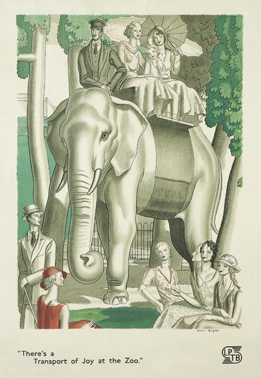
Jean Dupas, 1933, est. $2,000-3,000
Quite a few of them are tram posters too, and for some reason I’ve never really fallen in love with a tram poster, not even one for a Pullman tram.
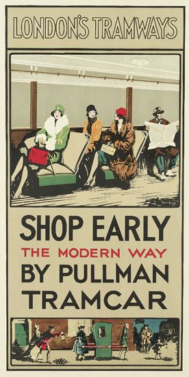
Rene Blair, 1929, $800-1,200
Interestingly, these are a different format to the mainstream of London Transport posters – double crown rather than double royal – and were presumable displayed somewhere else. But where? On trams, or on their stops? And why wee they different? Can anyone enlighten me?
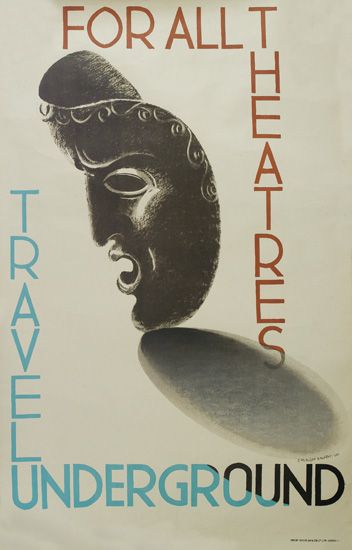
McKnight Kauffer, 1930, est. $800-1,200
The McKnight Kauffer above is a classic, but not even that can tempt me. Only this single Dora Batty has a small attraction for the Crownfolio wallet.
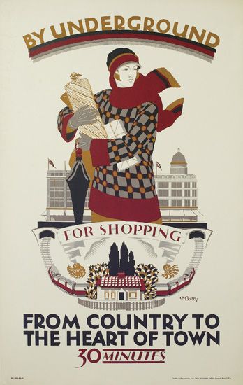
Dora Batty, 1925, est. $1,200-1,800
Mainly because I would like to think of myself as dashing chic-ly into London every so often. Of course it doesn’t happen, I don’t look like that and even if I did try it would take a whole lot longer than half an hour. Where can she live that is so bucolic and yet so close? Aylesbury? Guildford? We may never know.
There are plenty more posters along these lines if that’s what you want, but little else to report, apart from one nice David Klein at an even higher price than before.
Along with these two airline posters, from the Czech Republic and Australia respectively.
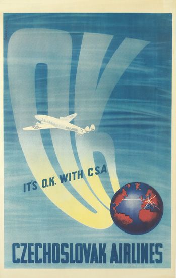
Schlosser, 1946, est. $800-1,200
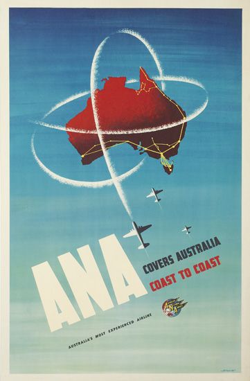
Ronald Clayton Skate, 1955, est. $800-1,200
Why I find them interesting is that both remind me of the Lewitt Him and Abram Games airline designs of a similar period, and together they represent what seems to be an international visual language of air travel just after the war. These infinite blue skies are the very newest thing, am image of how the airlines have made the whole world available to you, at least if you have enough money.
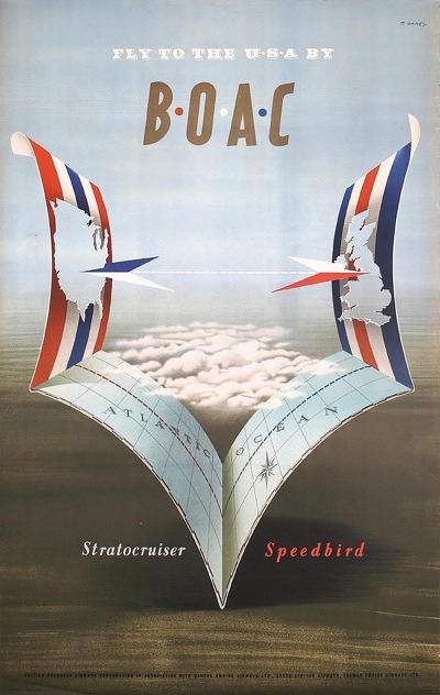
Abram Games, 1949
It’s easy to forget just how exciting and how modern air travel would have been then. Very few people would ever have seen such open skies before, so of course they became a symbol of the glamour and speed that the new airlines could provide.
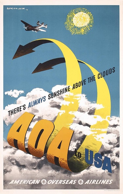
Lewitt Him, 1949
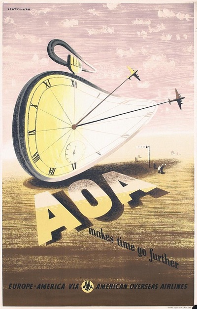
Lewitt Him, 1949.
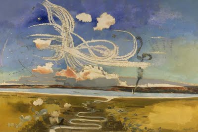
Except there may be a bit more to it than that. Because some people had seen those skies before, and a few more people had seen the trails that aircraft could leave too. The ANA poster at the top reminds me very much of Paul Nash’s painting, The Battle of Britain.
So while these blue skies are on one hand a simple representation of brand new freedoms, I think there is also a bit more meaning within them. These posters are rewriting some of the most potent imagery of the war, turning it from terrifying to exciting. There is no need to fear the trails that these aircraft leave, or the wide blue skies in which they fly, not any more.
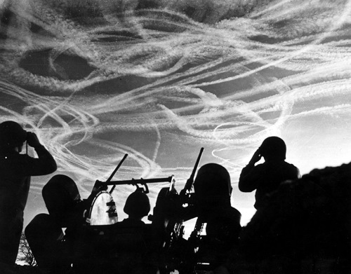
Battle of the Bulge, 1944
So these posters are not only being modern, they are also reminding the viewer that this new world has been built out of the conflict that came before. Swords are forged into ploughshares and the war in the air has brought us intercontinental jets.
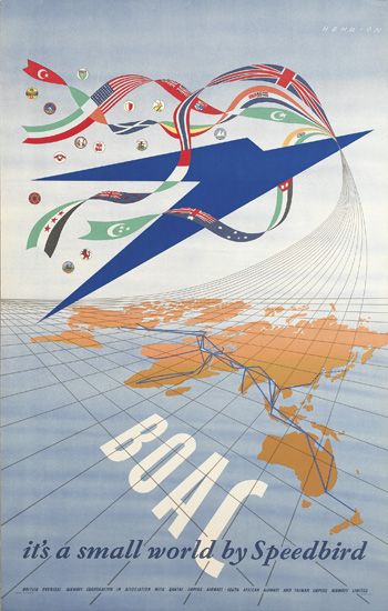
Henrion, 1947.
We might find it hard to make the connection now, but at the time the link must have been very obvious.
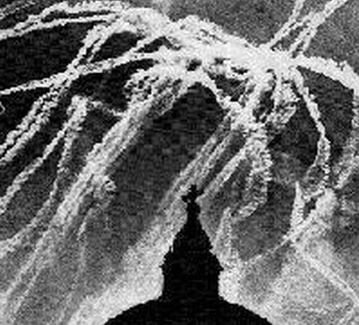
Battle of Britain, 1940
Which means that the reassurance and the rewriting must have been very necessary too.
I sooooo love reading this blog! Thank you for the continued visual treats QR!
Thank you for the kind comments! It’s lovely to hear that.
Less a post, more a thoughtful and perceptive essay.
Thank you too.
The reason that the ‘LT” tramways posters are different format are that they were mostly issued by the municipal London County Council Tramways who were merged into London Transport (along with the Underground Group who formed the dominant part of the new organisation) in 1933. Tramways posters – often illustrated or designed by students at the LCC’s Central School of Art – were intended for use in frames at tram shelters and stops – they came in the narrow format for frames, and a four-sheet style (sometimes with the same artwork). The LCCT also used similar sketches and illustrations on their monthly map covers.
Pullman was a bit cheeky – faced with increased competition from ‘plush’ buses in the 1920s, the LCC decided to tart their trams up, and with refurbished seating and lighting they called them ‘Pullman’ cars to try and pick up on the cachet of the luxurious railway carriages! I’m surprised the Pullman Company didn’t moan!
Brilliant, thank you. I was hoping that someone who knew would come along. So were the tram posters still produced after 1933 or did they wither away? I can’t recollect seeing many later than that – perhaps I will have to go and look it up.
The Pullman tram thing is v amusing, and proves that there is nothing new in the world of marketing hype too.