Dogged

There’s a certain amount of urgency to this post as the next Bloomsbury poster auction is tomorrow (Tuesday).  I do wish I could get a bit more excited about the Bloomsbury Auctions, I really do, as they really ought to be the missing piece of the jigsaw, the auctions which hoover up all the lower-priced pieces of good design which Christies no longer deign to touch.  But somehow, it just doesn’t quite work.

Nonetheless, shall  we get stuck in and see what we can turn up?  Perhaps we should begin with this post-war Shell poster, seeing as I was over in that direction this weekend.

HOOPER, George (1910-1994) YOU CAN BE SURE OF SHELL, Kintbury, Berks  lithographic poster post-war
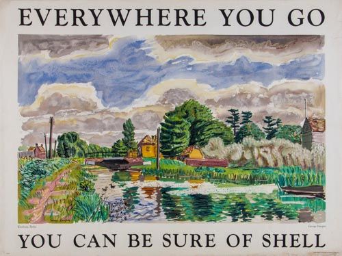
George Hooper, est £200-300

It’s rather hard to decide where to go next, in part because the poster part of the auction (there are film posters first, but I’m ignoring those) is arranged in alphabetical order of artists.  Which is I admit entirely logical, but does make it hard to construct any kind of narrative out of the whole thing beyond saying that there are posters.   Mind you, I think that if this selection of stuff was arranged in almost any order, it would still feel scattergun, it’s just that kind of sale.

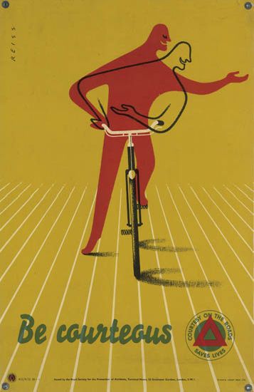
So, here is a poster I like for no good reason other than it’s kitsch and quintessentially 1950s.

Vintage BOAC poster dogs
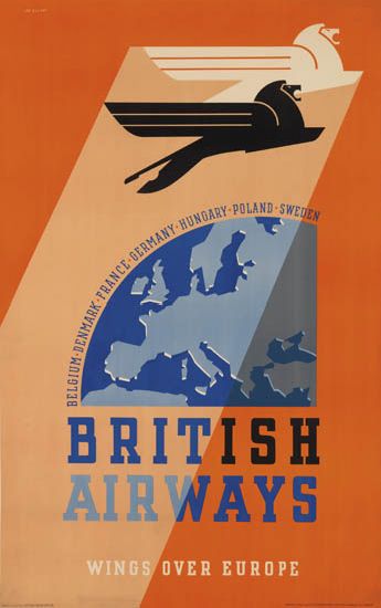
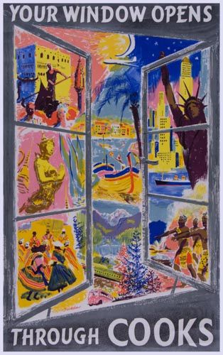
Anonymous, est. £300-500

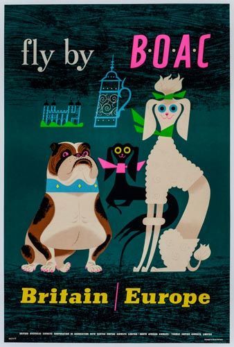
So if the bulldog represents Britain, and the poodle Europe, what is the black one up to?  Answers on a postcard please to the usual address.

Meanwhile this one is a classic, and a deserved one too.

GAMES, Abram (1914-1996) SEE BRITAIN BY TRAIN, British Railways  lithographic poster in colours, 1951, printed by The Baynard Press
Abram Games, 1951, est. £200-400

Although by rights that should mean that it is worth more than the dogs, but there you go.

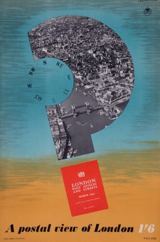
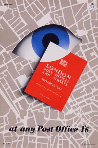
The one feature worth noting is that once again they’ve landed a whole haul of small GPO posters (for the last outbreak, see here).

As last time, they come in lots of ten with only one of each photographed, which isn’t really an enormous lot of use if you are thinking of bidding on them.

BROWNING A POSTAL VIEW OF LONDON, GPO  lithographic poster in colours, c.1950
Browning, 1950, est. £150-250

FARNHILL BY AIR MAIL, GPO  lithographic poster in colours, c.1950
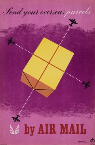
Farnhill, 1950, est. £150-250

ARMENGOL, AT ANY POST OFFICE, GPO  lithographic poster in colours, 1951, printed by J.D.& Co
Armengol, 1951, est. £150-250

This set are definitely not as stellar as the last selection.  Even though there is an Eckersley amongst them, it’s not one of his greats.


ECKERSLEY, Tom (1914-1997 POST OFFICE SERVICES, GPO  lithographic poster in colours, 1952
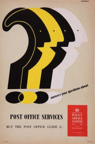
Tom Eckersley, 1952, est. £150-250

Other than that, however, it is a miscellany.  There are three of Henrion’s posters for Punch – I’ve chosen this one because it is the least frequently seen of them.

henrion-punch-99
FHK Henrion, est. £150-250

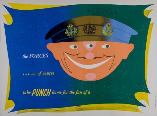
They are an interesting case, though, these posters as they appear quite regularly on the market, which leads me to suspect that they must have been sold or given away at some point.  Perhaps a trawl through early 1950s Punch might reveal the answer.

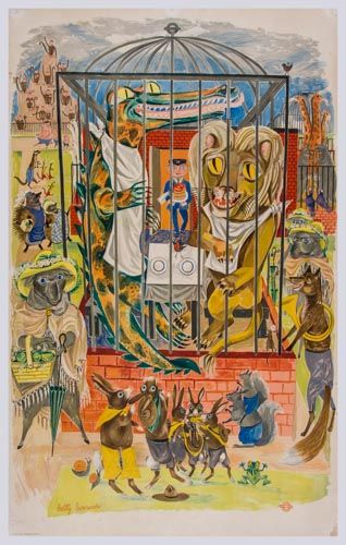
Also available are two very nice London Transport posters by Betty Swanwick.

SWANWICK, Betty (1915-1989) WILD or SAVAGE, London Underground  lithographic poster in colours, printed by Curwen Press,
Betty Swanwick, est. £200-400

SWANWICK, Betty WOOLWICH FERRY  lithographic poster in colours, 1949, printed by Curwen Pres
Betty Swanwick, 1949, est. £300-500

For once I agree with the estimates, as the second one, Woolwich Ferry, is by far the better of the two and would look wonderful on the wall, should any of you be tempted.

There is also further proof that P&O and the Orient Line commissioned a lot of very good design before the war, even if I can’t tell you any more about it than that.

ANONYMOUS ORIENT LINE TO THE MEDITERRANEAN  lithographic poster swallow cruises by 20000 ton steamers
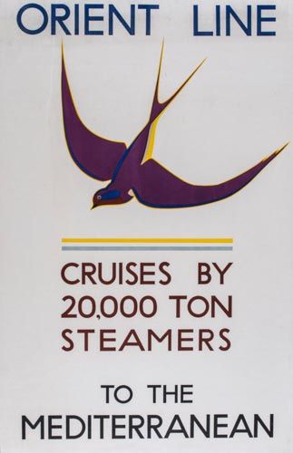
Anonymous, est. £150-250

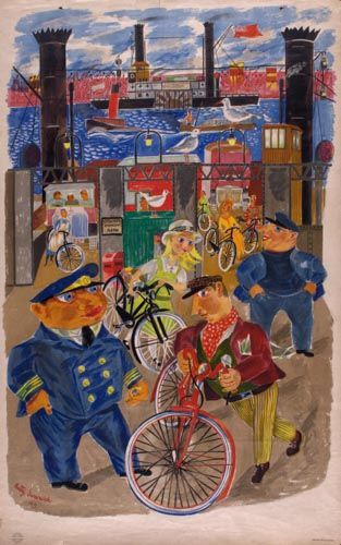
There’s also a chance once again to appreciate the hallucinogenic colour choices of Percy Drake Brookshaw.

BROOKSHAW, Percy Drake ((1907-1993) YOUR WINDOW OPENS THROUGH COOKS  lithographic poster in colours, c.1950, printed by Jordison & Co.
Percy Drake Brookshaw, c.1950, est. £150-250.

Along with a tram poster.

BROWN, Gregory (1887-1941) HORNIMAN MUSEUM, London Underground  lithographic poster in colours, 1934, printed by Crescens Robinson & Co. Ltd. London
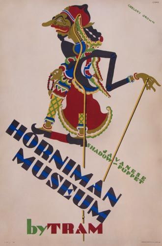
Gregory Brown, 1934, set. £200-400

And that’s basically your lot.

One final thing to say, though, which is I hope you are appreciating this blog post as it is the most expensive one I have ever written.  Half way through, my computer keeled over once again and this time it looks terminal (or at least rather too expensive to repair).  So I have been to the Big Town and come back with a new laptop, all in time to get this piece out before the auction begins tomorrow.  It’s not every blog that gives service like that, you know.

Designer’s eye

So here I am submerged in house renovations when there are poster auctions which I need to tell you about.  First in the line, mainly because it’s in just a few days time, is the forthcoming Swann Auction of Modernist Posters.

Now, with their being in New York, there are usually only one or two items of interest for us in a Swann auction, things like this, which although wonderful are somewhat outside the Quad Royal remit.

WALTER ALLNER (1909-2006) SUISSE ÉTÉ / WAGONS - LITS // COOK. travel poster
Allner, est. $1,500-2,000

HERBERT MATTER (1907-1984) ALL ROADS LEAD TO SWITZERLAND. 1935 travel poster
Matter, 1938, est. $2,000-3000

There are also a set of Theyre Lee-Elliott posters for the embryonic British Airways.

THEYRE LEE-ELLIOTT (1903-1988) BRITISH AIRWAYS / PARIS & SCANDINAVIA. 1938. Travel poster

M26145-31 001

M26145-29 001

All three are from 1938 and estimated at $800-1,200.  While we’re on the subject of British Airways, there is also this, which is apparently a very early example of photography in an airline poster.

DESIGNER UNKNOWN IT'S SMART TO FLY BRITISH AIRWAYS. Circa 1938. travel poster
Anonymous, c.1938, est. $800-1,200

If only flying were so glamorous now.

The main reason we’re here, however,  is lots 185-222 which are, in the main, from the collection of F H K Henrion.  There is one piece of his own work.

FREDERIC KAY HENRION (1914-1990) ARMY EXHIBITION. 1943. propaganada poster
F H K Henrion, 1943, est. $600-900

But what’s really going on is Henrion looking at the work of his fellow designers.  So there are examples from Reginald Mount, Pat Keely, Hans Schleger, Eckersley and many others – so many that I can’t include all of the ones I like.

REGINALD MOUNT (1906-1979) BONES MAKE EXPLOSIVES. Circa 1944.  world war two poster
Reginald Mount, 1944, est. $600-900

PATRICK COKAYNE KEELY (?-1970) GEARWHEELS CATCH CLOTHES / KEEP YOUR GUARD ON. 1941.  rospa poster
Pat Keely, 1941, est. $400-600

ZERO (HANS SCHLEGER, 1898-1976) NATIONAL ASSETS / BE SPARING IN THEIR USE. Circa 1940. GPO poster
Hans Schleger, 1940, est. $400-600

As well as a substantial selection of Abram Games’ designs; I don’t know if they were friends or whether Henrion was a particular admirer of his work.

ABRAM GAMES (1914-1996) RADIOLOCATION. 1941. World war two poster
Abram Games, 1941, est. $2,000-3,000

ABRAM GAMES (1914-1996) CIVIL RESETTLEMENT UNITS. 1945. army poster
Abram Games, 1945, est. $700-1,000

ABRAM GAMES (1914-1996) MEN LEAPING AHEAD IN INDUSTRY READ THE FINANCIAL TIMES EVERY DAY. 1955. poster
Abram Games, 1955, est. $2,000-3,000

I’ve even found a rare example of an Ashley Havinden poster.

ASHLEY HAVINDEN (1903-1973) KEP / DELICIOUS WITH FISH. Circa 1950.
Ashley Havinden, 1950, est. $400-600

Not everything is by a big name, either.  This very striking wartime image is simply by A.R., about whom I can tell you nothing.

A.R. (MONOGRAM UNKNOWN) POST OFFICE SAVINGS BANK. Circa 1942. poster
A.R., 1941, est. $500-750

Henrion clearly never stopped looking at posters and thinking about them as long as he worked, because there are a host of later examples too.

ALAN FLETCHER (1931-2006) D & AD 21ST. 1983. poster

So I strongly suggest you go over there and take a peek, not only for the insight into a designer looking, but also because Swann’s catalogues are properly written and informative.

MANFRED REISS (1922-1987) BE COURTEOUS. Circa 1955.  ROSPA poster
Manfred Reiss, 1955, est. $400-600

And now if you’ll excuse me, I have to order a skip.

Posters on Display

There was more to the Beverley Pick book than could fit into one single post. Ironically, what got left out last time was posters: to be precise their display, as demonstrated in this wonderful illustration by Mr Pick.

Beverley Pick wartime  poster display stand from display presentation book

It particularly jumped out at me because we have the poster at the bottom left, which I wasn’t actually certain was by Beverley Pick.

Beverley Pick photomontage world war two propaganda poster ministry of food small girl green vegetables

To be fair, the book doesn’t actually say it is either.  But given that every other photo in the book of Pick’s own work. it’s a reasonable assumption to make – and the photomontage and deep colour is very similar to his other poster work during the war.

BEverley Pick world war two propaganda poster ATS be useful

But the illustration of how these posters were displayed is worth a second look too.  Pick describes it as follows:

The light and portable poster screen shown here was designed to take seven posters of standard size and one headline streamer circulated at monthly intervals.

It’s a much more organised mean of display than I ever tend to imagine for Second World War posters.  More importantly, the experience of seeing seven posters together is very different to seeing one alone.  The single poster is much more like propaganda, just giving the viewer the idea that sowing winter vegetables is a good thing to do.  En masse, they are much more informative and give the viewer enough basic knowledge – which vegetables and when – to allow someone to go about it.

The display panel is a useful reminder that  posters appeared in more than one context, not only as solo propaganda pinned up on hoardings, in shops and on the walls of village halls but also in the more organised and didactic context of exhibitions too. It’s not something I’d really considered or read about before but having had that thought, the Imperial War Museum’s photo collection started to come in very useful.  Here’s their image of another poster much beloved of this blog.

F H K HEnrion posters on display off the ration exhibition London Zoo

This is, of course,  F.H.K. Henrion’s paen to the joys of rabbit meat, which  is on display as part of the Off the Ration Exhibition.

Entrance to Off the Ration Exhibition London Zoo

‘Off The Ration’ was originally held at London Zoo, which I always felt must have been a bit unnerving for the other animals, wondering how long it would be before they were designated as steak too.  No wonder that Lewitt Him’s kangaroo is feeding up the more likely candidates in the poster for the exhibition.

Lewitt Him off the ration exhibition poster 1943 Ministry of Information propaganda vintage poster

But returning to our subject of  the poster displays inside, I have seen both the posters at each end before now, but never the panel in the middle.  This may or may not have existed as a single poster – I have no way of knowing and even less means of finding out.  And were the Henrion posters commissioned for the exhibition first, or were existing posters incorporated into the exhibition’s design?  Again, I can’t tell you.

But these unanswerable questions are a useful reminder that posters during the war weren’t lone objects but were seen by people at the time as part of a whole range of other kinds of of graphic design – and the rest of it can easily be forgotten when we’re telling the story of the posters.

Take Potato Pete, as one of the more obvious examples.  He exists on posters, of course.

Potato Pete vintage world war two propaganda poster ministry of food

He too had his own exhibition, this time on Oxford Street (this looks like the site of the bombed-out John Lewis store which was used for a number of exhibitions during and just after the war).

Potato Pete exhibition

But many more people would have seen his image in the daily newspaper Food Bulletins put out by the Ministry of Food and so in many respects the posters and exhibtiions were just adjuncts of that.  So the poster was an image of an already well-known character, which meant that it would have been understood in a very different way.

The continuum of graphic design and display can work the opposite way round as well.  This woman in Oxford is finding out about salvage.

Ministry of Information Salvage exhibition Oxford

The displays that she is looking at aren’t, as far as I know, related to any particular poster campaign,although the main panel could quite easily pass as a poster design.  But nonetheless, people who’d seen this exhibition or one like it would read posters in a subtly different way, seeing them as just one part of what they were being told about salvage.  So perhaps posters had to say less, because they were acting as a reminder, or they were able to use visual symbols which would have been easily understood by the viewer because they’d already been explained in a different context.  It’s impossible to prove this, of course but equally it does seem absurd to thing that this overlap would not have happened.

None of this is in the slightest bit surprising to anyone who has any idea how advertising works in the modern world, where campaigns are planned across television, press and sometimes still posters, and now with social media added on too.  But these multiple contexts are very rarely considered in terms of wartime posters, even though the Ministry of Information was clearly a very shrewd and sophisticated user of all the means available to it.  And there were very many means indeed.  You might find a food exhibition in your local furniture retailer.

A view of a display by the Ministry of Food at the 'Domestic Front' exhibition held at James Brooke and Sons Ltd., 376 Bethnal Green Road. This display focuses on wartime cookery demonstrations and includes information on vitamins, dried eggs and vegetables.

More surprisingly, you might even catch an exhibition being driven down the street.

Travelling salvage exhibition outside Ministry of Information Bruce Angrave.

This highly covetable vehicle is a travelling salvage exhibition in 1943, and I shall let the Imperial War Museum describe it to you.

…the car has the words ‘Private Scrap is in town…come and meet him’ painted on the side. The van itself has a special bin for collecting books ‘for the forces, blitzed libraries, and salvage’, and the side of the van features a series of wooden display panels by artist Bruce Angrave. The salvage exhibition continues inside the vehicle.

Bruce Angrave’s panels aren’t posters and almost certainly don’t exist any more (and if someone wants to tell me I’m wrong on that, I’d very much like it). But they are part of the visual landscape that salvage posters inhabited, and so ought, even if just a tiny bit, to be taken into account when we talk about them.

When I studied Design History, I used to hate entirely abstract phrases like ‘visual culture’ and ‘discourse’; I’m hardly fond of them even now.  But they can have their uses sometimes.  Now that posters have become objects which are both valuable and collectable, the art-historical impulse tends to take over.  They are treated as ‘art’: framed and conserved, and displayed on their own.  None of this is wrong, but it can tend to leach into our thinking about them as well and that isn’t a good thing.  Posters are the bits of graphic design which were lucky enough to survive, but they were part of a much wider world of print and explanation, and it’s worth remembering that more often.


Surf, psychosis and Audrey Hepburn

Remember I asked last week where all the traditional railway posters have gone?  Well now I know the answer: they’re all in the forthcoming Onslows Sale.

Ronald Lampitt (1906-1988) St. Michael's Mount, original poster printed for BR(WR) by British Colour Printing c.1948
Ronald Lampitt, 1948, est. £500-600

There’s no shortage of them yet, that’s for certain.  In fact, in some wierd inversion of the natural order of the world, Onslows are currently offering a much more traditional set of posters than Sotherans.  Strange, and yet true.

Jack Merriott (1901-1968) Newquay, original poster printed for BR(WR) by Waterlow c.1954
Jack Merriott, 1954, est. £800-1,000

There are hundreds of them, really, please do go and see for yourself.  In fact I’d quite like it if you did as there are almost certainly some goodies which have passed me by.

All of which is not to say that there aren’t some other kinds of gems in there as well.  My pick of the sale has to be this, which is fabulous and I think underpriced.

F K H Henrion (1914-1990) Changing the Guard, original poster printed for London Transport by John Swain 1956
F H K Henrion, 1956, est. £100-150

But I’m more than happy to point you at this because we already have a copy and very nice it looks in its frame too.  As the estate agent said, it’s the foreshadowing of Pop Art in 1956, while at the same time insane genius at work.  Go on, you know you want to.

I also have no designs on these two James Fittons, because we’ve bought quite a bit of his work over the last year – by quite a bit I mean two or three posters, and we don’t have the wall space for even those.  I’m a bit less keen on the blackout poster; and while the clown is lovely, I suspect that it is lovely enough to fetch quite a high price too.

James Fitton (1899-1992) Inside its bright outside its dark, original poster printed for London Transport by Waterlow 1941
James Fitton, 1941, est. £200-300

James Fitton (1899-1992) Its safer by London Underground, (Clown on Tight rope) original poster (without title) printed for LT by Baynard 1937 - 102 x 63 cm
James Fitton, 1937, est. £400-600

Now I do rather want this Royston Cooper, although probably not at that price.

Royston Cooper Hastings & St Leonards, original silk screen poster printed for BR(SR) by Planet
Royston Cooper, est. £250-300

Hastings never looked so Continental.  It’s not alone either; there’s a fair amount more late 1950s early 1960s travel posterage  in there alongside the traditional stuff.

Anon Be Budget-wise ! Buy a Shopping Ticket to London, original poster printed for BR(SR)
Anonymous, est. £100-120

(Audrey Hepburn on a cut=price day return if you ask me.)

John Cort Country Afternoon Tickets, original poster printed for BR(SR)
John Cort, est. £100-120

Not only railway posters but also coach travel too.

Studio Seven Britain by Motor Coach, original poster printed by Waterlow -
Studio Seven, est. £40-60

I can’t work out whether the Morphets Sale is still feeding through into the rest of the market, or the rest of the market has woken up to the potential of this kind of design.  Either way, I rather like it.

The kitschier side of the 1950s is also represented here, and at prices only slightly lower than you might find at Sotherans too.

Alan Durman (1905-1963) Herne Bay on the Kent Coast, original poster printed for BR(SR) by Baynard 1962
Alan Durman, 1962, est. £600-700

I will be watching this kind of poster closely to see what they actually make.  I’m not entirely sure I approve of the trend here – are these posters actually that much better than the ones above them –  but that’s a thought for working out on another day in another post.

Although this Bromfield does get the Quad Royal seal of approval, even if it does look as though she’s standing in front of a giant bee.

Bromfield So near to the sea, original poster printed for BR(SR)
Bromfield, est. £160-180.

And it’s cheaper too.

There’s plenty more in this catalogue too, not least the World War Two posters, but this post has gone on for quite long enough already.  So I’ll deal with the rest of it next week, which gives you plenty of point me at all the interesting posters that I’ve missed too.  Then I’ll also explain why we’re probably not going to be buying anything from Onslows this time round (it involves a rabbit and pony, that’s all I’m saying for now).

Blue Sky Thinking

I could really do with a good auction now.  Even though we don’t have the wall space for anything else and probably would end up buying next to nothing, I’d still enjoy the excitement.  So, after Swann Galleries emailed to say that they had a wonderful set of London Transport posters in their forthcoming auctions, I did get my hopes up a bit.

And it is true, they do have some great and rare London Transport posters coming up.  It’s just that they are all too early for my taste (and therefore also too expensive for my means as well).

Montague Black, 2026 vintage London transport poster 1926

Jean Dupas fetches high prices, but it’s all a bit too much out of the Art Deco style manual for me.

Jean Dupas Transport of joy Vintage London Transport poster 1933
Jean Dupas, 1933, est. $2,000-3,000

Quite a few of them are tram posters too, and for some reason I’ve never really fallen in love with a tram poster, not even one for a Pullman tram.

Shop early by tram vintage travel poster Blair 1929
Rene Blair, 1929, $800-1,200

Interestingly, these are a different format to the mainstream of London Transport posters – double crown rather than double royal – and were presumable displayed somewhere else.  But where?  On trams, or on their stops? And why wee they different?  Can anyone enlighten me?

mcKnight Kauffer vintage London Transport theatre poster 1930
McKnight Kauffer, 1930, est. $800-1,200

The McKnight Kauffer above is a classic, but not even that can tempt me.  Only this single Dora Batty has a small attraction for the Crownfolio wallet.

Dora Batty from the country to the heart of town vintage london transport poster 1925
Dora Batty, 1925, est. $1,200-1,800

Mainly because I would like to think of myself as dashing chic-ly into London every so often.  Of course it doesn’t happen, I don’t look like that and even if I did try it would take a whole lot longer than half an hour.  Where can she live that is so bucolic and yet so close? Aylesbury? Guildford? We may never know.

There are plenty more posters along these lines if that’s what you want, but little else to report, apart from one nice David Klein at an even higher price than before.

David Klein New York vintage airline poster TWA 1960

Along with these two airline posters, from the Czech Republic and Australia respectively.

Schlosser CZECHOSLOVAK AIRLINES / IT'S O.K. WITH CSA. Circa 1946. vintage travel poster
Schlosser, 1946, est. $800-1,200

RONALD CLAYTON SKATE (1913-1990) ANA / COVERS AUSTRALIA / COAST TO COAST. Circa 1955.  Vintage travel poster
Ronald Clayton Skate, 1955, est. $800-1,200

Why I find them interesting is that both remind me of the Lewitt Him and Abram Games airline designs of a similar period, and together they represent what seems to be an international visual language of air travel just after the war.  These infinite blue skies are the very newest thing, am image of  how the airlines have made the whole world available to you, at least if you have enough money.

Abram Games BOAC poster 1949
Abram Games, 1949

It’s easy to forget just how exciting and how modern air travel would have been then.  Very few people would ever have seen such open skies before, so of course they became a symbol of the glamour and speed that the new airlines could provide.

Lewitt Him, vintage airline travel poster 1948 Poster Connection
Lewitt Him, 1949

Vintage Lewitt Him BOAC poster 1948
Lewitt Him, 1949.

Except there may be a bit more to it than that.  Because some people had seen those skies before, and a few more people had seen the trails that aircraft could leave too.  The ANA poster at the top reminds me very much of Paul Nash’s painting, The Battle of Britain.

Paul Nash Battle of Britain 1944 IWM good art I thank you

So while these blue skies are on one hand a simple representation of brand new freedoms, I think there is also a bit more meaning within them.  These posters are rewriting some of the most potent imagery of the war, turning it from terrifying to exciting.  There is no need to fear the trails that these aircraft leave, or the wide blue skies in which they fly, not any more.

Battle of the Bulge 1944 vapour trails
Battle of the Bulge, 1944

So these posters are not only being modern, they are also reminding the viewer that this new world has been built out of the conflict that came before.  Swords are forged into ploughshares and the war in the air has brought us intercontinental jets.

Strube vintage world war two RAF poster


Henrion BOAC vintage travel poster 1947 Swann
Henrion, 1947.

We might find it hard to make the connection now, but at the time the link must have been very obvious.

Vapour trails from Battle of Britain 1940
Battle of Britain, 1940

Which means that the reassurance and the rewriting must have been very necessary too.

The Few vintage World War Two propaganda poster

What is the range of activity of the commercial artist in Britain?

That’s what this copy of Graphis is asking in 1950. (And yes, the cover is by Tom Eckersley).

Cover of Graphis 31 1950 Tom Eckersley cover

Unfortunately for us, most of the answers are in black and white, apart from this design for Kia-ora by Lewitt-Him.

Lewitt Him Kiaora advertisrement 1950

And this Christmas advertisement for Simpsons of Piccadilly.

Simpsons of Piccadilly advertisement 1950

I think there may have been some more at some point, but my copy seems to have a page missing.  By way of compensation, I’ll try and find colour versions of the posters and illustrations they’ve reproduced where I can.  Still, it’s worth putting up with the black and white because there is some wonderful stuff included in their survey of British design.  I would like this Lewitt-Him showcard whatever colour it turned out to be.

Lewitt Him panda showcard from Graphis

Oddly, one of the things that makes this article particularly interesting is the small print.  Each image is credit twice, once to the artist and/or illustrator and once to the advertising agency which commissioned it.  Which means that, for a change, it’s possible to see how posters and advertisments came into being.

Let’s take Crawfords, for example (I would happily take almost anything from Crawfords’ considerable output if anyone is offering).  Their art director was Ashley Havinden, who did produce some of the illustrations for his own press advertisements.

Design for Wolsey advertisement, illustration by Ashley Havinden

Even within a single campaign, more than one artist might be used though; so this cartoon is by John Parsons.

Wolsey advertisement illustration by John Parsons

(Apologies for the wobbliness of the scans, but I don’t want to damage the magazine.)

At the same time, Havinden was also commissioning entire campaigns from other designers, like Tom Eckersley’s work for Gillette.

Tom Eckersley vintage poster Gillette goat 1950

As well as Eno’s Fruit salts, which was also produced by Crawfords.  A different format of this advertisement is reproduced in Graphis;  the French caption provides the extra explanation that Enos is ‘un digestif’.  I think, if forced to make a choice between some French pastis and a glass of Enos, the pastis would win every time.

Tom Eckersley Enos Fruit salts ad 1950


These double attributions of the advertisements, thougb, are a useful reminder that designers of the period were not artists, producing whatever they liked, but were working within a very commercial framework, receiving commissions from people they knew, often, I imagine, to quite a tight brief.  This is something that can get forgotten as we collect and admire posters today; increasingly they become detached from their original purpose and seen as artworks rather than functional pieces of design.  But that’s not how they were originally produced at all.

This is a point also made, in a slightly different way, in the essay which goes with these illustrations.  The author, Charles Rosner, thinks that the standard of posters and other commercial art has declined considerably since the war. The only high points are provided by what he calls ‘the cultural and social activities in advertising’, by which he means commissions from the BBC, London Transport, the Arts Council and the GPO.  By which he is also implying designs which aren’t contaminated by the need to sell things.

it's a wartime poster by hans schleger and we've got one too

But were these high-minded designs really better?  From this distance it’s hard to say for sure because so little British commercial advertising survives.  But take this page of F H K Henrion’s work.  The poster designs for the government health campaigns are more in the international modernist style with which I tend to associate him.

This wasn’t all he could produce though.   Take these fine fish for example.

(I’m rather fond of the sheep too, which is why it’s here, even though it’s not actually by Henrion).

On the opposite page are also a couple of his better-known designs for Punch.

a punch poster by henrion

But which of these are better?  Public information edges or Punch decorative? I find it hard to say, but then my pro-modernist bias probably isn’t as strong as some people’s.  What do you lot reckon?

The text makes an interesting point about posters as well.  Remember, this is 1950, and television advertising hasn’t been imagined yet, but posters are already seen as being in decline, and for reasons I’ve never seen put before.

 Posters are victims of the great speed of modern traffic, congestion of town streets, squeezing out of hoardings from town centres to areas with less appeal in publicity value, and town and country planning regulations, with only vague definitions of the places where hoardings are still allowed to stand.

So the golden age of the poster was partly caused by the fact that people were moving slowly enough to look at them.  Now there’s a thought.

But the article isn’t all about answers, it’s also made me ponder a couple of questions too.  This post is going on a bit, so I’ll return to them in the next few days.  For now you can just have this rather wonderful Lewitt-Him artwork as a clue about the first.  It is illustrated in Graphis, but if anyone has sighted it anywhere else other than the GPO archive, I’d like to hear from you.

GPO vintage Poster lewitt him lines of communication 1950