there is still the museum

Never apologise, never explain.  Only it has been rather a long time, for which I am sorry.  I hope that the new look (and concurrent ability to be seen properly on a mobile device) are some small consolation.

I will explain the gap properly in the next post (the short version being that I have discovered there is a limit as to how much writing even I can do in a day), but in the meantime I need to tell you that I will be appearing in real life next week, in that London.

I’m speaking as part of an event at the London Transport Museum which accompanies their Poster Girls exhibition, along with properly qualified people like Oliver Green and Ruth Sykes.  I will discussing how women designers portrayed women between the wars, which will mostly involve going on about this Dora Batty poster at inordinate length.

Dora Batty There is Still The Country London Transport 1927

It’s a good looking piece of design, but it’s also kicking great holes in the expectations of what women are meant to do on posters, which can only be a good thing.

If you can’t make it, I also wrote most of it down as an essay in the exhibition catalogue.  I’d like to be able to tell you that the exhibition itself is lovely, but as I had flu instead of going to the private view, I can’t yet.  Proper verdict next week, and in the meantime, perhaps I will see you there.

The train now arriving

This photo was brought to my attention on Twitter last week, and I got very excited because it was labelled as The Bakerloo Line at Piccadilly Station, 1970.

Bakerloo line at Piccadilly Station with nice graphic adverts


I was all ready to launch a whole blog post on the back of this, talking about how the 1950s style of graphic advertising persisted for far longer than any of us had imagined, and how what’s reported in graphics annuals may not reflect what’s actually going on in the real world, and so on and so on.

And then I looked at the clothes.  This isn’t 1970, is it.  It’s scarcely pushing 1960 if you ask me. So design history does not have to be redrawn.

It is a lovely photo though, and also a reminder that the past is a far distant place where tobacco is an acceptable Christmas present.

So in the absence of those thoughts, I do also have space to point you at this lovely picture as well, which Dr G posted in the comments section the other day and is originally from this blog.

War posters on display at MomA New York


On the main floor galleries of New York’s Museum of Modern Art, visitors study posters that tell them to buy war bonds and look out for the enemy.”-LIFE Magazine, December 21, 1942.

What they are actually looking at is entries in a National War Poster competition – and it’s a good job that Dr G told me that otherwise I would have wasted a great deal of time trying to identify what’s on the walls.

But the picture is interesting, and not just because it shows people looking at posters.  It’s also a reminder that war posters in particular were not just preaching, but were part of a conversation with the viewers, and a conversation in which the public could sometimes have quite an active role.  Right down, I might remind you, to making their own posters themselves.

handmade world war two poster

It still pains me that someone has cut up a Lewitt-Him to create this, but it can’t exactly be undone, can it.  Hey ho.

Popular, again

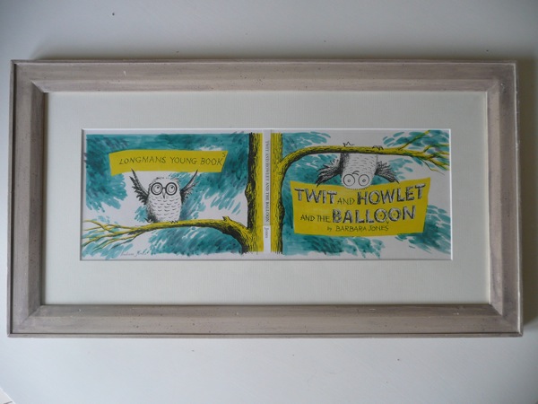
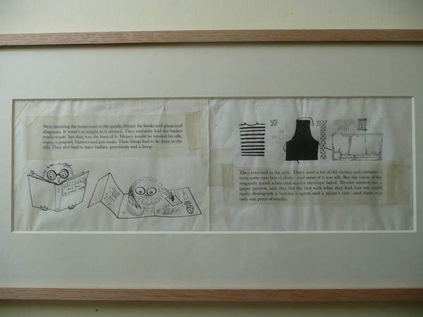
We’ve been beaten to it!  For a while now, me and Serge and Tweed have been thinking that what the world needs is a complete re-staging of Barbara Jones‘ Black Eyes and Lemonade Exhibition, which was held at the Whitechapel Gallery as part of the Festival of Britain celebrations in 1951.

Black Eyes and Lemonade Catalogue cover curated by Barbara Jones whitechapel art gallery

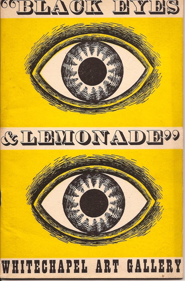
I’ve written about the exhibition before on here, as well as posting some details of the catalogue (from which we learn that a good third of the exhibition at least came from Barbara Jones herself).

But it’s still worth reprising what I’ve said before, which is that Black Eyes and Lemonade was a very important exhibition whose importance  – seen from the perspective of today – rivals the spindly-legged modernism on display at the South Bank itself.

Festival of Britain artists impression from FoB catalogue

I say this for two reasons really.  One is that the displays at the Festival of Britain itself were brilliant but at the same time also quite obvious.  The modern world of technology and leisure was the big promise that had been made at the end of the war; this dream was one of the things that people had been fighting for.  So while the displays of modern architecture and labour saving devices at the Festival were amazing and exciting, all brought together for the first time, one thing they were not was unexpected.  But Black Eyes and Lemonade was.

Black Eyes and Lemonade Whitechapel Art Gallery Barbara Jones pub display

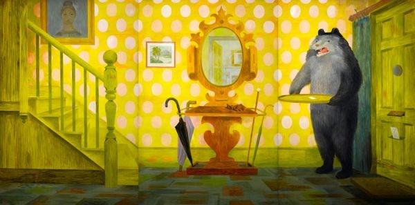
It takes a particular kind of contrary genius to look the other way when everyone else is pointing towards a radiant future, but that’s exactly what Barbara Jones did.  She collected up pub lettering, popular advertising and naive art – in short, all the things that she felt were not only neglected now but were also in danger of disappearing under a wave of television, good modern design and indifference.  (As one of the main artists on the Recording Britain project, Barbara Jones had form in thinking about what might be neglected and in danger of disappearing).

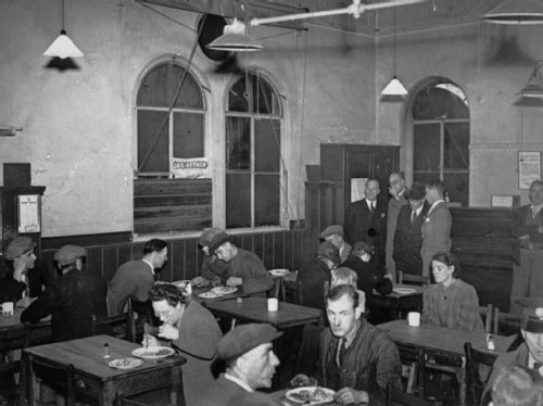
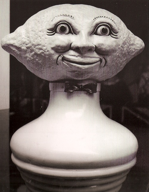
But Black Eyes and Lemonade was also revolutionary in that it was the first time popular industrial art had been allowed into the hallowed halls of a gallery or museum.  People at the time were genuinely outraged that the Idris Talking Lemon was being displayed as though it were a piece of art.

Black Eyes and Lemonade Whitechapel Art Gallery Idris Talking Lemon Barbara Jones

Of course poular art had been celebrated before.  Here’s just one example, Noel Carrington’s King Penguin on English Popular Art, from 1945.

Noel Carrington English Popular Art 1945 King Penguin

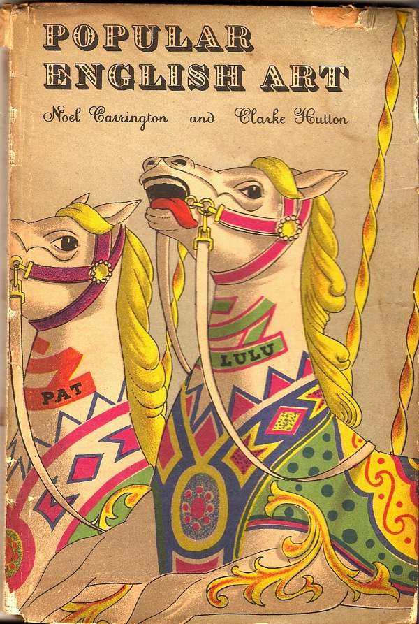
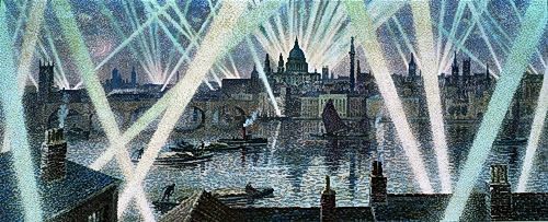
But you won’t find any talking lemons in here; instead it’s all horse brasses,  smocks and twelfth century hinges from cathedral doors.  The closest it gets to modernity is the sign painting on barges and an appreciation, shared with Black Eyes, of Victorian pub interiors.  It certainly wouldn’t have featured anything like this.

Black Eyes and Lemonade Airedale Fireplace

Black Eyes and Lemonade was the first time that the popular products of the industrial age had been celebrated in this way.  It began a process which leads, in the end, to Grayson Perry and Jeremy Dellar, which makes it in my book a very good thing.

The good news is that these kind of opinions are no longer a minority view, which is why the Whitechapel Gallery, along with the Museum of British Folklore, are now revisiting Black Eyes and Lemonade for an exhibiton which has just opened.   Now it’s an ‘archive exhibition’, whatever that means, and I can’t tell you any more than that as I haven’t been to see it yet.  Although it is on until 1 September, so there is some time.

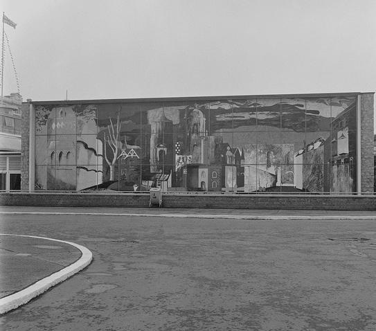
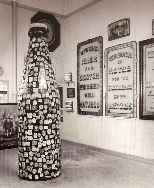
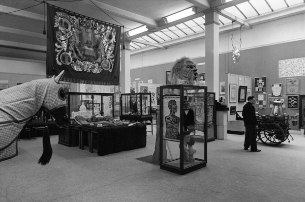
But I will, not least because the Whitechapel have sent over, by way of tantalising preview, these photographs of the exhibition in situ.

Black eyes and lemonade interior view with banner whitechapel art gallery


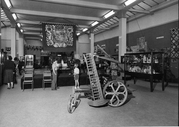
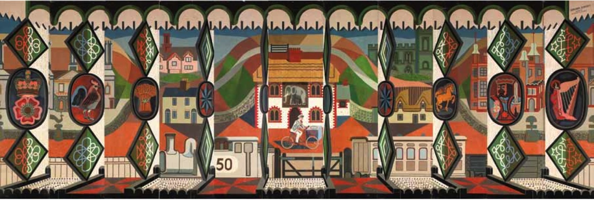
Look at that National Union of Railwaymen banner hanging from the ceiling, it’s a real index of how far we have all absorbed Barbara Jones’ ideas about what is worth celebrating in popular art.

Jeremy Dellar Manchester procession banner

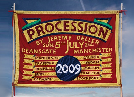
It doesn’t only link us to Jeremy Dellar and his modern banners produced for the Manchester Festival a few years ago, the idea has now become even more mainstream than that.  For Michael Wood’s most recent series about the history of Britain, a recurring motif was the banner, commissioned for the programme, which depicted the different stages of history featured in the series.

Michael Wood Great British Story Banner

Here it is again from a different angle, along with a quite splendid selection of other stuff.

Whitechapel art gallery black eyes and lemonade exhibition 1951


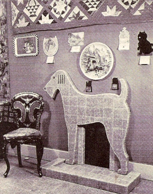
From the pictures they sent me I also learned that the Airedale fireplaec has not only survived, but is now preserved in the Design Museum collections.

airedale-fireplace

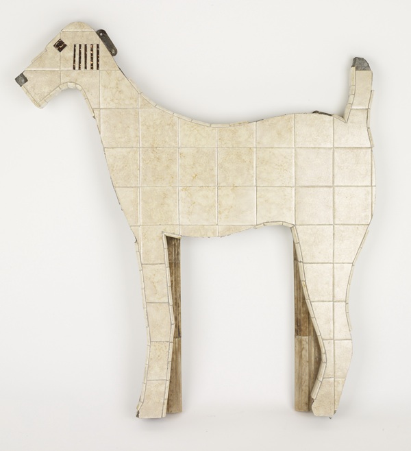
There is a whole story in that, just waiting to be told, but whatever it might be I think Barbara Jones would be rather pleased about the result.

Anyway, I will obviously be going as soon as I can possibly manage, if any of you get there before me, please do report back.

Bear necessities

Earlier this week, I made it down to London to take a look at the British Murals and Decorative Painting exhibition, as mentioned a few weeks ago.

I still love this.

Barbara Jones Out in the Hall 1960

Although I have faced up to the fact that we have neither the funds nor a wall space large enough.  Mind you, it was tempting; it was starting to look cheap, at least next to the Edward Bawden which, it turns out, was for sale.

Edward Bawden SS Oronsay Mural 1951

For £165,000.

But as ever, exhibitions never appear quite as you expect.  Two things really grabbed my attention, and they’re the biggest thing on display and one of the smallest.

The biggest is the John Piper mural from the Festival of Britain.  It’s unimaginably huge.  Even on Bond Street they could only find a space that would fit two thirds of its panels.

John PIper Festival of Britain homes and gardens pavilion mural

Its size is also its undoing, because a reproduction condenses it so much that you simply can’t see how good it is.  Take this detail, a cupola which is in part from Castle Howard with a bit of the Sheldonian thrown in.

John Piper detail of Festival mural

Or even these houses behind Owlpen Manor, which just disappear in a reproduction.

John Piper Owlpen detail from Festival mural

Really it’s brilliant – a contender for one of the best things Piper ever did, and I could have looked at it for hours.  And it really, really ought to be in a museum so that everyone gets the chance to do that.

The other object that caught my attention is tiny.

Kenneth Rowntree design for mural british restaurant in acton

This is a sketch by Kenneth Rowntree for a mural design for the British Restaurant in Acton in 1942.  I like it as a piece of design, but I love it even more for what it represents.

The British Restaurants were set up by the Ministry of Food during the Second World War as places where people could get a reasonable meal (well, within the confines of rationing) at a fair price.  They were set up in schools, in village halls, and, as Rowntree’s design shows, in churches too.  But what absolutely astounds me, and fills me with joy, is that the Ministry of Food decided that it was important that the restaurants were decorated, and not just by anybody, but by some of the leading mural artists of the time.

British Restaurant inspection visit

Here, thanks to the Imperial War Museum, are some bureaucrats, examining a British Restaurant with a view to getting it decorated.

A flick through the book which accompanies the murals exhibition reveals that it wasn’t only Rowntree, a conscientious objector, who worked on the British Restaurants, many other of his contemporaries did too.

There is so much that is good about this scheme, but what I love most is the vision, the sense that even in a world where food and supplies are rationed, where every man and woman is being directed to where they can best support the war effort, art is important.  But this isn’t an elitest intention, far from it; this art is designed for the most democratic of public places, it is genuinely art for all.

It’s a spirit that makes me thing that there was a country that I would have liked to live in.  I know there were disadvantages, and I probably wouldn’t have liked the bombing and the deprivation, the constant fear of death.  But even so, in its pride and its sense of what mattered in life, it’s a far better place than where I find myself living now.

Add To Cart

I could quite happily just give you this single picture and consider it a complete post, because it’s just fantastic

Barbara Jones Out in the Hall 1960

What I’m showing you here is a three and half metre long mural by Barbara Jones called ‘Out in the Hall’ from 1962.  I have no idea what it was painted for – although given that it was still in her studio in 2010 she may just have produced it for her own pleasure – but it was displayed in a Victoria & Albert Museum exhibition called Mural Art Today in 1962.

The truly extraordinary thing about it, though is that it is for sale through Liss Fine Art.  There’s a button on the page which just says ‘Add to Cart’.  I’m so tempted. The only drawback is that it costs £12,000, which means we’d have to choose between a bear on a yellow background and a functioning kitchen.  I took this vote to Twitter, where the vote was overwhelmingly in favour of the bear.  I’m not entirely convinced yet though.

To be honest, that one mural would be quite enough for me, but there is much, much more where that came from too.  Because Liss have organised an exhibition called British Murals & Decorative Painting 1910 – 1970, and what’s on display, and in many cases on offer, is really quite extraordinary.

Highlight – simply for the fact that it still exists in any shape or form at all – is the John Piper mural called ‘The Englishman’s Home’, which he designed for the exterior of the Homes and Gardens Pavilion at the Festival of Britain.

John PIper Festival of Britain homes and gardens pavilion mural

Here it is in situ, with a bin.

John Piper mural in situ festival of britain

Amazingly, this too is for sale, although for ‘Price on Request’, which I always translate as, ‘if you have to ask, you can’t afford it’.  I imagine they’d also want to vet you too, if only to make sure that you actually had the space to keep over sixteen metres of John Piper under proper conditions.  But that really ought to be in a museum, don’t you think?  Is there a campaign to get it for the V&A do you know?  And if not, shall we start one?

While we all consider that, there are other gems to eye up too.  This Edward Bawden was produced for the SS Oronsay in 1951, but is now in a private collection.

Edward Bawden SS Oronsay Mural 1951

Or this Claude Francis Barry, produced for nobody knows quite what or why during the war but unbelievably evocative.

Claude Francis Barry wartime london mural

I could go on almost indefinitely until I reproduced the entire collection, but I won’t, for a few reasons.

The first is that there is, I think a lot more to say about these works and right now I don’t know enough to say it.  A book has come out to accompany the exhibition and I think I’m going to need to absorb that first before I come to any definite conclusions.

But there is definitely something interesting going on here that hasn’t really been described properly before, and to me it looks like a graphic and representational style which is half way between fine art and posters.  This Mary Adshead could nearly come from a Shell poster of some kind.

Mary Adshead English Holiday puncture

It was intended to be one of eleven designs, but I’ll let the catalogue tell you the history of the piece, because it’s rather wonderful:

The Puncture and The Village Inn were two of eleven scenes in the series An English Holiday, commissioned by the British-Canadian business tycoon and politician Lord Beaverbrook, early in 1928, for the dining room at Calvin Lodge, Newmarket. The commission for An English Holiday was withdrawn by Lord Beaverbrook in August 1928, apparently after the intervention of his friend Lady Diana Cooper who felt that Beaverbrook would quarrel with most of the people (his friends and acquaintances) who served as the models for the scheme.

These murals also, perhaps, let us into another way of discovering a very British strand of art, one which stands so far outside the mainstream of continental modernism that it hasn’t properly been described yet.

There’s a good reason, too, for why very little of this has been described.  A note in the catalogue estimates that at least 90% of the murals of the period have been destroyed.  Barbara Jones, for example, produced at least 29, of which only two are known to be still extant.  The other one is in the exhibition too – produced for the International Labour Exhibition in Turin in 1961.

Barbara Jones International Labour Exhibition 1961

Price on request.  Sigh.

Finally, I don’t have time to think about this now because the exhibition isn’t on that long – only until 9th March, so you do really need to go and see it while you can.  As do I.