I mentioned a while ago that I was trying to be nice about railway posters. It’s all Grayson Perry’s fault. We came late to his Channel 4 series about taste, and it’s only available on 4OD for just a few more hours, but I am sure it will get repeated because it was one of the best pieces of television I’ve seen in a very long while ( as an ex-tv person, I have high standards). There wasn’t a poster in sight, just plenty of spray tan, Jamie Oliver tableware and cushions with pictures of labradors on, but it’s still got me thinking about what I do and don’t approve of on this blog, and why.

One of the reviews described Perry as being ‘like one big, walking open mind’, and that was the real pleasure of the series. He managed to enjoy every visual environment he came into, and to treat them all with equal respect. That picture above is him dressed up for a night out with the girls in Sunderland, so it isn’t the kind of respect you might expect, but it was very genuine.
Perry had obviously been reading his Bourdieu about how class and wealth are the determinants of taste – his script even used the phrase ‘cultural capital’ when talking about middle class people with the confidence to buy art from junk shops. But he wasn’t just spouting the jargon, Perry walked around clearly believing that everyone’s choices in decor, clothes, even tattoos, were as valid as anyone else’s. It was a rare and refreshing spectacle.
So why am I banging on about this, other than to persuade you that the series is well worth three hours of your time when it is finally repeated. Well, it made me think about a lot of things again and one of them, perhaps strangely, was how I categorise railway posters. Here’s Exhibit A (all posters courtesy of the NMSI today).
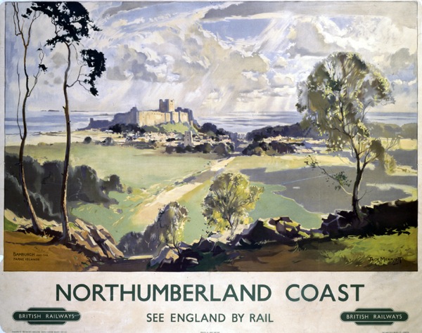
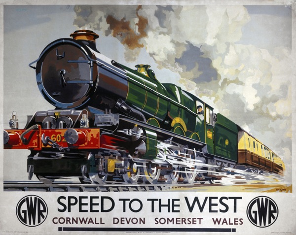
I found it really quite hard to choose this poster, a typical landscape one, as I kept being tempted by ‘more interesting’ ones on the search. So that’s my taste laid bare. Now for an even harder task, I’m going to find a Terence Cuneo and post that too.
It won’t come as any surprise to you that I do not love this sort of thing. But lots of other people do, clearly; his works go for thousands and there is a statue of him in Waterloo Station. I don’t think there’s a statue of Tom Eckersley yet, but I much prefer this.
Or even, for a fairer comparison with the posters above, this.
Not only am I ranking these in a hierarchy of taste which is not based on a coherent theory, in fact on nothing more than my own personal opinion, but I’m also, in the process, implicitly criticising other people for liking pictures of fields and trees. Or, indeed, trains.
Now on the one hand this is fine. Not even Grayson Perry would argue against personal taste. It is what it is, and what’s the point of having a blog and writing thousands and thousands of words without pay unless it is to indulge your own taste and opinions. But I think he would be trying to find the good in the other things too. And in the case of these railway posters I may be able to manage it.
Instead of categorising these posters as not-an-Eckersley and therefore failures, it’s possible to see them as a natural development, and a very democratic one too, of one of the key strands in British art, the landscape painting. In the period both before and after the war, when fine art was off on a continental, abstract and primitivist path, British landscape artists were never going to be in fashion. Unless they were very lucky, they were going to find it hard even to be seen as fine artists. But that didn’t mean that the art died out, it just went somewhere different for a while, on to posters. (There’s a lot more that could be said in this argument, but that can wait for another post).
In seeing these as inferior to the more abstract poster designs by artists like Games and Eckersley, I’m just expressing the cultural preferences (or perhaps prejudices) of my kind; I’ve been brought up with the narrative of the progress of fine art and so the more graphic designs are, clearly, superior. I don’t have the money to buy a Picasso, but I will flex my cultural capital by putting a poster on the wall instead. See my discrimination at work, even if I can’t afford the real thing.
But other people with other backgrounds might have a very different opinion. Imagine being brought up in the landed gentry, in a house stocked with eighteenth and nineteenth century watercolours alongside the pictures of dogs and pheasants. If you didn’t have the money for fine art, a railway poster might look very appealing indeed. It’s just a different story, that’s all.
In the course of the series, Grayson Perry, as well as exploring, makes a series of tapestries about the people he’s met and their tastes. The programme would be worth watching for these alone; they’re based on Hogarth’s Rake’s Progress and are wonderful.

Their collective title,though, is The Vanity of Small Differences. Which pretty much sums up the situation with railway posters, because there isn’t that much difference between them in the end, just the slight distinctions of personal taste.
Well except for the pictures of trains. I still haven’t managed to get my head round those yet. But I will try, I promise.
Isn’t it the difference between romance and energy / humour / edge? I visited a photography exhibition recently where the work was seperated into two rooms: one landscapes, sunsets, atmospheric scenes; the other urban, architectural and essentially about people and their environments. The photographs in both rooms were very beautiful. When I considered purchasing one I wanted something with an edge.
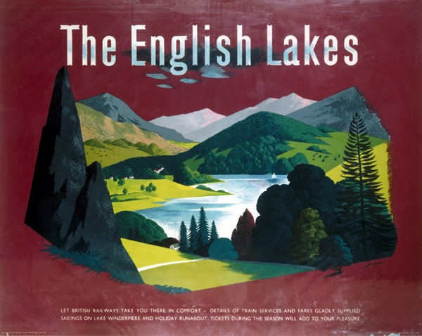
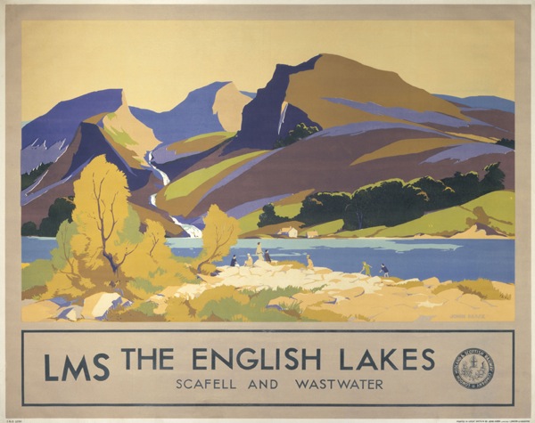
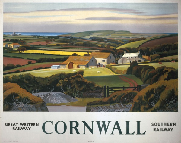
I suppose one difference is that people like pictures of trains because they like trains, i.e. the object of the poster/art as much as, or more, than its representation. I think you move on (if that isn’t too self-congratulatory) to getting more pleasure from the art itself. So for me the The English Lakes poster is head and shoulders above the rest (although I am very taken with the Cornwall poster, who is that by? Looks a little like Maurice Wilson?)
The Cornwall poster is by Adrian Allinson (1936).
The idea of edge is a really interesting one – at what point do landscapes cease to have an ‘edge’ and become safe art? I am thinking about the Romantic approach to landscape here – where a wild place was still faintly dangerous and seeing it as beautiful was an avant-garde thing to do. But are those paintings still thrilling in the way they were when they were painted, or have they lost their edge? And can a picture of the British landscape still have edge ?(I think it could, perhaps).
Yes also to the difference between art as photograph-substitute and art for its own sake. And then the poster, which is never entirely for its own sake. Those pictures of trains are always very, very detailed, aren’t they; never impressionistic, every bolt accounted for and noted down. I need to think about this some more one day and work out what my problem is with that, beyond the obvious one of not caring for trains that much.
And thank you for the answer, I should have put titles really. Sorry about that.
Sometimes it can be as simple as something being ‘safe’ in that the artist is painting in a style already well established by others; they may well bring a high degree of technical skill to the execution but not that much in the way of imagination or thinking. In contrast the early modernism evident in other posters probably jarred somewhat at the time but has a wonderful sparkle and playful use of form and colour. Things are a little more complicated now though as modernism is very much an accepted style which can be every bit as received and safe as the chocolate pictures of trains or landscapes. Even more difficult are new posters made in the style of modernist posters or packaging – one naturally gravitates towards them as you would some previously unseen vintage gem but then often you pause as you realise you are looking at a kind of repro….
Lots of interesting thoughts there. Were pre-war modernist railway posters one of the ways in which the landscape tradition developed then? They weren’t at all safe, I don’t think.
In terms of your second point, I think we are now in the infinitely regressing and reproduced worlds of Baudrillard, at a point where my understanding starts to run out. But I think, if I am remembering right, that nothing is authentic or real any more, so you can produce a poster in any style you want and it is all empty of meaning. As for what this itself signifies, I’ll throw that open to the floor.
OK, so Cuneo’s steam engines maybe very, very detailed but there are plenty more without bolts…
http://www.christies.com/lotfinder/ZoomImage.aspx?image=/lotfinderimages/d54298/d5429872&IntObjectID=5429872
http://www.christies.com/lotfinder/LargeImage.aspx?image=/lotfinderimages/d45587/d4558774x.jpg
http://www.onslows.co.uk/press_nov_2009.htm
Yes indeed, I accept all of those as lovely posters with trains on. Thank you, with a bit more assistance like that I may one day be able to appreciate everything in the manner of Grayson Perry.
What’s interesting though, is that they are all pre-war, a time, I would guess, when the train was still a marvelous new piece of technology, and so suited to a modernist style. Are Cuneo’s designs already nostalgic for that? Or has modernism just moved on and left the train behind?
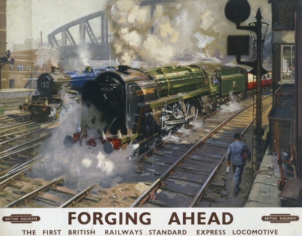
The Cuneo you picked is the only poster specifically commissioned to show off that particular kind of train. All the others sell the journey, or the destination.
“Forging ahead” is British Rail trying to sell a newish kind of steam train when most other countries of the world were dieselizing rapidly, so nostalgia irony?
Just for info, it was the cover of the Triang Hornby Catalogue in 1973.
I’ll not blame you for not ever liking this one:
http://www.pegnsean.net/~railwayseries/surprisepacketpostersmall.jpg
Or indeed the ICI works on the Wirral. We once, briefly, owned that poster.
I know what you mean, but for me Cuneo still foregrounds the trains so much that it’s hard to see anything else. There is a Pathe newsreel of him at work on their website, and he’s very much drawing trains from life on it.
That other one’s rather, well, extraordinary, isn’t it?