Owls in the kitchen

A mysterious package arrived in the post a few weeks ago.  Unannounced and anonymous, it turned out to be  a small selection of materials about one of my favourite artists and people, Barbara Jones.

There’s a couple of booklets – one a catalogue of an exhibition in Marlborough in 1999, the other a review of her life and works published in the journal of the Private Libraries Association.  (I think my new aspiration may be to own a private library).

But best of all are a pair of cuttings.  One is her obituary from – possibly – a Hampstead newspaper.  (This is very brown as well as fragile, so I’ve scanned it in black and white for easier reading.)

Barbara Jones obituary

Apologies for the slightly insane scale, but I wanted you to be able to read it.

The other, is even better, because it’s an article about Barbara Jones and her immensely quirky and desirable kitchen.  Which of course includes the owl dishwasher, as featured on here (and BBC television) before.  I think this dates from 1966 or so, as she mentioned having just finished Design for Death.

Barbara Jones kitchen newspaper cutting

Click on this and it will get bigger.  Living in an old house, I particularly like her approach to damp patches, which is just to cover them up with plastic daffodils.  It’s an example we can all follow.

I really have no idea who sent me this at all.  The very short note that came with these gems simply says that they were found in the clearing of a relative’s house and otherwise would have been recycled.

Whoever you are, thank you so much for not recycling.  This package has given me an enormous amount of pleasure and I hope that in sharing it, a few more people will be delighted as well.

Be really cool, man, archive

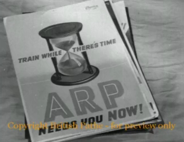
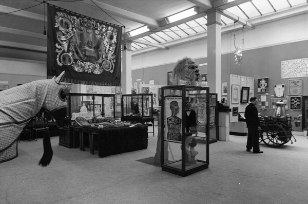
The recent announcement from the British Postal Museum and Archive announcing that they have upgraded their online catalogue may not have been the most retweeted 140 characters in the history of Twitter.  But the news is actually quite exciting.

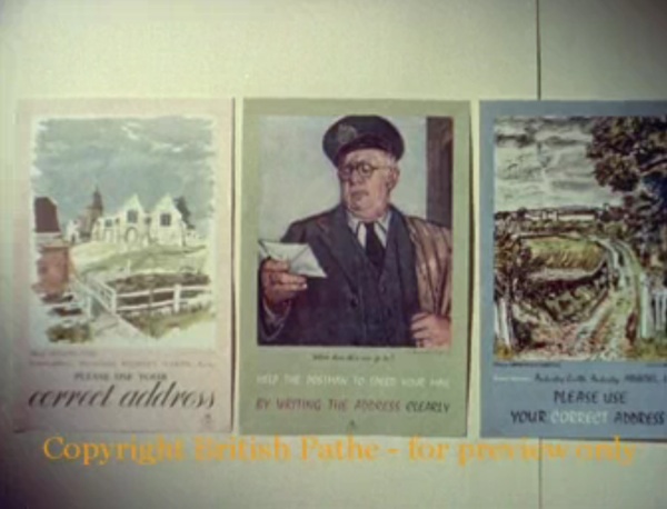
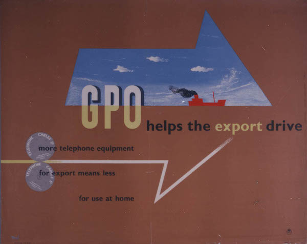
On an entirely practical level the images are now larger than a postage stamp. The particular joy of this is that I can now get a proper look at the van posters, which are some of my favourite things in the world.

henrion-reindeer-long

I wonder if any of these have survived outside of the BPMA’s collections?  I’ve never come across one out in the wild.

1951 Alick Knight post early robin poster GPO

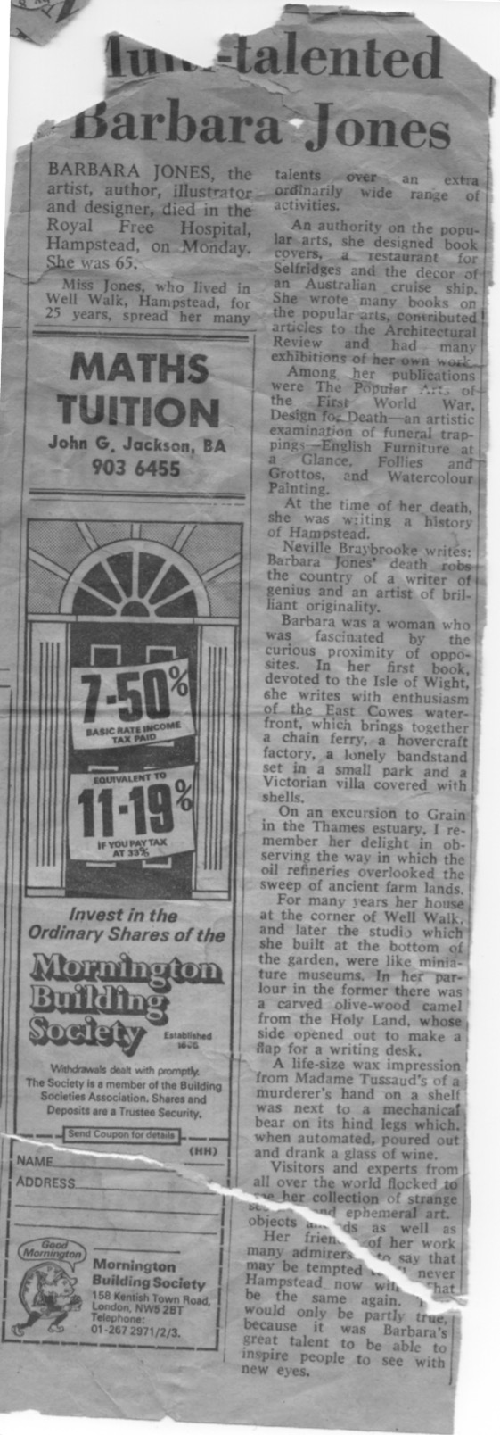
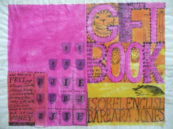
More than that, a whole lot of new material also seems to have been catalogued for the first time.  I had no idea that Barbara Jones had ever designed a poster for the GPO, but the evidence is there in full colour.

Barbara Jones GPO poster mermaid inland postcards

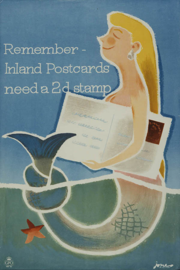
It’s from 1956, since you ask.

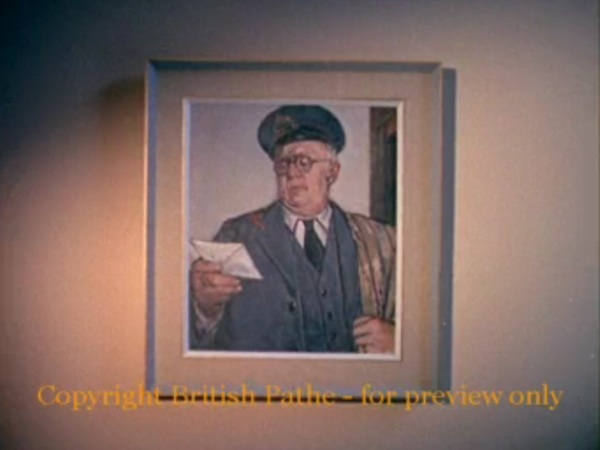
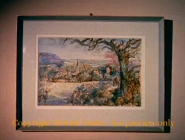
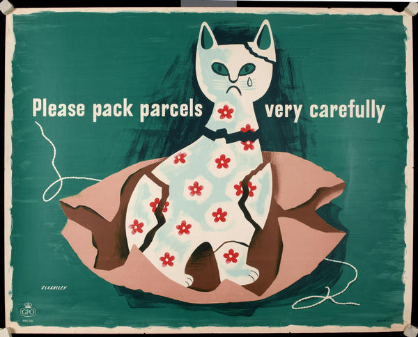
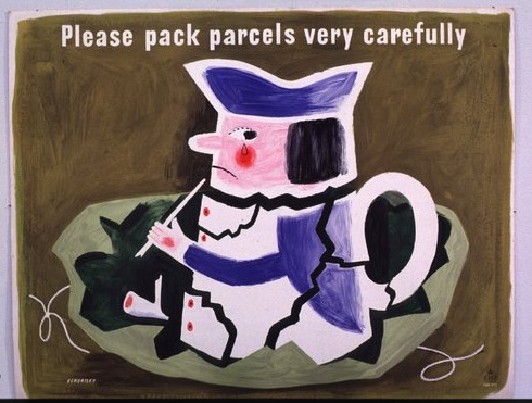
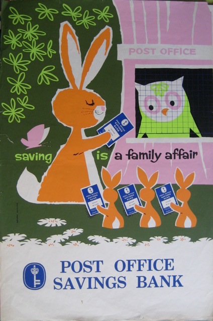
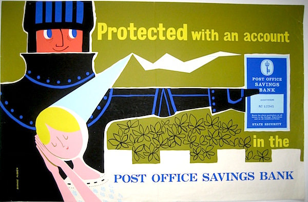
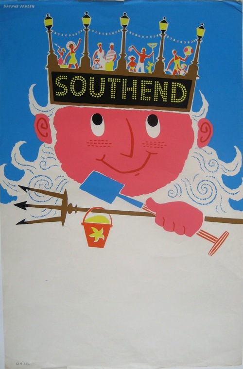
In addition, for the first time the catalogue now includes some Post Office Savings Bank posters.  This is clearly still a work in progress as, currently, there’s nothing in there by Daphne Padden and she did some of her best work for the POSB.

Daphne Padden post office savings bank poster with rabbits and owl.

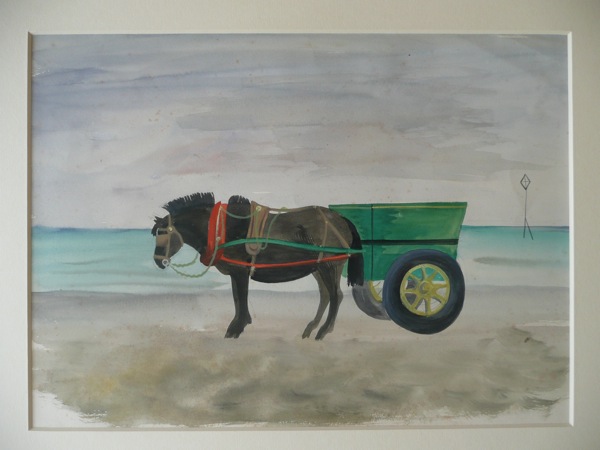
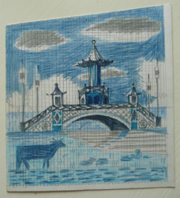
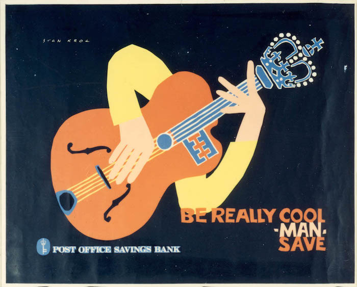
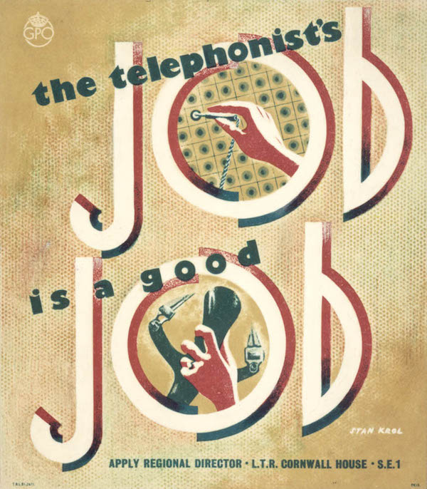
What is in there, though, when you search for POSB posters, is a lot of work by Stan Krol, quite a bit of which I’ve never seen before.

Stan Krol post office savings bank poster 1960 guitar

With both posters and artwork included.

Stan Krol eureka gpo poster artwork 1960

All of which is a salutary reminder.   It’s not just that archives themselves are important, but also the way they are arranged and made accessible.  Because both of these things can change the way we think about the past.

Let’s just start with the contents.  A couple of years ago, I wrote about Stan Krol, saying that I couldn’t find out that much about the man or his output.  Obviously, pages of Stan Krol posters in the BPMA catalogue rather changes things.

stan krol telephonists job artwork GPO 1951

Morever, in the new, exciting BPMA catalogue, the results also come up differently.  Back in the day, the archive used to sort the results, so that the artwork would come up first, then the posters.  So I would skip through the artwork, and just look at the posters instead.

1968 Tom Eckersley detector van van poster

But now the two come up intermingled, which means that I don’t miss items like this Tom Eckersley internal poster, which shows as artwork but not as finished poster.

Tom Eckersley GPO internal poster mailbags 1950

All of which will, I am sure, make other differences to the way I think as well, even if I I don’t entirely know what the results will be yet.  Watch this space.

The biggest change of all, of course, is just the fact that online archives exist in the first place.  This blog, and I’m sure much else besides, simply wouldn’t exist without them.

GPO Gay Christmas van poster

If I had to travel from London to York and all points in between simply to see posters, it’s just not going to happen without a private income or a job that is prepared to pay for me to do it.  Neither of which things exist.  So online archives enable me, and many many other people, to think more widely and to see more points of reference.  But there is another more subtle benefit too, which is that they also allow people like me to choose.

Prior to this, the only way I would have been able to see any GPO posters would have been either in auction catalogues, or in books.  In each case, the posters would have been pre-selected.  But give me an archive and a computer, and I am at liberty to decide which items I find interesting.  So, perhaps, I am less likely to fall in with the accepted canon of ‘good’ posters as a result, and history ends up being written slightly differently.  Which is clearly a good thing.

Schlegel export drive gpo poster 1950

So hurrah for the lovely new BPMA catalogue and archives in general.

Games Giant postcards van poster 1961

But wonderful as all of this is, we mustn’t let this blind us to the fact that not everything is archived.  This may sound like a truism but it’s actually a really important point, and it’s something I think about a lot in connection with Daphne Padden.

Daphne Padden POSB poster knight

Her work has been massively under-recognised over the years, and her profile still isn’t as high as it should be.  Now there were plenty of reasons for this – and being a woman working on the outskirts of London must have played a considerable part.  But a big part of it has to be because she just worked for the wrong people.

Daphne Padden lytham st Annes British Railway poster

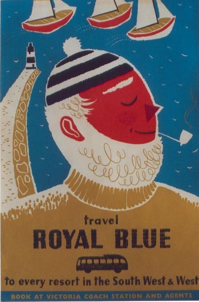
Railway posters were sold and collected when they were produced, and nowadays they are traded at auction, reproduced in books and as fridge magnets, and kept in a socking great archive in York (now there’s an interface that could still do with taking a long hard look at itself).  But she only ever did a few of those.

Daphne Padden isle of Man BRitish railways poster

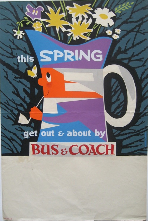
Instead her main customer were the coach companies.  And where is the coach archive, I hear you ask?  Well exactly.

Daphne Padden Royal Blue vintage coach poster sailor 1957

There isn’t a collection of these anywhere; hardly any survive and it’s possible that the most comprehensive selection (now that the Malcolm Guest collection got sold) is in our spare room.  Which is ridiculous.

Coach tour rabbits Daphne padden coach poster

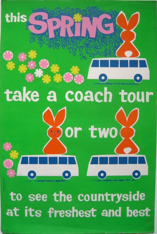
And because my spare room doesn’t have an archivist or – more to the point – doesn’t actually contain more than a couple of dozen coach posters when hundreds were produced, people don’t know about these designs.  So they don’t get reproduced in books, or as fridge magnets, and in the end they disappear from view.

Daphne Padden Southend coach poster

Along with the designers, like Daphne Padden, who produced them.

Spring coach poster Daphne Padden

So while we can have a lot of fun with the archives that are there, it’s always worth using them with half a mind to the ones that don’t exist.

Postal Art

There is more to life than auctions. as proved by what Mr Crownfolio found on his internet wanderings recently.

GPO Art

What that link takes you to is a short Pathe film about, amazingly, the poster art of the GPO, dating from 1959.  Which means that you get treated to things like this Ruskin Spear.

Ruskin spear postman painting for GPO poster from pathe newsreal

This is the original, sitting on the walls of the GPO Head Office, where you can also find this rather lovely view of Iwerne Minster by John Minton as well.

John Minton painting of Iwerne Minster for GPO poster design on Pathe newsreel

But don’t worry, as the very period commentary will tell you, if you want to see art works like this without travelling to London, just pop into your local Post Office where these posters will be on display.

GPO posters on display from pathe newsreel 1959

The featured set of posters, mostly done by ‘arty’ artists, were apparently intended to give the viewer an awareness of place, which would in turn lead them to address their letters in the correct fashion.  Apparently.

But that’s not all there is on offer, the film also features the range of Greetings Telegrams which the GPO now offers, and it’s possible to play the game of Spot-the-Barbara-Jones-birdie (posted before here if you want a closer look).

Mixed GPO greetings telegrams from Pathe film including Barbara Jones

Sadly, the designer that they choose to feature isn’t Ms Jones herself, but one Shirley Thompson.  She’s shown working with F.B. Savage, head of the design department, on a Valentine’s Telegram.  But oh, just look at that office.

GPO art office from pathe film

I’d happily take anything they’ve got in there.  Frustratingly, though I can’t quite work out what they’ve got tucked down the side of the desk there.  It ought by rights to be one of these.

Tom Eckersley cat ornament poster GPO pack parcels carefully

Tom Eckersley toby jug please pack parcesl carefully GPO poster

Except neither of them quite match.  Is it a first draft?  Or is it something else altogther?  I can’t find anything more likely in the BPMA catalogue so if anyone can provide a positive identification, please do.

This film is by no means the end of things either, I can see just from its own page that there is another short film entitled ARP Posters.

Early ARP poster woman from Pathe newsreel


It’s a soundless set of rushes, just showing a set of early ARP posters in various ways.  But it’s valuable nonetheless.  I’ve never seen some of these posters before.

ARP egg timer poster from Pathe newsreel


I wonder what else lurks within their archives, waiting to be discovered?

Looking a gift book in the mouth

A short Barbara Jones announcement for all of you who, like me, think that she deserves more recognition.  At last it seems to be happening.  Not only is the Black Eyes and Lemonade exhibition running at the Whitechapel until September, but now Jennings Fine Art are holding a selling exhibition of her work at the start of next month.  Including lovely things like this.

Barbara Jones gift book artwork neil jennings

It even comes with a caption:

Barbara JonesThe Gift Book

Watercolour and pen & ink, 1964. Original artwork for the front and rear covers of the book co-written with Isobel English. Extensively annotated by the artist. Reference: Artmonsky A6, illustrated p.129.

Provenance: The artist’s studio. 

I have no idea what it will cost, mind you.  Annoyingly, I can only find a teeny-tiny image of what the finished product looked like .

Barbara Jones gift book cover

This comes from the very useful Barbara Jones page at Ash Rare Books, which, by some oversight, I don’t think I’ve pointed out before.

There are more nice things in the exhibition too.  Here’s another.

Barbara Jones watercolour of horse on beach

 Seaside Pony & Cart

Watercolour.  Studio stamp verso.  Provenance: The artist’s studio.

James Russell has also posted, very interestingly, about Barbara Jones.  Mostly I will let you go and read it yourself, but there are two interesting facts in it that are worth repeating.

One is that Little Toller books are publishing a new edition of her book The Unsophisticated Arts, which you can read about here.  To my consternation, it includes additional drawings, ephemera and other material from her studio, which means that we’re going to have to buy it, despite having an original copy already.

The other, related fact is that her studio is, apparently, still extant.

Her studio has remained largely untouched since her death; most of the artwork has gone, but her sketchbooks and ephemera remain.  We spent hundreds of hours cleaning up the images and making them good for publication. it was a joy to work on because you look so closely at every single image and you see each page in a new way.

I’m boggled.  How has it survived and who is looking after it?  More to the point, I want to go and see it.  Now.

The selling exhibition, meanwhile, is from 5-9 and 12-17 June at the Peggy Gay Gallery, Burgh House, Hampstead.  Apparently Barbara Jones’s studio looked out onto Burgh House.

Barbara Jones sketch

 Mural Design for the Cake House, St James’s Park

A series of watercolour, gouache, pencil and pen & ink drawings, c.1969.  The New Cake House was opened by Mrs. Harold Wilson on 23/2/70.  The mural, constructed in ceramic tiles by Richard Parkinson, depicts the George III Jubilee celebrations held in the park in 1840.  We would like to thank Anthony Raymond and English Heritage for their assistance in cataloguing this work.  Provenance:  The artist’s studio.

Reference: Artmonsky pp.109-110; English Heritage Archive. (please note that this is only one drawing from the series)

I know I said that she deserves more recognition so I ought to be pleased about this, and for the most I am.  But at the same time, a small part of me minds that someone who I feel I stumbled upon by accident, along with a few others, is now becoming mainstream.  Still, I am sure Barbara Jones herself would have been very pleased, she was a fan of the popular after all.  So I will try to be pleased as well.

Popular, again

We’ve been beaten to it!  For a while now, me and Serge and Tweed have been thinking that what the world needs is a complete re-staging of Barbara Jones‘ Black Eyes and Lemonade Exhibition, which was held at the Whitechapel Gallery as part of the Festival of Britain celebrations in 1951.

Black Eyes and Lemonade Catalogue cover curated by Barbara Jones whitechapel art gallery

I’ve written about the exhibition before on here, as well as posting some details of the catalogue (from which we learn that a good third of the exhibition at least came from Barbara Jones herself).

But it’s still worth reprising what I’ve said before, which is that Black Eyes and Lemonade was a very important exhibition whose importance  – seen from the perspective of today – rivals the spindly-legged modernism on display at the South Bank itself.

Festival of Britain artists impression from FoB catalogue

I say this for two reasons really.  One is that the displays at the Festival of Britain itself were brilliant but at the same time also quite obvious.  The modern world of technology and leisure was the big promise that had been made at the end of the war; this dream was one of the things that people had been fighting for.  So while the displays of modern architecture and labour saving devices at the Festival were amazing and exciting, all brought together for the first time, one thing they were not was unexpected.  But Black Eyes and Lemonade was.

Black Eyes and Lemonade Whitechapel Art Gallery Barbara Jones pub display

It takes a particular kind of contrary genius to look the other way when everyone else is pointing towards a radiant future, but that’s exactly what Barbara Jones did.  She collected up pub lettering, popular advertising and naive art – in short, all the things that she felt were not only neglected now but were also in danger of disappearing under a wave of television, good modern design and indifference.  (As one of the main artists on the Recording Britain project, Barbara Jones had form in thinking about what might be neglected and in danger of disappearing).

But Black Eyes and Lemonade was also revolutionary in that it was the first time popular industrial art had been allowed into the hallowed halls of a gallery or museum.  People at the time were genuinely outraged that the Idris Talking Lemon was being displayed as though it were a piece of art.

Black Eyes and Lemonade Whitechapel Art Gallery Idris Talking Lemon Barbara Jones

Of course poular art had been celebrated before.  Here’s just one example, Noel Carrington’s King Penguin on English Popular Art, from 1945.

Noel Carrington English Popular Art 1945 King Penguin

But you won’t find any talking lemons in here; instead it’s all horse brasses,  smocks and twelfth century hinges from cathedral doors.  The closest it gets to modernity is the sign painting on barges and an appreciation, shared with Black Eyes, of Victorian pub interiors.  It certainly wouldn’t have featured anything like this.

Black Eyes and Lemonade Airedale Fireplace

Black Eyes and Lemonade was the first time that the popular products of the industrial age had been celebrated in this way.  It began a process which leads, in the end, to Grayson Perry and Jeremy Dellar, which makes it in my book a very good thing.

The good news is that these kind of opinions are no longer a minority view, which is why the Whitechapel Gallery, along with the Museum of British Folklore, are now revisiting Black Eyes and Lemonade for an exhibiton which has just opened.   Now it’s an ‘archive exhibition’, whatever that means, and I can’t tell you any more than that as I haven’t been to see it yet.  Although it is on until 1 September, so there is some time.

But I will, not least because the Whitechapel have sent over, by way of tantalising preview, these photographs of the exhibition in situ.

Black eyes and lemonade interior view with banner whitechapel art gallery


Look at that National Union of Railwaymen banner hanging from the ceiling, it’s a real index of how far we have all absorbed Barbara Jones’ ideas about what is worth celebrating in popular art.

Jeremy Dellar Manchester procession banner

It doesn’t only link us to Jeremy Dellar and his modern banners produced for the Manchester Festival a few years ago, the idea has now become even more mainstream than that.  For Michael Wood’s most recent series about the history of Britain, a recurring motif was the banner, commissioned for the programme, which depicted the different stages of history featured in the series.

Michael Wood Great British Story Banner

Here it is again from a different angle, along with a quite splendid selection of other stuff.

Whitechapel art gallery black eyes and lemonade exhibition 1951


From the pictures they sent me I also learned that the Airedale fireplaec has not only survived, but is now preserved in the Design Museum collections.

airedale-fireplace

There is a whole story in that, just waiting to be told, but whatever it might be I think Barbara Jones would be rather pleased about the result.

Anyway, I will obviously be going as soon as I can possibly manage, if any of you get there before me, please do report back.