Bear necessities

Earlier this week, I made it down to London to take a look at the British Murals and Decorative Painting exhibition, as mentioned a few weeks ago.

I still love this.

Barbara Jones Out in the Hall 1960

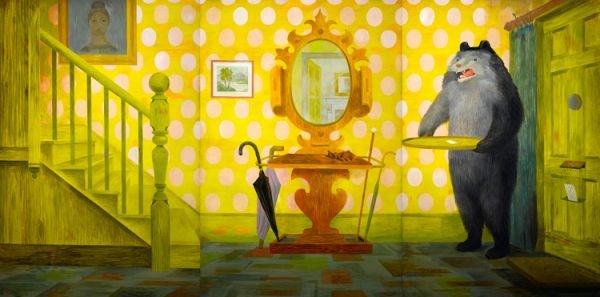
Although I have faced up to the fact that we have neither the funds nor a wall space large enough.  Mind you, it was tempting; it was starting to look cheap, at least next to the Edward Bawden which, it turns out, was for sale.

Edward Bawden SS Oronsay Mural 1951

For £165,000.

But as ever, exhibitions never appear quite as you expect.  Two things really grabbed my attention, and they’re the biggest thing on display and one of the smallest.

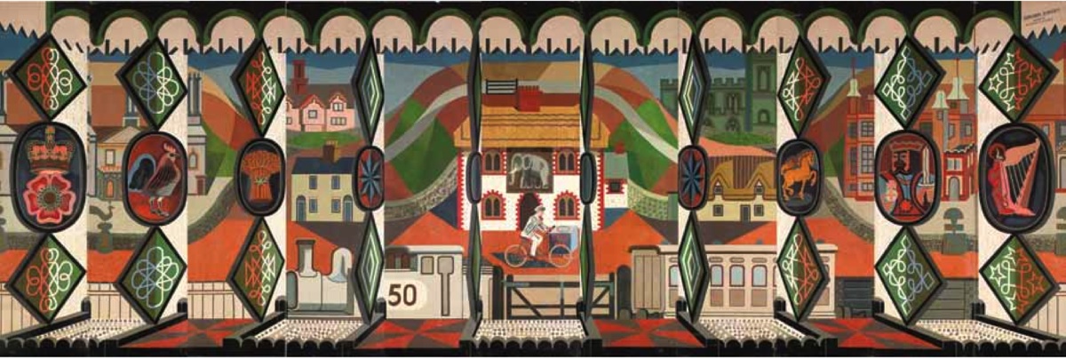
The biggest is the John Piper mural from the Festival of Britain.  It’s unimaginably huge.  Even on Bond Street they could only find a space that would fit two thirds of its panels.

John PIper Festival of Britain homes and gardens pavilion mural

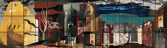
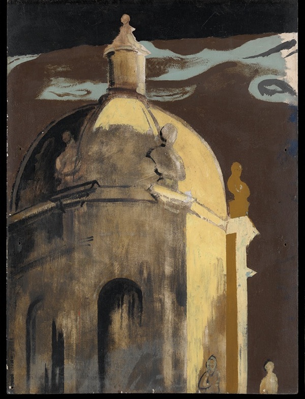
Its size is also its undoing, because a reproduction condenses it so much that you simply can’t see how good it is.  Take this detail, a cupola which is in part from Castle Howard with a bit of the Sheldonian thrown in.

John Piper detail of Festival mural

Or even these houses behind Owlpen Manor, which just disappear in a reproduction.

John Piper Owlpen detail from Festival mural

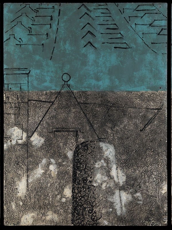
Really it’s brilliant – a contender for one of the best things Piper ever did, and I could have looked at it for hours.  And it really, really ought to be in a museum so that everyone gets the chance to do that.

The other object that caught my attention is tiny.

Kenneth Rowntree design for mural british restaurant in acton

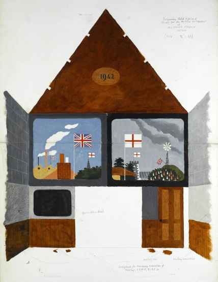
This is a sketch by Kenneth Rowntree for a mural design for the British Restaurant in Acton in 1942.  I like it as a piece of design, but I love it even more for what it represents.

The British Restaurants were set up by the Ministry of Food during the Second World War as places where people could get a reasonable meal (well, within the confines of rationing) at a fair price.  They were set up in schools, in village halls, and, as Rowntree’s design shows, in churches too.  But what absolutely astounds me, and fills me with joy, is that the Ministry of Food decided that it was important that the restaurants were decorated, and not just by anybody, but by some of the leading mural artists of the time.

British Restaurant inspection visit

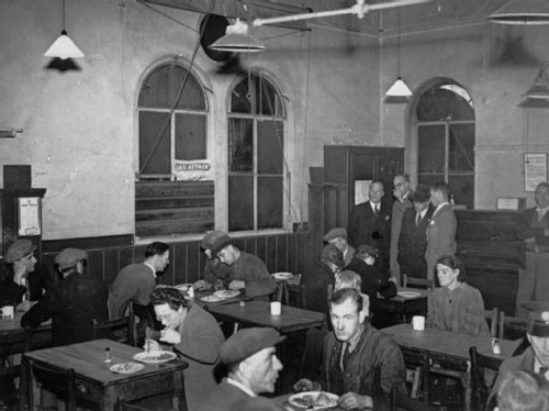
Here, thanks to the Imperial War Museum, are some bureaucrats, examining a British Restaurant with a view to getting it decorated.

A flick through the book which accompanies the murals exhibition reveals that it wasn’t only Rowntree, a conscientious objector, who worked on the British Restaurants, many other of his contemporaries did too.

There is so much that is good about this scheme, but what I love most is the vision, the sense that even in a world where food and supplies are rationed, where every man and woman is being directed to where they can best support the war effort, art is important.  But this isn’t an elitest intention, far from it; this art is designed for the most democratic of public places, it is genuinely art for all.

It’s a spirit that makes me thing that there was a country that I would have liked to live in.  I know there were disadvantages, and I probably wouldn’t have liked the bombing and the deprivation, the constant fear of death.  But even so, in its pride and its sense of what mattered in life, it’s a far better place than where I find myself living now.

Extravagance

Do you remember I said recently that we weren’t buying anything because we needed carpets and curtains?  It turns out that there are exceptions to this.

Black Eyes and Lemonade Catalogue cover curated by Barbara Jones whitechapel art gallery

Which is not a poster but the catalogue for the Black Eyes and Lemonade exhibition at the Whitechapel Art Gallery in 1951, curated, of course, by Barbara Jones.

Now we paid the money for something which is, if I am honest, not that pictorial.  There are a couple of images of popular graphics from the exhibition.

Molassine advertisement from Black eyes and lemonade catalogue barbara jones

Along with one Barbara Jones drawing of a doll.

Black eyes and lemonade doll drawing by barbara jones 1951

But that’s your lot – the rest looks like this.

Black Eyes and lemonade barbara jones inside text

From all of which I can tell you a few things.  One is that at least a third of the exhibition belonged to Barbara Jones herself; I wish I could have seen her house.

The second is that, more than anything else I have ever seen,the whole miscellaneous variety of human life is present, from bread to postcards of ‘Dressing up the cat’, a milk float to a stuffed chub, a beer pump to crochet-work mittens.  The only way I could give you the full picture of its oddity would be to type the whole thing out.

But fear not.  Chapter 27 of my world domination plan still includes a complete restaging of the entire Black Eyes and Lemonade exhibition, and with this in my hands I can at last make a start on it.  Even if I do have to live without carpets in the meantime.

Singing Together

Friday, so what could be better than some Barbara Jones birds, even if they are a bit grubby round the edges.

Barbara Jones Singing Together BBC Schools booklet 1957

Todays flock are pretty self-explanatory, playing in another lovely BBC Schools booklet of songs and music for children.  (I have actually mentioned these before, but now a copy is in my own hands, so you get to see it again).

Along with the songs ,there are further Barbara Jones drawings inside. These are in a much freer style, but still with her trademark exccentricity.

barbara jones green broom illustrations from BBC Singing Together schools booklet 1957

Mind you, the songs invite it.  The illustration above is for a traditional folk song called Green Broom which – as you might guess from the illustration – is pretty much a pagan welcome to spring.  While the young man worrying about his hair below goes with  Benjamin Britten’s setting of Begone Dull Care.

Barbara Jones illustration from BBC Singing Together schools booklet 1957

Also in there are bits of Schubert and Grieg, along with Victorian ballads and Norwegian folk songs. It’s almost as though Barbara Jones has had a hand in the selection process too.

The birds came as part of a selection box of these leaflets, all from the 1950s.  They’re all interesting, but a couple of them particularly so.  Summer 1954 was done by Derrick Hass.

BBC Singing Together booklet Summer 1954 Derrick hass illustrations

We’ve discussed him on here before (see the comments too for some memories of him) but he’s worth mentioning again in the context of what designers went on to do in the 1960s and beyond.  The prevailing story is that the rise of the all-in advertising agency put paid to the old-style poster designer:  a few – like Eckersley and Games – carried on, some like Henrion and Pick formed corporate identity consultancies, and who knows what happened to the rest.  But Derrick Hass bucked the trend by not only going into agency work but becoming an enormously successful and respected creative director who worked and won awards right up until retirement age, forty years after he did these.

BBC singing together Derrick Hass Summer 1954 small illustration

That’s quite an achievement.

Meanwhile I just like this Heather Lacey illustration, perhaps because it reminds me of illustrations in Puffin books.

Heather Lacey BBC Singing Together booklet 1950s

I can find nothing out about her at all, mainly because half of the internet seems to be called Heather Lacey.  If anyone knows more, please let me know.

These booklets, taken all together, were quite an achievement.  Every term, a school would get a new set of illustrations along with their music, perhaps not all of as wonderful as the ones I have chosen but certainly all good.  I’ve said it before but I’m quite happy to say it again; I’d love it if I thought my daughter was being exposed to both music and illustration of this quality in her primary school lessons.  But I’m pretty sure she isn’t, and that’s a profound loss.

We’ve grown used to seeing this kind of top-down culture (this is great art, you must know about it and I am right) as being elitist, discriminatory and rife with snobbery.  We don’t believe any more that the BBC or indeed any kind of media should be exposing us to high art, rather that they should be giving us what we want.  There is some truth in all of this, and in any case we can’t turn the clock back.  But we should also remember that sometimes, just sometimes, the result was profoundly democratic, and particularly so in things like these booklets where the art just arrives without any comment.  All children should be given the chance to see and hear illustrations and music like this.  They don’t have to like them – and we shouldn’t think any the less of them if they don’t. But if we just give them photocopied sheets of popular songs, we are taking away from them the chance of knowing these things exist.  And for a few children that might be the chance of knowing who or what they wanted to become.

D I Y Barbara Jones

Barbara Jones is becoming increasingly collectable.  At least that’s the message I’m getting from eBay.  We recently watched a whole collection of BBC schools booklets go past; most went for one or two pounds if they sold at all.  The one exception was this.

Barbara Jones BBC Time and Tune booklet 1960

By Barbara Jones, it sold for £21.50.

All of which preamble is mainly so I can convey my pleasure at getting this for just one squid.

Barbara Jones Woodentops colouring book front cover

It pretty much had to be by Barbara Jones given how similar it is to her Woodentops book, but it also does us the favour of saying so inside.

Barbara Jones woodentops colouring book inside front page

Most of the pages inside have been coloured in – I was going to say sadly, but it isn’t really, it’s just the book being used as it was meant to be.  One or two were missed though, so you can get an idea of what the drawings are like.

Barbara Jones Woodentops colouring book skipping

Leafing through it, I am struck by what hardworking farmers the Woodentop family are.  They haul the hay in with just a horse-drawn cart, collect eggs and get up early for the milking.

Barbara Jones Woodentops colouring book milking picture

All of which would have been quite normal then, but seems like a long-lost rural idyll from the vantage point of today.  And now if you’ll excuse me, I’ve got some colouring-in to do.

File under miscellaneous

The email from the Swiss auction house Poster-Auctioneer announcing their latest auction has once again dropped into my mailbox.  So I flicked through page after page of foreign posters, pretty sure that none of them would appear on the blog.  Until I came to this Donald Brun and my resolution crumbled.

Donald Brun 1952 volkswagen poster poodle genius

It’s the perfect mixture of sophisticated and daft, isn’t it.  Clearly they are expecting quite a lot of people to think the same, because it has an estimate of 900 swiss francs, which is over £600.  Never mind.

Once I’d given in to that, I thought I might as well include this poster too, mainly on the grounds that it’s a kind of style that really the British never even attempted, and so I do hanker after it a bit.

Kurt Helmut very foreign autophon poster

It’s by the rather brilliantly named Kurtz Helmut, and isn’t dated, although it doesn’t really need one, and it could be yours for in the region of 500 francs.

Elsewhere, there are some bits and bobs of Barbara Jones available on eBay should anyone be interested.  Exhibit A is a handful of original drawings, as brought to my attention by James Manning.  This one is the best, mainly because of the dog.

Barbara JOnes watercolour with nice dog

The better treasure, for me at least, is a copy of Design for Death, which is a wonderful book and definitely worth buying in its own right (as I have explained at some length on here before).  But how much better if it comes with this.

Barbara Jones owl christmas card 1960

It’s Barbara Jones’ own Christmas Card from 1960, featuring two owls who bear more than a passing resemblance to Twit and Howlett.  We do have the book, so I cannot possibly justify spending a minimum of £25 on one small card.  But I am tempted.

Architecture subsidiary art to confectionary, obviously

I’ve been reading quite a lot about the Festival of Britain recently (mainly because there is, still, precious little else written about design in the 1950s).  But it has reminded me that I really do need to get around to inventing some form of time travel.

This is Barbara Jones sorting out exhibits for Black Eyes and Lemonade, the exhibition at the Whitechapel Art Gallery which was her contribution to 1951.

One of the questions we used in choosing the old exhibits for Whitechapel was memory – when you think of the posters you can remember seeing as a child, what comes up first? …but then people would say Thorleys, I’ve never forgotten that.  So I telephoned Thorleys who said ‘yes of course, but you’ll have to come and look for it – all our old advertising stuff is in a shed.  Anything left over has been shoved in there for years – do come in old clothes!’

Thorleys feed advertising sign as at Black Eyes and Lemonade

We needed boiler suits, rubber gloves and Wellington boots, but it was all there, crammed into a warehouse on the Regents Canal.  The latest discards were near the door, clean and new, but beyond them far to the back were rolls and bundles thickly black with London grime.  We peeled off the top layers to find more than a century’s advertising: posters, tin plates, glass plates, leaflets that unfolded to show chicks bursting from the egg, and portraits in oils of prize animals fed on Thorleys.  The collection filled a whole room of the gallery.

In the course of my searches, I also came across these.

Black Eyes and Lemonade pub mirrors

They are a pair of pub mirrors which were also part of the exhibition, and which came up for sale last year.

Black Eyes and Lemonade Pub mirror detail

Here they are on display in 1951, in a whole room of pub exuberance.

Black Eyes and Lemonade Whitechapel Art Gallery Barbara Jones pub display

The more i see of Black Eyes and Lemonade, the more I want to recreate it; at the very least on the internet, but preferably in real life.

The only good selection of images of the exhibits in situ I’ve ever come across is in A Snapper Up of Unconsidered Trifles (as mentioned in my last post), so a whole documentary set must exist somewhere but, frustratingly, there are no picture credits in the book so I don’t know where they are and I do have a few other things to do before I set off on that particular diversion.

Black Eyes and Lemonade Whitechapel Art Gallery Idris Talking Lemon Barbara Jones

The two pictures which get most reproduced when people are talking about it (which doesn’t happen often enough) are the Idris talking lemon above – apparently it said that lemonade is good for man, woman and child – and the 1930s fireplace in the shape of an Airedale dog.

Black Eyes and Lemonade Airedale Fireplace

I think that’s probably because they were the two exhibits which most challenged people’s ideas of what ought, and ought not to be in an art gallery.  Popular art wasn’t a new idea in 1951, but that was as long as it kept itself to nice safe territory like fairground rides, barge boat painting and morris-dancers hobby horses.  The products of commercialism and the near past were much more dangerous and definitely not art, as Barbara Jones’ own memories make clear.

…we had borrowed two waxworks from Madame Tussauds – Queen Anne for general appeal and the beloved late Chief Rabbi for Whitechapel.  The first local visitors were delighted to see him, but later the Synagogue felt he was too near the talking lemon for dignity.  So we swapped the waxworks round, though the visual balance was destroyed, and Queen Anne stood nearer the lemon.

There was plenty more too.  I can’t scan the iced model of St Paul’s Cathedral made by Aircraftsman Brown of the RAF School of Cookery, although I really wish I could because it is a delight in royal icing.  And its caption was the title of this piece, which makes me think that the whole thing must have been a very witty entertainment indeed.  Perhaps I’ll use my time travelling to go back to the exhibition too, as well as doing a raid on some choice poster archives.

British popular art 1951 exhibition poster Barbara Jones

For now, while time travel isn’t possible, perhaps someone should think very hard about putting together some of this exhibition again.  Because this collection, this way of looking at the world was a revolutionary piece of thinking back in 1951.  This is a time when people want minimalism made from new materials, colours and styles, not old things, when even the government is putting its weight behind good design as a way of educating and improving society.  Black Eyes and Lemonade is challenging all of this, and taking a view on taste, design and the visual arts which was post-modern before modernism had even properly got going in Britain.

Ruth Artmonsky’s book takes Barbara Jones at her own estimation as a ‘jobbing artist’.  She was in fact much more than that, in many parts of her work she was a pioneer – Black Eyes and Lemonade could probably sit quite happily next to the Jeremy Deller retrospective when that opens later this year even though it’s sixty years old.  But because it’s ephemeral, it’s forgotten.  And she deserves better than that.


Incidentally, I had hoped that the catalogue would help me to find some more bits and pieces from the exhibition to illustrate, and the good folks at St. Judes have kindly put some of their copy online.  But the text is, well, a bit dry, so sadly it doesn’t really help.