Modern Tendencies

Reader request day today on Quad Royal.  This isn’t something I often do, but Paul Durham has asked for some help from you lot.  He’s trying to find as many images as he can of the posters that were issued by Heals for their exhibitions in the Mansard Gallery.  This was right at the top of the Heals Building in Tottenham Court Road, and they held exhibitions there from 1917 until the late 1970s.

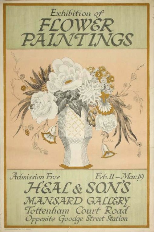
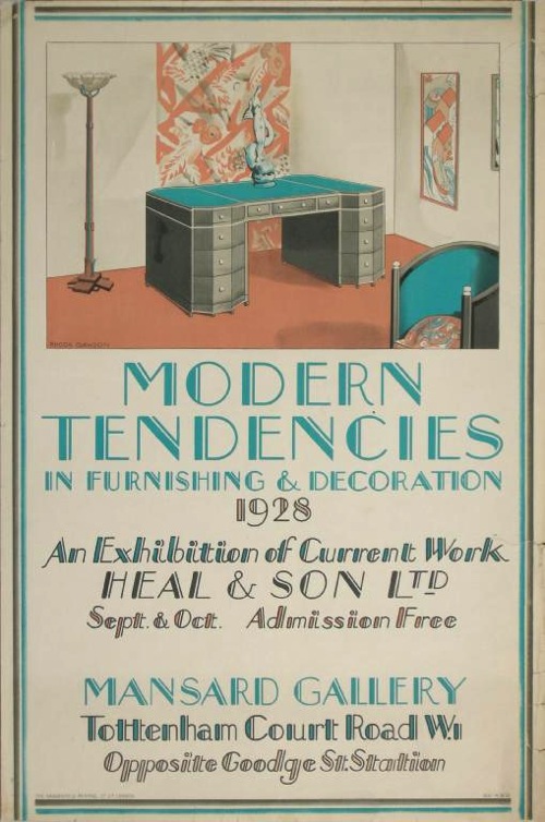
It’s an interesting request on several fronts: partly because the posters are good and aren’t something I have ever covered on here until now, and partly because it doesn’t seem that anyone really knows how many there are and who designed them. Not even Heals can say for sure exactly which exhibitions were held there.  So we can, perhaps, add to the sum total of human knowledge.  Here’s one I dug up that was auctioned at Onslows a few years ago, by Rhoda Dawson, and for one of their less assertively modern exhibitions.

Rhoda Dawson flower paintings heals mansard gallery

There’s also the fact that I’m sympathetic to anyone in the grip of a completist collecting mania.  These things need to be encouraged.  So let’s see what we can do to help.

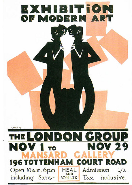
Paul has sent me a few over as starters.  This is by McKnight Kauffer from 1918, and is the earliest one he’s managed to track down so far.

McKnight Kauffer London Group Mansard Gallery 1917

There were earlier exhibitions though.  The second one ever, Poster Pictures, in June 1917, displayed the original paintings for many London Transport posters, in aid of prisoners of war in Germany.  Which is very interesting as it proves that the dissemination of posters as art wasn’t just limited to what LT themselves put on show.

When I first read about the Mansard Gallery, I thought, oh, art exhibitions at the top of Heals, fair enough.  But actually the idea was a bit more interesting than it initially sounds, being as it was part of the great between-the-wars project of making everyone like elitist art.  (I’ve posted about this so often that I simply can’t put all the links on; one day I must index this monster).

Obviously the Mansard Gallery held art exhibitions, it’s what galleries do, after all.  But the aim of having them in a furniture store – and of displaying the art in the first place – was to persuade people buying furnishings that they might benefit from art work as part of the house decorations and how it may work within the home.   That’s another McKnight Kauffer below, by the way, from 1918 this time.

McKnight Kauffer Mansard Gallery London Group 1918

Part of me thinks this is all a bit, ‘books do furnish a room’, but that’s probably unfair.  Not least because Heals really did want to persuade you that art would improve your home.  So much did they want to persuade people of this, that there was not merely a gallery up in the top of the building, but also the Mansard Flat, which was furnished to the very apex of Heals taste, and was used to show how art might work in a domestic setting. Which then makes sense of a picture I have seen (but don’t ask me where) of a McKnight Kauffer London Underground poster being used in a Heals furnishing display.  I wish I could find that, as it would tie up all the loose ends quite neatly.

Heals Mansard Gallery posters

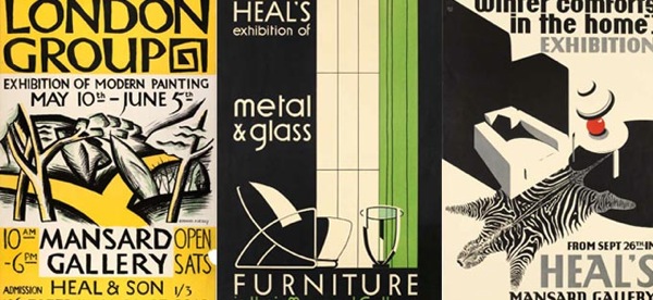
But as you can see from the posters above, the demarcations were nothing like as neat as that; just as art crept into the furniture displays, so did furniture make its way into the gallery.  I’d be intrigued to know what furniture too, presumably the stuff that was a bit too advanced to actually sell to the English, even in London.  That’s what seems to be on display here; it’s another poster by Rhoda Dawson, from the same lot at Onslows.

Heals Mansard Gallery Modern tendencies poster 1928

But of course these divisions aren’t so neat and tidy outside of the gallery either, because Heal’s also produced rather good posters for their furniture as well as the gallery.  These are rather outside our remit, but then they are so good that I can’t leave them out entirely.

Heals contemporary furniture 1950s poster

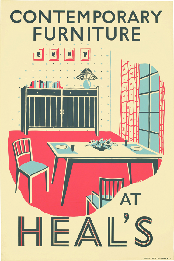
They’re also quite liberally scattered over the web as Heals produced reproductions a few years ago.  How did that pass me by?

That however is by the by.  Can anyone point me, and more to the purpose Paul, at any more.  I have a feeling that there will be more lurking in books and catalogues than there will be out there on the net, so if you know of any, please do let me know.  For myself, because I’m interested now, if there are any pictures of the exhibitions, please send them along too.

Addendum:

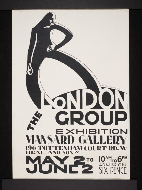
Here’s another one, by William Roberts, which Martin Steenson found in McKnight Kauffer’s Art of the Poster.

William Roberts Mansard Gallery poster from McKnight Kauffer art of the poster


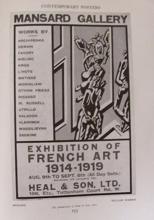
Thank you for that one.

To Sheffield, by dachshund

Whatever I was expecting to find in the Guardian yesterday, it certainly wasn’t this.

Beaumont Post Early Sausage Dog vintage 1950 GPO Poster

But thank heavens for the quiet of the New Year, because it allowed them to give almost a whole page to an exhibition in Sheffield of the works of none other than Leonard Beaumont.

Sadly – at least from my point of view – it is not going to be wall-to wall GPO dog illustration.  But it’s still very interesting.  The exhibition concentrates on Beaumont’s lino etchings – he donated over 80 pieces of work to the Sheffield Art Gallery just before his death.

Beaumont Knife Grinders 1932

They’re fantastic bits of Art Deco/Vorticist design, but all the more impressive because it seems that Beaumont was almost entirely self-taught,  Working at the Sheffield Telegraph, he produced the prints in the evenings.  By 1936, he’d moved to London and stopped making them.

So that’s the exhibition, but. at least from a Quad Royal perspective that’s where the story gets interesting.  Because in London he joined Mather and Crowther as a commercial designer, and also worked freelance, producing (according to an interview in the Sheffield Star in 1983) wrappers for Nestle chocolate, posters and stamps for the post office, along with – and this was a surprise to me – the cover for the Festival of Britain catalogue.

Festival of Britain catalogue cover

Pretty much all I have known of his posters to date, and all the ones I have ever featured on here, have been for the GPO.

Beaumont Vintage GPO post early poster n/d


Leonard Beaumont GPO poster address letters clearly and correctly

Now according to all of the articles, he then went off to Sainsburys in 1950 to sort out their corporate identity, and stayed there until he retired.  That he worked for them is certain (here’s Shelf Appeal on his work there).  But he was still producing posters for the GPO during the 1950s too – the last one above dates from 1957, and the example below from 1958.

beaumont-books-stamps


He also produced one of my favourite mad GPO posters ever.

Beaumount a smile in your voice vintage GPO poster

As one of the articles notes, it’s the use of type which distinguishes his work.  To which I would also add the use of collaged photos and graphics together.  For a self taught man, he was a very adept modernist.

Anyway, the upshot of all of this is that I can make a very confident prediction that I will be turning up in Sheffield at some point in 2013.  The exhibition runs until September, so there’s plenty of time to make that come true.

Extravagance

Do you remember I said recently that we weren’t buying anything because we needed carpets and curtains?  It turns out that there are exceptions to this.

Black Eyes and Lemonade Catalogue cover curated by Barbara Jones whitechapel art gallery

Which is not a poster but the catalogue for the Black Eyes and Lemonade exhibition at the Whitechapel Art Gallery in 1951, curated, of course, by Barbara Jones.

Now we paid the money for something which is, if I am honest, not that pictorial.  There are a couple of images of popular graphics from the exhibition.

Molassine advertisement from Black eyes and lemonade catalogue barbara jones

Along with one Barbara Jones drawing of a doll.

Black eyes and lemonade doll drawing by barbara jones 1951

But that’s your lot – the rest looks like this.

Black Eyes and lemonade barbara jones inside text

From all of which I can tell you a few things.  One is that at least a third of the exhibition belonged to Barbara Jones herself; I wish I could have seen her house.

The second is that, more than anything else I have ever seen,the whole miscellaneous variety of human life is present, from bread to postcards of ‘Dressing up the cat’, a milk float to a stuffed chub, a beer pump to crochet-work mittens.  The only way I could give you the full picture of its oddity would be to type the whole thing out.

But fear not.  Chapter 27 of my world domination plan still includes a complete restaging of the entire Black Eyes and Lemonade exhibition, and with this in my hands I can at last make a start on it.  Even if I do have to live without carpets in the meantime.

Posters on Display

There was more to the Beverley Pick book than could fit into one single post. Ironically, what got left out last time was posters: to be precise their display, as demonstrated in this wonderful illustration by Mr Pick.

Beverley Pick wartime  poster display stand from display presentation book

It particularly jumped out at me because we have the poster at the bottom left, which I wasn’t actually certain was by Beverley Pick.

Beverley Pick photomontage world war two propaganda poster ministry of food small girl green vegetables

To be fair, the book doesn’t actually say it is either.  But given that every other photo in the book of Pick’s own work. it’s a reasonable assumption to make – and the photomontage and deep colour is very similar to his other poster work during the war.

BEverley Pick world war two propaganda poster ATS be useful

But the illustration of how these posters were displayed is worth a second look too.  Pick describes it as follows:

The light and portable poster screen shown here was designed to take seven posters of standard size and one headline streamer circulated at monthly intervals.

It’s a much more organised mean of display than I ever tend to imagine for Second World War posters.  More importantly, the experience of seeing seven posters together is very different to seeing one alone.  The single poster is much more like propaganda, just giving the viewer the idea that sowing winter vegetables is a good thing to do.  En masse, they are much more informative and give the viewer enough basic knowledge – which vegetables and when – to allow someone to go about it.

The display panel is a useful reminder that  posters appeared in more than one context, not only as solo propaganda pinned up on hoardings, in shops and on the walls of village halls but also in the more organised and didactic context of exhibitions too. It’s not something I’d really considered or read about before but having had that thought, the Imperial War Museum’s photo collection started to come in very useful.  Here’s their image of another poster much beloved of this blog.

F H K HEnrion posters on display off the ration exhibition London Zoo

This is, of course,  F.H.K. Henrion’s paen to the joys of rabbit meat, which  is on display as part of the Off the Ration Exhibition.

Entrance to Off the Ration Exhibition London Zoo

‘Off The Ration’ was originally held at London Zoo, which I always felt must have been a bit unnerving for the other animals, wondering how long it would be before they were designated as steak too.  No wonder that Lewitt Him’s kangaroo is feeding up the more likely candidates in the poster for the exhibition.

Lewitt Him off the ration exhibition poster 1943 Ministry of Information propaganda vintage poster

But returning to our subject of  the poster displays inside, I have seen both the posters at each end before now, but never the panel in the middle.  This may or may not have existed as a single poster – I have no way of knowing and even less means of finding out.  And were the Henrion posters commissioned for the exhibition first, or were existing posters incorporated into the exhibition’s design?  Again, I can’t tell you.

But these unanswerable questions are a useful reminder that posters during the war weren’t lone objects but were seen by people at the time as part of a whole range of other kinds of of graphic design – and the rest of it can easily be forgotten when we’re telling the story of the posters.

Take Potato Pete, as one of the more obvious examples.  He exists on posters, of course.

Potato Pete vintage world war two propaganda poster ministry of food

He too had his own exhibition, this time on Oxford Street (this looks like the site of the bombed-out John Lewis store which was used for a number of exhibitions during and just after the war).

Potato Pete exhibition

But many more people would have seen his image in the daily newspaper Food Bulletins put out by the Ministry of Food and so in many respects the posters and exhibtiions were just adjuncts of that.  So the poster was an image of an already well-known character, which meant that it would have been understood in a very different way.

The continuum of graphic design and display can work the opposite way round as well.  This woman in Oxford is finding out about salvage.

Ministry of Information Salvage exhibition Oxford

The displays that she is looking at aren’t, as far as I know, related to any particular poster campaign,although the main panel could quite easily pass as a poster design.  But nonetheless, people who’d seen this exhibition or one like it would read posters in a subtly different way, seeing them as just one part of what they were being told about salvage.  So perhaps posters had to say less, because they were acting as a reminder, or they were able to use visual symbols which would have been easily understood by the viewer because they’d already been explained in a different context.  It’s impossible to prove this, of course but equally it does seem absurd to thing that this overlap would not have happened.

None of this is in the slightest bit surprising to anyone who has any idea how advertising works in the modern world, where campaigns are planned across television, press and sometimes still posters, and now with social media added on too.  But these multiple contexts are very rarely considered in terms of wartime posters, even though the Ministry of Information was clearly a very shrewd and sophisticated user of all the means available to it.  And there were very many means indeed.  You might find a food exhibition in your local furniture retailer.

A view of a display by the Ministry of Food at the 'Domestic Front' exhibition held at James Brooke and Sons Ltd., 376 Bethnal Green Road. This display focuses on wartime cookery demonstrations and includes information on vitamins, dried eggs and vegetables.

More surprisingly, you might even catch an exhibition being driven down the street.

Travelling salvage exhibition outside Ministry of Information Bruce Angrave.

This highly covetable vehicle is a travelling salvage exhibition in 1943, and I shall let the Imperial War Museum describe it to you.

…the car has the words ‘Private Scrap is in town…come and meet him’ painted on the side. The van itself has a special bin for collecting books ‘for the forces, blitzed libraries, and salvage’, and the side of the van features a series of wooden display panels by artist Bruce Angrave. The salvage exhibition continues inside the vehicle.

Bruce Angrave’s panels aren’t posters and almost certainly don’t exist any more (and if someone wants to tell me I’m wrong on that, I’d very much like it). But they are part of the visual landscape that salvage posters inhabited, and so ought, even if just a tiny bit, to be taken into account when we talk about them.

When I studied Design History, I used to hate entirely abstract phrases like ‘visual culture’ and ‘discourse’; I’m hardly fond of them even now.  But they can have their uses sometimes.  Now that posters have become objects which are both valuable and collectable, the art-historical impulse tends to take over.  They are treated as ‘art’: framed and conserved, and displayed on their own.  None of this is wrong, but it can tend to leach into our thinking about them as well and that isn’t a good thing.  Posters are the bits of graphic design which were lucky enough to survive, but they were part of a much wider world of print and explanation, and it’s worth remembering that more often.


On Display

Having already written in praise of the ephemeral last week, it’s time to explore some more things that can never be recreated.

I ordered this book ages ago, but it arrived just before Christmas after a slow sea crossing of the Atlantic.

Beverley Pick, cover image of display presentation book

The wait was worthwhile, because it is full of wonderful things, even if, sadly, the cover is the only bit of colour there is.

The book covers the full range of display and design, ranging from grand stands at trade shows, like this one for English Electric at the Radio Show at Olympia,

Beverley Pick exhibition Stand for English Electric at Radio Show at Olympia

to small portable displays and shop windows.

Beverley Pick BOAC small counter display object

Beverley Pick BOAC five continents window display

In addition, there’s plenty of practical advice too, with examples of Pick’s own models for his designs – this one intended for shop windows.  He’ll even tell you what glue he used to keep a particularly difficult model together.

Beverley Pick design for Alexon shop display board

But it’s the exhibition stands I love the best.  This is another one from the Radio Show, for a manufacturer of wireless components.

Beverley Pick Ediswann stand Radio Show

This love isn’t just about a wallowing in ephemeral nostalgia on my part, I also think that the exhibition stands are architecturally important, and too often forgotten.

Pick’s book was published in 1957, at a time when British architecture was only just getting on its feet again after the war.  Although a great deal of buildings were being built, houses and flats in particular, the pressures of wartime reconstruction meant that they were mass-produced and kept simple as a result.  Almost everything being built was commissioned by governments and local authorities, with private building licences almost impossible to procure, so the scope for architectural innovation was very limited indeed.

Schools were almost the only buildings which allowed for any kind of experimentation, and even this was constrained by the limited materials available, along with the pressure for  quick and low-cost rebuilding of war damage.  This is Great Barr School in Birmingham, finished in 1958.

Great Barr School, Birmingham, designed by architect A.G. Sheppard Fidler, 1958

All of which meant that the architecture of the first half of the decade (what tends to be called ‘The Festival Style’) never really got built. By the time that less urgent, more extravagant buildings were being commissioned, the architectural fashion had changed, and Brutalism was coming to the fore.  It’s been said that Coventry Cathedral (commissioned n 1951 but only finished in 1962) is one of the few buildings outside the South Bank to be a full expression of the style.  Certainly it was seen as old-fashioned even before it was completed.

BAsil Spence vintage British Railways poster

Although, I personally do have to nominate the Toast Rack building in Manchester as another classic in the style, even if Pevsner calls it the first Pop building ever.

Manchester Hollings Building toast rack

This used to house the Domestic Science College, and thus also had the fried egg building next door.

toast rack and fried egg building

Arguments about the precise number aside, the fact that there are so few of these huildings is why the exhibition stands are worth looking at.  Because for the first five years of the 1950s, perhaps even longer, exhibition design was the main expression of cutting-edge architectural taste in Britain.

Beverley Pick BOAC stand British Industries Fair

These stands are not buildings, they never will be, and often they were designed by different people, exhibition designers rather than architects.  But they are still among the best expressions of the style of the early and mid 1950s that were ever built, and perhaps all the more exuberant because that architectural imagination simply couldn’t be channelled anywhere else.

More beverley pick exhibition stand models

Beverley Pick, in his book, is mostly concerned with the design process and mechanics of display rather than the theory, but even he acknowledges that architecture and exhibition design were very intermingled at this point.

In the years after the war, many architects, forced by building restrictions to devote much of their time to exhibition work, by necessity, acquired valuable training in display and presentation.  Conversely, display designers, entrusted by their clients with the responsibility of producing their exhibition stands, became well versed in architectural and structural matters.

This is also a reminder that Pick was just one of many designers working in the field.  His book only illustrates his own work, but there are plenty more to be found (and goodness only knows I have spent enough time poring over them) in the Designers in Britain series.  I particularly love this Farmers’ Weekly stand by Misha Black and Alexander Gibson from about 1950.

Farmers Weekly exhibition stand c1950 Mischa Black

This Robin Day design for ECKO dates from about the same year too.

Robin Day ecko stand Radio exhibition

Day also did this ICI pavilion for the Royal Agricultural Show in 1955 or 1956; here the spindly festival style is developing into something sleeker and a bit closer to International Modernism.

Robin Day exhibition stand for ICI Royal Agricultural Show

I would like to live in this as my house please, with a giant Quad Royal logo towering over the roof.

More seriously, I am really surprised that more attention hasn’t been paid to these exhibition designs, however ephemeral they were.  The start of the 1950s – and indeed what is seen as the birth of serious design at this time – is always constructed in terms of exhibitions: Britain Can Make It in 1946 (below), and then of course the Festival of Britain itself in 1951.

Shop Window Street at Britain Can Make It 1946

Both of these exhibitions are very thoroughly documented, which does help.  But all sorts of exhibitions on every scale continued throughout the decade and, mostly, their design has been completely  ignored.

This amnesia goes back in time, because a lot of pent-up architectural design was being channelled into exhibition design during the war as well.  Here are a couple of rather striking Army exhibitions.

Ministry of Information Army Exhibition in Cardiff 1944

The one above is in Cardiff in 1944, that below on the site of the bombed-out John Lewis department store on Oxford Street a year earlier.

Ministry of Information Army Exhibition Oxford Street 1943

Ministry of Information Army Exhibition Oxford Street 1943

It’s clear that the Festival of Britain style was already in the making during the war, rather than springing out of nowhere on the South Bank.

As well as the big budget extravaganzas, there were smaller ones too, many of which were held at Charing Cross Station (did they tour in the provinces after, or was the newspaper coverage enough I wonder?)

Ministry of Information Coupons Exhibition at Charing Cross Station

Ministry of Information Bread is a munition of war exhibition Charing Cross Station

Again, the wartime exhibitions are also a subject which has not been much covered as far as I can tell (and if I’ve missed something please do let me know).  All I’ve found so far is this article, and the fact that it was produced as part of a Henry Moore Institute Study Day about Sculpture in the Home shows just how much the subject has slipped between the cracks of different disciplines.  It’s a shame for what seems to me to be a really important piece of the design history of Britain.  There’s a lost architectural story to be told out there for the telling, if only we can be bothered to look in different places to find it.

Thinking in numbers

For anyone who thought the infographic is a modern phenomenon, the London Transport Museum is here to set you right.

They’ve just created a new display of graphics about numbers, which I am mainly drawing your attention to because this Schleger is both fantastic and not often seen.

Hans Schleger vintage London Transport poster 1938.

Interestingly, it’s from 1938.  These kind of explanatory posters with factual graphics are sometimes ascribed to the war, with its accompanying need to explain to the people, but clearly the trend had begun before the conflict started. This design by Theyre Lee Elliot is even earlier, from 1936.

Theyre Lee Elliott 1936

(I’m guessing from the press release that this is in the exhibition from the description, apologies if you go there and it isn’t…)

In fact a fair chunk of the exhibition seems to be dedicated to proving that the infographic goes back quite a long way further than we might think.

Irene Fawkes 1924 vintage London Transport infographic poster

The design above, by Irene Fawkes, dates from 1924 and there are plenty more of that ilk in the exhibition, although they are mostly in a pre-war style that I can’t get too excited about.

Charles Shephard 1923 Vintage London Transport poster

But what this makes me think, perhaps even more than how far these kind of explanation goes back, is that what seems to be missing are their modern equivalents.  I know there are exceptions to this – a few years ago London Transport produced a set of posters explaining why escalators needed to be replaced, which were placed on the hoardings around the work which weren’t graphically exceptional but were interesting and informative.  In the main, though, it doesn’t feel as though public bodies feel the need to explain to us what they are doing any more. Or am I missing something?

Heinz Zinram vintage London Transport poster 1960s

The above is by Heinz Zinram (at least he took the photographs) and dates from 1965.  Just as true today though.

And thanks to Macca, who pointed me at this exhibition in the first place, for which I am very grateful.