Skylon Biro

Mr Crownfolio went off to do some shopping for our holiday the other day.  He still has no sunhat, but we do now own this.

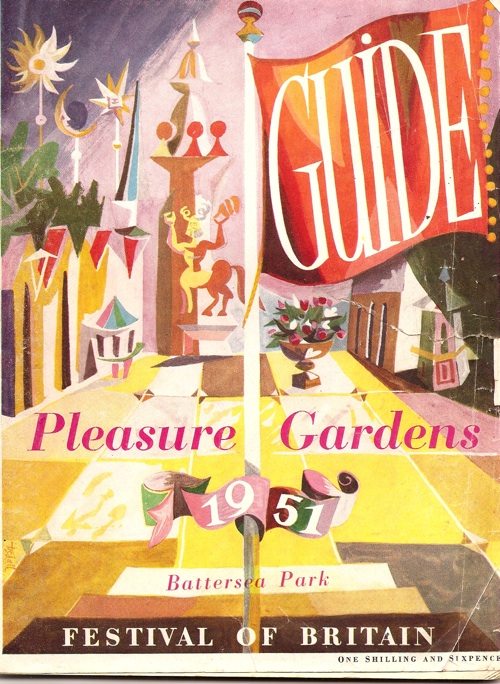
Festival of Britain Battersea Pleasure Gardens cover

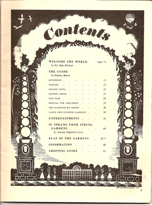
Given that the gardens were the slightly more raucous and, dare I say it, downmarket outpost of the Festival of Britain, I wasn’t expecting too much from the guide.  But it’s a surprisingly interesting piece of design; take this contents page by Osbert Lancaster.

Festival of Britain Battersea Pleasure Gardens contents page Osbert Lancaster

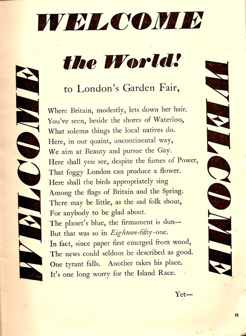
There are also some interesting layouts too.

Festival of Britain Battersea Pleasure Gardens Welcome page

Although I will spare you the rest of the poem which isn’t up to the standard of the typography.

The good design perhaps isn’t so surprising, as it turns out that one of the two editors and designers of the guide is Ruari McLean, founder of Motif, amongst other things.

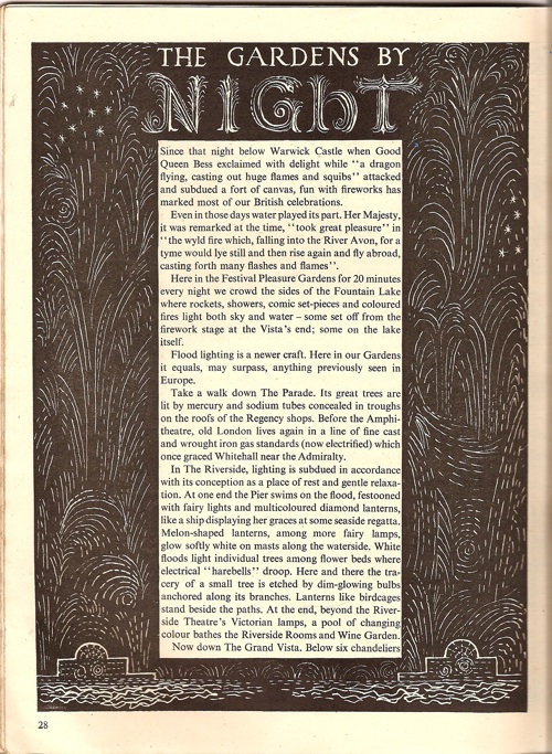
Festival of Britain Battersea Gardens guide night

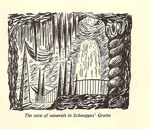
He clearly commissioned some good artists but very few of the illustrations are credited – not just the full page spreads, but also the smaller black and white illustrations, in a whole range of styles, which are scattered throughout the text.

Festival of Britain Battersea Gardens guide cave Schweppes

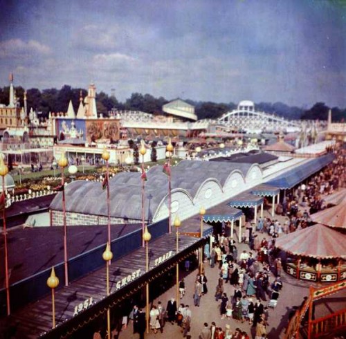
This is all part of trying to make the Battersea Pleasure Gardens (its name alluding to the old eighteenth century pleasure gardens at Ranleagh and Vauxhall) as uplifting and high-minded as the rest of the Festival.  The guide makes it sound like a promenade of flowers, architecture, Punch and Judy Shows and orchestral music.  The pictures, however, show that it was basically a very large funfair.

Festival of Britain Battersea Gardens guide photo

In the course of finding out all of this, I read an article which suggested that the Festival of Britain could be seen – if Battersea and the South Bank are thought of together – as the world’s first theme park, with the theme of course being Britain.  It’s an interesting thought.

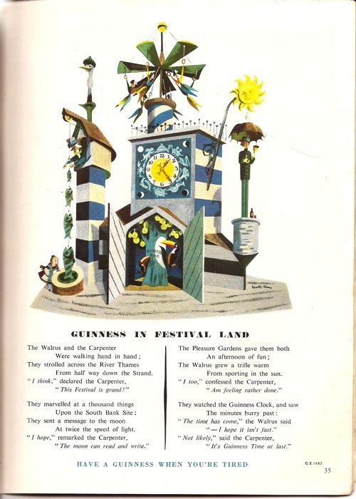
But I haven’t quite finished with the guide yet, because it’s also got some interesting advertisements in.  One is by our old friends Lewitt-Him.

Festival of Britain Battersea Gardens guide Lewitt HIm Guinness ad

They designed the Festival Clock, which was one of the attractions of Battersea and apparently contained the most complicated clock mechanism ever built at that time.  It was such a success that Guinness commissioned eight more, allowing the clock to tour department stores and amusement parks all over the country.

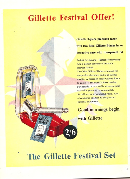
This Gillette advert, meanwhile, is a reminder that modern design still only had a very tenuous hold in 1951 Britain, and certainly hadn’t spread to packaging design.

Festival of Britain Battersea Gardens guide Gillette ad

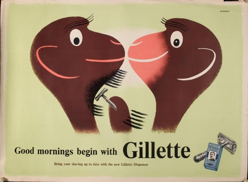
Tom Eckersley’s Gillette posters from a year or so before suffered from just the same problems of contrast.

Tom Eckersley vintage gillette monkey poster

A copy of this hangs on our stairs and, every so often, I am still shocked again by the contrast between the modern image and the Victorian packaging.

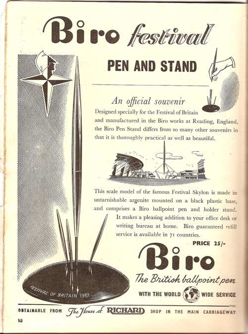
Finally, though, there is this, which will just have to describe itself.

Festival of Britain Battersea Gardens guide skylon biro

Truly it is a brave new world which has such things in it.
life : henrion : rabbit

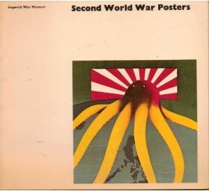
I called up this book out of our library’s reserve stores the other day (you can easily enough find it on Amazon if your library isn’t so obliging).

World War Two posters book cover Imperial War Museum 1972

It’s from 1972, so I wasn’t hoping for too much from it, but actually I was surprised.  There’s a short introductory essay, but then the bulk of the book consists of short biographies of some of the designers who produced propaganda posters during World War Two – not just those from the UK but also Russians, Europeans and Americans as well.

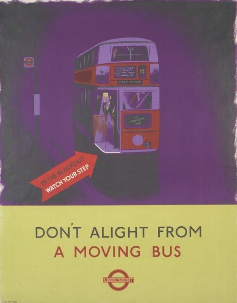
Reading them has been a salutary lesson for me.  I tend to assume that all of the knowledge in the world is out there on the internet for me to find.  And if it isn’t there, it’s not known.  Well I’m wrong.  Because there is plenty of information in here which is new to me.  Like a proper biography of James Fitton, for example, which told me that he left school at fourteen and worked on the docks in Manchester, attending art school in the evenings.  All of which makes me admire him even more.

James Fitton vintage London Transport poster World War Two Moving Bus

So today’s post was going to be all about the these biographies.  But then I got distracted by this.

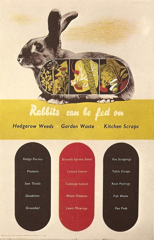
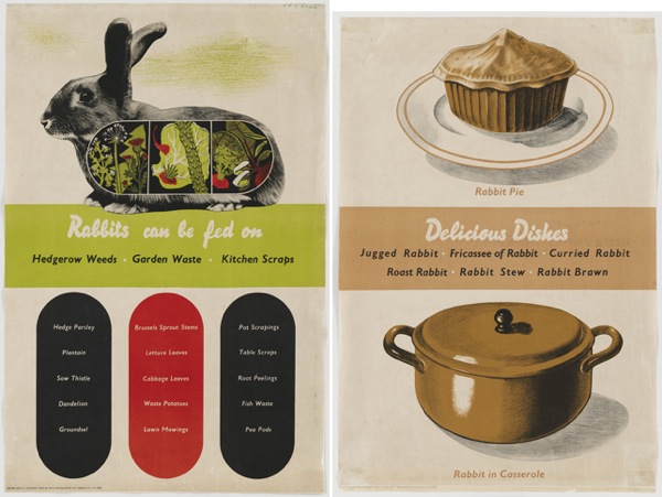
F H K Henrion vintage WW2 propaganda poster rabbits can be fed on

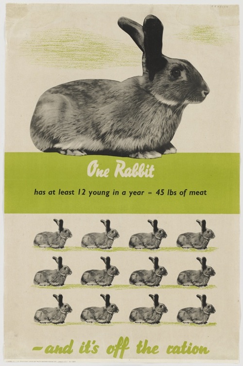
Which is fabulous, and by FHK Henrion.  In fact it’s so fabulous that it’s currently on display at MoMA in New York, along with some of its brethren. (Well rabbits will breed, won’t they).

F H K Henrion big rabbit vintage World War Two Home Front poster

The exhibition is Counter Space : Design and the Modern Kitchen and if I could get over to New York to see it, I would.  Every bit of it, from early functionalist design to artworks about domesticity sounds brilliant.  And it’s on until early May, so if you do get the chance to go, please do and let me know all about it.
But for the purposes of Quad Royal, the really interesting thing is that there is a whole section of British Home Front posters about food.  Hence Mr Henrion and his rabbits.  There are in fact three, as they also have the pair of the first poster, which explains why that rabbit is looking behind so nervously.

vintage World war Two poster FHK Henrion rabbit pie

Now under normal circumstances I’d just go on about these, but MoMA themselves have written an excellent blog post about these posters, which I really couldn’t improve on.

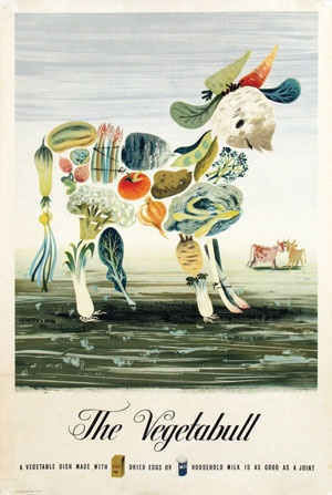
But fortunately for those of us who aren’t going to make it to New York this month, there is at least a handlist of all of the exhibits online.  Which means that I can tell you that, in addition to the Henrions, they are also exhibiting a few old friends like the Vegetabull.

Lewitt Him Vegetabull poster world war two home front

Which means that we have something hanging on our wall which is also up in MoMA.  Get us.

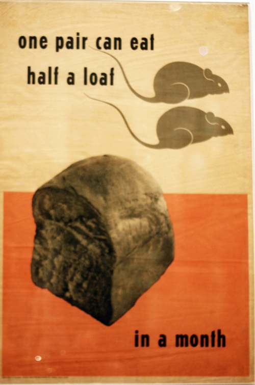
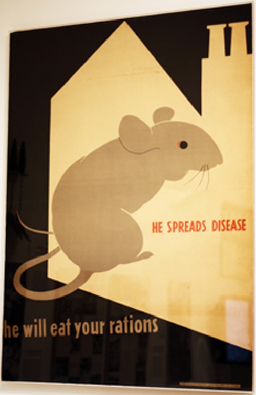
In addition, though, the exhibition is displaying a really intriguing set of posters which I have never seen before.  Herbert Tomlinson rat posters from MoMA Counterspace

By Herbert Tomlinson about whom I know nothing.

Herbert Tomlinson rat poster world war two home front

This pattern of absence and presence is really interesting.  On one hand, it’s easy to see why these posters have ended up in MoMA; they fit very easy into the narrative of International Modernism which the museum itself has done so much to construct.

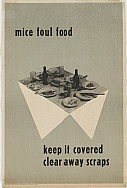
Herbert Tomlinson mice poster MoMA more ratty micey propaganda stuff

What I understand less is why these posters seem to have disappeared over here.  This may be no more than random chance: these weren’t posters that anyone much wanted to collect or keep, by a designer that no one much remembered so they disappeared into oblivion as soon as they were torn down.  Or perhaps a rat and mouse-infested world isn’t how we want to remember the war?

Whatever the reason, it’s yet another reminder of two important facts about posters.  One is that the history which does exist is very much constructed, and that the story may differ wildly depending on who’s doing the telling.  The other is that all of these histories are made from a very partial and unrepresentative sample.  So few posters survive, and for such random reasons, that it will perhaps never be possible to tell the complete tale of posters at any point in time.  But that doesn’t mean we can’t have  a lot of fun trying in the meantime.

Que savez vous de la Grande Bretagne?

I got some lovely photographs by email before Christmas (so thank you Adrian Jeffery) and to my shame, what with one thing and another, rather left them to one side.  But now I am here to make amends.

Because this is a fabulous thing.

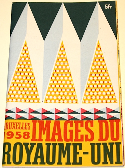
British brochure Brussels Expo 1958 cover Barbara Jones Illustration

It’s the brochure for the British pavillion at the 1958 Brussels Expo (home of the Atomium).  Which would be fine enough as it is, but what’s even better is that it’s illustrated by Barbara Jones.  And it’s something which doesn’t come up very much at all, even in the Ruth Artmonsky book.  This is the French version.

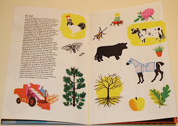
Brussels expo 1958 British pavilion brochure page spread cow

Now I’d be  more than happy just to wallow in the pictures here.  But the brochure (catalogue? guide?  I’m not entirely sure) is also more interesting than that, because it epitomises the debate that I’ve been mulling over for a while, the conflicted relationship between modernism and Britishness.

Brussels Expo 1958 catalogue for British Pavilion Barbara Jones illustration

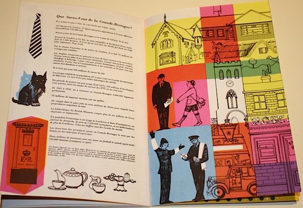
Now, design historians tend to love Expos and other sorts of National Exhibitions, because it is design, if you like, giving a speech.  It’s fine to read them as a guide to the state of the nation, and its self image, because that’s exactly what they are designed to express.  So here we have a Britain of friendly policemen, tea and Scottie dogs.

Brussels Expo 1958 British Pavilion Guide barbara jones

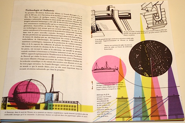
But we also have modern industries, housed in sparkling factories.

Brussels expo British pavilion catalogue Barbara Jones illustration factories

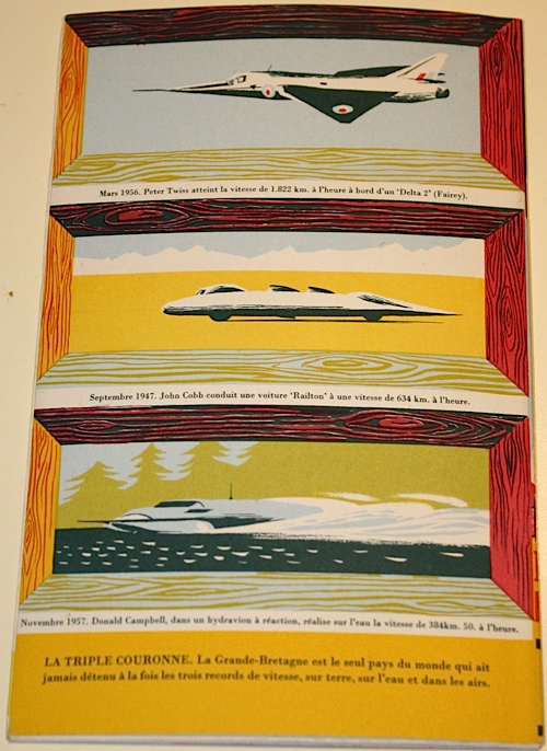
The tension between these runs all the way through the brochure (catalogue? guide?  I’m not really sure) right until the back cover.  Here are modern machines, but made safe by a more traditional frame.

Back cover Brussels Expo 58 British Pavilion catalogue

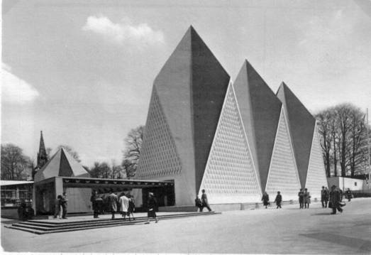
Now it could be argued that if you commission someone like Barbara Jones, connoisseur of folk art and disappearing traditions, to do your illustrations, then this is what you are going to get.  But the same conflict runs through the entire display.  Here is the shard-like exterior.

British Pavilion Brussels Expo 1958

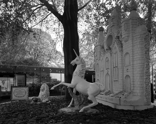
But this is what happens when you get up close.

Brussels Expo British pavilion lion and unicorn

And if that looks just a bit familiar, almost the entire design team for the Brussels Expo had indeed worked together on the Festival of Britain.  Here’s Jonathan Woodham’s summary of the problems they faced.

[Britain’s] national ambitions were caught between the worlds of heritage, as represented in the Hall of Tradition, of scientific innovation, as displayed in the Hall of Technology, and of economics and industrial competitiveness, as represented architecturally by the more contemporary character of the glass-fronted British Industries Pavilion.

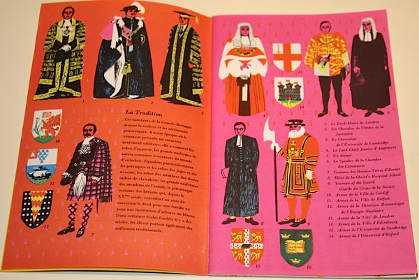
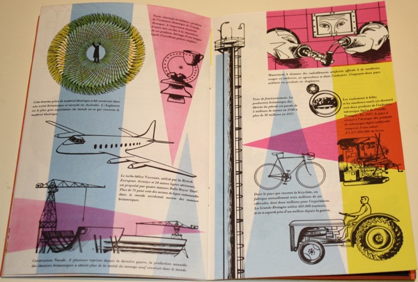
All of this is made manifest in the brochure, from royalty to machinery.

Royalty spread from British pavilion catalogue Brussels expo 58

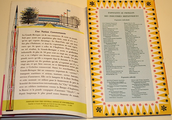
Machinery spread from British pavilion catalogue Brussels expo 58

I tend to see this later part of the 1950s as the height of Britain’s optimism about the brave new post-war world of spindly legs and bright colours and good design for all.  But even in 1957-8, it was impossible to be simply modern.  Being British was always much more complicated than that.

Travel Safely

Karen at Travel on Paper emailed earlier this week to say that they are having an Open Studio this weekend.

Now, we don’t advertise just any old event here on Quad Royal.  But she swayed me by including two fabulous Christmas coach posters along with the invite.

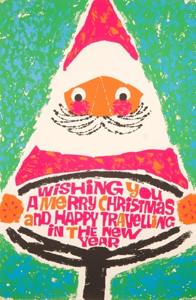
Father Christmas vintage coach poster 1960s clarke

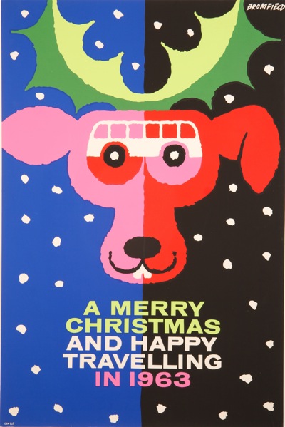
Father Christmas at the wheel, above,  is by Clarke, and the reindeer by Bromfield.

Vintage Coach poster Bromfield Christmas travelling reindeer

Which makes a couple of excellent bonus images for the advent calendar, so thank you very much to them.  There will be more from the coach companies later this month, once the GPO have calmed down a bit.
Should you want to turn up and see more of this kind of thing in the meantime, their Open Studio is:
10-12 DECEMBER – Friday evening 6-9pm      Saturday & Sunday12-5pm
and they live at:
Clockwork Studios, First Floor, 38B Southwell Road Camberwell SE5 9PG

This is half a mile from where I used to live, but over 100 miles from where I live now, so sadly I won’t be there. But have fun if you are.

Behind the scenes in the museum

Now, I promise, the last word on London Transport reproductions.  The discussion has rumbled on in the comments for a bit, but the big guns have now been called in to settle it.
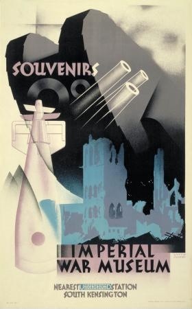
vintage london transport poster imperial war museum austin cooper 1932
Imperial War Museum, Austin Cooper, 1932

This email is from Oliver Green, former Head Curator and Research Fellow of the London Transport Museum and so, more than anyone, the man who knows.
I think there’s some confusion in this discussion between a reprint and a reproduction, though LT may not always have been consistent about this.

An R in the print number would normally indicate a reprint, not a reproduction, and was carried out by the original printers using the original plates.

A reproduction would be a poster produced from a new photographic copy of one of the original printed copies. London Transport has been doing this since the 1960s, but mainly with posters from the pre-war period. As they were reproduced for sale, not display on the system, they are always smaller than the original standard 40 x 25 in double royal format used on the Underground.

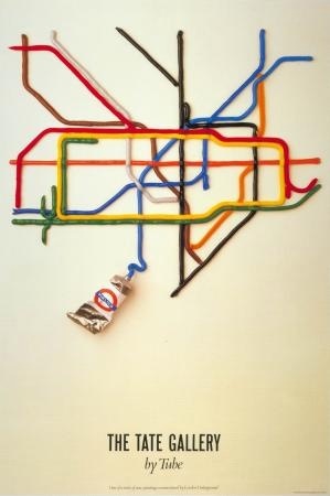
Reprinting did not happen very often, although there have been a few exceptions like the famous Tate Gallery poster by Fine White Line which has gone through numerous editions since it first appeared in 1986.

Tate Gallery London Underground Poster 1986

There have also been very few attempts to go back to the original artwork to produce a new lithographic poster. Again there is the famous exception of the Kauffer poster for the Natural History Museum which he designed in 1939 but was never printed because of the outbreak of war.

McKnight Kauffer Natural History Museum 1939/1974 London Transport poster
Natural History Museum, McKnight Kauffer, 1939/1974

The artwork was rediscovered by LT in 1974 and reproduced as a poster for the system in 1975. It is a moot point whether this counts as an original or a reproduction since a printed copy did not exist in Kauffer’s day.

Many thanks to Oliver for that, although I think that LT themselves haven’t been exactly contributing to the clarity.  They clearly did have a rare outbreak of reprinting in 1971 or thereabouts, producing the posters which stirred up this debate in the first place, but which they then labelled as reproductions in socking great black letters, confusing us all unduly.  But now I understand.

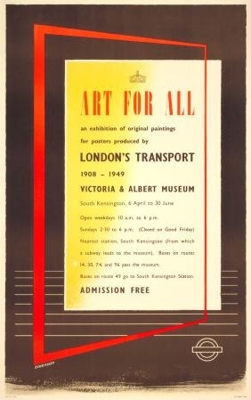
Tom Eckersley Art for All London Transport exhibition poster 1949
Tom Eckersley, original Art for All exhibition poster, 1949

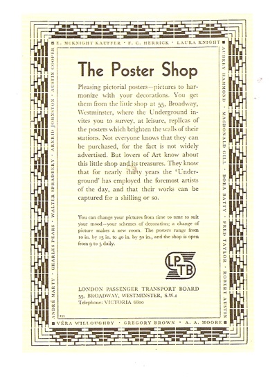
From all of which, two other things.  One is that Oliver Green has contributed an essay to the book which accompanies the Art for All Yale exhibition which I mentioned last week.  This, Art for All: British Posters for Transport has now arrived at Crownfolio HQ and I have to say is rather good, both readable and fact-filled.  Perhaps the highlight for me (and probably almost no one else) is that they have reproduced this advertisement, from Modern Publicity.

art for all repro of poster shop london transport ad

I once saw a poster of this for sale on eBay and didn’t buy it, which I’ve regretted ever since, as it answers one of my ever-present questions, which is why do more London Transport and railway posters still exist these days?  Clearly, the answer is because they were selling them as well as pasting them on the walls of the tube.  Pleasingly, the book tells me all about this – and how the railway companies held exhibitions of their posters as well.   Plus I have learnt lots about lithography, which can only be a good thing.

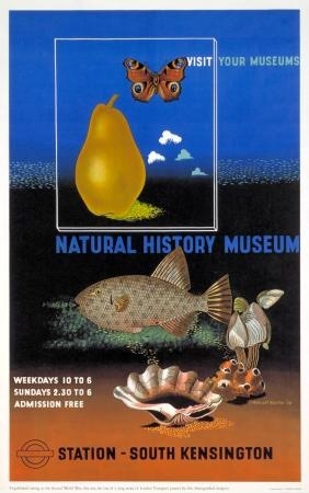
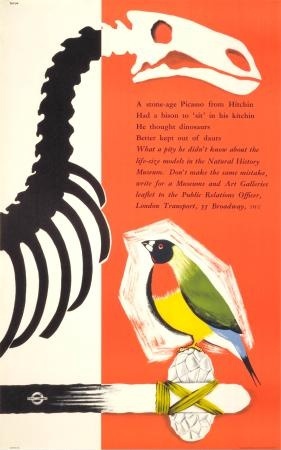
Vintage London Transport Poster natural history museum Tatum 1956
Natural History Museum, Edwin Tatum, 1956.  In Yale collection

There’s lots more to like in the book too – including a complete catalogue of Yale’s poster holdings, which are much more modern than I expected, and which means that Mr Crownfolio and I own more than ten posters which are also in the Yale Center for British Art.   Whereas I don’t suppose anyone can say that about their Constables, so hurrah for the world-wide democracy of posters.

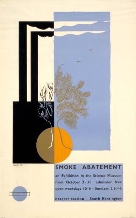
But also, in searching out the McKnight Kauffer that Oliver Green referred to, I discovered a whole wealth of museum posters in the LT archives, including some really wonderful ones which I’d never seen before.

Smoke Abatement Exhibition Science Museum Poster, Beath 1936
Smoke Abatement Exhibition, Beath 1936

And then also one or two that I did.

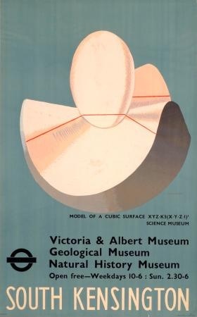
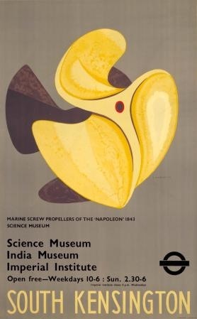
Edward Wadsworth South Kensington Museums poster 1936
Edward Wadsworth, South Kensington Museums, 1936

The very first time I wandered in to the old Rennie’s shop off Lamb’s Conduit Street, this Edward Wadsworth poster for the South Kensington Museums was on the wall.  I’d come in there quite by accident, wandering past, not even knowing that it was possible to buy old posters, but I fell in love with it.  I’d like to say that this was entirely because I recognised it as a great piece of design, but the fact that I’d worked in the South Ken museumopolis, and that the blue was a perfect match for my sitting room wall colour also had quite a lot to do with it.

But it cost hundreds of pounds.  I can’t remember exactly how many, but enough to seem like an awful lot then,  So I spent several weeks in a state of indecision, coming back to visit it a couple of times.  And then, finally, I didn’t buy it.

Which was, of course, a terrible mistake.  Never mind the value and the fact that I couldn’t even think about affording it now, it’s a beautiful poster, and would have looked wonderful on my walls for all of these years in between.

Here, just to rub salt into the wounds, is its companion.

Edward Wadsworth London transport posters South Kensington Museums
Edward Wadsworth, South Kensington Museums, 1936

Sigh.

Horses, sorry, modernism for all

Crownfolio is thinking of going to France.  Actually, I’ve been thinking about my holidays for some time, but now it looks as though I’m going to have to plan another trip as well, and all because of this exhibition.

It’s called Art for All, and it’s an exhibition of British transport posters at the Yale Center for British Art, which is a part of the University.

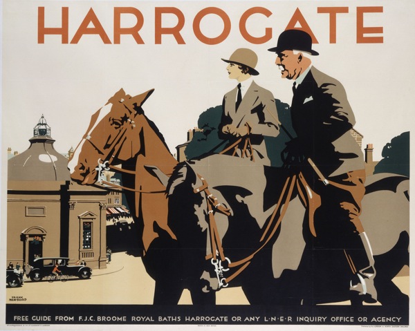
Now at first I found myself a bit surprised and bemused that Yale could be bothered to have a collection of transport posters (a bequest, apparently see below*).  But then I look at something like this 1932 Newbould,

Frank Newbould Harrogate vintage railway poster 1932

and realise that it’s not a million miles away from a Stubbs or a Gainsborough in its depiction of a very specific kind of horsey Britishness.

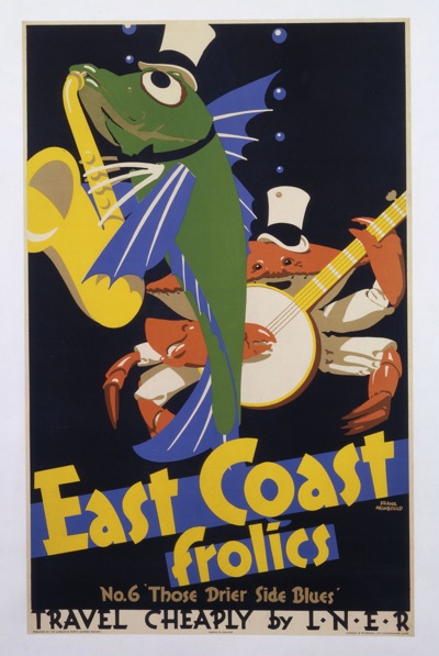
To be fair to them, though, the exhibition – or at least the collection of images that they’ve chosen to promote it – isn’t packed to the gills with landscapes and posh people.  In fact, if anything, it’s more on the side of modernism.    There’s plenty of McKnight Kauffer, and also these delightfully a-typical Newboulds from 1933 (I wonder if he got bored of fields, villages and market towns too).

Frank Newbould, East Coast Frolics 1933

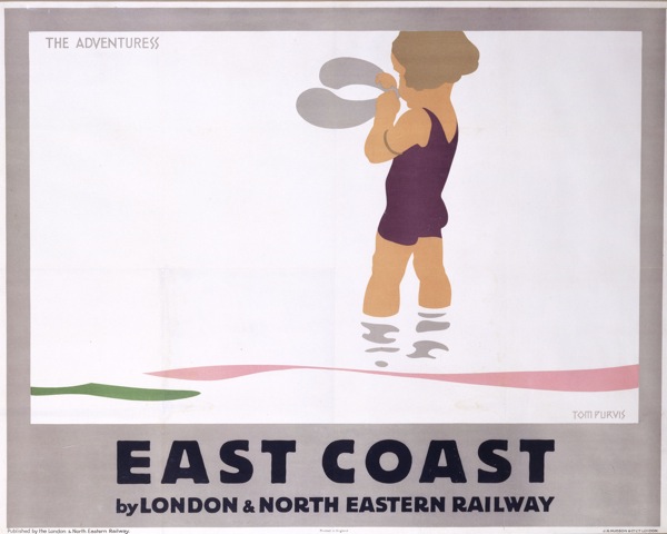
The Jazz Age made incarnate by fish.  You can’t beat that, can you.  Or this Tom Purvis, with an unusually subtle colour-scheme.

Tom Purvis East Coast LNER poster  1928

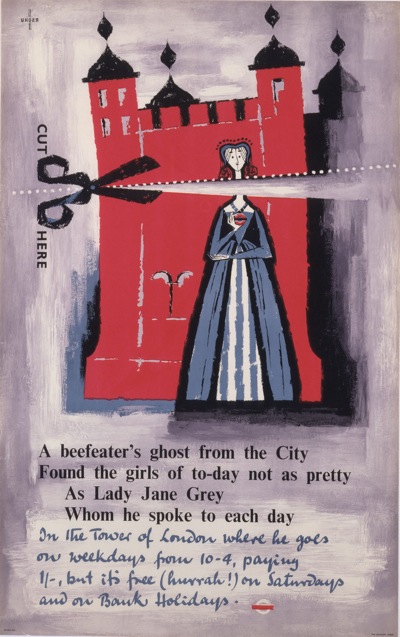
I also like the fact that the curators don’t seem to believe that all good design evaporated after the Second World War.  They’ve included this 1956 Unger,

Unger Tower of London vintage London transport poster 1956

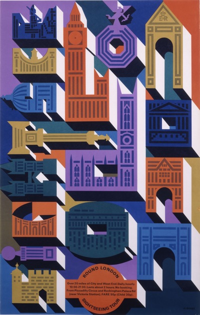
As well as this even later – 1965 – Abram Games.

Abram Games vintage London Transport poster

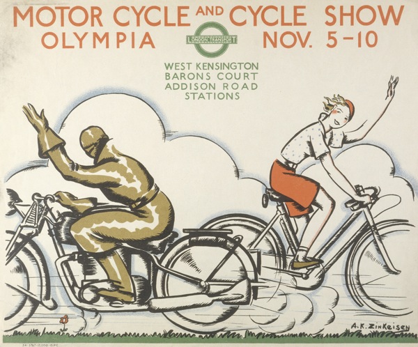
Even better, they’ve not just gone for name designers and known posters.  Also included is this 1933 gem by Anna Katrina Zinkeisen.

Zinkeisen_Mortor-Cycle-and-Cycle-Show, vintage London Transport poster, 1934

All of these were part of the Henry S Hacker bequest to Yale.  I think I rather like his taste.

So, if you are in the U.S., it would be worth quite a detour to see this lot  – and more, there are over 100 in the show in total.  The show runs from next week until August 15th, so you’ve got plenty of time.  And if you do make it, I’d love to hear what it’s like.

If you’ve been wondering in the meantime why I’m thinking French thoughts, it’s because the exhibition transfers to the Musée de L’Imprimerie, Lyon, France: October 15, 2010–February 13, 2011.  Which is slightly more accessible by Eurostar than Yale.

But if even that seems too daunting, there’s also a book – Art for All: British Posters for Transport (Yale Center for British Art).  More on that when it arrives.

*Thanks to a very forgiving email from Henry Hacker himself, I now know that it isn’t a bequest, and that Henry Hacker is still very happily collecting posters.  Which makes his gifts even more generous.