I got some lovely photographs by email before Christmas (so thank you Adrian Jeffery) and to my shame, what with one thing and another, rather left them to one side. But now I am here to make amends.
Because this is a fabulous thing.
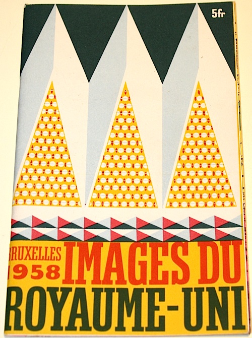
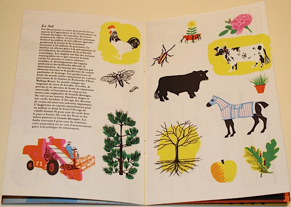
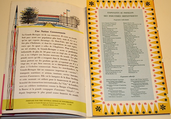
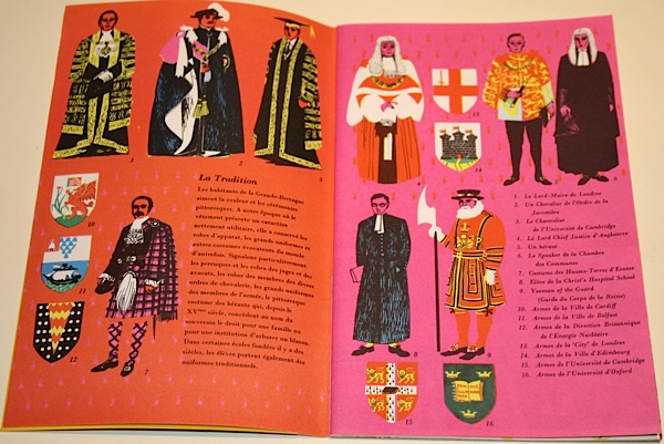
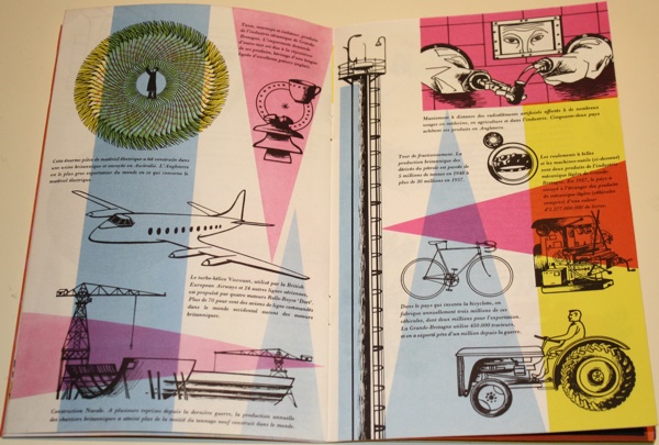
It’s the brochure for the British pavillion at the 1958 Brussels Expo (home of the Atomium). Which would be fine enough as it is, but what’s even better is that it’s illustrated by Barbara Jones. And it’s something which doesn’t come up very much at all, even in the Ruth Artmonsky book. This is the French version.
Now I’d be more than happy just to wallow in the pictures here. But the brochure (catalogue? guide? I’m not entirely sure) is also more interesting than that, because it epitomises the debate that I’ve been mulling over for a while, the conflicted relationship between modernism and Britishness.
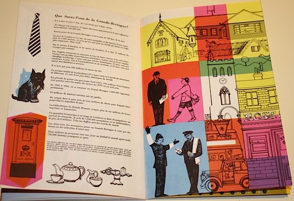
Now, design historians tend to love Expos and other sorts of National Exhibitions, because it is design, if you like, giving a speech. It’s fine to read them as a guide to the state of the nation, and its self image, because that’s exactly what they are designed to express. So here we have a Britain of friendly policemen, tea and Scottie dogs.
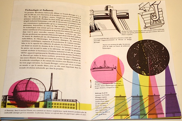
But we also have modern industries, housed in sparkling factories.
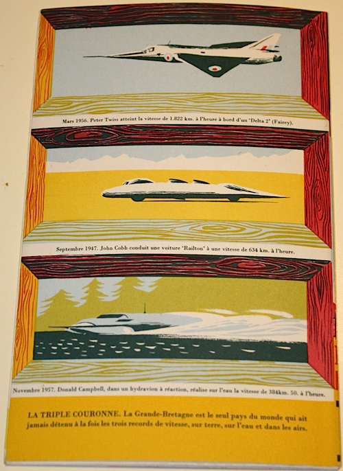
The tension between these runs all the way through the brochure (catalogue? guide? I’m not really sure) right until the back cover. Here are modern machines, but made safe by a more traditional frame.
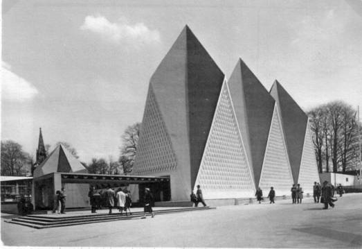
Now it could be argued that if you commission someone like Barbara Jones, connoisseur of folk art and disappearing traditions, to do your illustrations, then this is what you are going to get. But the same conflict runs through the entire display. Here is the shard-like exterior.
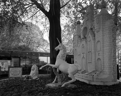
But this is what happens when you get up close.
And if that looks just a bit familiar, almost the entire design team for the Brussels Expo had indeed worked together on the Festival of Britain. Here’s Jonathan Woodham’s summary of the problems they faced.
[Britain’s] national ambitions were caught between the worlds of heritage, as represented in the Hall of Tradition, of scientific innovation, as displayed in the Hall of Technology, and of economics and industrial competitiveness, as represented architecturally by the more contemporary character of the glass-fronted British Industries Pavilion.
All of this is made manifest in the brochure, from royalty to machinery.
I tend to see this later part of the 1950s as the height of Britain’s optimism about the brave new post-war world of spindly legs and bright colours and good design for all. But even in 1957-8, it was impossible to be simply modern. Being British was always much more complicated than that.
