For anyone who thought the infographic is a modern phenomenon, the London Transport Museum is here to set you right.
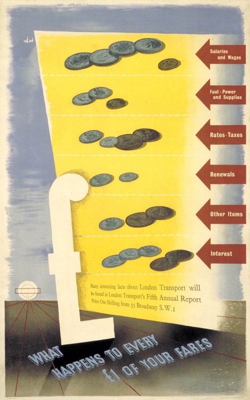
They’ve just created a new display of graphics about numbers, which I am mainly drawing your attention to because this Schleger is both fantastic and not often seen.
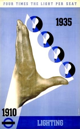
Interestingly, it’s from 1938. These kind of explanatory posters with factual graphics are sometimes ascribed to the war, with its accompanying need to explain to the people, but clearly the trend had begun before the conflict started. This design by Theyre Lee Elliot is even earlier, from 1936.
(I’m guessing from the press release that this is in the exhibition from the description, apologies if you go there and it isn’t…)
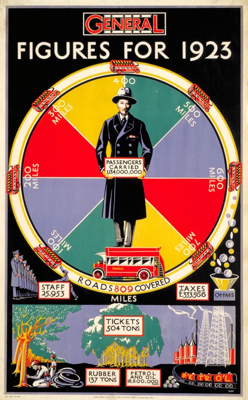
In fact a fair chunk of the exhibition seems to be dedicated to proving that the infographic goes back quite a long way further than we might think.
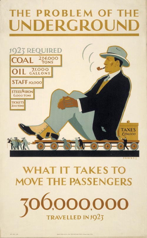
The design above, by Irene Fawkes, dates from 1924 and there are plenty more of that ilk in the exhibition, although they are mostly in a pre-war style that I can’t get too excited about.
But what this makes me think, perhaps even more than how far these kind of explanation goes back, is that what seems to be missing are their modern equivalents. I know there are exceptions to this – a few years ago London Transport produced a set of posters explaining why escalators needed to be replaced, which were placed on the hoardings around the work which weren’t graphically exceptional but were interesting and informative. In the main, though, it doesn’t feel as though public bodies feel the need to explain to us what they are doing any more. Or am I missing something?
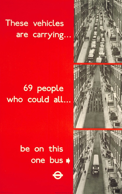
The above is by Heinz Zinram (at least he took the photographs) and dates from 1965. Just as true today though.
And thanks to Macca, who pointed me at this exhibition in the first place, for which I am very grateful.
