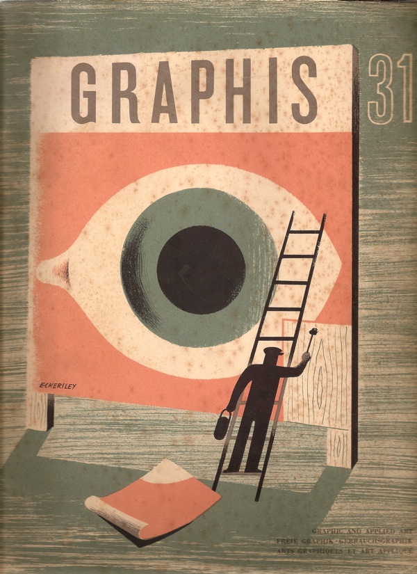
That’s what this copy of Graphis is asking in 1950. (And yes, the cover is by Tom Eckersley).
Unfortunately for us, most of the answers are in black and white, apart from this design for Kia-ora by Lewitt-Him.
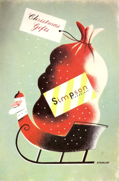
And this Christmas advertisement for Simpsons of Piccadilly.
I think there may have been some more at some point, but my copy seems to have a page missing. By way of compensation, I’ll try and find colour versions of the posters and illustrations they’ve reproduced where I can. Still, it’s worth putting up with the black and white because there is some wonderful stuff included in their survey of British design. I would like this Lewitt-Him showcard whatever colour it turned out to be.
Oddly, one of the things that makes this article particularly interesting is the small print. Each image is credit twice, once to the artist and/or illustrator and once to the advertising agency which commissioned it. Which means that, for a change, it’s possible to see how posters and advertisments came into being.
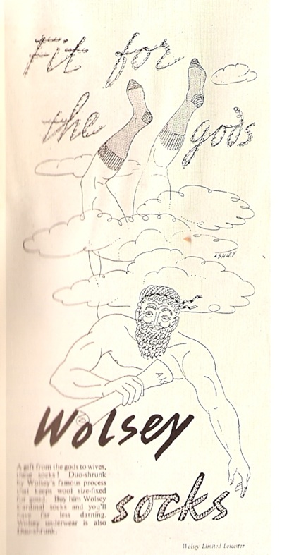
Let’s take Crawfords, for example (I would happily take almost anything from Crawfords’ considerable output if anyone is offering). Their art director was Ashley Havinden, who did produce some of the illustrations for his own press advertisements.
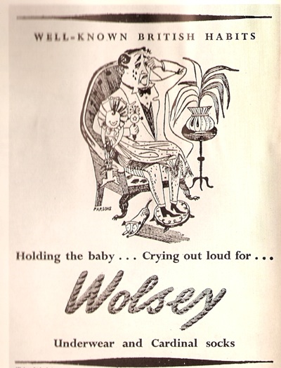
Even within a single campaign, more than one artist might be used though; so this cartoon is by John Parsons.
(Apologies for the wobbliness of the scans, but I don’t want to damage the magazine.)
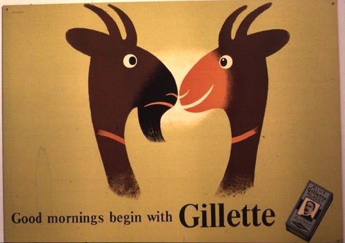
At the same time, Havinden was also commissioning entire campaigns from other designers, like Tom Eckersley’s work for Gillette.
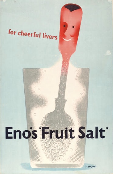
As well as Eno’s Fruit salts, which was also produced by Crawfords. A different format of this advertisement is reproduced in Graphis; the French caption provides the extra explanation that Enos is ‘un digestif’. I think, if forced to make a choice between some French pastis and a glass of Enos, the pastis would win every time.
These double attributions of the advertisements, thougb, are a useful reminder that designers of the period were not artists, producing whatever they liked, but were working within a very commercial framework, receiving commissions from people they knew, often, I imagine, to quite a tight brief. This is something that can get forgotten as we collect and admire posters today; increasingly they become detached from their original purpose and seen as artworks rather than functional pieces of design. But that’s not how they were originally produced at all.
This is a point also made, in a slightly different way, in the essay which goes with these illustrations. The author, Charles Rosner, thinks that the standard of posters and other commercial art has declined considerably since the war. The only high points are provided by what he calls ‘the cultural and social activities in advertising’, by which he means commissions from the BBC, London Transport, the Arts Council and the GPO. By which he is also implying designs which aren’t contaminated by the need to sell things.
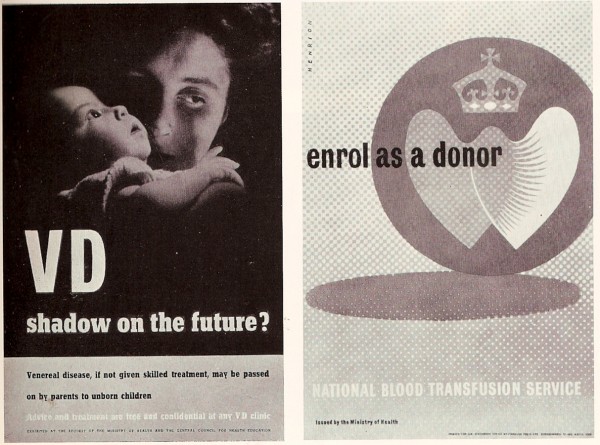
But were these high-minded designs really better? From this distance it’s hard to say for sure because so little British commercial advertising survives. But take this page of F H K Henrion’s work. The poster designs for the government health campaigns are more in the international modernist style with which I tend to associate him.
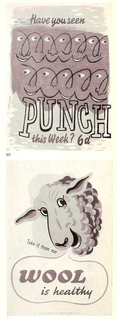
This wasn’t all he could produce though. Take these fine fish for example.
(I’m rather fond of the sheep too, which is why it’s here, even though it’s not actually by Henrion).
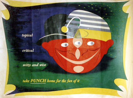
On the opposite page are also a couple of his better-known designs for Punch.
But which of these are better? Public information edges or Punch decorative? I find it hard to say, but then my pro-modernist bias probably isn’t as strong as some people’s. What do you lot reckon?
The text makes an interesting point about posters as well. Remember, this is 1950, and television advertising hasn’t been imagined yet, but posters are already seen as being in decline, and for reasons I’ve never seen put before.
Posters are victims of the great speed of modern traffic, congestion of town streets, squeezing out of hoardings from town centres to areas with less appeal in publicity value, and town and country planning regulations, with only vague definitions of the places where hoardings are still allowed to stand.
So the golden age of the poster was partly caused by the fact that people were moving slowly enough to look at them. Now there’s a thought.
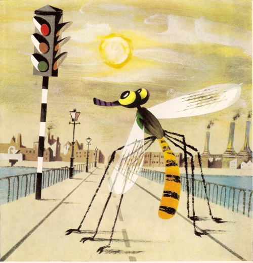
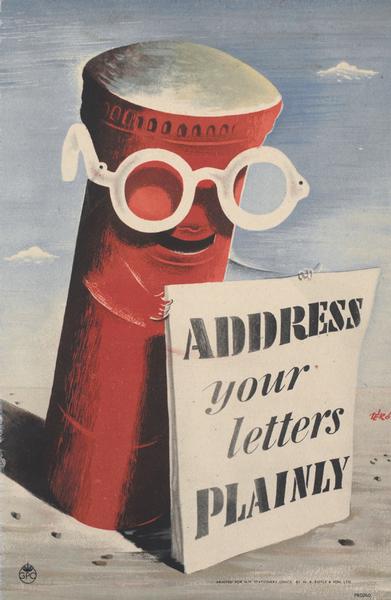
But the article isn’t all about answers, it’s also made me ponder a couple of questions too. This post is going on a bit, so I’ll return to them in the next few days. For now you can just have this rather wonderful Lewitt-Him artwork as a clue about the first. It is illustrated in Graphis, but if anyone has sighted it anywhere else other than the GPO archive, I’d like to hear from you.
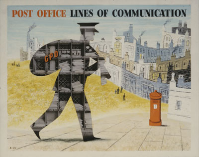
Fascinating. And look at the quality of the lettering.
There’s more to come too!
Funny things opinions…… not read the essay but I can’t say I’d identify a gulf between the quality of public information posters and those items tainted by the tawdry need to sell product. Many of the designers mentioned worked on both types of work – would they have differing standards because when paid to work on a commercial product?…I’d say not. Some incredibly creative commercial poster work was done post war, I’d say the work merely changed with the demands of the times, that’s called progress….I think
I agree, I think he’s more expressing a kind of snobbishness than anything else; in the text he also says that the BBC, LT etc are better precisely because they commission fine artists, which does rather reveal his prejudices.
The whole thing probably deserves its own post one of these days, but it did come up in a post a while back, about how railway posters are slightly ‘dissociated’ from commerce and so, perhaps, are valued more highly now.
http://vintageposterblog.com/2010/10/22/put-it-there/
And I shall go away and give it some more thought.