Be prepared

Hurrah, an auction.  It’s about time we had a nice chunky set of British posters for sale, and it’s Bloomsbury Auctions who are obliging this time, on the 16th February.

Once again, there are incalculable quantities of airline posters.  Where do they all come from? I don’t remember them being in auctions a few years ago, and suddenly they are omnipresent.

Lewitt Him vintage airline poster AOA stratocruiser 1948
Lewitt Him, 1948, est £300-500

Lewitt Him AOA vintage airline poster 1950
Lewitt Him, 1950, est. £400-600

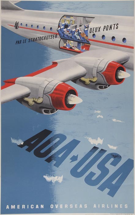
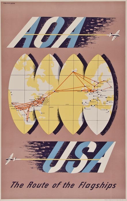
Well, there are at least six.  Some of them are indeed the usual Lewitt-Him AOA designs, but there are also other designers working for other airlines for a change.  This one is by Willy de Majo, who deserves a post all of his own one day.

Willy de Major vintage BOAC airline poster 1948 South America
Willy de Majo, 1948, est. £600-800

My favourite of them all is probably this Schleger design for BEA, which I don’t remember ever having seen before now.

Hans Schleger BEA poster hand
Hans Schleger, est. £700-900

It’s also reminded me that when I wrote about these wide blue skies in the airline posters the other day, I left something out, something I only realised last week when I was thinking about the afterlife of surrealism in graphic design.

vintage BOAC poster 1948 airline flags
Anon, 1948, est. £350-450

Because as well as being a remaking of wartime skies and vapour trails, these clear skies with their spotting of clouds are also the heavens across which surrealist visions drift.

BEverley Pick vintage airline poster BOAC
Beverley Pick, est £500-700

Certainly Schleger’s airline skies aren’t much different to his pre-war dreams; it’s just different kinds of flying I suppose.  Maybe it did seem unreal to get to places so quickly, I don’t know.

Laurence Fish, life is gay at whitley bay, vintage travel poster
Laurence Fish, est. £200-400

Apart from the airlines, I can also offer you the undervalued dose of kitsch above, along with a neat Lander and a John Burningham that every household should own.

RM Lander Isle of Man vintage travel poster
R M Lander, est, £ 150-250

John Burningham vintage London Transport poster boat 1964
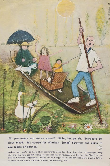
John Burningham, 1964, est £100-150

Beyond that the posters that most appeal to me are, strangely enough, mostly pre-war.  Mind you, who could resist this.

Blackpool vintage LMS travel railway poster
Anon, est. £200-400

While the idea of ‘J B Priestley’s England’ is one which hasn’t really lasted, making this poster an interesting curio.

Austin Cooper vintage railway poster J B Priestley Good Companions
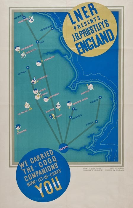
Austin Cooper, est. £150-250

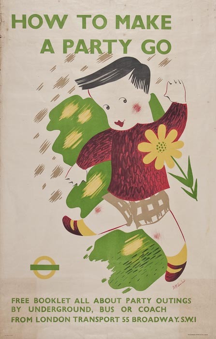
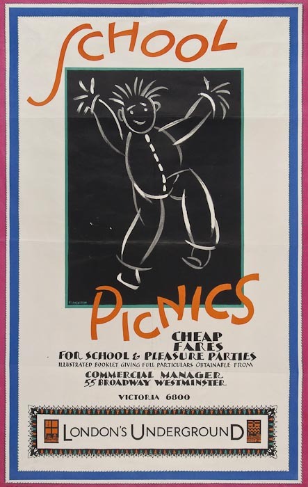
These two, meanwhile, are just quaintly likeable.

D M Earnshaw vintage London transport poster 1938 party
D M Earnshaw, 1938, est. £100-150

Freda Lingstrom school picnics vintage poster 1930
Freda Lingstrom, 1930, est. £200-300

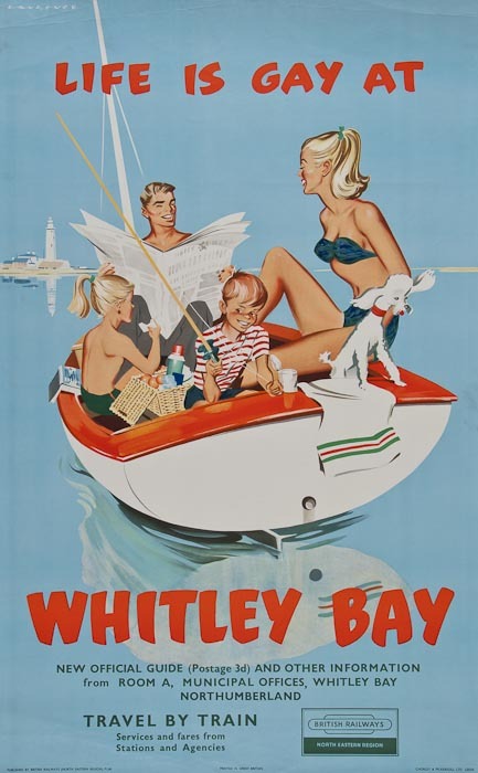
None of which, though, really adds up to much other than some posters which I enjoy but probably won’t buy, along with a couple of interestingly low valuations on one or two lots.  I shall be particularly interested to see what happens to the Burningham and Whitley Bay posters when they come up.

There are also a very few posters on offer at Dominic Winter’s auction tomorrow, but they do include one or two interesting wartime and pre-war ones.  This Abram Games falls, like so many of his wartime posters, into the category of admirable but I wouldn’t want to have it on my wall.

Abram Games vintage army ordnance poster c1943
Abram Games, 1943, est. £300-500

Then there is this  McKnight Kauffer ARP poster.

McKNight Kauffer vintage propaganda poster ARP 1938
Edward McKnight Kauffer, 1938, est. £200-300

We have a smaller version of this and I was considering it the other day, because it is an odd one.

Although I quite like it as a piece of graphic design (enough to have the air pellet holes removed and get it framed, so a fair bit of like), I’m not sure it’s successful as a poster.  But then it does have an almost impossible task to fulfill.  The design dates from 1938, so just before the war; it needs to make people aware that there is a need for them to do something, but at the same time it can’t spell out the detail of what might happen and frighten people (“you will all be bombed in your beds and die without ARP, so there”).  So it ends up being a bit vague and ineffectual; perhaps they thought that people would have read the papers and would be able to fill in the details themselves, or maybe they just wanted to be woolly at this stage, I don’t know.

Dominic Winter are also selling an ARP poster by Pat Keely in the same sale, and I’m not sure his design is much more convincing.

Pat Keely vintage arp world war two propaganda poster 1938
Pat Keely, 1938, est. £200-300

What do you reckon?

Posters on Display

There was more to the Beverley Pick book than could fit into one single post. Ironically, what got left out last time was posters: to be precise their display, as demonstrated in this wonderful illustration by Mr Pick.

Beverley Pick wartime  poster display stand from display presentation book

It particularly jumped out at me because we have the poster at the bottom left, which I wasn’t actually certain was by Beverley Pick.

Beverley Pick photomontage world war two propaganda poster ministry of food small girl green vegetables

To be fair, the book doesn’t actually say it is either.  But given that every other photo in the book of Pick’s own work. it’s a reasonable assumption to make – and the photomontage and deep colour is very similar to his other poster work during the war.

BEverley Pick world war two propaganda poster ATS be useful

But the illustration of how these posters were displayed is worth a second look too.  Pick describes it as follows:

The light and portable poster screen shown here was designed to take seven posters of standard size and one headline streamer circulated at monthly intervals.

It’s a much more organised mean of display than I ever tend to imagine for Second World War posters.  More importantly, the experience of seeing seven posters together is very different to seeing one alone.  The single poster is much more like propaganda, just giving the viewer the idea that sowing winter vegetables is a good thing to do.  En masse, they are much more informative and give the viewer enough basic knowledge – which vegetables and when – to allow someone to go about it.

The display panel is a useful reminder that  posters appeared in more than one context, not only as solo propaganda pinned up on hoardings, in shops and on the walls of village halls but also in the more organised and didactic context of exhibitions too. It’s not something I’d really considered or read about before but having had that thought, the Imperial War Museum’s photo collection started to come in very useful.  Here’s their image of another poster much beloved of this blog.

F H K HEnrion posters on display off the ration exhibition London Zoo

This is, of course,  F.H.K. Henrion’s paen to the joys of rabbit meat, which  is on display as part of the Off the Ration Exhibition.

Entrance to Off the Ration Exhibition London Zoo

‘Off The Ration’ was originally held at London Zoo, which I always felt must have been a bit unnerving for the other animals, wondering how long it would be before they were designated as steak too.  No wonder that Lewitt Him’s kangaroo is feeding up the more likely candidates in the poster for the exhibition.

Lewitt Him off the ration exhibition poster 1943 Ministry of Information propaganda vintage poster

But returning to our subject of  the poster displays inside, I have seen both the posters at each end before now, but never the panel in the middle.  This may or may not have existed as a single poster – I have no way of knowing and even less means of finding out.  And were the Henrion posters commissioned for the exhibition first, or were existing posters incorporated into the exhibition’s design?  Again, I can’t tell you.

But these unanswerable questions are a useful reminder that posters during the war weren’t lone objects but were seen by people at the time as part of a whole range of other kinds of of graphic design – and the rest of it can easily be forgotten when we’re telling the story of the posters.

Take Potato Pete, as one of the more obvious examples.  He exists on posters, of course.

Potato Pete vintage world war two propaganda poster ministry of food

He too had his own exhibition, this time on Oxford Street (this looks like the site of the bombed-out John Lewis store which was used for a number of exhibitions during and just after the war).

Potato Pete exhibition

But many more people would have seen his image in the daily newspaper Food Bulletins put out by the Ministry of Food and so in many respects the posters and exhibtiions were just adjuncts of that.  So the poster was an image of an already well-known character, which meant that it would have been understood in a very different way.

The continuum of graphic design and display can work the opposite way round as well.  This woman in Oxford is finding out about salvage.

Ministry of Information Salvage exhibition Oxford

The displays that she is looking at aren’t, as far as I know, related to any particular poster campaign,although the main panel could quite easily pass as a poster design.  But nonetheless, people who’d seen this exhibition or one like it would read posters in a subtly different way, seeing them as just one part of what they were being told about salvage.  So perhaps posters had to say less, because they were acting as a reminder, or they were able to use visual symbols which would have been easily understood by the viewer because they’d already been explained in a different context.  It’s impossible to prove this, of course but equally it does seem absurd to thing that this overlap would not have happened.

None of this is in the slightest bit surprising to anyone who has any idea how advertising works in the modern world, where campaigns are planned across television, press and sometimes still posters, and now with social media added on too.  But these multiple contexts are very rarely considered in terms of wartime posters, even though the Ministry of Information was clearly a very shrewd and sophisticated user of all the means available to it.  And there were very many means indeed.  You might find a food exhibition in your local furniture retailer.

A view of a display by the Ministry of Food at the 'Domestic Front' exhibition held at James Brooke and Sons Ltd., 376 Bethnal Green Road. This display focuses on wartime cookery demonstrations and includes information on vitamins, dried eggs and vegetables.

More surprisingly, you might even catch an exhibition being driven down the street.

Travelling salvage exhibition outside Ministry of Information Bruce Angrave.

This highly covetable vehicle is a travelling salvage exhibition in 1943, and I shall let the Imperial War Museum describe it to you.

…the car has the words ‘Private Scrap is in town…come and meet him’ painted on the side. The van itself has a special bin for collecting books ‘for the forces, blitzed libraries, and salvage’, and the side of the van features a series of wooden display panels by artist Bruce Angrave. The salvage exhibition continues inside the vehicle.

Bruce Angrave’s panels aren’t posters and almost certainly don’t exist any more (and if someone wants to tell me I’m wrong on that, I’d very much like it). But they are part of the visual landscape that salvage posters inhabited, and so ought, even if just a tiny bit, to be taken into account when we talk about them.

When I studied Design History, I used to hate entirely abstract phrases like ‘visual culture’ and ‘discourse’; I’m hardly fond of them even now.  But they can have their uses sometimes.  Now that posters have become objects which are both valuable and collectable, the art-historical impulse tends to take over.  They are treated as ‘art’: framed and conserved, and displayed on their own.  None of this is wrong, but it can tend to leach into our thinking about them as well and that isn’t a good thing.  Posters are the bits of graphic design which were lucky enough to survive, but they were part of a much wider world of print and explanation, and it’s worth remembering that more often.


The Price of Everything

Today, a miscellany of stuff, mostly for sale.  And it’s a mixed bag of good, bad and ugly.  Shall we start with the latter?

This, um, rarely seen poster is being sold by an American auction house in an internet auction on Sunday.  Although I tell you this more as a warning than an invitation to buy.

British Railways British Transport Hotels 1978 Winterbreak poster

Truly, proof that the golden age of the railway poster was dead and buried by 1978.  Amazingly there is a bid on it too.

To cleanse your eyes after that, some lovely Daphne Padden.  Travel On Paper are selling this classic for what looks to me like a very reasonable dealer price of £275.

Daphne Padden Royal Blue coach poster 1957 fishermen and cat

Now I’m not sure what Daphne Padden is actually worth these days (and I know that I’m saying this from the persepective of someone who’s got quite a few of her posters, and am therefore not exactly an unbiased observer, but hey).  On one hand, other dealers are selling less good posters by Daphne Padden for £450+; on the other, we got our copy of the poster above at Morphets, last year, for just £65 and something else came with it, even if I can’t remember what.  So, what’s the actual value? I haven’t got a clue. Anyway, Travel on Paper are at MidCentury Modern in Dulwich on Sunday 20th if you want to look at some of their posters or just say hello.

Over on eBay it’s the same story, posters of varying quality at seemingly random prices.  Shall we start with cheap, but rightfully so.

Ebay 1950s National Savings Bank poster Casual Earner Regular Saver

It’s a National Savings Bank Poster, but I can’t tell you any more than is on the listing I’m afraid.

While this railway poster, with a similar womens’ magazine styling to its illustration, has a starting bid of $210.

British Railways Southern Region Folkstone poster 1959


But it is being sold by a dealer, PosterConnection, so perhaps the price isn’t so surprising.

Meeting them somewhere in the middle is this H M Bateman Save Fuel poster which seems very reasonable at £48 Buy It Now, especially considering it’s 20″ x 30″.

H M Bateman don't be fuelish WW2 propaganda poster

The more I think about that, the more I think it is a bargain; the better known examples of these can go for £200 or more at auction.  Don’t say I didn’t warn you.

The seller also has this ATS poster, from a series which has been mentioned on here before, and I believe is by Beverley Pick.

Beverley Pick World War TWo ATS propaganda poster

This is currently on a £68 Buy It Now, which is rather more like what it would fetch at auction, but still not unreasonable.

Finally in this heap of odds and ends, a couple of follow-ups to previous posts.  When I wrote about John Burningham the other day, I couldn’t find an image of his cats in a boat coach poster that I’d liked so much at the exhibition.  But Liz Dobson very kindly sent me a photo.

John Burningham boatload of cats coach travel poster lovely

I’ll add it to the post as well, but I thought I’d show you here too as it’s so great.  And if you do happen to have a spare one…

And following on from my musings about airline posters, Martin Steenson of Books & Things pointed me at this Lewitt-Him AOA poster, which he currently has for sale.

Lewitt Him AOA poster vintage travel

While it doesn’t have the expansive blue skies or vapour trails of their other posters, I still think this has a strong connection to the visual language of the war in the air.  Because it looks to me like nothing so much as a wartime aircraft recognition poster.

World War Two aircraft recognition poster

Were there other areas where the visual memory of the war spilled out of the national subconscious and into peace time like this?  Surely there must have been: the war was too all-encompassing to be easily forgotten, however hard people wanted to try.

Blue Sky Thinking

I could really do with a good auction now.  Even though we don’t have the wall space for anything else and probably would end up buying next to nothing, I’d still enjoy the excitement.  So, after Swann Galleries emailed to say that they had a wonderful set of London Transport posters in their forthcoming auctions, I did get my hopes up a bit.

And it is true, they do have some great and rare London Transport posters coming up.  It’s just that they are all too early for my taste (and therefore also too expensive for my means as well).

Montague Black, 2026 vintage London transport poster 1926

Jean Dupas fetches high prices, but it’s all a bit too much out of the Art Deco style manual for me.

Jean Dupas Transport of joy Vintage London Transport poster 1933
Jean Dupas, 1933, est. $2,000-3,000

Quite a few of them are tram posters too, and for some reason I’ve never really fallen in love with a tram poster, not even one for a Pullman tram.

Shop early by tram vintage travel poster Blair 1929
Rene Blair, 1929, $800-1,200

Interestingly, these are a different format to the mainstream of London Transport posters – double crown rather than double royal – and were presumable displayed somewhere else.  But where?  On trams, or on their stops? And why wee they different?  Can anyone enlighten me?

mcKnight Kauffer vintage London Transport theatre poster 1930
McKnight Kauffer, 1930, est. $800-1,200

The McKnight Kauffer above is a classic, but not even that can tempt me.  Only this single Dora Batty has a small attraction for the Crownfolio wallet.

Dora Batty from the country to the heart of town vintage london transport poster 1925
Dora Batty, 1925, est. $1,200-1,800

Mainly because I would like to think of myself as dashing chic-ly into London every so often.  Of course it doesn’t happen, I don’t look like that and even if I did try it would take a whole lot longer than half an hour.  Where can she live that is so bucolic and yet so close? Aylesbury? Guildford? We may never know.

There are plenty more posters along these lines if that’s what you want, but little else to report, apart from one nice David Klein at an even higher price than before.

David Klein New York vintage airline poster TWA 1960

Along with these two airline posters, from the Czech Republic and Australia respectively.

Schlosser CZECHOSLOVAK AIRLINES / IT'S O.K. WITH CSA. Circa 1946. vintage travel poster
Schlosser, 1946, est. $800-1,200

RONALD CLAYTON SKATE (1913-1990) ANA / COVERS AUSTRALIA / COAST TO COAST. Circa 1955.  Vintage travel poster
Ronald Clayton Skate, 1955, est. $800-1,200

Why I find them interesting is that both remind me of the Lewitt Him and Abram Games airline designs of a similar period, and together they represent what seems to be an international visual language of air travel just after the war.  These infinite blue skies are the very newest thing, am image of  how the airlines have made the whole world available to you, at least if you have enough money.

Abram Games BOAC poster 1949
Abram Games, 1949

It’s easy to forget just how exciting and how modern air travel would have been then.  Very few people would ever have seen such open skies before, so of course they became a symbol of the glamour and speed that the new airlines could provide.

Lewitt Him, vintage airline travel poster 1948 Poster Connection
Lewitt Him, 1949

Vintage Lewitt Him BOAC poster 1948
Lewitt Him, 1949.

Except there may be a bit more to it than that.  Because some people had seen those skies before, and a few more people had seen the trails that aircraft could leave too.  The ANA poster at the top reminds me very much of Paul Nash’s painting, The Battle of Britain.

Paul Nash Battle of Britain 1944 IWM good art I thank you

So while these blue skies are on one hand a simple representation of brand new freedoms, I think there is also a bit more meaning within them.  These posters are rewriting some of the most potent imagery of the war, turning it from terrifying to exciting.  There is no need to fear the trails that these aircraft leave, or the wide blue skies in which they fly, not any more.

Battle of the Bulge 1944 vapour trails
Battle of the Bulge, 1944

So these posters are not only being modern, they are also reminding the viewer that this new world has been built out of the conflict that came before.  Swords are forged into ploughshares and the war in the air has brought us intercontinental jets.

Strube vintage world war two RAF poster


Henrion BOAC vintage travel poster 1947 Swann
Henrion, 1947.

We might find it hard to make the connection now, but at the time the link must have been very obvious.

Vapour trails from Battle of Britain 1940
Battle of Britain, 1940

Which means that the reassurance and the rewriting must have been very necessary too.

The Few vintage World War Two propaganda poster

What is the range of activity of the commercial artist in Britain?

That’s what this copy of Graphis is asking in 1950. (And yes, the cover is by Tom Eckersley).

Cover of Graphis 31 1950 Tom Eckersley cover

Unfortunately for us, most of the answers are in black and white, apart from this design for Kia-ora by Lewitt-Him.

Lewitt Him Kiaora advertisrement 1950

And this Christmas advertisement for Simpsons of Piccadilly.

Simpsons of Piccadilly advertisement 1950

I think there may have been some more at some point, but my copy seems to have a page missing.  By way of compensation, I’ll try and find colour versions of the posters and illustrations they’ve reproduced where I can.  Still, it’s worth putting up with the black and white because there is some wonderful stuff included in their survey of British design.  I would like this Lewitt-Him showcard whatever colour it turned out to be.

Lewitt Him panda showcard from Graphis

Oddly, one of the things that makes this article particularly interesting is the small print.  Each image is credit twice, once to the artist and/or illustrator and once to the advertising agency which commissioned it.  Which means that, for a change, it’s possible to see how posters and advertisments came into being.

Let’s take Crawfords, for example (I would happily take almost anything from Crawfords’ considerable output if anyone is offering).  Their art director was Ashley Havinden, who did produce some of the illustrations for his own press advertisements.

Design for Wolsey advertisement, illustration by Ashley Havinden

Even within a single campaign, more than one artist might be used though; so this cartoon is by John Parsons.

Wolsey advertisement illustration by John Parsons

(Apologies for the wobbliness of the scans, but I don’t want to damage the magazine.)

At the same time, Havinden was also commissioning entire campaigns from other designers, like Tom Eckersley’s work for Gillette.

Tom Eckersley vintage poster Gillette goat 1950

As well as Eno’s Fruit salts, which was also produced by Crawfords.  A different format of this advertisement is reproduced in Graphis;  the French caption provides the extra explanation that Enos is ‘un digestif’.  I think, if forced to make a choice between some French pastis and a glass of Enos, the pastis would win every time.

Tom Eckersley Enos Fruit salts ad 1950


These double attributions of the advertisements, thougb, are a useful reminder that designers of the period were not artists, producing whatever they liked, but were working within a very commercial framework, receiving commissions from people they knew, often, I imagine, to quite a tight brief.  This is something that can get forgotten as we collect and admire posters today; increasingly they become detached from their original purpose and seen as artworks rather than functional pieces of design.  But that’s not how they were originally produced at all.

This is a point also made, in a slightly different way, in the essay which goes with these illustrations.  The author, Charles Rosner, thinks that the standard of posters and other commercial art has declined considerably since the war. The only high points are provided by what he calls ‘the cultural and social activities in advertising’, by which he means commissions from the BBC, London Transport, the Arts Council and the GPO.  By which he is also implying designs which aren’t contaminated by the need to sell things.

it's a wartime poster by hans schleger and we've got one too

But were these high-minded designs really better?  From this distance it’s hard to say for sure because so little British commercial advertising survives.  But take this page of F H K Henrion’s work.  The poster designs for the government health campaigns are more in the international modernist style with which I tend to associate him.

This wasn’t all he could produce though.   Take these fine fish for example.

(I’m rather fond of the sheep too, which is why it’s here, even though it’s not actually by Henrion).

On the opposite page are also a couple of his better-known designs for Punch.

a punch poster by henrion

But which of these are better?  Public information edges or Punch decorative? I find it hard to say, but then my pro-modernist bias probably isn’t as strong as some people’s.  What do you lot reckon?

The text makes an interesting point about posters as well.  Remember, this is 1950, and television advertising hasn’t been imagined yet, but posters are already seen as being in decline, and for reasons I’ve never seen put before.

 Posters are victims of the great speed of modern traffic, congestion of town streets, squeezing out of hoardings from town centres to areas with less appeal in publicity value, and town and country planning regulations, with only vague definitions of the places where hoardings are still allowed to stand.

So the golden age of the poster was partly caused by the fact that people were moving slowly enough to look at them.  Now there’s a thought.

But the article isn’t all about answers, it’s also made me ponder a couple of questions too.  This post is going on a bit, so I’ll return to them in the next few days.  For now you can just have this rather wonderful Lewitt-Him artwork as a clue about the first.  It is illustrated in Graphis, but if anyone has sighted it anywhere else other than the GPO archive, I’d like to hear from you.

GPO vintage Poster lewitt him lines of communication 1950

Finders

Amidst all the chaos of moving, a pleasant surprise, in the form of this Lewitt-Him children’s book, which was discovered squashed between two bigger poster books on the shelves.

Lewitt Him Little Red Engine gets a Name cover

Now I’ve blogged about their books before, and even mentioned this in passing but I had no idea we owned a copy of it at all.  Not even Mr Crownfolio, who tends to be less surprised by these discoveries than I am, knew it was there.  It has now been put in a safer place, because it is truly delightful.

Lewitt Him Little Red Engine gets a Name illustration

I’m afraid I can only show you the single illustrations. There are also some great double-page spreads too, but unfortunately the long thin format doesn’t fit on the scanner, so you’ll just have to believe me on that one.

Lewitt Him Little Red Engine gets a Name illustration

Still, as well as those there are some smaller pictures in the text which do fit.  I am particularly fond of these sheep.

Lewitt Him Little Red Engine gets a Name illustration sheep

I used to be on the train, whizzing past that arrow.  Now I think I’m more like the sheep.

There is also an entirely accurate preview of the state of things here at Crownfolio Towers right now.

Lewitt Him Little Red Engine gets a Name illustration suitcases

The removal men arrive later today.  More news when we come out the other side.