Designer’s eye

So here I am submerged in house renovations when there are poster auctions which I need to tell you about.  First in the line, mainly because it’s in just a few days time, is the forthcoming Swann Auction of Modernist Posters.

Now, with their being in New York, there are usually only one or two items of interest for us in a Swann auction, things like this, which although wonderful are somewhat outside the Quad Royal remit.

WALTER ALLNER (1909-2006) SUISSE ÉTÉ / WAGONS - LITS // COOK. travel poster
Allner, est. $1,500-2,000

HERBERT MATTER (1907-1984) ALL ROADS LEAD TO SWITZERLAND. 1935 travel poster
Matter, 1938, est. $2,000-3000

There are also a set of Theyre Lee-Elliott posters for the embryonic British Airways.

THEYRE LEE-ELLIOTT (1903-1988) BRITISH AIRWAYS / PARIS & SCANDINAVIA. 1938. Travel poster

M26145-31 001

M26145-29 001

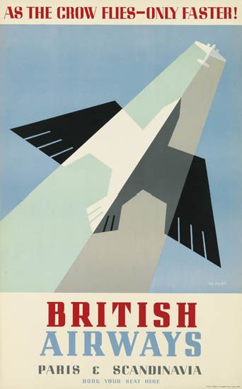
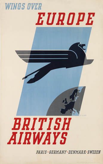
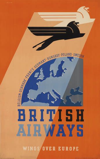
All three are from 1938 and estimated at $800-1,200.  While we’re on the subject of British Airways, there is also this, which is apparently a very early example of photography in an airline poster.

DESIGNER UNKNOWN IT'S SMART TO FLY BRITISH AIRWAYS. Circa 1938. travel poster
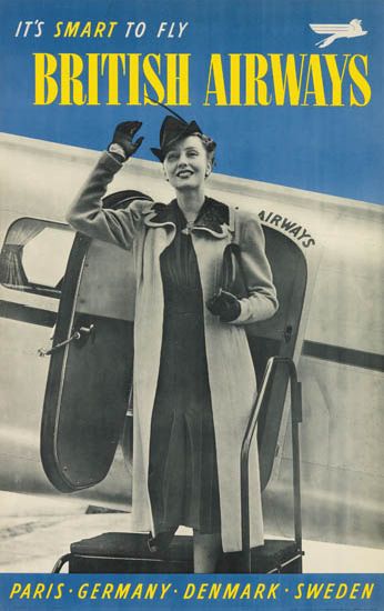
Anonymous, c.1938, est. $800-1,200

If only flying were so glamorous now.

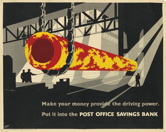
The main reason we’re here, however,  is lots 185-222 which are, in the main, from the collection of F H K Henrion.  There is one piece of his own work.

FREDERIC KAY HENRION (1914-1990) ARMY EXHIBITION. 1943. propaganada poster
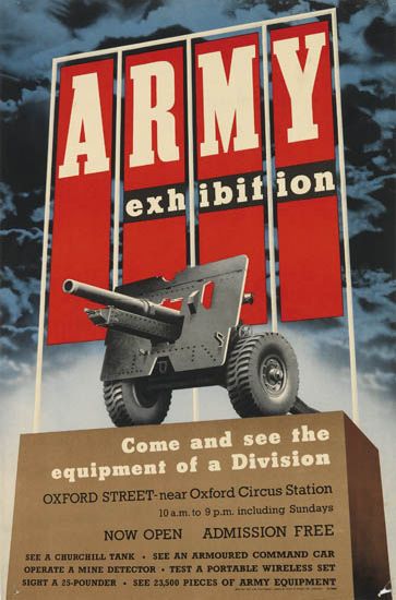
F H K Henrion, 1943, est. $600-900

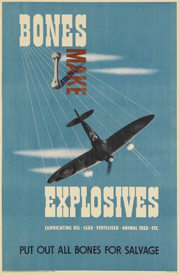
But what’s really going on is Henrion looking at the work of his fellow designers.  So there are examples from Reginald Mount, Pat Keely, Hans Schleger, Eckersley and many others – so many that I can’t include all of the ones I like.

REGINALD MOUNT (1906-1979) BONES MAKE EXPLOSIVES. Circa 1944.  world war two poster
Reginald Mount, 1944, est. $600-900

PATRICK COKAYNE KEELY (?-1970) GEARWHEELS CATCH CLOTHES / KEEP YOUR GUARD ON. 1941.  rospa poster
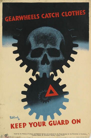
Pat Keely, 1941, est. $400-600

ZERO (HANS SCHLEGER, 1898-1976) NATIONAL ASSETS / BE SPARING IN THEIR USE. Circa 1940. GPO poster
Hans Schleger, 1940, est. $400-600

As well as a substantial selection of Abram Games’ designs; I don’t know if they were friends or whether Henrion was a particular admirer of his work.

ABRAM GAMES (1914-1996) RADIOLOCATION. 1941. World war two poster
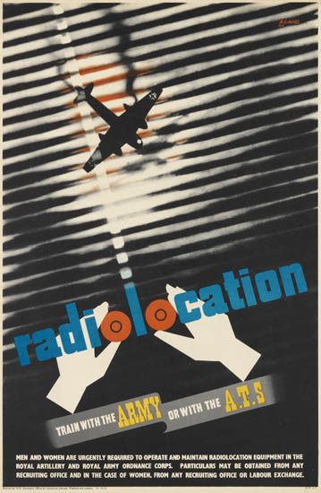
Abram Games, 1941, est. $2,000-3,000

ABRAM GAMES (1914-1996) CIVIL RESETTLEMENT UNITS. 1945. army poster
Abram Games, 1945, est. $700-1,000

ABRAM GAMES (1914-1996) MEN LEAPING AHEAD IN INDUSTRY READ THE FINANCIAL TIMES EVERY DAY. 1955. poster
Abram Games, 1955, est. $2,000-3,000

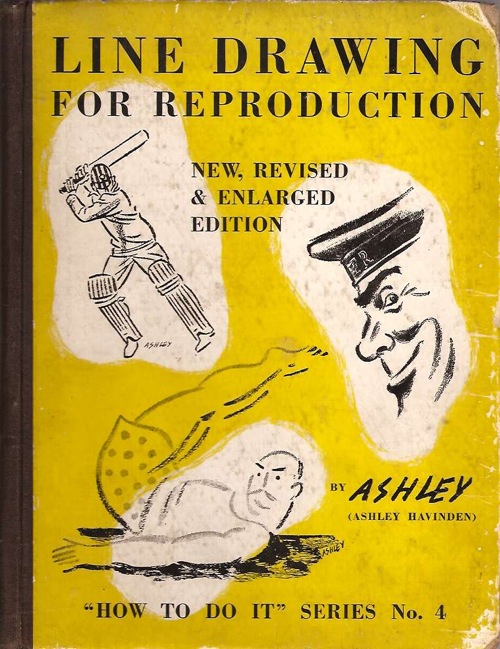
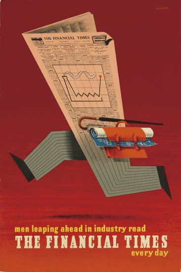
I’ve even found a rare example of an Ashley Havinden poster.

ASHLEY HAVINDEN (1903-1973) KEP / DELICIOUS WITH FISH. Circa 1950.
Ashley Havinden, 1950, est. $400-600

Not everything is by a big name, either.  This very striking wartime image is simply by A.R., about whom I can tell you nothing.

A.R. (MONOGRAM UNKNOWN) POST OFFICE SAVINGS BANK. Circa 1942. poster
A.R., 1941, est. $500-750

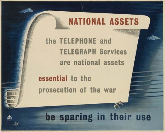
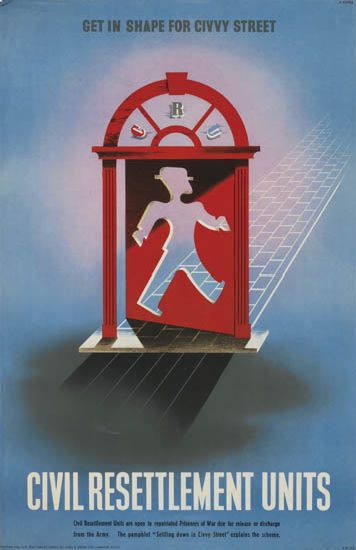
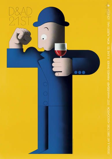
Henrion clearly never stopped looking at posters and thinking about them as long as he worked, because there are a host of later examples too.

ALAN FLETCHER (1931-2006) D & AD 21ST. 1983. poster

So I strongly suggest you go over there and take a peek, not only for the insight into a designer looking, but also because Swann’s catalogues are properly written and informative.

MANFRED REISS (1922-1987) BE COURTEOUS. Circa 1955.  ROSPA poster
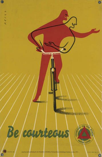
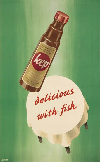
Manfred Reiss, 1955, est. $400-600

And now if you’ll excuse me, I have to order a skip.

Line tint screen

Given how much this blog loves Ashley Havinden and his immaculate 1930s style, it’s a wonder that this book has been sitting next to my desk for so long without any comment here.

Ashley Havinden Line drawing for reproduction cover

Or at least that’s what I thought until I actually picked it up this morning.  Mr Havinden may have been a very dapper gentleman with a wonderfully fluid style, but the king of interesting prose he is not.  What’s more there are nothing like enough of his drawings in the book either.  To be fair this is because he is a very generous author who spends much of his time praising other people’s work, but I still can’t help being disappointed.  This GPO delight is pretty much the only one which isn’t already on the cover,

Ashley Havinden GPO press advertisement dove

With apologies for the slightly dodgy scan.

The book also does what it sets out to do very well, which is teach an aspiring illustrator how to create good drawings which will reproduce well in newspapers and magazines.  So I am now much better informed about print technology of the 1930s (the book was originally published in 1933, but my copy, interestingly, was reprinted in 1941, so the subject was thought worthy of some very limited wartime paper).

In particular, I know now what scraperboard art is (I’d come across it in the Artist Partners brochure, where it has a whole section of its own, but had no idea what was actually involved).

Ashley Havinden scraperboard illustration

If you’re also wondering, it’s a chalk covered paper.  To quote our guide and instructor,

The advantage of this paper is that one can paint on it with black ink and with the use of a scalpel knife or sharp penknife white lines can then be scratched across the part covered with black ink.

Quite apart from just doing it because it looks good, apparently the real purpose of this is to create something which looks like a woodcut but can be reproduced more easily and without the trouble of having to make a woodcut in the first place.  So now I know.

But the other really interesting aspect of the book is that it is a reminder that the advertising and graphic design of the period wasn’t all about posters, far from it.  A great deal of artist and agency time would have been spent on the central subject of Havinden’s book, black and white print advertising in newspapers and magazines.

Ashley Havinden Marsh's York Ham Ad

That ad isn’t from the book by the way, but borrowed from Mikey Ashworth’s photostream, which I am starting to believe is the repository of all graphic design in the world.

I don’t have any peace-time figures to hand, but certainly during the war the biggest chunk of the Ministry of Food’s budget wasn’t spent on posters or even nicely-designed leaflets.  Rather it went on press advertising.

Ministry of Food Food facts press advertisement Carrots

What’s more these images reached people all across the country who would rarely see an advertising hoarding and might never come across a London Transport poster.  For much of Britain, this is what the design of the times would have looked like, before, during and after the Second World War.

It’s not like these adverts have disappeared without trace either; read any edition of Modern Publicity or Designers in Britain and good press ads are singled out just like the posters (albeit in a form which is so blurry as to be impossible to reproduce on the blog).  But nowadays we skip over them.  They are ephemeral, yellowing – and perhaps more to the point they don’t frame nicely and look good on the wall.

All of which means that artists like Ashley Havinden, who mostly drew for newspaper and magazine advertising and did very few actual posters, tend to get forgotten when we are writing the graphic history of the period.  Havinden mentions others in the book too, like Robb, W.G. Easton and De Lavererie.

De lavererie illustration havinden book

There’s also a section on Barnett Freedman too.  He’s not exactly forgotten, but the drawings that Havinden has chosen are just the kind of work that does disappear.

Barnett Freedman brewers soc ad from havinden book

Havinden also makes an interesting comment on how Freedman has transferred his distinctive lithographic style into newsprint without losing its character.

When Barnett Freedman is working for newspaper reproduction, he used a paper grained by himself to resemble the surface of a lithographic stone.  This gives his chalk work all the crispness and openness of texture suitable to the making of a line block, while containing as much tone value as a fine-screen half-tone.

And because he’s talking about both good examples for artists, like Picasso, Cocteau and Henry Moore, as well as other disciplines such as book illustration, there are plenty more well-known artists in there too; you just don’t need me to tell you about them.

The point of all of this is not to suggest that we start believing that these drawings are the new posters.  But when we’re thinking about posters, I think it is always worth remembering that they were by no means the only forms of visual design on offer before and after the war. For very many people, they weren’t even the dominant one.

Beware of the Swarf

Attic find of the year has to be awarded to RoSPA, who went into their warehouse  last year and discovered 700 old posters.  I dream of doing something like that.  Especially if it produces posters like this one.

Leonard Cusden RoSpa poster  1951

This is by Leonard Cusden from 1951, and it’s the original artwork, as is, it seems, much of what was discovered in the back of the warehouse.

Not everything is of quite such high quality graphically, although this Bruce Angrave from the 1940s is rather fine.

Courtesy is Infectious, hand-rendered artwork, road safety, Bruce Angrave, 1940s © The Royal Society for the Prevention of Accidents.

While this poster by Digby Willis is just rather fantastic quite regardless of the style.

But Sensible Shoes Protect Your Feet, hand-rendered artwork, industrial safety, Digby Wills, 1954 © The Royal Society for the Prevention of Accidents

I may be needing a copy of that when small Crownfolio hits the teenage years.

Many of the rest, like these two by Roland Davies and F Blake respectively, are more from the Ladybird books or Woman magazine school of design than high graphics.

Journey’s End, poster published by RoSPA and printed by Loxley Brothers, Sheffield, road safety, Roland Davies, 1960s © The Royal Society for the Prevention of Accidents.

Don’t Lose Sight of Them, Protect Your Eyes at Work, hand-rendered artwork, industrial safety, F Blake, 1954 © The Royal Society for the Prevention of Accidents.

While this one, by Gus from 1963, is just plain odd, mostly because it makes me feel very sorry for the hen.

Accidents Don’t Just Happen, They are Caused, hand-rendered artwork, general safety, Gus, 1963 © The Royal Society for the Prevention of Accidents.

Maybe it’s the gender politics making me uneasy.

Overall, though, the impression that these posters give is that RoSPA’s quality control systems, so thorough during the Second World War and in the years after, disappeared later on.

And they really did have a quality control system; their Publicity Committee was staffed by, amongst others, Tom Eckersley and Ashley Havinden, whose keen eyes really did let little dross through.  Here are the couple of posters that we own from this period, by G R Morris and Eckersley himself.

G R MOrris vintage RoSPA safety poster broken bands hurt hands

vintage Rospa child road safety poster tom eckersley

RoSPA are a really interesting organisation: there is a lot more to say about their posters and I’m rather surprised to discover that I’ve not written anything about them properly on the blog yet.  This is even more surprising given that their wartime posters get a mention in the book (did I mention the book? that I have written one? and that you can order it from Amazonalready?).  But most of what we tend to come across are the later posters, and these in the main would have caused the sensitive disposition of Ashley Havinden some pain I think.

Vintage ROSpa road safety poster 1960s

More posted here if you are a glutton for punishment.  To make up for that, I’ll go through some archives and dig out a few gems one of these days, because there are some great ones to be seen, most notably on VADS.  This one, which I’d never seen before now, is by Theyre Lee Elliott.

Theyre Lee Elliott vintage Rospa safety poster

However, I am a mere amateur in this field, because if you really want to know about RoSPA, the person you need to be reading is Paul Rennie,who wrote his PhD thesis on their wartime poster output, and has condensed this into a couple of articles which you can find here and here.

Rothholz vintage WW2 RoSPA poster

You can even –  such are the wonders of the internet – download his entire thesis from the British Library if you like.  I’d recommend it, it’s a good read.

If you’d rather form your own opinions about the posters, RoSPA are exhibiting 40 of their finds in Birmingham next week.  Two words of warning, though.  Firstly the exhibition is only on for three days.  But perhaps more importantly, RoSPA are mostly exhibiting reproductions rather than the originals themselves.  That said, it would probably still be pretty interesting, so if anyone goes, can you let me know all about it please?

Finally, from one Eckersley to another.  I mentioned this showcard last week when it appeared on eBay.

Tom Eckersley vintage Guinness poster showcard

The starting price was 99p; it finally went for £317.  I know it’s easier to display than a poster but even so, I’m still astonished.  Thoughts and explanations – along with corresponding valuations of the poster itself – in the comments box please.

Posters Produce Results

No arguing with that, is there.

Posters Produce Results. 1932 CECILIA H. MURPHY British Advertising Association
Cecilia Murphy, 1932, est. $1,700-2,000

Although for today’s post, the results we are mostly bothered about come from auctions, as all at once there is a rush of new sales on the horizon and I can hardly keep up.

That poster above is included in  Poster Auction International’s May 6 sale in New York.  There isn’t a great deal else of British interest there, except to say that it’s always good to see something by Ashley Havinden.

Use BP. 1932 ASHLEY Havinden vintage poster
Ashley Havinden, 1932, est $2,000-2,500

I’m also going to make one of my periodic exemptions for things foreign, mainly because this exhibition poster by Max Bill is just an extraordinary piece of design for 1945.

USA Baut. 1945 MAX BILL (1908-1994) vintage exhibition poster
Max Bill, 1945, est. $800-1,000

It still looks modern now, so back then it must have seemed like a visitation from the future.

Other than that, there is what looks like a chance to buy the complete works of Alphonse Mucha, but if you’ve got enough money to do that – estimates go as high as $90,000 –  you’re probably not reading this blog for advice on posters.

There’s a bit more to detain the rest of us at the forthcoming Van Sabben auction on April 21st, although most of it comes from the well-trodden paths of airline advertising, wartime and post-war propaganda posters and the London Underground.

Having said that, even these can deliver a few surprises, the greatest of which is probably this Beaumont.  In fact more of a fright than a surprise really; Mr Crownfolio is very worried that someone has beheaded their mum and put her in the cabbage patch.

Beaumont vintage propaganda poster 1950  cabbages
Leonard Beaumont, 1950, est. €120-400

Even at the top end, that estimate seems fairly reasonable when you consider that the lot also includes three other posters of the same ilk, all dating, I think, from after the war.

Anonymoust food propaganda poster after world war two

Green vegetables vintage British propaganda poster

Shredded cabbage vintage ministry of food propaganda poster late 1940s

On a similar theme is this poster, although with the added bonus of an interestingly menacing tone.

1946 bread want it vintage propaganda poster Ministry of Food
Anonymous, 1946, est. €80-160

Once again, there is a slew of airline posters, many of which have featured on this blog before.  Of those, the most desirable is probably this Abram Games.

Abram Games vintage 1949 airline poster BOAC
Abram Games, 1949, est. €650-1,000

But there are a few novelties here too.  This is one.

vintage 1949 BOAC poster Glad airline time is money
Glad, 1949, est €150-280.

I have never come across Glad before, but it’s really rather good, so if anyone can knows more, please do let me know.

The second is by John Bainbridge, about whom I do know more and have been meaning to post about for some time, because he is both excellent and not well enough known.

John Bainbridge, vintage airline poster BEA, 1949
John Bainbridge, 1949, est. €150-250

Although he worked in Britain for much of his career, John Bainbridge was originally from Australia, and there is a really good archive of his work over there, which I must post about one day.

There aren’t many London Transport posters for once, but those few are quite unusual.  This first one can only be from the 1930s.

Roy Meldrum vintage London Transport poster Green Line 1933
Roy Meldrum, 1933, est. € 300-600.

Van Sabben also have the poster below dated to 1935, which seemed a bit odd to me.  And a brief delve into the LT Museum site gives a date of 1950 instead, as well as confirming that it is one half of a pair poster.

James Arnold out to the Farms vintage London Transport poster 1950
James Arnold, 1950, est. €120-250.

Again, this looks like quite a bargain, as it also gets you this S John Woods poster from the same year as well.

S John Woods vintage London Transport poster 1950

Oddly, the other half of the farms pair poster is also on sale, but in a different lot.

Other half of farms pair poster
James Arnold, 1950, est. €100

I’m no completist when it comes to pair posters – would you ever really put the other half up on the wall?  So given the choice, I think I’d probably rather have the S John Woods instead.

As if all of that wasn’t enough for one day, Poster Connection also have a sale in San Francisco on 28th April.  There are airline posters, and that’s probably all I need to say about it.  But I did rather like this one.

BEA vintage airline poster Europe 1948
Anonymous, 1948, est. $200-360.

But it’s not just the gaiety I like, it’s also a reminder of the huge gulf between Britain and America at this point.  Britain was still enduring austerity, worse even than during the war, and this brightly coloured poster would have been an unimaginable luxury, depicting foreign travel which could only be dreamed off.  Such stuff were for export only, as the country desperately tried to entice Americans over to spend their money, and so help pay off the war debt.

Without linen on backside

At last.  I’ve been banging on about PosterConnection’s shop on eBay for quite a while now – its selection is enough to persuade me to be interested in foreign posters every so often.  Now, finally, they are also selling some British designs.  And good ones too.  Pick of the pops has to be this Daphne Padden.

Daphne Padden Royal Blue vintage coach poster sailor 1957

They are asking about £250 for it, and I can’t work out whether that’s a reasonable price or not.  This is mainly because the last time I saw one of these going past an auction was at the final Morphets sale, where the prices were definitely depressed by the sheer quantity of what was on offer.  What is this worth? Do any of you lot know?

A few other British posters are on offer, of which my favourite is this poster by Harry Stevens from 1960.

Southern Coach vintage poster boy at seaside Harry Stevens 1960

Once again, there is also the chance to see Britain from the foreign point of view.  Which can be quite different, because I definitely don’t remember Manchester ever looking like this.  With the possible exception of the air colour, that is.

Swissair Manchester poster Harry Ott 1951

But I do rather like this cricketing lion.

Cricketing Lion Host Buzas 1960 vintage travel poster

He could almost be by Royston Cooper, but in fact he’s the work of one Host Buzas in 1960.  Good show.

Oh, and in case you’re wondering about the title, that’s how all of these posters are described.

There’s good stuff elsewhere on eBay too at the moment.  Perhaps most urgently, I need to point you at this Abram Games poster, which is a lovely joyful one without bullets or dead people or blood in it.  I know that’s not his fault, he was working for the Army so it was part of the job description, but I do find the results quite hard work sometimes.

Vintage Abram Games army civvy street poster world war two

The bloke who is selling this had the experience which I can only dream of; they bought a new house and found a whole roll of these posters up in the attic.  They’re in very good condition too.  I know this for certain because we’ve already bought one, and very lovely it is too.

While we’re on the subject of attic finds, you might want to watch the Antiques Roadshow on Sunday, because a Scottish woman brought in fifteen Keep Calm and Carry On posters – story here, and indeed everywhere else.  This brings the total known to exist to somewhere round about twenty and they are apparently worth £1,000 each; although how they’ve worked that out when no one has ever auctioned one before and the rip-offs are plastering the internet like bad grafitti I don’t know.  And if they say on the show – as I am pretty sure they will judging by the news story – that they were produced for use in the event of invasion when this is not true I will shout at the television.  So there.

Rant over, back to eBay.  A couple of posters we are probably not going to buy are these two Festival of Britain designs. They are wonderful, but their prices are already soaring into the stratosphere with a couple of days to go.

Festival of Britain vintage poster Abram Games

Festival of Britain vintage poster Abram Games

Festival of Britain is such a lovely searchable term, isn’t it.

For those of us without a bottomless wallet there is both this Amstutz, from 1967 (the sellers has a number of other GPO posters but I can’t quite get excited about them).

Vintage GPO guide poster Amstutz 1967

And then this psychedelic oddity.

boots poster, mad, black and white

They’re both being sold abroad, so might not go for that much.

Finally, this is not a poster, but might be of interest to one or two of you.

how to draw like Ashley havinden

I’d like to be able to draw just like that.  Now off you go, I’ve got a television to shout at.

What is the range of activity of the commercial artist in Britain?

That’s what this copy of Graphis is asking in 1950. (And yes, the cover is by Tom Eckersley).

Cover of Graphis 31 1950 Tom Eckersley cover

Unfortunately for us, most of the answers are in black and white, apart from this design for Kia-ora by Lewitt-Him.

Lewitt Him Kiaora advertisrement 1950

And this Christmas advertisement for Simpsons of Piccadilly.

Simpsons of Piccadilly advertisement 1950

I think there may have been some more at some point, but my copy seems to have a page missing.  By way of compensation, I’ll try and find colour versions of the posters and illustrations they’ve reproduced where I can.  Still, it’s worth putting up with the black and white because there is some wonderful stuff included in their survey of British design.  I would like this Lewitt-Him showcard whatever colour it turned out to be.

Lewitt Him panda showcard from Graphis

Oddly, one of the things that makes this article particularly interesting is the small print.  Each image is credit twice, once to the artist and/or illustrator and once to the advertising agency which commissioned it.  Which means that, for a change, it’s possible to see how posters and advertisments came into being.

Let’s take Crawfords, for example (I would happily take almost anything from Crawfords’ considerable output if anyone is offering).  Their art director was Ashley Havinden, who did produce some of the illustrations for his own press advertisements.

Design for Wolsey advertisement, illustration by Ashley Havinden

Even within a single campaign, more than one artist might be used though; so this cartoon is by John Parsons.

Wolsey advertisement illustration by John Parsons

(Apologies for the wobbliness of the scans, but I don’t want to damage the magazine.)

At the same time, Havinden was also commissioning entire campaigns from other designers, like Tom Eckersley’s work for Gillette.

Tom Eckersley vintage poster Gillette goat 1950

As well as Eno’s Fruit salts, which was also produced by Crawfords.  A different format of this advertisement is reproduced in Graphis;  the French caption provides the extra explanation that Enos is ‘un digestif’.  I think, if forced to make a choice between some French pastis and a glass of Enos, the pastis would win every time.

Tom Eckersley Enos Fruit salts ad 1950


These double attributions of the advertisements, thougb, are a useful reminder that designers of the period were not artists, producing whatever they liked, but were working within a very commercial framework, receiving commissions from people they knew, often, I imagine, to quite a tight brief.  This is something that can get forgotten as we collect and admire posters today; increasingly they become detached from their original purpose and seen as artworks rather than functional pieces of design.  But that’s not how they were originally produced at all.

This is a point also made, in a slightly different way, in the essay which goes with these illustrations.  The author, Charles Rosner, thinks that the standard of posters and other commercial art has declined considerably since the war. The only high points are provided by what he calls ‘the cultural and social activities in advertising’, by which he means commissions from the BBC, London Transport, the Arts Council and the GPO.  By which he is also implying designs which aren’t contaminated by the need to sell things.

it's a wartime poster by hans schleger and we've got one too

But were these high-minded designs really better?  From this distance it’s hard to say for sure because so little British commercial advertising survives.  But take this page of F H K Henrion’s work.  The poster designs for the government health campaigns are more in the international modernist style with which I tend to associate him.

This wasn’t all he could produce though.   Take these fine fish for example.

(I’m rather fond of the sheep too, which is why it’s here, even though it’s not actually by Henrion).

On the opposite page are also a couple of his better-known designs for Punch.

a punch poster by henrion

But which of these are better?  Public information edges or Punch decorative? I find it hard to say, but then my pro-modernist bias probably isn’t as strong as some people’s.  What do you lot reckon?

The text makes an interesting point about posters as well.  Remember, this is 1950, and television advertising hasn’t been imagined yet, but posters are already seen as being in decline, and for reasons I’ve never seen put before.

 Posters are victims of the great speed of modern traffic, congestion of town streets, squeezing out of hoardings from town centres to areas with less appeal in publicity value, and town and country planning regulations, with only vague definitions of the places where hoardings are still allowed to stand.

So the golden age of the poster was partly caused by the fact that people were moving slowly enough to look at them.  Now there’s a thought.

But the article isn’t all about answers, it’s also made me ponder a couple of questions too.  This post is going on a bit, so I’ll return to them in the next few days.  For now you can just have this rather wonderful Lewitt-Him artwork as a clue about the first.  It is illustrated in Graphis, but if anyone has sighted it anywhere else other than the GPO archive, I’d like to hear from you.

GPO vintage Poster lewitt him lines of communication 1950