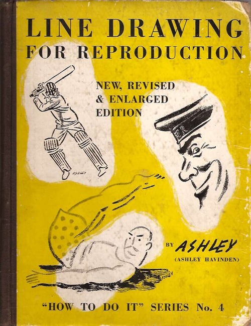
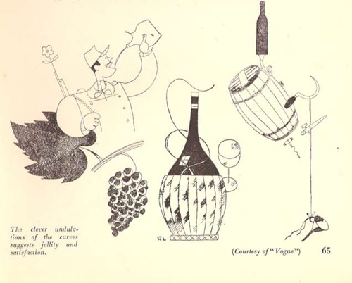
Given how much this blog loves Ashley Havinden and his immaculate 1930s style, it’s a wonder that this book has been sitting next to my desk for so long without any comment here.
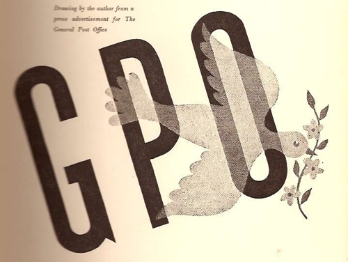
Or at least that’s what I thought until I actually picked it up this morning. Mr Havinden may have been a very dapper gentleman with a wonderfully fluid style, but the king of interesting prose he is not. What’s more there are nothing like enough of his drawings in the book either. To be fair this is because he is a very generous author who spends much of his time praising other people’s work, but I still can’t help being disappointed. This GPO delight is pretty much the only one which isn’t already on the cover,
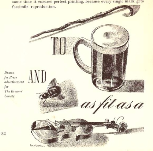
With apologies for the slightly dodgy scan.
The book also does what it sets out to do very well, which is teach an aspiring illustrator how to create good drawings which will reproduce well in newspapers and magazines. So I am now much better informed about print technology of the 1930s (the book was originally published in 1933, but my copy, interestingly, was reprinted in 1941, so the subject was thought worthy of some very limited wartime paper).
In particular, I know now what scraperboard art is (I’d come across it in the Artist Partners brochure, where it has a whole section of its own, but had no idea what was actually involved).

If you’re also wondering, it’s a chalk covered paper. To quote our guide and instructor,
The advantage of this paper is that one can paint on it with black ink and with the use of a scalpel knife or sharp penknife white lines can then be scratched across the part covered with black ink.
Quite apart from just doing it because it looks good, apparently the real purpose of this is to create something which looks like a woodcut but can be reproduced more easily and without the trouble of having to make a woodcut in the first place. So now I know.
But the other really interesting aspect of the book is that it is a reminder that the advertising and graphic design of the period wasn’t all about posters, far from it. A great deal of artist and agency time would have been spent on the central subject of Havinden’s book, black and white print advertising in newspapers and magazines.
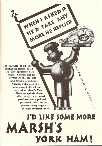
That ad isn’t from the book by the way, but borrowed from Mikey Ashworth’s photostream, which I am starting to believe is the repository of all graphic design in the world.
I don’t have any peace-time figures to hand, but certainly during the war the biggest chunk of the Ministry of Food’s budget wasn’t spent on posters or even nicely-designed leaflets. Rather it went on press advertising.
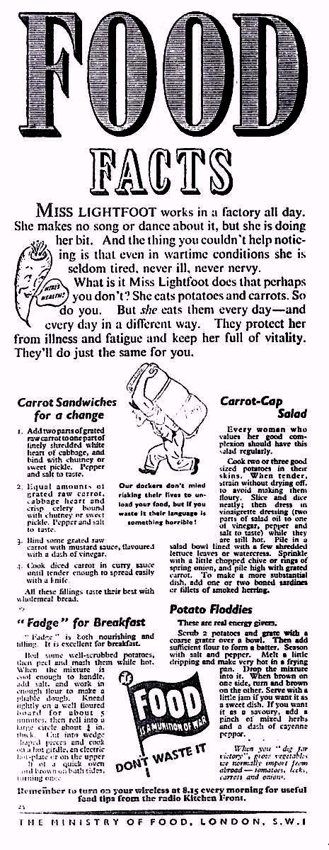
What’s more these images reached people all across the country who would rarely see an advertising hoarding and might never come across a London Transport poster. For much of Britain, this is what the design of the times would have looked like, before, during and after the Second World War.
It’s not like these adverts have disappeared without trace either; read any edition of Modern Publicity or Designers in Britain and good press ads are singled out just like the posters (albeit in a form which is so blurry as to be impossible to reproduce on the blog). But nowadays we skip over them. They are ephemeral, yellowing – and perhaps more to the point they don’t frame nicely and look good on the wall.
All of which means that artists like Ashley Havinden, who mostly drew for newspaper and magazine advertising and did very few actual posters, tend to get forgotten when we are writing the graphic history of the period. Havinden mentions others in the book too, like Robb, W.G. Easton and De Lavererie.
There’s also a section on Barnett Freedman too. He’s not exactly forgotten, but the drawings that Havinden has chosen are just the kind of work that does disappear.
Havinden also makes an interesting comment on how Freedman has transferred his distinctive lithographic style into newsprint without losing its character.
When Barnett Freedman is working for newspaper reproduction, he used a paper grained by himself to resemble the surface of a lithographic stone. This gives his chalk work all the crispness and openness of texture suitable to the making of a line block, while containing as much tone value as a fine-screen half-tone.
And because he’s talking about both good examples for artists, like Picasso, Cocteau and Henry Moore, as well as other disciplines such as book illustration, there are plenty more well-known artists in there too; you just don’t need me to tell you about them.
The point of all of this is not to suggest that we start believing that these drawings are the new posters. But when we’re thinking about posters, I think it is always worth remembering that they were by no means the only forms of visual design on offer before and after the war. For very many people, they weren’t even the dominant one.