The importance of being dull

Still the auctions keep coming at us.  Although today’s first offering is a bit left field, as Lawrence’s of Bletchingly have a really quite massive set of World War Two Propaganda posters on offer in their next sale.  But it’s a set of posters I rather like, mainly because they are very, very dull.

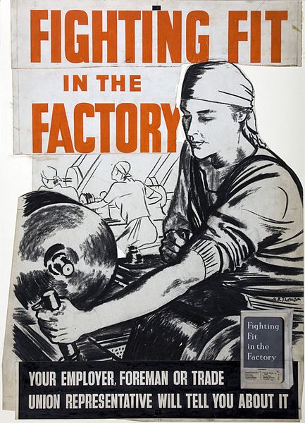
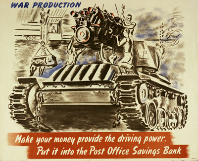
Take the one on the left, here.  This is about strikes in the mining industry, which were a real problem during the war.

World war two propaganda poster illegal stoppages men wanted for stretcher parties

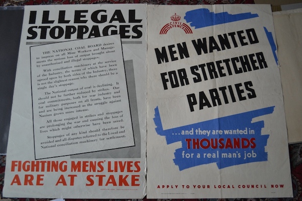
I doubt that would ever get illustrated, except perhaps in a fairly detailed book about the mining industry during World War Two.  And that’s if they ever found a copy – it doesn’t seem to be in the IWM collections, certainly not in the digitised set anyway.  And so it’s dull, but it’s actually quite important.

Sometimes it still boggles me that there is no complete record of what posters were produced during the war (I mean, what’s their excuse?) and, more than that, we still don’t really have any idea.  So posters like this can just pop up and, perhaps, be seen for the first time since 1945.  And so this poster may be dull, but it’s also important.

There are plenty more where that came from too.

Quicker Turnaround World War Two propaganda poster

This one isn’t in the IWM digitised collections either, but there are six copies in this auction.

The story of how they survived is as follows (with thanks to Lawrences for being so helpful).

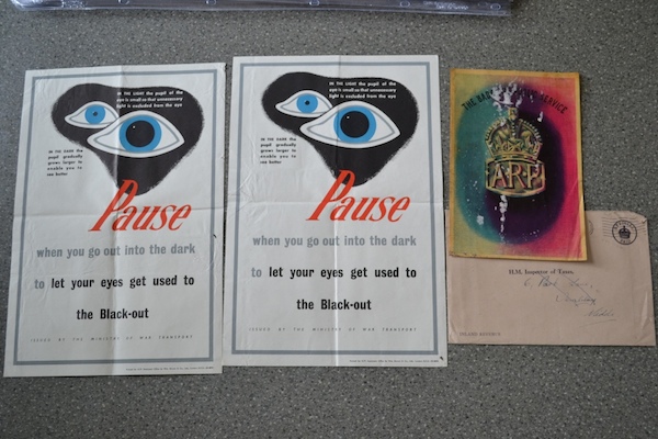
The posterswere discovered in a chest of drawers which had been kept in a garage.  Surprisingly they have survived on the whole in very good condition, although many do show signs of age and some appear to have been displayed at the time of the war.  There are also many which have not been used and we can only guess were surplus to requirements.  Two envelopes and some labels are visible within the collection and are addressed to HM Inspector of Taxes, Hendon.  I should imagine that the collection had not seen the light of day for nearly 70 years.

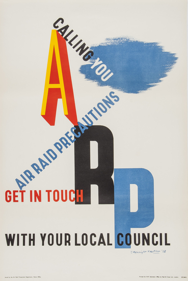
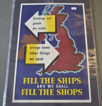
From the selection offered, I am guessing that Mr Inspector of Taxes was an air raid warden, as a lot of the posters relate to that.

Strip posters what to do in an air raid, world war two propaganda

And I think we can see some official document here.

eyes poster and official ARP documentation

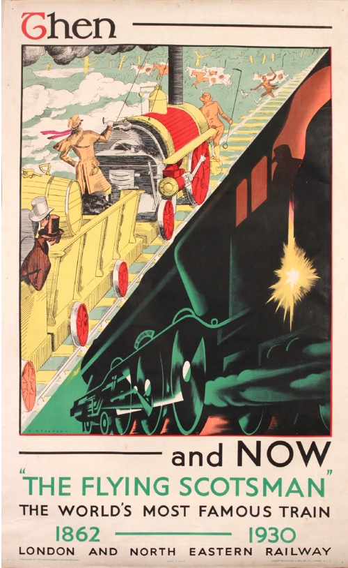
But he clearly got sent a lot of other stuff too, as what’s on offer covers a huge range from the run-up to the war, through to the war itself and then the financial aftermath as well.

Fill the Ships to Fill the shops World War Two propaganda poster

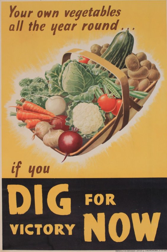
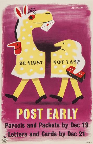
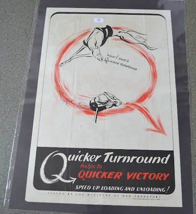
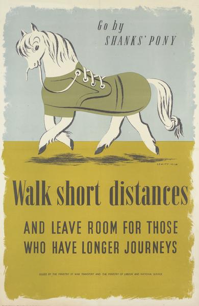
There is only one poster that I would buy on aesthetic grounds, which is this classic Lewitt-Him.

Lewitt Him Shanks Pony Walk Short Distances poster world war two

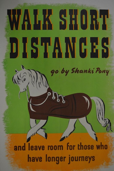
Unlike most of the others, it has an estimate, in this case a fairly reasonable £100-200.   Although it is in the slightly more lurid (and if I am remembering rightly, later) colour way and version, which I have to say I like less.

Lewitt Him Shanks Pony Walk Short Distances poster world war two

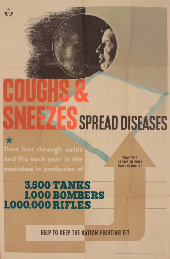
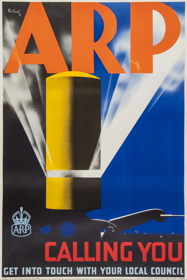
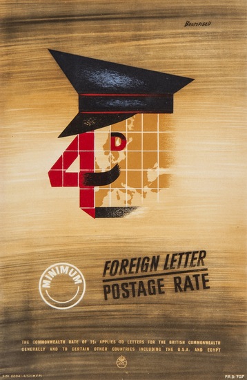
But that’s not the star turn.  Because what else was in the drawer, but this?

Keep Calm and Carry On poster

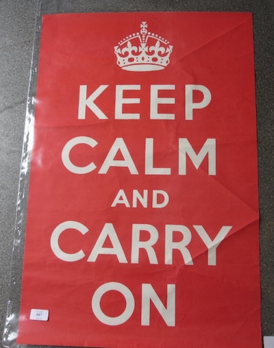
And not once, but six times.  Each now with an estimate of £400-600.

I have to say though, that I can’t really see the point of buying an original of these, unless you are a museum.  Because restored, framed and on the wall, everyone is just going to assume that you’ve bought a reprint.  And I can’t see the satisfaction of knowing that you have an original being worth several hundred quid.  Although this is mainly because I can’t really see the point of buying it at all.

Is it really efficient?

On we must go with the endless stream of auctions.  Today it is Onslows, which takes place on Friday.  What can I tell you about it?

Well the first thing that will strike you as you browse through the catalogue is precisely what a tonnage of Shell posters they have – and there are more too, tucked away at the end.

Keith Grant Somerset Shell Educational poster Wiltshire
Keith Grant, est. £100-150

I really must take a look at what these actually sell for, because the higher estimates of £100-150 do always strike me as slightly fanciful, but then a few always manage to reach that.  Certainly,  I don’t see them going as high at other auctions or on eBay.  Watch this space and I will report back.

That would, however, be an utterly reasonable price to pay for these Tristram Hillier items, which have the same estimate.  I’ve written about them before but, frankly, any excuse.

Tristram HIllier Shell guide to fossils educational poster

Tristram Hiller shell guide to minerals educational poster

What I haven’t ever written about properly, however, are the Shell educational posters themselves.  Must do that one of these days.

Meanwhile back at Onslows, the other thing that will strike you about the auction is a job lot of GPO posters, some being sold singly, some as individual lots.

1950 Harry stevens air mail GPO poster
Harry Stevens, 1950, est. £70-100

Sams 1954 minimum 4d letter rate GPO poster
Sams, 1954, est. £60-80

Now I happen to know the story behind these posters, and it’s one to make any archivist’s hair curl.  Back in the early 1980s, the Royal Mail in their Mount Pleasant HQ were having a sort out.  Sensibly, they decided that two copies of each of the posters they had produced should go to an archive – these are the ones which the BPMA have now.  Rather more bogglingly, they put the rest in a skip.  The seller rescued a selection that he liked.  Some were sold at Bloomsbury in March, this is another batch.

1950 Martin Aitchison Your Letterbox is it really efficient ?, GPO poster
Martin Aitcheson, 1950, est. £40-50

Other than that, the other two interesting items are two rather lovely sets of proofs, one by Barnett Friedman and the other by Edward Ardizzone.

Barnett Freedman (1901-1958) Wuthering Heights (16 plates) , Jane Eyre (16 plates) and Anna Karenina (16 plates), proof uncut lithograph sheets for illustrations from Heritage Press NY 1952,
Barnett Friedman, 1952, est. £200-300

Edward Ardizonne (1900-1979) lithograph proof sheets for Sinbad, Fairground Freak Show and WW2 sentry
Edward Ardizzone, est. £30-50.

I like them a lot, but what you’d actually do with them I’m not entirely sure.

Meanwhile the rest of what is on offer is the usual mix of foreign stuff that I am going to ignore, railway and travel posters, and, as ever, a fair selection of World War Two Home Front posters.

This is probably the stand-out railway poster for me.

Frank Newbould (1887-1951) Scarborough, original poster printed for LNER poster by Waterlow c. 1930
Frank Newbould, 1930, est. £700-1,000

Although, as even a cursory flick through this blog would reveal, I am always a sucker for this series.

L A Wilcox (Lesley Arthur 1904-1982) Cornwall Travel by Train, original poster printed for BR(WR) by Jordison 1960 BR poster
L A Wilcox, 1960, est. £600-700

The main event in the travel poster section, at least if you are me, is a stream of these black and white British travel posters.  A couple are quite interestingly early.

Brighton travel poster 1938
Anonymous, 1938, est. £50-70

The vast majority are not.

Walter Scott's Britain Warwick - The Castle, original sepia photographic poster printed for The Travel Association circa 1948 poster
Anonymous, c. 1948, est. £50-70.

While this in no way constitutes a recommendation to buy one, these posters are quite interesting as historical artefacts.  Take a look at the date: it’s just after the war has ended, and Britain is desperate to pay back the war loans.  And one of the ways to do that, is of course American tourist dollars; so these posters wing their way over to the States to try and persuade our American cousins to come over here.  But I often wonder just how well they worked.  Because America is sleek, glossy and most of all technicolour, but Britain is broke.  So our posters come in black and white and are printed on the cheapest, thinnest paper imaginable.

Of course none of this explains why the 1938 poster is equally as shoddy.  Perhaps the British Travel and Tourist Association were just cheapskates, all the time.

The reason I’ve thought about these posters so much is that Mr Crownfolio and I, some years ago, bought a whole roll of these posters from America for about £30.  We tried to sell a couple on eBay but basically got laughed at.  But then, a couple of years later we tried again, and the prices started rising – so much so that one of the last ones went for over £100.  And now they are at Onslows, well I never.

In the war section, meanwhile, this is probably the most classic poster.

Norman Wilson (dates unknown) Dig for Victory, original WW2 poster printed for HMSO by Chromoworks c.1940 propaganda poster
Norman Wilkinson, 1940, est. £300-400.

While this is my favourite.

Coughs & Sneezes Spread Diseases, original WW2 Home Front poster printed for HMSO by Chromoworks circa 1940
Anonymous, 1940, est. £40-50

Just look at the difference in prices, I am clearly in a minority of one on this.

For a change, there aren’t that many London Transport posters in there, but it’s worth persevering through the whole catalogue, because a pair of gems, both by Abram Games, are tucked away at the end.

Abram Games london zoo lovely poster
Abram Games, 1976, est. £100-150

Abram Games (1914-1996) London Transport Conducted Tours, original poster printed by Waterlow 1950 London Transport poster
Abram Games, 1950, est. £400-500.

In fact that poster above is the very last one in the sale.  And probably one of the best.   But it’s an exception, and I am slightly worried by the general lack of good posters like that from the Onslows sale.  Because with Christies having got so expensive, there’s a real need for an auction house selling the stuff that, well, Christies used to – the Games, the Eckersleys and the Royston Coopers to start with, never mind the Daphne Paddens.  But they aren’t appearing here – so where have they gone?  They haven’t entirely migrated to the railwayana auctions, so where have they all gone?  Do any of you know, because I certainly don’t. And I’d like to.

Unpeopled

We’re going a bit off-piste today, heading for a change towards those heady days of modernity before the Second World War.

That we’re doing this is all the fault of regular correspondent medieval modernist who pointed me at this particular set of posters a while back.

A R Thomson Improve each shining hour LNER poster

And every since then I haven’t been able to stop thinking about them.   But then it’s rare that you get such a set of posters so determined to be object lessons in modernity.  In each one of them, the fusty, over-detailed, over-crowded Victorian era is ttransformed, thanks to the potent magic of LNER, into a chic, clean-lined, highly futuristic scene.

A fine advertising message, you might say, and you’d be right.  But there’s a lot more going on here than just the steam railway  being dragged into an art deco world, so much so that it’s hard to know where to begin.

LNER Harwich crossings poster a r thomson

Let’s start with the artist, A. R. Thomson.  Now I’ve only started researching him today, so I’m afraid that this post won’t contain the benefit of the information in his biography, Tommy: A Biography of the Distinguished Deaf Royal Painter A.R.Thomson, which I am about to order for the grand sum of one new pence.  There is a clue there in the title, but he does seem to have been a quite extraordinary character.

6ft 5ins tall; He was deaf, and also did not speak, his wife helping as business manager. He spoke through his brush. Conducted conversations by making lightning sketches.Studied under painter illustrator and poster designer John Hassall [died 1948] and historical scenes/portraitist Sir William Quiller Orchardson [died 1910].

Since we’ve been talking about murals recently, here is one that he produced for the Science Museum. It’s fourteen feet long.

A R THomson combine mural for science museum

Two other things stand out for me though.

Vintage London Transport poster Street Markets Thomson 1949

One is that he designed this Street Markets poster for London Transport in 1949 (which means that there is a short bio of him on their site as well).  It’s one that I’ve always loved, and occasionally regret not buying at Morphets.

The other is that, at the 1948 London Olympic Games, he was the last-ever winner of the Gold Medal for Painting, which is such a mind-boggling idea that I am unable to process it properly.

He seems to have done quite a lot of poster work during the war, I imagine that he wasn’t called up because of his disability.

A R THomson Fighting fit world war two propaganda poster


post office savings bank tank poster a r thomson

All of which is a massive, but fascinating detour from the point at which westarted, so let’s return to his very peculiar set of posters for the LNER.

A r thomson then and now lner poster flying scotsman

Because despite the modern tour de force that is the Flying Scotsman, there is a deep anxiety underlying these posters.  The trips to the seaside, the carriages, the outdoors games  – even the very railway itself – are all old ideas.  The job that he pictures want to do is to persuade us that  these institutions have all changed with the times.  There is an interesting incongruity here.  Perhaps the most committed users of modernity are those who feel that they have something to prove, that their product might, in fact, date from the past.  Whereas if you are producing a car or a washing machine, it can look exactly how it wants, because it is modern in its very existence.

What’s also absolutely fascinating for me, though, is how this modernity is represented.  The smooth streamlining of this period of modernism/modern design is a vlsual cliche now, we all know what it looks like and it has been revived and reused so many times that it is no longer exciting or surprising.  But here, butted up against the visual clutter that it wants to replace, we can start to see it as it would have been felt back then – stark, surprising, and, for me at least, quite chilly.

LNER poster Then and Now golf ar thomson

When we were discussing these posters in the comments before, medieval modernist suggested that

there seems to be new higher order in the alternative vision, where simplicity and order are prized over chaos

This is true.  And I think that there is a big clue in the word chaos there, because one thing that these posters make me feel very strongly is the effect of the First World War on these designs.  Modernity was an attempt to impose a very rigid kind of order on the world, one that was felt to be very necessary after the chaos, horrer and ultimate disorder that was the trenches.

Now this isn’t something that can ever be proven, just as we will never be able to say for certain that the slightly simple cheerfulness of much 1950s design was a reaction to the next war.

But the big clue for me is in the people.  The Victorian scenes are teeming with humanity, but in contrast modernity requires very few people indeed.  And absence was perhaps the biggest legacy left by World War One.

Sea bathing LNER then and now ppster a r thomson

I don’t think this is just because time has made us forget, although this has to be a big part of it.  I suspect too that it was something that many people who lived in the 1920s and 1930s could bear to articulate fully either.    The reason I think of this is that there is a spine-tingling passage in one of HV Morton’s tours of England, which I can’t lay my hands on right now in which he describes the raw new stone and lettering of the war memorials that are in every village and town that he passes through, and the pain and memories caused every time they are seen.

So the lack of people in these posters – in the posters of this period in general – isn’t just because people clutter up the place and machines are just so much more modern to look at.  That is part of it, but the absences are also more profound.  People are missing in this modern world, killed by the machines of modern warfare, and by their absences they can be still counted amongst us, without us having to speak of them.

Is Your Letterbox Efficient?

I was just thinking that it had all gone very quiet on the auction front, when what should come along but a whole auction full of posters at Bloomsbury.

It’s an interesting hotch-potch with almost every form of poster you can think of represented in the mix.  So there’s foreign posters and railway posters.

PIPER, Raymond NORFOLK BROADS railway poster
Raymond Piper, est. £200-400

Alongside ski posters and London Transport posters.

FITTON, James (1899-1982) CIRCUS, London Underground lithograph in colours, 1937 London Transport poster
James Fitton, 1937, est. £200-300

UNGER, Hans (1915 - 1975) PIMLICO, London Underground offset lithograph in colours, 1972 poster
Hans Unger, 1972, est. £200-300

I’ve never seen that Unger before, although it’s not, in my book, one of his best.  The pricing is a bit, well, interesting as I can’t see that the Unger and the Fitton are in any way comparable in quality, but according to the estimates, they are.

In addtion, there are plenty of poster types that have been mentioned on here before, such as David Klein posters and aeroplane posters with lots of blue skies in them.

Note the increasing prices for David Klein; had I had the foresight and money to buy some a few years ago, I would be thoroughly quids in.  But I didn’t, and anyway, I would only have wanted to keep them.

KLEIN David (1918-2005) SAN FRANCISCO, Fly TWA offset lithograph in colours, c.1958, poster
David Klein, 1958, est. £1,400-1,800

LEWITT-HIM LEWITT (1907-1991)HIM (1900 - ) AOA USA lithograph in colours, 1948 poster
Lewitt-Hi, 1948, est. £150-250.

Another poster that I keep mentioning on here is this McKnight Kauffer from 1938.

KAUFFER, Edward McKnight ARP lithograph in colours, 1938,
McKnight Kauffer, 1938, est. £140-180

As ever, it turns up with the matching Pat Keely.

KEELY, Pat Cokayne (?-1970) ARP lithograph in colours, 1938 poster
Pat Keely, 1938, est. £140-180

My theory about this – and I have said this before but I think it’s worth repeating – is that these posters come up so often because they were deliberately saved.  They were, I believe,  the first propaganda posters issued by the government in advance of World War Two.  So they were a novelty, and also a harbinger of a great event that I am sure quite a lot of people could see coming.  So, if the chance arose, they saved them for posterity, or the grandchildren, or for all the other reasons that make people keep otherwise insignificant pieces of paper.

Move forward two years and the whole British population is drowning in slogans and propaganda, coming at them from newspapers, leaflets and the radio, as well as from posters.  So the last thing they want to do is keep one as a reminder.  In any case, there are so many, which one to choose?  So the latter posters survive in dribs and drabs, mostly saved by accident.  But these first ones, people knew they were important and they kept them.

Fortunately, not everything in the auction is something seen before.  This, for example, has to be one of the least obvious posters ever.

ANONYMOUS BETTER BROWN THAN LILY WHITE offsetlithograph in colours, c.1960ANONYMOUS BETTER BROWN THAN LILY WHITE offsetlithograph in colours, c.1960 poster
Anonymous, c. 1960, est. £200-400

Artist not known, but more than that I have no idea what it is on about either.  Nor, it appears, does Bloomsbury.  Any ideas anyone?

Most exciting, for me at least, are these.

ECKERSLEY, Tom (1914-1997) POST EARLY. GPO lithograph in colours,  poster
Tom Eckersley, est. £150-200

This is just one of five, yes count ’em, five sets of GPO posters, each with ten posters in them.  Including, in this lot, a reminder of what a good designer Harry Stevens is at his best.

STEVENS, Harry (1919-2008) BY AIR MAIL. GPO lithograph in colours, 1951,  poster
Harry Stevens, 1951, est. £150-200

I would bid on them, but judging from our last experience with the Dorrit Dekk lots, these will go for a lot more than the estimates.

AITCHISON YOUR LETTERBOX…GPO lithograph in colours poster
Aitchison, est. £150-200 

And I’m not surprised.  This values them at £15-20 a poster; I reckon they’d go for more than that on eBay.  Although I don’t, to be fair, know what the other posters are, they may all be dogs of the first order.

BROMFIELD FOREIGN LETTER. GPO lithograph in colours, 1951 poster
Bromfield, 1951, est. £150-200

We’ve emailed Bloomsbury to ask what they are, and when we get an answer, I’ll let you know.

Mrs Housewife on Display

There are some things I haven’t been telling you recently, and it’s time to fess up.

The biggest omission is the Bloomsbury Auctions sale which happened last week. Now this wasn’t the most exciting collection of posters I have ever seen in one place, but there was one significant exception. This was three lots, right at the end, all by Dorrit Dekk.  Each one was a total treasure trove, with a whole range of posters in, not just one.

Dorrit Dekk wireless licence GPO poster 1940s

Dorrit Dekk Home makers poster Post office savings bank

What’s more, they were estimated at £200-300 per lot which, with at least ten posters each time, was looking like a total bargain.  Hence my silence.

Dorrit Dekk staggered holidays World War Two home front propaganda poster

As the sale went on, we got more and more excited, because nothing seemed to be selling for over its estimate, and quite a few things were falling below that (the contrast with Christies is not something that you need me to explain).  So by the time we got to the three Dekk lots our hopes were high.

Dorrit Dekk Love Post Office Savings Banks poster 1960s

But they were rapidly dashed to the ground again.  They all went for well over their estimates, £420 in two cases and a whopping £550 for the one with all of the travel posters in.

Dorrit Dekk orient line travel poster

Dorrit Dekk France travel poster

Bah.  I hope whoever got them likes them.

The second thing I missed was for the rather more practical reason that I only got about 48 hours notice of the sale, but it’s still interesting enough to draw your attention to after the event.  Lot 247 at 1818 Auctioneers in Cumbria at the start of this week was a set of World War Two Home Front propaganda posters, How Mrs Housewife Saves Fuel For Battle.

Mrs Housewife Saves Fuel World War Two Propaganda poster home front

Mrs Housewife Saves Fuel World War Two Propaganda poster home front pair

Mrs Housewife Saves Fuel World War Two Propaganda poster home front

There were thirteen in total, which would have been worth a mention on its own as it’s pretty rare for a whole set to turn up like this.  But also included were these title banners.

Mrs Housewife Saves Fuel for battle title posters for set world war two propaganda

Now I’ve never actually seen something like that before, and I was immediately reminded of this.

Beverley Pick wartime poster display stand from display presentation book

These are Beverley Pick’s travelling poster displays for the Ministry of Information, which I’ve blogged about before.  And what I think came up for auction was a set of posters designed for exactly this kind of display.  Which is a rare thing indeed.  I wouldn’t be entirely surprised if those posters were by Pick himself, either; I’ve seen that kind of brickwork effect on other designs of his.

By way of atonement for these past sins, please have a couple of things which are coming up for auction in the future and so you’re able to buy.  Of which the most interesting is this rather lovely London Transport poster which is being sold by Wooley and Wallis in Salisbury next week.

Leith Poster 1928 London Transport Never Mind the Weather

It’s by a rather mysterious Leith, and seems to be the only poster that he or she ever designed for London Transport.  It has an estimate of just £100-200 if you fancy it, and why shouldn’t you, it’s very appropriate for the season.

Meanwhile in Chippenham a collection of rather ordinary advertising posters has turned up.

Goodyear tyres for farmers advertising posters

I was going to call them pedestrian, but given that half of them are for tyres, that would just be silly.

Goodyear deluxe tyres advertising poster

Still, worth mentioning simply to remind ourselves once again that by no means all past advertising was great.

Motor Homes poster

And quite a lot of it was really rather ordinary.

Finally, this isn’t a poster and it is in a Christies sale with the word Old Master in the title, so it’s definitely unaffordable.  It’s by Lill Tschudi and dates from 1933.

Lilli Tschudi Sticking Up Posters 1933

But it’s people sticking up posters, and the work behind the paper is always worth remembering.


Lend a hand

There’s a certain inevitability about the fact that now I’ve written the Home Front Posters book, a whole heap of new information about World War Two posters has popped up in various places.  This isn’t entirely a painful discovery, and not just because I am now resigned to the fact that while research could go on indefinitely, books do have deadlines.  Because today’s exhibit is that particular joy, a brand new archive.

What’s happened is that the National Archives have digitised a significant chunk of their wartime posters and are distributing them via Wikipedia.  (There’s a full explanation here if you want to know more).  It’s very exciting because there are a large number in there that I’ve never seen before.  Here’s a rather nice Dorrit Dekk to begin with.

Dorrit Dekk World War Two propaganda poster Staggered Holidays

This isn’t just an act of altruism but also a kind of crowd-sourcing, because the archives don’t have much information about many of these posters and they’re asking for people to help with everything from attributions to translation of foreign-language posters.

Part of the challenge, particularly with matching artists to designs is that these aren’t printed posters but the original artworks, quite often without the signatures that the finished item would have.  So it ends up being a process more like finding the provenance of a painting.  For example, we have this Eileen Evans, signed.

Lend a Hand on the Land Eileen Evans World War Two propaganda poster

Which makes it a fairly reasonable guess that these two posters in the National Archives are also by her.

Lend a Hand potato harvest farming holiday camp poster artwork eileen evans national archives ministry of information

Lend a hand with the potato harvest farming holiday camp world war two poster eileen evans ministry of information artwork

In fact I’m confident enough about that to have amended the description for each of those.

Only 350 of the 2,000 designs in the National Archives have been uploaded so far, but what’s already striking is how many of these I’ve never even seen before.  Take this Pat Keely for example.

Pat Keely wait for daylight world war two blackout poster artwork national archives

I think he owes McKnight Kauffer an acknowledgement on that one. Keely’s quite well-represented in the selection that are up so far, again often with previously unseen posters.

Cross at the lights world war two blackout poster national archives Pat Keely

What’s difficult, though, is to interpret what these previously unknown designs actually mean.  Are these for posters which were printed but are as yet unreported – whether that is because a copy never survived, or perhaps does exist but has not yet been digitised by the Imperial War Museum?  Or are they designs which were not actually ever produced?  In many ways. my bet would be on the latter.  Artworks which never went to the printers would be far more likely to survive.

Then on the other hand, this artwork is in there, for a poster which was very definitely printed in quite large numbers.

Make do and mend world war two poster ministry of information artwork

There’s not an obvious conclusion to be had.  Except perhaps that – because of wartime haste, limited record-keeping and the only accidental survival of what were intended to be very ephemeral bits of paper – we’ll probably never have the definitive list of World War Two Home Front posters, never mind their dates and artists.

It’s also worth remembering that this collection is very partial. The artworks all came from the Ministry of Information, but they were by no means the sole source of posters during the war.  Both National Savings and the Ministry of Food, two of the highest-spending departments at the time, commissioned their own advertising, so very few of their designs, if any, would turn up in the MoI’s archives.   And that’s without considering other poster producers, from British Railways to the Army.  Even so, there are still some delightful surprises in there.  It may not be the greatest design ever – apparently by the mysterious Xenia – but I love the idea of Village Produce Associations a lot.

Xenia poster artwork village produce associations

So I am very happy to report that Google reveals many VPA’s founded during the war are still going today.  Hurrah.

That kind of continuity after the war is also apparent in the poster designs.  It’s easy to believe, as I’ve said on here before, that all wartime posters stopped as soon as hostilities ceased, but that’s far from the truth.  Many campaigns, from salvage to fuel saving, just continued unchanged.  This fuel saving poster – in the great tradition of bossy shouty slogans – could date from during or after the war.

Turn that Gas down World War Two austerity fuel saving poster national archives

Other campaigns, meanwhile, were reversioned for the peace.

Dig for Plenty world war two poster reversioned for austerity post war national archives

Dig for plenty world war two austerity poster national archives artwork

It’s also fascinating to see some of the very definitely post-war designs produced by the new Labour Government to persuade people that the continuing austerity was necessary – a much harder job than wartime propaganda.

We work or want post world war two propaganda poster national archives

Wages and salaries can only go up with production post war propaganda poster national archives

These seem to me to be much rarer than the wartime posters, presumably because, by this stage of post-war austerity, no one at all wanted to keep them as a souvenir.

There’s plenty more to be seen in there too – including this Percy Drake Brookshaw artwork for – well for what?

Percy Drake Brookshaw apple picking artwork for something national archives

So why not take a look and see what I’ve missed out.