Greetings

Today,  I think have the cheapest item ever presented on Quad Royal.  Instead of paying hundreds of pounds for a poster, you can get one of these little beauties for just £2.50.

Daphne Padden southend bus poster card Beast In Show

Or if that doesn’t tickle your fancy, how about this one instead?

Daphne Padden go shopping by  bus poster card Beast In Show

Once again, these appear thanks to the sterling work of Beast In Show (the non-teatowel wing of To Dry For) who, as you may well remember, have already worked with us to turn Daphne Padden’s designs into tea towels and placemats.  In case you don’t remember, they go something like this.

To Dry For Daphne Padden Gardener tea towel

Daphne Padden Autumn place mats Beast in Show

They are so enthusiastic about her designs (and frankly why wouldn’t any sane person be) that there is now a range of Daphne Padden cards available as well.

coach-knights-padden

They are all lovely, and I can’t really choose a favourite, but I do just have to draw your attention to the one below, because there just aren’t enough psychedelic breakfasts in the world.

Carlton-card-Padden

There are loads and loads of them – way more than I can stuff into one blog post, however hard I try.

Daphne Padden vintage bus poster design Scarborough card

You can see them all – and indeed buy them – on the Beast In Show website.  You have nothing to lose (at least compared to buying a poster you don’t).

Dog days

Todaay’s offering is two wonderful posters by Patrick Tilley.  This one – from 1959 – I’ve never seem in colour before.

Patrick Tilley The Times Top People Dog

Although Ido seem to remember it in the relevant Modern Publicity.

This one is dated a year later and I don’t think I’ve ever seen it before anywhere.

Patrick Tilley Top People Take The Times greek poster

So there you go, a Quad Royal first.  And can I also commend Patrick Tilley for putting dates on his poster; if every designer did that my life would be a great deal easier.

Miscellania

It’s too hot to think properly.  So it’s lucky then that some interesting bits and bobs connected with past posts have come my way.

Firstly, Hans Unger.  Four years ago now, I wrote a piece about his life and his work not just in graphic design but also stained glass.   It’s worth going back to read that post, even if you’ve looked at before, simply for the comments, which are still arriving even now.  Clearly he was a man who was beloved by very many people.

The post came about because Mr Crownfolio had been reading about Unger’s work on St Columba’s Church in Chester.  Their website person, Bernard Payne, got in touch recently and has sent me two more photographs of Unger’s work for the church.

Hans Unger Stained Glass st columba's church chester

Hans Unger stained glass st columba's church chester

Sadly, these two windows aren’t in existence any more – they were taken out in 1986 because the timber was rotting and the mullions deteriorating, and clearly no one at the time thought they were worth saving.  Which is a great shame.

Also a while back, I posted about the symbolism of blue skies on post-war airline posters like these two Lewitt-Hims.

Lewitt Him, vintage airline travel poster 1948 Poster Connection

Vintage Lewitt Him BOAC poster 1948

My speculation was that, after the Second World War, these clear blue skies might have had more meaning that we might at first suspect.  Now the fighters and the bombers were gone, there were no more looping white trails signifying a dogfight any more.  The skies, and by association the aeroplanes that fly in them, were now safe, to be celebrated rather than feared.

So I was very pleased with the discovery I made when I was researching James de Holden Stone the other day.  In 1945, when the war ended, he was the Art Director of Vogue, and this was the cover he designed for their October issue.

James de Holden Stone Vogue cover October 1945

And this is how Vogue themselves described it:

With the war in Europe and the Far East finally having come to an end in September, Vogue has no suitable cover commissioned for this issue. James de Holden-Stone, the magazine’s art director, makes his point aptly with a painting of blue skies – denoting the end of the blitz over London.

The cover comes, incidentally, from a whole archive of them which is now online and well worth a browse through, even though it is a bit of a pig to search (the link starts you off in the 1950s, just to make it a bit easier).

Finally, while we are on the subject of ways to waste time on the internet, Mr Crownfolio has been disappearing into the British Newspaper Archive in order to find out more about the history of our house.  And from his searches I can also tell you that Daphne Padden was a bridesmaid in Bathwick, in 1934.  She wore blue taffeta and was given a vanity case and a rope of pearls for her troubles.  Sadly that’s all that the archive can tell us about her.  I do wish I knew more.

Sh-Sh-Sh-Sh

Once again, we are back with the conundrum that we have no idea how much we don’t know about posters.  Although I suspect there are vast unsuspected continents of ignorance out there in the darkness.

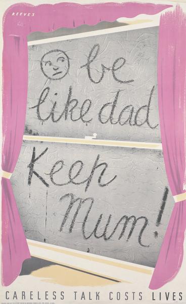
One small portion of it popped its head above the parapet before Christmas, when these two posters appeared on eBay.

Freddie Reeves careless talks costs lives world war two propaganda posters

Freddie Reeves Careless talk costs lives world war two propaganda poster train

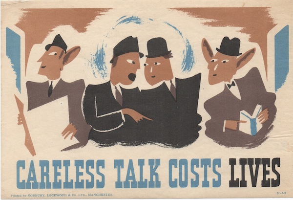
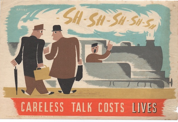
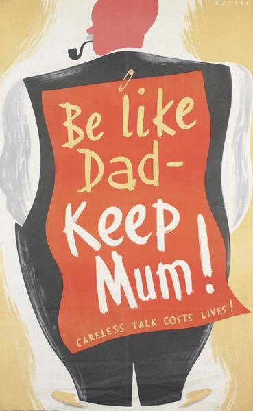
They are the work of one Freddie Reeves, and were being sold by his descendents, along with this poster, which we infuriatingly missed because our bid failed to register, something I am still smarting about.

Vanity Fair ice cream colours Freddie Reeves poster

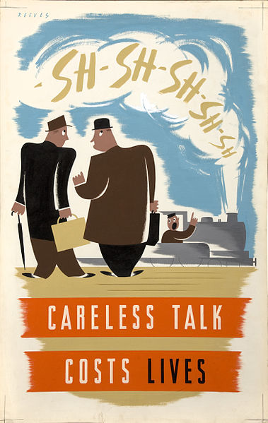
But enough of that (although, honestly, we’ve missed so much stuff recently that I could fill a whole blog post on that subject alone) and back to the Careless Talk posters, the likes of which I have never seen before.  A rummage around on Google, does throw up this, though, which is artwork from the National Archives and clearly related.

freddie reeves train careless talk costs lives bigger format

It’s just as much of a surprise as the others, and I’ve certainly not seen it illustrated anywhere apart from the National Archives.  Mostly, I think this is down to the fact that the Home Front posters were never fully documented at the time, and so it will never be possible to produce a full catalogue.  There will always be ones like these that pop up out of nowhere to surprise us.

But I also think – and I am as guilty of this as the next person – that we tend to go for the obvious thought.  So when we think of Coughs and Sneezes Spread Diseases, our brains immediately serve up a Bateman.

Bateman Coughs and Sneezes world war two propaganda poster home front

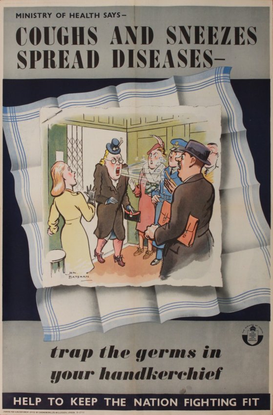
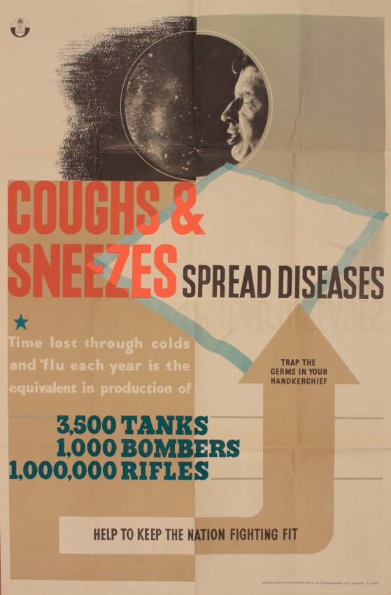
Whereas actually that slogan came in many different styles, both before and after the war.

Coughs & Sneezes Spread Diseases, original WW2 Home Front poster printed for HMSO by Chromoworks circa 1940

Coughs and Sneezes vintage poster for sale eBay

And thus it is with Careless Talk as well; the slogan is so intimately linked with Fougasse that it’s hard for us to imagine any other posters, but they did exist.  As these two examples show.

The only clue that these ones give us is that they were printed in Manchester, which isn’t something I’ve ever seen before on a World War Two poster.  So was this some kind of local campaign?  Funded by someone other than the MoI?  I can only conjecture.

As far as I can tell, Freddie Reeves only did a couple of other posters, on a similar topic as it turns out.

BE like dad keep mum world war two propaganda poster

BE lIke dad keep mum reeves world war two propaganda poster

But that’s not to say that there aren’t other ones out there, it’s just that we don’t know about them yet.

What’s also interesting about the posters that we bought is that they are tiny, seve and a half inches by five inches.  And yes, we were a bit surprised when they came out of the envelope that size, which will teach us to read eBay listings properly.  But, again, I’ve never come across a World War Two poster that small before.  There are GPO posters that are nearly that small, like this Beaumont for example.

Christmas dog GPO poster

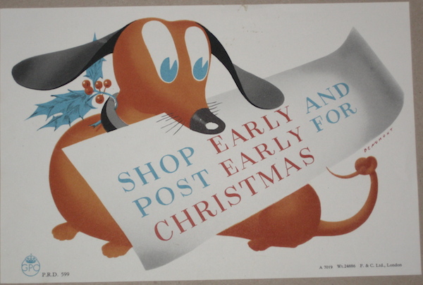
But even these are six inches by nine, and thus a different format.  So the Careless Talk posters weren’t designed for those GPO spaces.  I wonder where they were meant for?  Perhaps the corner of shop windows, although I can’t prove that.  From which I am driven to conclude  that, particularly where World War Two Home Front posters are concerned, we will never know anything like the full story.

The eBay listing also said of Freddie Reeves:

He was a graphic artist during the 1940’s, 1950’s, 1960’s and 1970s’s. He did a lot of work for Good Housekeeping, Barkers, Morleys and some well known WW2 posters.

So where are all those other illustrations and posters then?  Where is the work of Freddie Reeves in the history books?  And how would we ever know he had been missing, were it not for the fact that one of his descendants sold a few last remaining pieces on eBay?  This bothers me, it really does.  Because how many other designers were out there, producing good stuff, and whose work we will never ever know because we have no idea that we are even meant to be looking out for it?

Memorable

There are of course other exceptions to my rule (as stated below) that most 1960s posters aren’t worth hanging on my wall.

Patrick Tilley Sunday Times Vintage 1960s Posters Accurate

The obvious ones are of course Patrick Tilley’s posters for the Sunday Times.

Patrick Tilley Sunday Times Vintage 1960s Posters Perceptive

I’ve posted about them on here before.

Patrick Tilley Sunday Times Vintage 1960s Posters Entertaining

Along with, thanks to Patrick Tilley himself, the follow-up set of designs that never ended up being used.

Sunday Times poster statue and bird Patrick Tilley

I would quite happily put any or all of these up in my house, and in fact probably will do one of these days.

Patrick Tilley Sunday Times Vintage 1960s Posters alert

But I’m not sure why that is.  They’re not throw-backs to the 1950s, they’re very much of their time and yet I still like them.  Explanations on a postcard please, because I certainly don’t have any.

But I’m clearly not alone in this.  I was surprised – mainly because they are fairly rare posters – to see this exanple on the Rennies website.

postertimestilleyprovocative

For £1250.

We’ve got the set.  And frankly, if anyone were to offer us six times that price for them, we’d probably have to accept.  It would go a long way towards paying for the kitchen….

Cleaning up

Remember our Daphne Padden prints from last year?

Daphne Padden gardener print to buy

(Which are, incidentally, still available, if you want one just leave a comment or drop me a line via the contact form).

Daphne Padden London print to buy

Well now, thanks to the lovely people at To Dry For, you are now also able to buy Daphne Padden tea towels too.  Just take a look at this, beautifully printed onto linen and rather desirable.

To Dry For Daphne Padden Gardener tea towel

That’s not all, either,  because they’ve also made two more Padden designs into tea towels as well.

To Dry For Daphne Padden kitchen baking tea towel

Daphne Padden To Dry For chickens tea towel

It’s all very exciting if you ask me.

They are for sale right now via the To Dry For website, and in the next week or so I will be running some kind of competition with a couple of these as prizes.  Except I don’t know what kind of competition that might be yet.  Watch this space (or even suggest one of your own, you might just win a tea towel for that too).

To Dry For London Tea Towel Daphne Padden