Unpeopled

We’re going a bit off-piste today, heading for a change towards those heady days of modernity before the Second World War.

That we’re doing this is all the fault of regular correspondent medieval modernist who pointed me at this particular set of posters a while back.

A R Thomson Improve each shining hour LNER poster

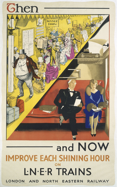
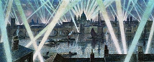
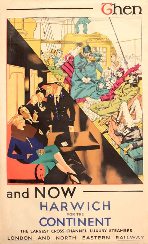
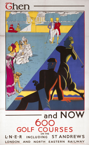
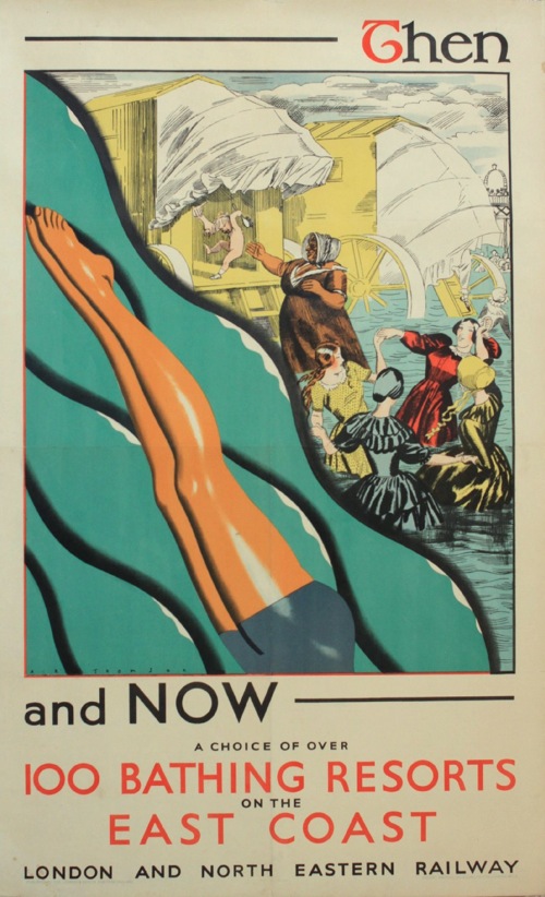
And every since then I haven’t been able to stop thinking about them.   But then it’s rare that you get such a set of posters so determined to be object lessons in modernity.  In each one of them, the fusty, over-detailed, over-crowded Victorian era is ttransformed, thanks to the potent magic of LNER, into a chic, clean-lined, highly futuristic scene.

A fine advertising message, you might say, and you’d be right.  But there’s a lot more going on here than just the steam railway  being dragged into an art deco world, so much so that it’s hard to know where to begin.

LNER Harwich crossings poster a r thomson

Let’s start with the artist, A. R. Thomson.  Now I’ve only started researching him today, so I’m afraid that this post won’t contain the benefit of the information in his biography, Tommy: A Biography of the Distinguished Deaf Royal Painter A.R.Thomson, which I am about to order for the grand sum of one new pence.  There is a clue there in the title, but he does seem to have been a quite extraordinary character.

6ft 5ins tall; He was deaf, and also did not speak, his wife helping as business manager. He spoke through his brush. Conducted conversations by making lightning sketches.Studied under painter illustrator and poster designer John Hassall [died 1948] and historical scenes/portraitist Sir William Quiller Orchardson [died 1910].

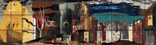
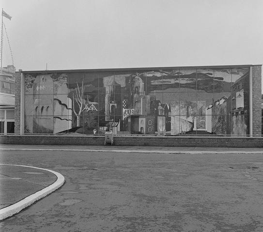
Since we’ve been talking about murals recently, here is one that he produced for the Science Museum. It’s fourteen feet long.

A R THomson combine mural for science museum

Two other things stand out for me though.

Vintage London Transport poster Street Markets Thomson 1949

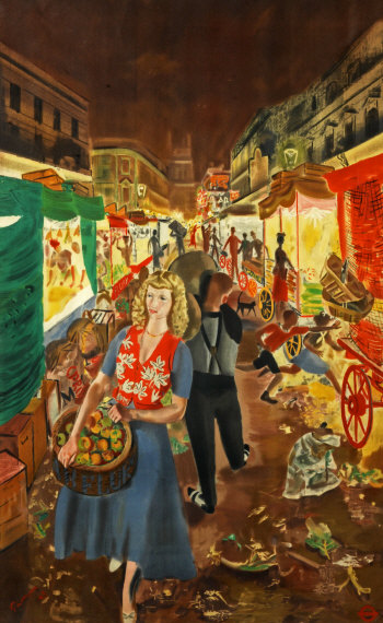
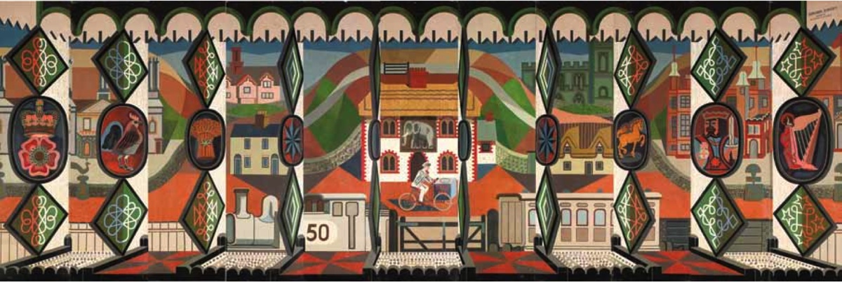
One is that he designed this Street Markets poster for London Transport in 1949 (which means that there is a short bio of him on their site as well).  It’s one that I’ve always loved, and occasionally regret not buying at Morphets.

The other is that, at the 1948 London Olympic Games, he was the last-ever winner of the Gold Medal for Painting, which is such a mind-boggling idea that I am unable to process it properly.

He seems to have done quite a lot of poster work during the war, I imagine that he wasn’t called up because of his disability.

A R THomson Fighting fit world war two propaganda poster


post office savings bank tank poster a r thomson

All of which is a massive, but fascinating detour from the point at which westarted, so let’s return to his very peculiar set of posters for the LNER.

A r thomson then and now lner poster flying scotsman

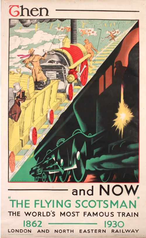
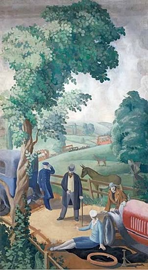
Because despite the modern tour de force that is the Flying Scotsman, there is a deep anxiety underlying these posters.  The trips to the seaside, the carriages, the outdoors games  – even the very railway itself – are all old ideas.  The job that he pictures want to do is to persuade us that  these institutions have all changed with the times.  There is an interesting incongruity here.  Perhaps the most committed users of modernity are those who feel that they have something to prove, that their product might, in fact, date from the past.  Whereas if you are producing a car or a washing machine, it can look exactly how it wants, because it is modern in its very existence.

What’s also absolutely fascinating for me, though, is how this modernity is represented.  The smooth streamlining of this period of modernism/modern design is a vlsual cliche now, we all know what it looks like and it has been revived and reused so many times that it is no longer exciting or surprising.  But here, butted up against the visual clutter that it wants to replace, we can start to see it as it would have been felt back then – stark, surprising, and, for me at least, quite chilly.

LNER poster Then and Now golf ar thomson

When we were discussing these posters in the comments before, medieval modernist suggested that

there seems to be new higher order in the alternative vision, where simplicity and order are prized over chaos

This is true.  And I think that there is a big clue in the word chaos there, because one thing that these posters make me feel very strongly is the effect of the First World War on these designs.  Modernity was an attempt to impose a very rigid kind of order on the world, one that was felt to be very necessary after the chaos, horrer and ultimate disorder that was the trenches.

Now this isn’t something that can ever be proven, just as we will never be able to say for certain that the slightly simple cheerfulness of much 1950s design was a reaction to the next war.

But the big clue for me is in the people.  The Victorian scenes are teeming with humanity, but in contrast modernity requires very few people indeed.  And absence was perhaps the biggest legacy left by World War One.

Sea bathing LNER then and now ppster a r thomson

I don’t think this is just because time has made us forget, although this has to be a big part of it.  I suspect too that it was something that many people who lived in the 1920s and 1930s could bear to articulate fully either.    The reason I think of this is that there is a spine-tingling passage in one of HV Morton’s tours of England, which I can’t lay my hands on right now in which he describes the raw new stone and lettering of the war memorials that are in every village and town that he passes through, and the pain and memories caused every time they are seen.

So the lack of people in these posters – in the posters of this period in general – isn’t just because people clutter up the place and machines are just so much more modern to look at.  That is part of it, but the absences are also more profound.  People are missing in this modern world, killed by the machines of modern warfare, and by their absences they can be still counted amongst us, without us having to speak of them.

Him and Her

Do you want to see one of my birthday presents?  Or at least the illustrations contained within.

Zuleika dobson illustration George Him

The book is Zuleika Dobson by Max Beerbohm – for a change it is a book I’ve always intended to read –  and the illustrations are by George Him. So of course they are wonderful. As is Mr Crownfolio, who gave it to me.

Zuleika Dobson illustration George Him

The book itself, however, is less easy to classify.  It’s published by the Heritage Press (who even write about their edition here), but with a slip case that makes it look like something issued by the Folio Society, which is why I haven’t bothered to show it on here.  Why bother when I can fill the page with illustrations like these instead?

Zuleika Dobson illustration George Him

Puzzle one is that the book does not appear on the bibliography on the George Him website.  None of which matters, but is all a bit odd.

Zuleika Dobson illustration George Him

A further mystery is that when you have a look at the Wikpedia page on Zuleika Dobson (should you, say, happen to be Googling that book along with George Him), the illustration is of a 1961 Penguin Classics version of the book, cover design also by George Him.

Zuleika Dobson Penguin Lewitt Him cover

There must have been a craze for both the book and Him round about them.  Understandable, but still a bit peculiar.

Zuleika Dobson illustration George Him

All of which does rather frustrate my googling though and means that I may never be able to find out exactly what this copy is doing and why.  But never mind, because it is absolutely delightful to look at.

Zuleika Dobson illustration George Him

(There are loads more illustrations, by the way, but I didn’t want to crush my lovely copy on the scanner. Sorry about that.)

Add To Cart

I could quite happily just give you this single picture and consider it a complete post, because it’s just fantastic

Barbara Jones Out in the Hall 1960

What I’m showing you here is a three and half metre long mural by Barbara Jones called ‘Out in the Hall’ from 1962.  I have no idea what it was painted for – although given that it was still in her studio in 2010 she may just have produced it for her own pleasure – but it was displayed in a Victoria & Albert Museum exhibition called Mural Art Today in 1962.

The truly extraordinary thing about it, though is that it is for sale through Liss Fine Art.  There’s a button on the page which just says ‘Add to Cart’.  I’m so tempted. The only drawback is that it costs £12,000, which means we’d have to choose between a bear on a yellow background and a functioning kitchen.  I took this vote to Twitter, where the vote was overwhelmingly in favour of the bear.  I’m not entirely convinced yet though.

To be honest, that one mural would be quite enough for me, but there is much, much more where that came from too.  Because Liss have organised an exhibition called British Murals & Decorative Painting 1910 – 1970, and what’s on display, and in many cases on offer, is really quite extraordinary.

Highlight – simply for the fact that it still exists in any shape or form at all – is the John Piper mural called ‘The Englishman’s Home’, which he designed for the exterior of the Homes and Gardens Pavilion at the Festival of Britain.

John PIper Festival of Britain homes and gardens pavilion mural

Here it is in situ, with a bin.

John Piper mural in situ festival of britain

Amazingly, this too is for sale, although for ‘Price on Request’, which I always translate as, ‘if you have to ask, you can’t afford it’.  I imagine they’d also want to vet you too, if only to make sure that you actually had the space to keep over sixteen metres of John Piper under proper conditions.  But that really ought to be in a museum, don’t you think?  Is there a campaign to get it for the V&A do you know?  And if not, shall we start one?

While we all consider that, there are other gems to eye up too.  This Edward Bawden was produced for the SS Oronsay in 1951, but is now in a private collection.

Edward Bawden SS Oronsay Mural 1951

Or this Claude Francis Barry, produced for nobody knows quite what or why during the war but unbelievably evocative.

Claude Francis Barry wartime london mural

I could go on almost indefinitely until I reproduced the entire collection, but I won’t, for a few reasons.

The first is that there is, I think a lot more to say about these works and right now I don’t know enough to say it.  A book has come out to accompany the exhibition and I think I’m going to need to absorb that first before I come to any definite conclusions.

But there is definitely something interesting going on here that hasn’t really been described properly before, and to me it looks like a graphic and representational style which is half way between fine art and posters.  This Mary Adshead could nearly come from a Shell poster of some kind.

Mary Adshead English Holiday puncture

It was intended to be one of eleven designs, but I’ll let the catalogue tell you the history of the piece, because it’s rather wonderful:

The Puncture and The Village Inn were two of eleven scenes in the series An English Holiday, commissioned by the British-Canadian business tycoon and politician Lord Beaverbrook, early in 1928, for the dining room at Calvin Lodge, Newmarket. The commission for An English Holiday was withdrawn by Lord Beaverbrook in August 1928, apparently after the intervention of his friend Lady Diana Cooper who felt that Beaverbrook would quarrel with most of the people (his friends and acquaintances) who served as the models for the scheme.

These murals also, perhaps, let us into another way of discovering a very British strand of art, one which stands so far outside the mainstream of continental modernism that it hasn’t properly been described yet.

There’s a good reason, too, for why very little of this has been described.  A note in the catalogue estimates that at least 90% of the murals of the period have been destroyed.  Barbara Jones, for example, produced at least 29, of which only two are known to be still extant.  The other one is in the exhibition too – produced for the International Labour Exhibition in Turin in 1961.

Barbara Jones International Labour Exhibition 1961

Price on request.  Sigh.

Finally, I don’t have time to think about this now because the exhibition isn’t on that long – only until 9th March, so you do really need to go and see it while you can.  As do I.

Line tint screen

Given how much this blog loves Ashley Havinden and his immaculate 1930s style, it’s a wonder that this book has been sitting next to my desk for so long without any comment here.

Ashley Havinden Line drawing for reproduction cover

Or at least that’s what I thought until I actually picked it up this morning.  Mr Havinden may have been a very dapper gentleman with a wonderfully fluid style, but the king of interesting prose he is not.  What’s more there are nothing like enough of his drawings in the book either.  To be fair this is because he is a very generous author who spends much of his time praising other people’s work, but I still can’t help being disappointed.  This GPO delight is pretty much the only one which isn’t already on the cover,

Ashley Havinden GPO press advertisement dove

With apologies for the slightly dodgy scan.

The book also does what it sets out to do very well, which is teach an aspiring illustrator how to create good drawings which will reproduce well in newspapers and magazines.  So I am now much better informed about print technology of the 1930s (the book was originally published in 1933, but my copy, interestingly, was reprinted in 1941, so the subject was thought worthy of some very limited wartime paper).

In particular, I know now what scraperboard art is (I’d come across it in the Artist Partners brochure, where it has a whole section of its own, but had no idea what was actually involved).

Ashley Havinden scraperboard illustration

If you’re also wondering, it’s a chalk covered paper.  To quote our guide and instructor,

The advantage of this paper is that one can paint on it with black ink and with the use of a scalpel knife or sharp penknife white lines can then be scratched across the part covered with black ink.

Quite apart from just doing it because it looks good, apparently the real purpose of this is to create something which looks like a woodcut but can be reproduced more easily and without the trouble of having to make a woodcut in the first place.  So now I know.

But the other really interesting aspect of the book is that it is a reminder that the advertising and graphic design of the period wasn’t all about posters, far from it.  A great deal of artist and agency time would have been spent on the central subject of Havinden’s book, black and white print advertising in newspapers and magazines.

Ashley Havinden Marsh's York Ham Ad

That ad isn’t from the book by the way, but borrowed from Mikey Ashworth’s photostream, which I am starting to believe is the repository of all graphic design in the world.

I don’t have any peace-time figures to hand, but certainly during the war the biggest chunk of the Ministry of Food’s budget wasn’t spent on posters or even nicely-designed leaflets.  Rather it went on press advertising.

Ministry of Food Food facts press advertisement Carrots

What’s more these images reached people all across the country who would rarely see an advertising hoarding and might never come across a London Transport poster.  For much of Britain, this is what the design of the times would have looked like, before, during and after the Second World War.

It’s not like these adverts have disappeared without trace either; read any edition of Modern Publicity or Designers in Britain and good press ads are singled out just like the posters (albeit in a form which is so blurry as to be impossible to reproduce on the blog).  But nowadays we skip over them.  They are ephemeral, yellowing – and perhaps more to the point they don’t frame nicely and look good on the wall.

All of which means that artists like Ashley Havinden, who mostly drew for newspaper and magazine advertising and did very few actual posters, tend to get forgotten when we are writing the graphic history of the period.  Havinden mentions others in the book too, like Robb, W.G. Easton and De Lavererie.

De lavererie illustration havinden book

There’s also a section on Barnett Freedman too.  He’s not exactly forgotten, but the drawings that Havinden has chosen are just the kind of work that does disappear.

Barnett Freedman brewers soc ad from havinden book

Havinden also makes an interesting comment on how Freedman has transferred his distinctive lithographic style into newsprint without losing its character.

When Barnett Freedman is working for newspaper reproduction, he used a paper grained by himself to resemble the surface of a lithographic stone.  This gives his chalk work all the crispness and openness of texture suitable to the making of a line block, while containing as much tone value as a fine-screen half-tone.

And because he’s talking about both good examples for artists, like Picasso, Cocteau and Henry Moore, as well as other disciplines such as book illustration, there are plenty more well-known artists in there too; you just don’t need me to tell you about them.

The point of all of this is not to suggest that we start believing that these drawings are the new posters.  But when we’re thinking about posters, I think it is always worth remembering that they were by no means the only forms of visual design on offer before and after the war. For very many people, they weren’t even the dominant one.

Deck the halls

I think it’s about time to get the Christmas decorations out, isn’t it?  Or in this case, the Christmas posters.  I’ve been saving this one for half the year – and that’s not a weird reflection on it, by the way, it’s part of the design.

Raymond McGrath London Transport Christmas poster 1937

This delight is a little 10″ x 15″ London Transport poster, from 1937 which popped up on eBay over the summer.  And that was supposed to be the end of the post, until I decided to try and find out something about Raymond McGrath, who designed it.

Now the London Transport Museum website doesn’t have much information on him, and it appears that this was the only thing he ever did for LT.  But a bit more delving on the web reveals a lot more.  If I am honest it didn’t take that much, McGrath has his own Wikipedia page for heavens sake, and it turns out he was a really interesting chap.

Predominantly, McGrath was an architect and so rather falls out of the scope of this blog, but I’ll give you a brief summary because it’s such a fascinating and, it seems, infrequently told story.  Coming from Australia in 1926, he quickly became one of the pioneers and champions of modernist architecture in Britain.  His first major work was the remodelling of Finella, a house for the Cambridge don Mansfield Forbes (there is a comprehensive and wonderful article about this if you would like to read more), and this got him known, to the extent that he was put in charge  of the remodelling of Broadcasting House in  1931, so at the age of just 27 he was overseeing architects like Wells Coates and Serge Chermayeff.  He also designed a stunning modernist house in Chertsey, St Anne’s Hill House.

Raymond McGrath Hill House chertsey

(This was later owned by Phil Manzanera of Roxy Music, and there is a great discussion of the area’s modernist rock heritage here.)

Despite these works, a combination of the war, a lack of work and his wife’s mental problems led McGrath to take a job in the Dublin Office of Public Works, where he became Principal Architect in 1948, a job he held until the 1960s.  While he did much notable work there, the move meant that he effectively disappeared from the architectural record in Britain.

As the poster shows, McGrath was also a talented artist and draughtsman.   Below is one of the set of drawing about aircraft production that he contributed to the War Artists scheme before he left for Dublin.

Raymond McGrath war artists painting aircraft production

But this piece of his design has to be one of my favourite things, just for its pure modernist quirkiness.

Raymond McGrath aeroplane wallpaper

It has an interesting provenance, apparently.

This elegant design for a wallpaper was only one element in an entire design scheme presented by McGrath for a house called “Rudderbar”, commissioned by a British female pilot of the 1930’s.  It had been conceived as a combination “house and transport hub” having “an aircraft hanger and a garage built alongside domestic quarters surmounted by an observation/control tower”! It was to be built nearby the historic Hanworth Airplane Field, Feltham, Middlesex, England. And all of this in McGrath’s signature Modernist style.

Rather wonderfully, the paper is being reprinted, so you can now buy it to paper your flying room should you wish.  Although McGrath is interesting enough to warrant more of a memorial than even this, I think.

Printed

These are exciting times here at Quad Royal.  Because as well as going on about posters at great length (a service which will, of course, continue) we’ve also got something to sell.  Prints of Daphne Padden designs to be precise.  Take a look at this.

Daphne Padden original gardener screen print for sale

And while I’m here, this too.

Daphne Padden London screen print for sale

Rather good, aren’t they?  I like them really quite a lot.

They are both original screenprints (none of your giclee or laser printer nonsense over here, oh no) done by our friends at I Dress Myself on lovely quality paper using eco-friendly water based inks.  And the designs are, as far as I can tell, completely unseen until now.

The backstory to all this goes back a couple of years now, to when we bought a couple of great piles of material from Daphne Padden’s estate. As I wrote at the time, this wasn’t only made up of posters but also a small number of full size designs which had been made by collaging cut tissue paper.  You might recognise this one.

Daphne Padden original collage gardener

The glue has rather browned, but you can’t really blame it after fifty or more years.

Every single person we showed them too said, oh but they are wonderful, you must do something with them, until eventually we gave in.  And so now, after much to-ing and fro-ing over copyright and so on, we have.

Daphne Padden gardener print to buy

There will be a couple more print designs coming in the new year and also, excitingly, some tea towels too.

Now what with moving house and so on I really didn’t want to be selling them right now.  But it is Christmas, and you are the loyal readers of Quad Royal, so I thought you should at least have a chance to buy them before the grand New Year launch.  What’s more, you can have them at a price of just £35 each – so at least £10 cheaper than they will be in the shops.  (Postage is £3.50 for up to five at a time.)

Daphne Padden London print to buy

Oh and they’re 30cm x 40cm in size.

Another result of the move and the general chaos that my life is in at the moment, is that I don’t have a shop front or anything useful like that yet.  So if you want to buy a print, or two, or how ever many you like, then the way to do it for now is to send a note via the contact form with your name, address and your order.  I will get back to you with an invoice which you can pay via either Paypal or bank transfer.   If that all seems a bit terrifying and you prefer just pressing buttons to order something, I will also list them on eBay next week.  Or you could just put a comment below and I’ll email you.

Right, that’s the slightly technical bit over with, shall I tell you a bit more about the back story?  One of the issues with the copyright was that we needed to work out what these designs actually were, because if they had been produced for a company, then the rights would still belong to that company.  The conclusion I eventually came to – and I’d be interested to hear any other thoughts on this – is that these were unused designs.

This is partly because I simply couldn’t match any of these collages to a known design, whether for a poster or otherwise.  Then, when I thought about it a bit more, I realised that these were probably the final designs that got sent over to the lithographers for printing.  At which stage I imagine that they got inky, battered and finally screwed up and thrown in the bin.  Which means, I am guessing, that the ones which survived are ones which didn’t get printed for whatever reason.

The upshot of this, incidentally, is that copyright rests with the RSPCA, as beneficiaries of Daphne Padden’s estate, so they will be getting money from the print sales.  In the New Year, we’ll also be producing some larger limited edition prints for the benefit of the RSPCA, and also for Oxfam, who owned some more of the designs too.  And as the originals will, we hope, be coming to rest in the Brighton Design Archive, we’ll do a print for them too.  But that’s next year.  When I’ve moved house.