Mr Eckersley is at home

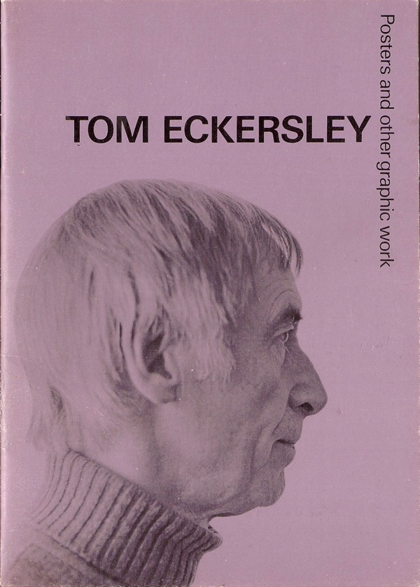
We bought some Tom Eckersley ephemera off eBay a while back.  Some you might be familiar with, like this exhibition catalogue.

Tom Eckersley exhibition catalogue cover 1993

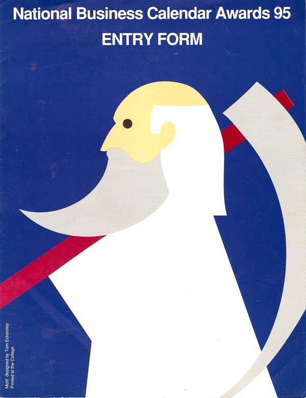
Others perhaps less so.

Tom Eckersley business calendar awards cover 1994

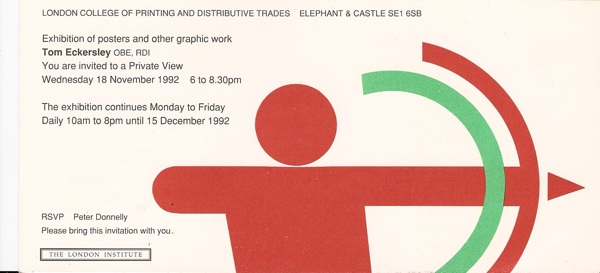
Tom Eckersley LCP invite 1993 private view

When the envelope arrived, there were some bonus items too – some photocopies and postcards, most interestingly this one, celebrating 30 years of Iconograda.

Tom Eckersley Iconograda 30th anniversary postcard

The most surprising inclusion, however, was this.  A panorama of Tom Eckersley in his study.

Tom Eckerslye in his study

Click on it to enlarge.  And apologies for the wobbly bit but that’s an ingrained crease and won’t iron out any more than that.

It turns out that the seller had interviewed Tom Eckersley in 1993 when he’d been doing some research on the London Underground.  They’d become lunching partners in the last year of Eckersley’s life, and Eckersley had even designed a book cover for him, although this was never used.

There’s not a lot to say about these really. I just thought you’d probably be as delighted and surprised to see them as we were.

Later this week, lots of auctions.  In fact a complete deluge of the things.

Spot the birdy

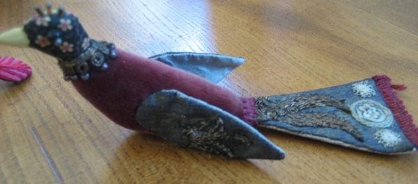
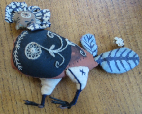
Another day on Quad Royal, another bird.  But today’s isn’t any old bird, oh no; this is a Festival of Britain bird.

Joan Nicholson needlework bird Festival of Britain

Yes really.  This very bird was made to ornament some of the room sets in the Festival and it’s not just a copy but the actual thing.  So what’s it doing on my coffee table (other than for me to take not very good photographs of it)?

Birds by Joan Nicholson from Festival of Britain

A fewof these birds – along with many other delights –  came to visit earlier this summer thanks to their current owner, Nancy Nicholson.   Nancy is not only a textile and pattern designer in her own right, but is also the daughter of one of the power couples of 1950s design, Roger and Joan Nicholson.

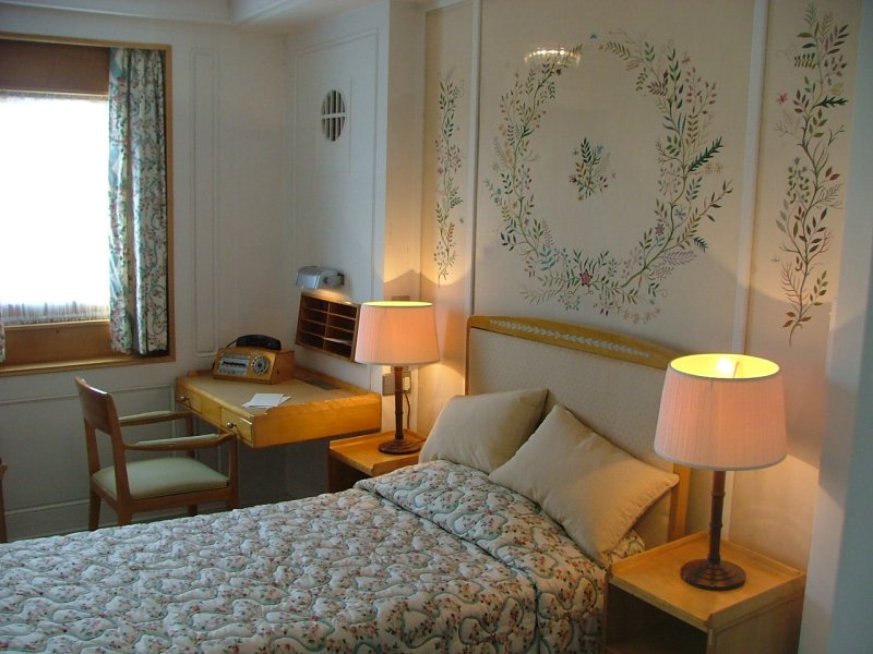
I’ve written briefly about Roger Nicholson before (since then I’ve discovered even more of his contribution to design at the time and really owe him another post one day). Joan was a talented designer in her own right whose most famous commission was the wall hanging for the Queen’s bedroom on the Royal Yacht Britannia.

Queens Bedroom on Royal yacht britannia with embriodery by Joan Nichsolson

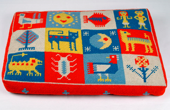
She also wrote several classic books about embroidery and produced some delightfully idiosyncratic designs – here’s just one.  I hope to show you some more in due course.

Joan Nicholson needlepoint

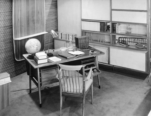
But back to the birds.  In 1951, Roger Nicholson, along with his brother Robert,  designed a number of the room sets in the Homes and Gardens Pavilion at the Festival of Britain  This, for example, is the Headmaster’s Study.

Roger Nicholson Headmaster study roomset for Festival of Britain

At some point, it was decided that the rooms were all looking a bit austere and needed a bit more decoration.  So Joan Nicholson was asked if she could help.  The result was these birds.

Joan NIcholson bird ornamenents from Festival of Britain

These have to be incredibly rare – how many actual items which were displayed at the Festival still exist? Not many I would guess.  But they’re also interesting because they do something which I always enjoy, which is disrupt the conventional narrative of the Festival of Britain.

Roger Nicholson Room design Festival of Brigain

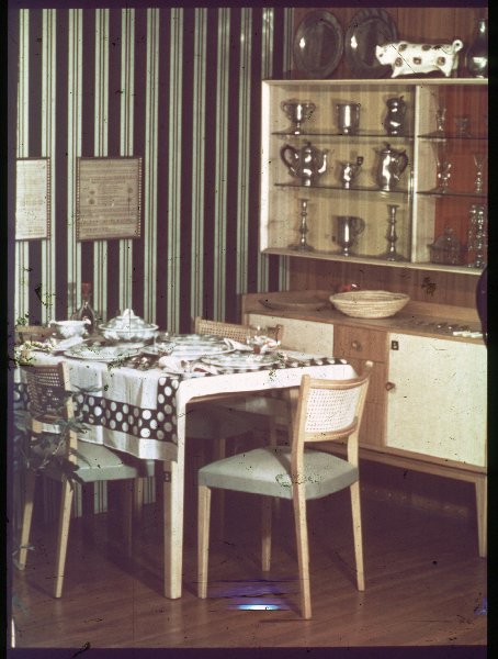
The story of interior decoration at the Festival is always supposed to be one of a Scandinvian style modernism which sweeps all before it, including decorative clutter.  But take another look at these rooms.  Yes, they may not have the array of knick-knacks which would have graced a 1930s fireplace.  But ornaments haven’t entirely disappeared.  The headmaster up there has some odds and ends on his shelf, while the farmer for whom this dining area was designed has a whole trophy cabinet of pewter as well as a rather covetable china bull.

Roger Nicholson Farmer room Festival of Britain Homes and Gardens

So when we remember the Festival of Britain, let’s not just honour the Robin Day chairs and Terence Conran tables, let’s honour the ornaments too.  Because the reality is always so much more complicated than the myth.

More than that, we must also remember the people who weren’t Robin Day and Terence Conran, but who also made the Festival what it was.  People like Joan and Roger Nicholson.

Loves a sailor

An errand sent me rummaging through our stack of Daphne Padden bits and bobs the other day.  This made me realise two things.  One is that they really ought to be in an archive box, something which has been on my to do list for too long. The other – more relevant here – is that I never got round to scanning much of it in order that you lot could take a look at them.  It’s time to make amends, clearly.  Here’s a thoughtful bird to start with.
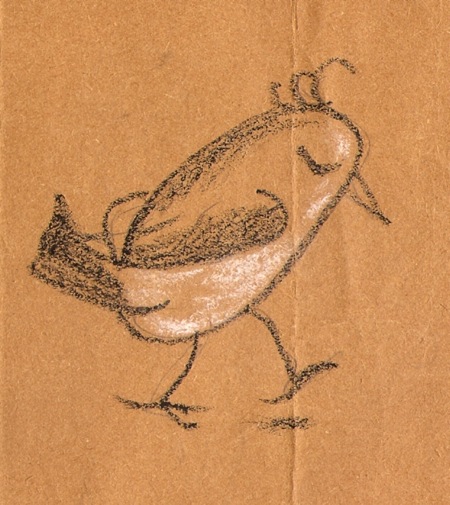
Daphne Padden sketch of bird

For those who weren’t around last year (where were you?), the executive summary is as follows.  After Daphne Padden’s death in 2009, a lot of her posters came up for auction in 2010.  We got in contact with the executors after this, and ended up buying a miscellany of drawings, sketches, designs and, well, other stuff which hadn’t been included in the auction.

Most of the archive has gone to the Brighton University Archive of Art and Design where it can be consulted by historians and designers (more exciting developments on this next month too) but we kept a few small pieces that we might want to display one of these days.  I posted pictures of a few of them when they arrived, but but promised more.  That was some time ago.  Oops.

This was the item which particularly made me feel remiss.  I swear I had never seen it before, although Mr Crownfolio assures me I have.
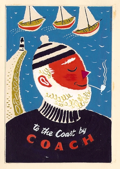
daphne padden design for sailor coach poster 1950s

It’s done in real detail but very small (just over 10cm high) and in a little paper folder, so I like to think that this was what she presented to the coach company as a proposal.  This is of course the poster commission which resulted, although it does exist with a couple of different varients in its lettering.
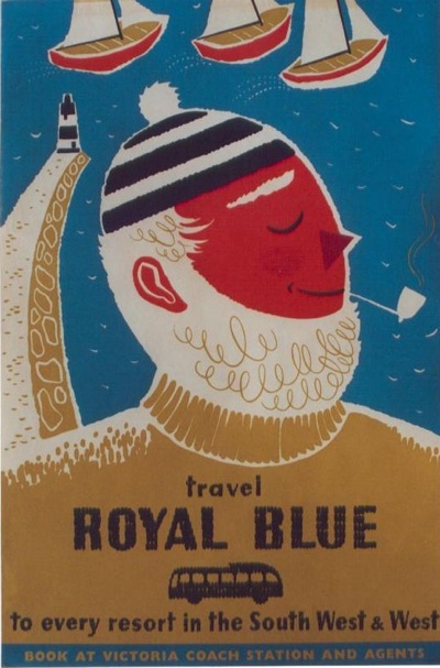
Daphne Padden Royal Blue vintage coach poster sailor 1957

She obviously liked this series of posters a great deal.  I’ve posted this study before, but it was all part of the same collection of things she kept over the years.
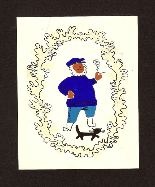
Daphne Padden old salt artwork

Along with this much rougher sketch, on a torn piece of brown paper.
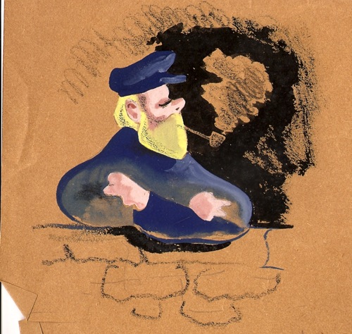
Daphne padden sketch of sailor on brown paper

There’s nothing similar for any of her other designs, so she must have felt a real sentimental attachment for this one.

Also of interest are a couple of proofs for British Railways leaflets.  This one is helpfully stamped 1963.
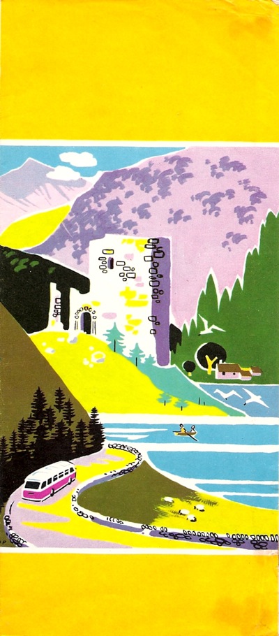
Daphne Padden proof for British Railways leaflet 1963

Along with them is one finished leaflet, which looks as though it’s from a slightly different series.
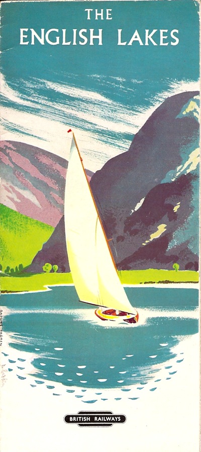
Daphne Padden British Railways leaflet 1960s The English Lakes

(In case you also worry about these things as much as I do, the BR in-house printing department definitely did the inside on this one, it’s not very exciting at all.)

Once again, I would have had no idea that she’d designed these without this evidence.  I also have no idea where to start looking for them in the great sea of ephemera out there, so if anyone can point me at some more, I’d be very interested to see them.

Finally, there is this.  I have no idea what it is for or even if it was by her at all, but  I rather like it.
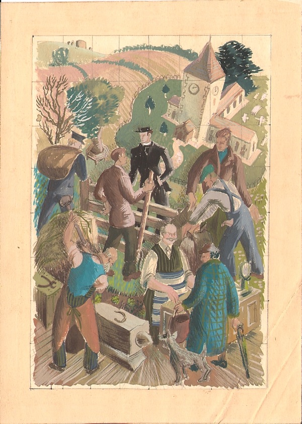
A sketch.  Possibly by Daphne padden

What do you think?


Not here

I’ve tried to write a sensible blog post today, I really have, but my brain just isn’t co-operating.  So my thoughts on Catherine Flood’s British Posters: Advertising, Art and Activism will have to wait for another day. When I might actually have some thoughts to relate.

So I was just going to give you a poster of a cat by way of apology.

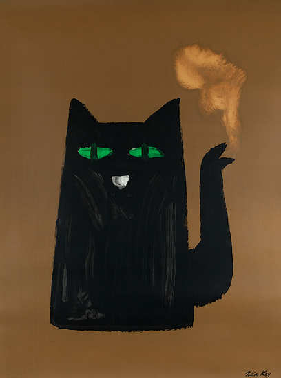
A poster of a cat about which I can remember nothing at all

But I can actually do a bit better than that.  Because the Brighton Design Archives have been putting up some of their holdings on Flickr, and they tweeted the other day that set of Henrion’s work had just gone up.  And so it has.

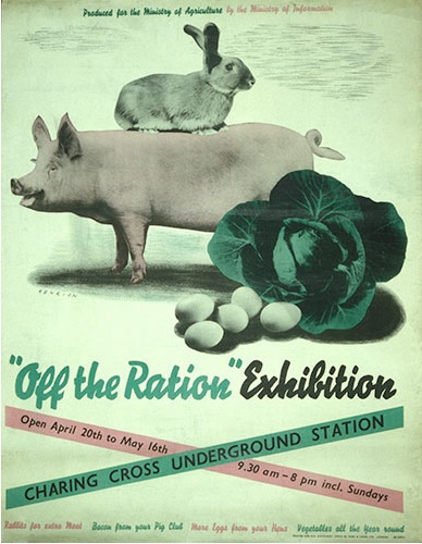
Henrion vintage poster worldwar two 1941

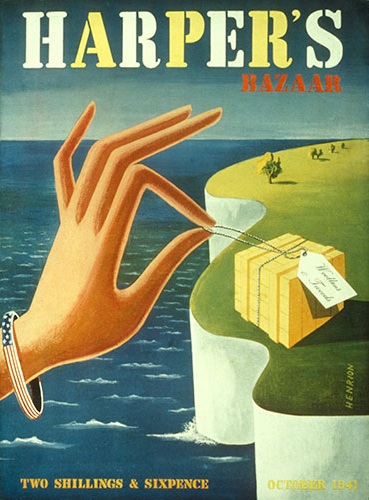
It’s only a small set, but it provides a neat overview of Henrion’s career, beginning with wartime posters and illustration work.

Henrion Harpers Bazaar cover 1941

As the decade moves on, the poster is no longer king and the designs that Henrion produces are increasingly part of a whole corporate identity.

F H K Henrion ‘Taylor Woodrow built this airport’, 1955. Poster artwork showing Henrion’s characteristic wire-frame model.

Coincidentally, the set is in fact illustrating one of the arguments in the poster book, that only a very few designers in the 1950s remained poster artists, while many more set up companies and set about creating corporate brands instead.

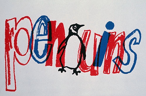
F H K Henrion ‘Penguins’, part of a range of work for the publisher in the 1960s, including a number of book covers.

A point that is very true of Henrion.

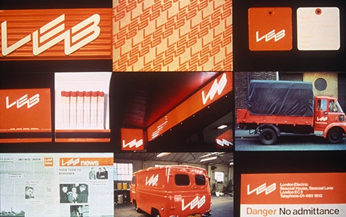
 Examples of London Electricity Board corporate identity work by Henrion. 1970

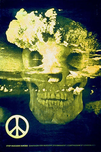
The illustrations are all informatively captioned, and it’s well worth going to look at the set yourself.  I learned two things, one is that Henrion designed this famous CND poster.  (I knew the poster very well, just had no idea that it was his)

‘Stop Nuclear Suicide’, a poster for the Campaign for Nuclear Disarmament, 1960,  F H K Henrion

The other is that there is apparently one of those petite design books out about Henrion.  Has anyone read it?  Is it any good?  Shall I buy it? If you want to know more about him for free, though, there is a fine interview from Blueprint in 1986, which is here.
Meanwhile a normal service will resume later this week when I hope to have my brain back and working.

Krol to be kind

We bought this quite a while ago, but only recently got round to photographing it.

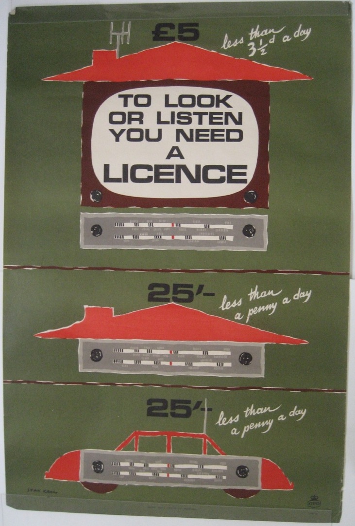
Stan Krol vintage GPO poster March 1966 TV and radio licensing

It’s by Stan Krol, and thanks to the BMPA and their lovely online catalogue I can tell you that it’s from March 1966.  A date that slightly surprised me as I would have had it down as late 1950s had I been asked.  And when I look at the catalogue closely, this poster is sandwiched in between lots of other 1950s posters so I am wondering whether this might be a typo.  I will ask them.

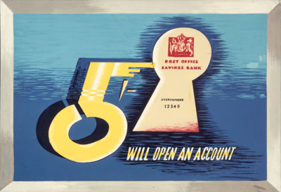
What I can’t tell you and don’t know, however, is much about Stan Krol himself.  I’ve been trying to research him for the last week or two and it’s been a useful lesson in two ways.  One is that sometimes it really isn’t possible to find out much other than that someone once designed posters and was born in 1910, the one biographical fact I do have about him.  The other is that not all designers from the past are in fact undiscovered geniuses.  Which isn’t to say that Stan Krol is a bad designer at all, he did some great stuff, like this poster for the Post Office Savings Bank from 1960, when Krol was already turning 50.

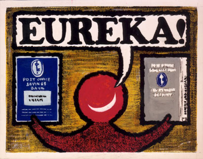
Stan Krol vintage Post Office Savings Bank poster 1960

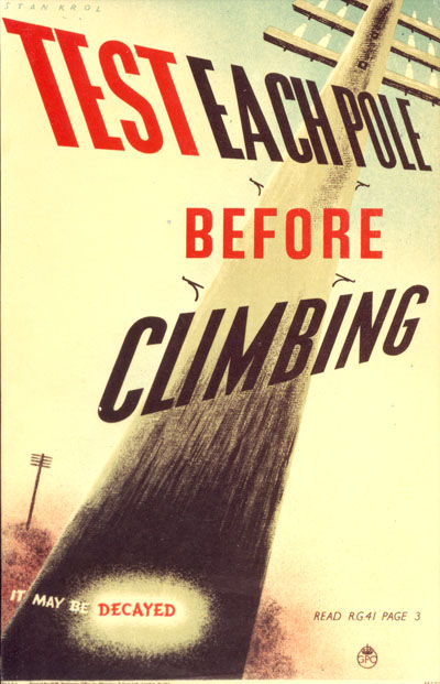
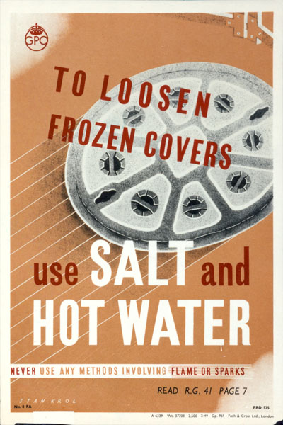
In fact it’s the BPMA archive that can tell me the most about Krol’s career.  He started working for them in the late 1940s, which is when these two usefully informative internal posters come from.

Staff information poster for Telegraph engineers; featuring a telegraph pole. Also included is a proof of this poster, with artist's details on the back. Artist: Krol, Stan.  Printer: Waterlow & Sons Ltd.

Poster explaining the correct procedure for removing manhole covers; featuring a picture of a manhole cover. Artist: Krol, Stan.  Printer: Fosh & Cross Ltd. Vintage GPO poster

He carries on working for them throughout the 1950s.

Stan Krol vintage GPO poster 1950

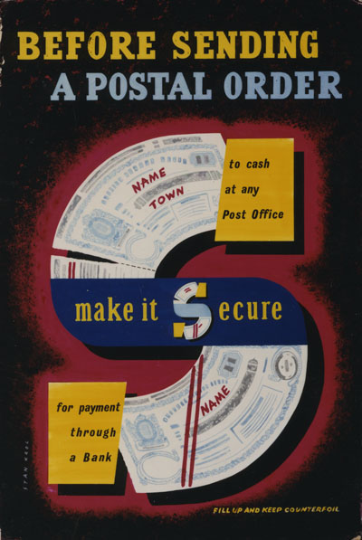
stan Krol 1956 vintage GPO postal order poster

He carried on throughout the 1960s as well.

Stan Krol vintage Post Office Savings Bank poster 1960

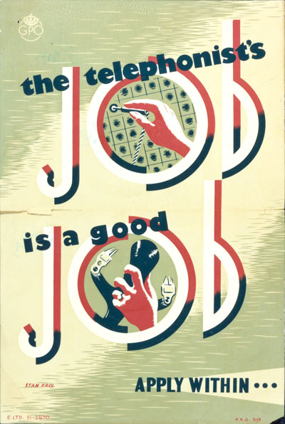
Stan Krol vintage GPO recruitment poste 1962

He was even producing posters for them as late as 1971.

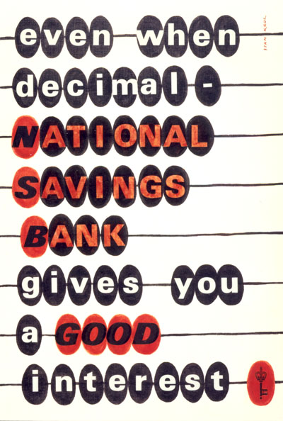
Stan Krol vintage national savings bank poster 1971 decimalisation

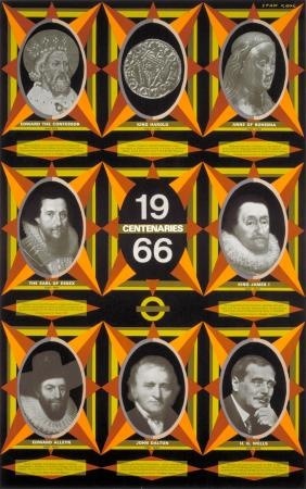
When you lay out all of his GPO stuff like that, it’s not a bad selection of work.  But what’s strange is both how little he seems to have done for other people, and how that mostly wasn’t as good.  This, for example, is one of just two posters he did for London Transport.

Stan Krol vintage London Transport poster anniversaries 1966

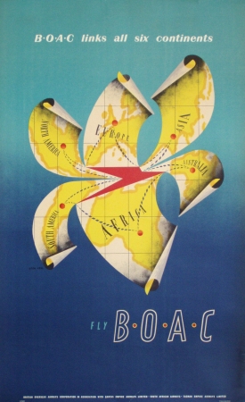
He also did a fairly standard blue skies BOAC poster at some point, which does make me think of peeling a banana.

Stan Krol vintage BOAC poster 1950s

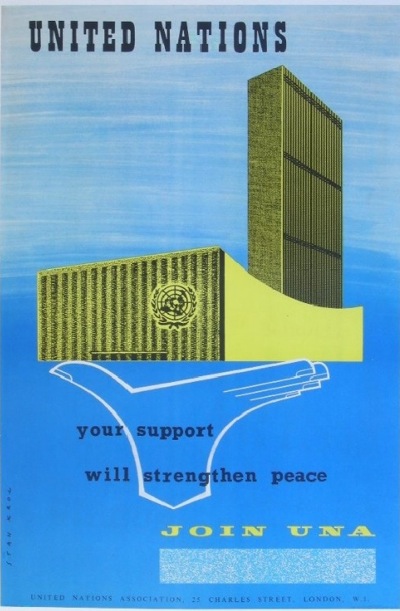
Along with a United National poster in a similar style

stan Krol vintage poster United Nations

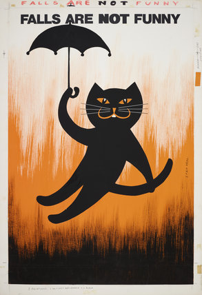
But he was still capable of some surprises too.  I like this ROSPA poster from 1971 more than most people would simply because it has a black cat on it.

Stan Krol vintage ROSPA safety poster 1971

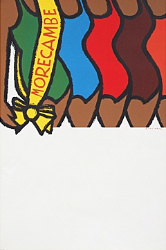
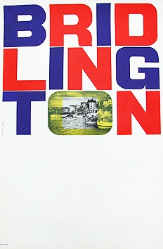
But the two coach posters that I’ve seen of his – both from the 1960s are just plain great.

Stan Krol Morecambe beauty contest vintage coach poster 1967

Stan Krol vintage Bridlington poster 1967 coach poster

Both of these are courtesy of Fears and Kahn; the Morecambe bathing beauties have sadly sold, but Bridlington is still there if it has taken your fancy.

Now that I’ve laid Krol’s work end to end along the blog, I like it a lot more than I did when I began.  He fitted his style to the times very well, a particularly impressive feat when you consider that he was producing his last posters when he was in his 60s.  Yes, he may not be an undiscovered genius, but he was a very good working designer.  And they need celebrating as well.

D I Y Barbara Jones

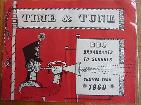
Barbara Jones is becoming increasingly collectable.  At least that’s the message I’m getting from eBay.  We recently watched a whole collection of BBC schools booklets go past; most went for one or two pounds if they sold at all.  The one exception was this.

Barbara Jones BBC Time and Tune booklet 1960

By Barbara Jones, it sold for £21.50.

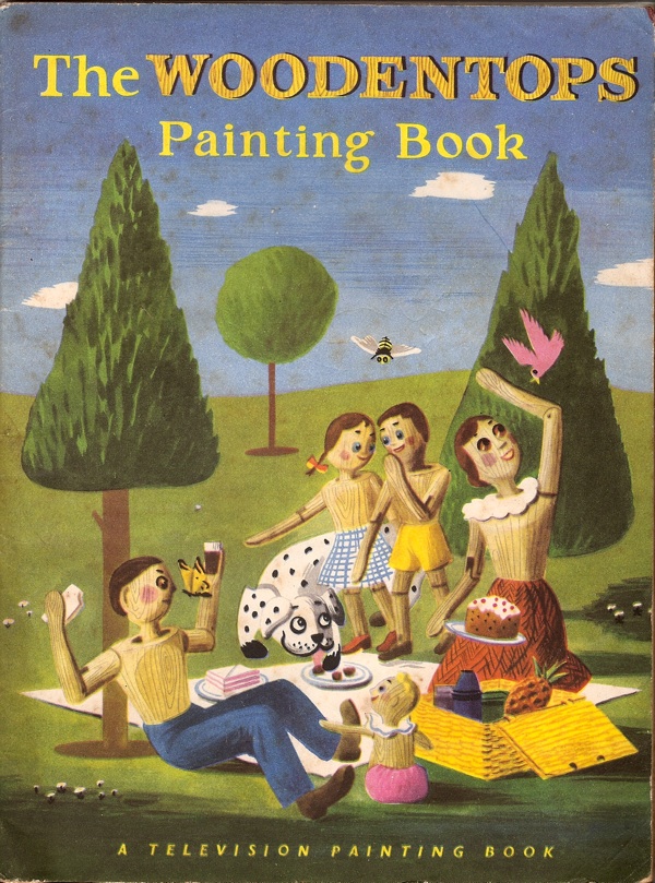
All of which preamble is mainly so I can convey my pleasure at getting this for just one squid.

Barbara Jones Woodentops colouring book front cover

It pretty much had to be by Barbara Jones given how similar it is to her Woodentops book, but it also does us the favour of saying so inside.

Barbara Jones woodentops colouring book inside front page

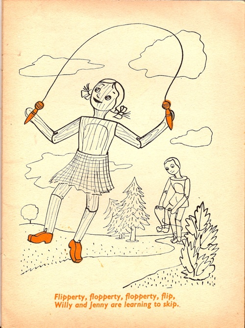
Most of the pages inside have been coloured in – I was going to say sadly, but it isn’t really, it’s just the book being used as it was meant to be.  One or two were missed though, so you can get an idea of what the drawings are like.

Barbara Jones Woodentops colouring book skipping

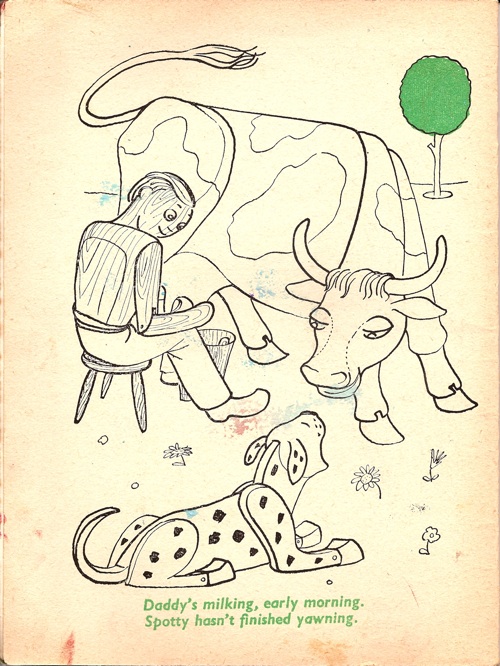
Leafing through it, I am struck by what hardworking farmers the Woodentop family are.  They haul the hay in with just a horse-drawn cart, collect eggs and get up early for the milking.

Barbara Jones Woodentops colouring book milking picture

All of which would have been quite normal then, but seems like a long-lost rural idyll from the vantage point of today.  And now if you’ll excuse me, I’ve got some colouring-in to do.