I do like a sharp-eyed reader. Sheila got in contact to show me this poster, which she’d just bought on eBay.
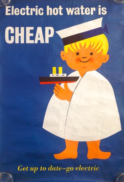
It’s great, isn’t it. But I can’t tell you anything definite about it, because it isn’t signed. Sheila, however, has a theory.
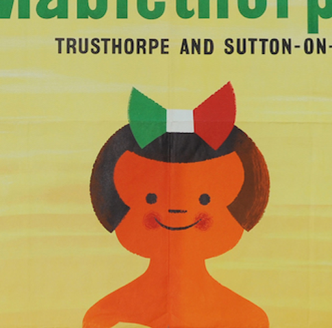
Compare and contrast with this, which is a Tom Eckersley classic.
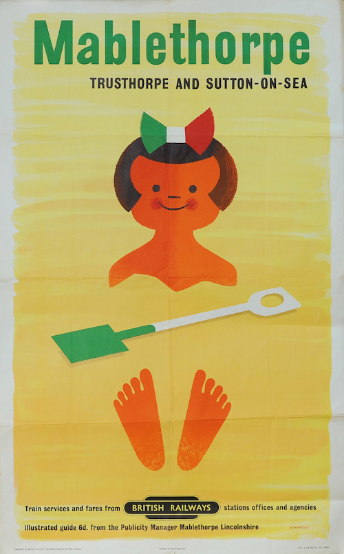
These children are, if not twins, then certainly close relatives.
So is this a hitherto unknown Eckersley? Well it might be. The construction of the faces are almost identical, and so little is known about British commercial posters of this period that I wouldn’t be at all surprised at all if an entirely new poster turned up.
Equally, though – and this is Mr Crownfolio’s theory – it’s possible that another graphic designer saw Eckersley’s poster and rather liked the way that the face had been done. So when he or she got the right commission which involved drawing a child, they took some inspiration from the Mabletherpe little girl.
One possible way to sort this might involve going through a complete set of graphic design and poster annuals for the late 1950s and seeing whether the electric hot water poster is mentioned at all. Sadly I can’t volunteer, as we don’t have a full set. But if anyone else wants to have a go, or has any other theories or knowledge about this poster, do let us all know in the comments below.
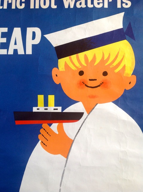
I am absolutely positive that this is not an Eckersley poster. The main clue is in the use of lines – there are two graphic ‘languages’ being used in the image.
Eckersley likes to construct shapes with cleanly defined flat edges. Look at the toes sticking out of the sand: if he were to draw fingers on a hand he would construct them the same way, as separate shapes, and not as a single shape bisected by lines. Where he does use lines (here on this poster and elsewhere), they are bold graphic strokes. The lines on the ‘electric’ poster are dotted constructions, fussier than Eckersley’s single brushstrokes. Plus, look at the coloured shading on the hair. The colouring is a little random, unlike the clean, geometric shapes Eckersley uses when he adds texture. That line down the towel is not something he would do, because it doesn’t read as a shadow, and draws attention to itself as an overlaid mark. Like the little dots in the ears. Unnecessary (if cute). Look at how Eckersley uses the colour of the ‘Mabelthorpe’ sand to separate the top and bottom of the girl’s figure. No extra lines needed.
I could go on! But I would bet ca$h mon£y it’s someone inspired by Eckersley and not the man himself.
Good, I knew someone would know. And put like that, I can’t really argue.
I don’t think its an Eckersley either, but Oh My, someone has taken ‘inspiration’ from Mr Eckersley.
Although not as much fun as leafing through original copies of Modern Publicity et al to track posters, take a look at http://magazines.iaddb.org/. It is AMAZING (note emphatic use of capitals)
Oh yes, that is good – I’ve dipped in a few times but haven’t had the chance to disappear into it properly yet!