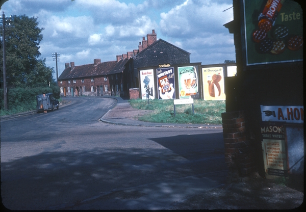
Once again, this post comes to you courtesy of someone else’s generosity. In this case, it’s thanks to Mike Ashworth, who pointed me towards the Phyllis Nicklin collection, via this picture of Jiggins Lane in Bartley Green, Birmingham in 1953.
Great, isn’t it. And rare too. Considering how present posters were on the streets of Britain in the 1950s and 60s, pictures of them at work are few and far between. Which is a very sad thing if you are an obsessive like me.
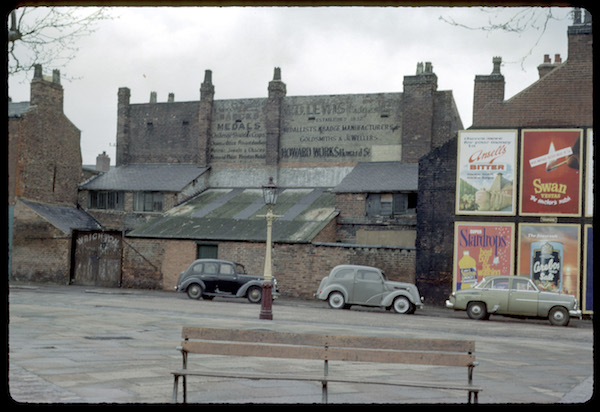
There are plenty more where that came from too. Here’s the Jewellery Quarter in 1963.
(I’ll put links to larger pictures at the bottom of each picture so that you can stare at the text in more lovely detail than Quad Royal can handle, starting here.)
Part of the reason that these pictures are so wonderful is that, although clearly she was a very good photographer with an eye for the perfect shot, Phyllis Nicklin took them as record, not art. She worked as an extra-mural Geography tutor at Birmingham University and took slides as a record of how Birmingham was changing in the years after the war. At least that’s the assumption, but there’s no proof. Nicklin died in post, in 1969, so the slides were left in the custody of the University without any kind of manifesto or description of how we are meant to see them.
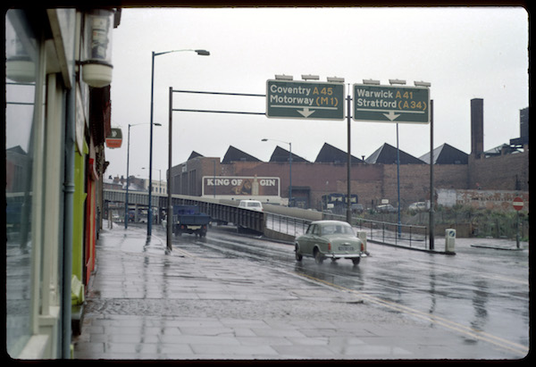
Whatever her motives, what we do have is photographs of posters, doing their thing, from the early 1950s – that’s 1954 above – right up until a year before her death, in late 1968.
I can find a whole heap of reasons to be interested in these images. Seeing posters in the location that they were designed for is interesting enough in itself, as is the fact that these pictures mostly show commercial posters of the kind that very rarely survive or are even recorded in Britain. But there’s more to be seen in them beyond that. Phyllis Nicklin’s slides underline another issue that I’ve been thinking about for a while, and that’s how crowded with information the world around the posters was.
Nowadays, if you do ever see one of these posters, it’s likely to be framed and separated off from any distraction, more often than not on the white wall of a gallery, or the tastefully pale walls of chez Crownfolio. But pretty much the only poster in the Nicklin images which is displayed in such a separated way is the giant gin poster above in 1968, and even that’s juxtaposed with factory roofs and signs.
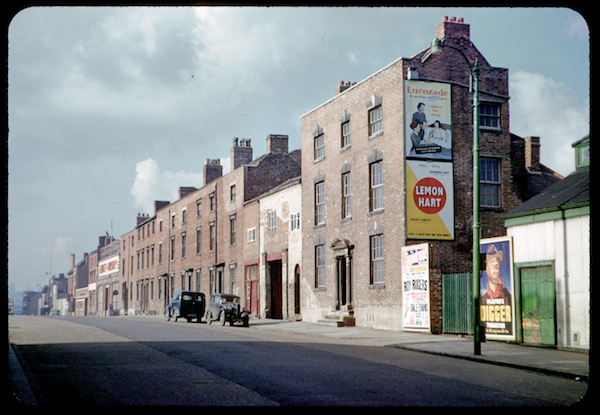
Look at the first few pictures again though, and these posters are all displayed in groups that have been put together at random with no thought for design or complementarity. It’s a Darwinian visual world out there, and these posters have to fight amongst themselves for attention.
But other posters aren’t the half of what’s going on. Take a look at the bottom left corner of the very first picture. The Rowntrees poster is on its own, but it is up against two enamel signs. These posters – in 1967 – are facing similar competition.
Post-war posters weren’t displayed in a visually blank environment, far from it. They were surrounded by all sorts of other text, advertising other things, in different ways. However we see them now, back then they were part of a whole and very varied ecosystem of text and advertising messages.
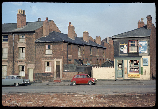
In the picture above, the posters above look modern in comparison with the old fashioned text of the enamel signs, although I can see that for some advertisers, the impression of tradition and permanency that these kinds of advertising give would be a bonus rather than a disadvantage. Windolene is up to date and disposable, but Woodbines will always be there when you need them.
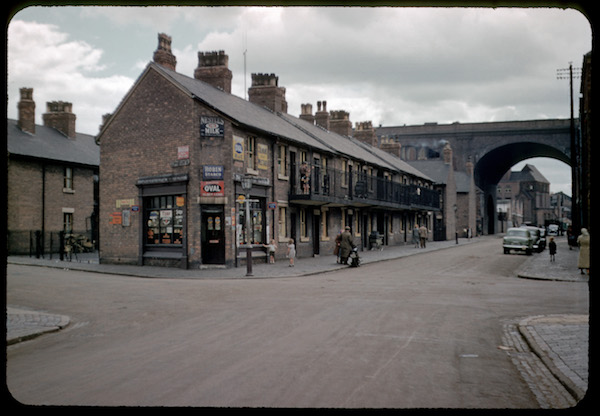
In some places, these other advertisements were the only kind available. This newsagent in 1953 is dense with text and information, but none of it comes from a poster.
It’s worth noting Robin Starch didn’t confine its advertising to enamel; here it is in 1960, on another newsagent, advertising on a poster instead. Or perhaps in addition to: I have no idea how their advertising budget was spent, nor how long enamel signs remained on display.
Please note that I’m doing very well here by not making any jokes at all about starching robins.
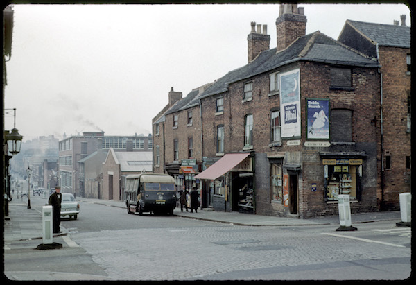
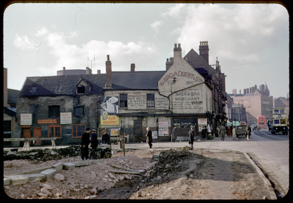
The enamel signs weren’t the only kind of text that the posters were in competition with either, nor the oldest.
That poor Surf poster above has to get its message through against a positive babel of painted wall adverts, boards advertising taxis and smaller posters. Were we to see it in a gallery, we’d be hard-pressed to imagine it operating under those – rather unfavourable – conditions. But perhaps we should try a bit harder next time. We might not like it, but this is how the posters were designed to be seen.
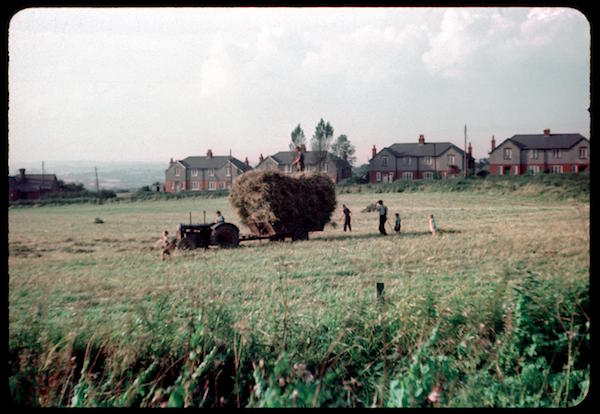
There is plenty more to enjoy in the archive apart from the posters. Phyllis Nicklin was right to record so much of Birmingham: she depicts a world that we can hardly recognise now. Here’s a photograph taken on the edge of the suburbs in 1953.
It looks not only bucolic but a relic of an age utterly passed with its teetering hayrick.
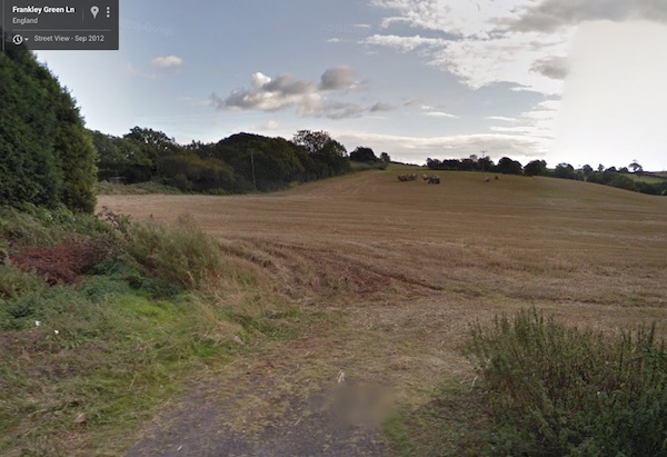
Except there’s an irony. The website which houses Nicklin’s photograph has also identified the locations where she took them on Google Maps. Every single one of the buildings that I’ve shown in this post has gone: replaced by newer factories, modern flats or sometimes just a blank piece of tarmac without a building on it at all. Nothing she saw remains, with once exception. And that’s the field, which is as rolling and undeveloped as it ever was.
And when I went to look at it on Google Streetview, they’re still bringing in the harvest.
The Nicklin photographs have been championed by the website Brumpic, and you can find out more about her on there. A selection of photographs have also been catalogued by the University of Birmingham, and you an find those here. Do go and look, it’s worth the effort.
Interesting. We’ve gone from empty streets and roads, but crowded posters, to quite the opposite. Personally, I prefer the former.
Me too.
Fascinating as always, I always look forward to what goodies you will find for us next. Seeing posters out and about does certainly make one look at them in a different way. Those which may seem rather bright or brash on there own on a plain wall, seem rather less so when surrounded by other competing advertising.
It’s also a reminder that photos taken of what may seem rather boring subjects at the time, after a few decades are a serious part of our social history, covering everything from posters advertising the must-have products of the day, to showing us the cars and clothing styles that people chose.
Couldn’t agree more about photographs. There are so few pictures of posters in action, and yet they were everywhere at the time!