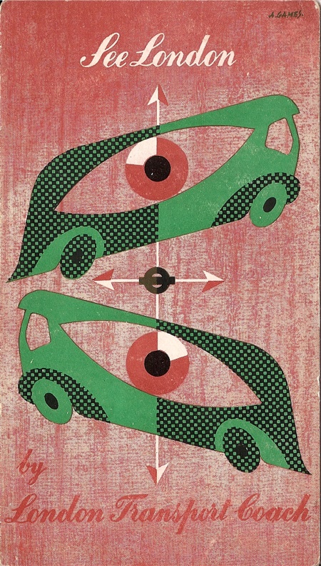
The combination of house renovation and school holiday means that the blog has been a bit neglected recently. By way of apology, here’s a very lovely bit of Abram Games, very much on an appropriate theme for the holidays.
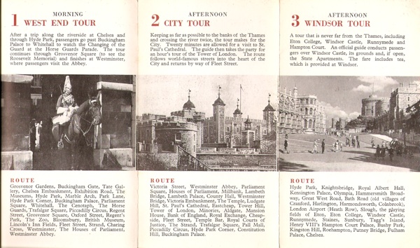
Some closely related posters were on here the other day, but this isn’t it, rather it’s the leaflet which must have been part of the same campaign. West End or City, do you think? Or how about a trip out of town to Windsor, tea included in the fare?
What always strikes me about these kind of leaflets is how different the bulk of the typesetting is from the cover – the British Railways Holiday Haunts guides are another good example. Outside we are in a modern and exciting world; inside it’s business as usual.
I can only imagine that it was the covers and posters which got sent out to designers, while the rest was always done by the in-house design team.
In the end, though, I’m not sure that I mind that much – the mismatch is part of the period charm. Nowadays everything would match, and every element of the design would chime with every other. But would it be better as a result? Perhaps not, just different.

