Death, Sheep and Lemonade

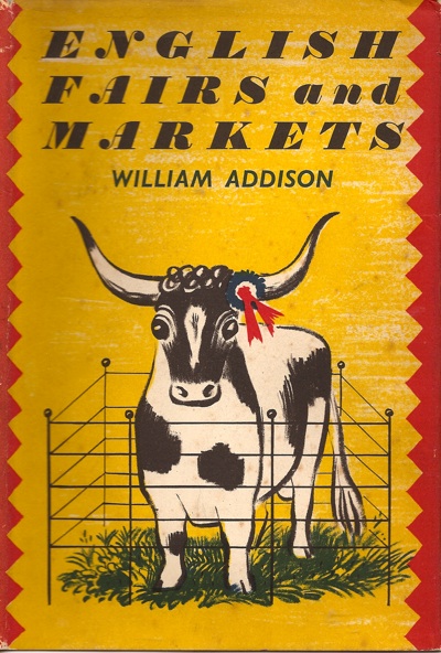
I promised you Barbara Jones, and Barbara Jones you shall have.  I’ve always liked her work, which began when we picked up this book in a second-hand shop quite a few years ago now.

Barbara Jones cover of English Fairs and Markets

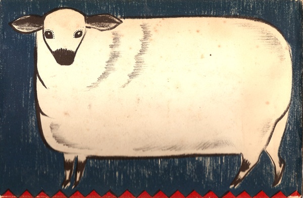
Not only is it a very fetching cow, but it also reminds me of County Shows, which are some of my favourite things in the world.  I’m off to the Bath and West later this week, and will be looking out for bemused-looking animals with rosettes in her honour.  Here is the sheep from the back cover.

Barbara Jones English Fairs and Markets reverse

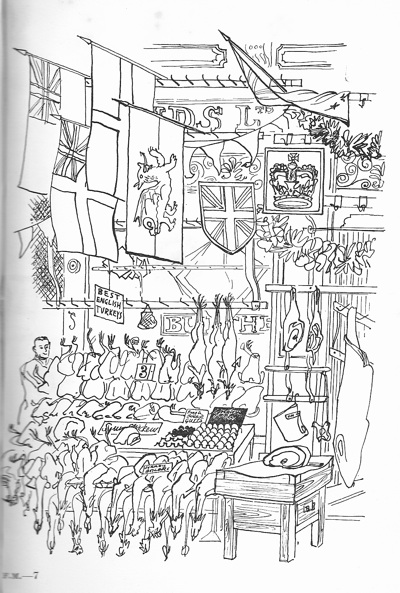
And one of the more delicate line drawings from the inside – this is Leadenhall Market decorated for the Coronation of Queen Elizabeth II.

Leadenhall decorated for coronation Barbara Jones illustration

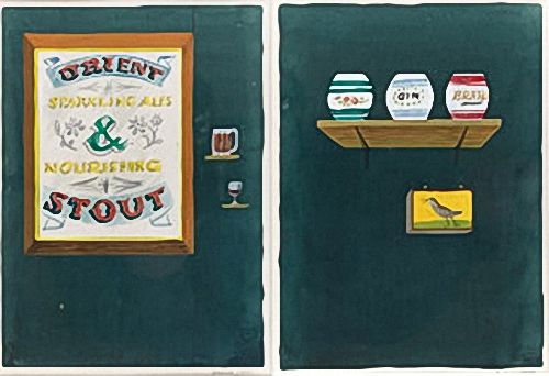
But the more that I find out about her, the more I am discovering that the (very many) book covers and illustrations are just one part of what she did.  Every biography I have found of her (on Wikipedia, or this rather good illustrated catalogue by Ash Rare Books) makes the point that the vast majority of her work was ephemeral and has disappeared.  She studied mural design at the Royal College of Art, and her work appeared on liners – here is a sketch for a very ‘popular arts’ trompe l’oeil mural for the Tavern Bar of the S.S. Orsova.

Barbara Jones sketch for mural for tavern bar of SS Orsova

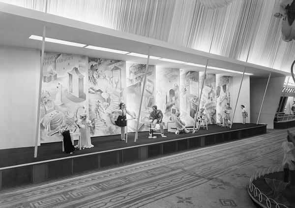
as well as working for the 1947 Britain Can Make It exhibition.

Barbara Jones muriel for Britain Can Make it Children's Section

A striking tableaux in the toys section illustrating the famous Birthday Nursery Rhyme, from monday’s child ‘fair of face’ sitting before a dressing-table, through the days of the week to Sunday’s child ‘blithe and bonny and good and gay’ rightly put in a glass case out of reach of an every-day little boy who resents such perfection. Murals by Barbara Jones, figures by Hugh Skillen.

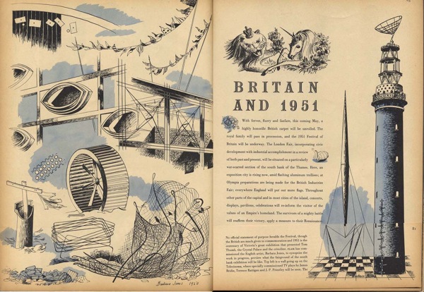
She also designed murals for the Festival of Britain.  None survive, but here are her illustrations of the Festival being built in 1950.

Flair magazine barbara jones festival of britain 1950

And, apparently, she also designed sets for The Woodentops.  How much more influential can you be?

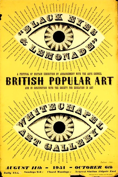
But even despite that, I think perhaps her most important legacy was in ways of seeing.  The Festival of Britain poster which I posted a couple of weeks ago, was for an exhibition that she curated as well as designed.

Festival of Britain Black Eyes and Lemonade poster Barbara Jones 1951

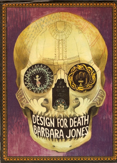
And after I’d posted it, Mr Crownfolio came and plonked this on my desk (which had apparently been on the shelves all this time, unbeknownst to me).

Barbara Jones cover for Design for Death

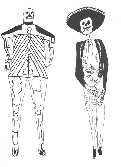
She collected, wrote and illustrated the book in a rather wonderfully understated Gothic fashion.

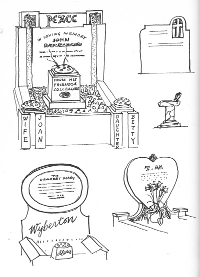
Barbara Jones Illustration from design for death

While the book itself wanders over everything from Aboriginal mourning rituals to modern graves for pets, passing through poetry, floral tribute, anthropology and etiquette on the way.  The result is a very modern kind of book, where the pictures are working alongside the words rather than just illustrating them – I can’t recommend it too highly.

Barbara Jones illustration from design for death

But in terms of what she achieved with her work, the fly-leaf gives as good a description as any.

Before it was generally fashionable to enjoy the decorative and amusing objects produced by popular art, Barbara Jones was already studying them and collecting them, and she did much for them when she put on the exhibition called ‘Black Eyes and Lemonade’ during the Festival of Britain.  Miss Jones’ house in Hampstead, full of curious and delightful things, is a vivid illustration of her impatience with the chastity of conventional ‘good taste’ and her feeling for invention, fantasy and vitality wherever it may be found.

I wonder what became of her house?  They should have preserved it for the nation.

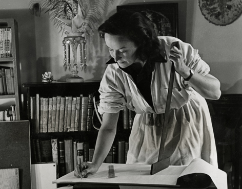
Barbara Jones picture

Do you think that’s it behind her?

Should you feel the need to campaign for something to be preserved though, the last remaining one of her murals has just been put forward for a listing order.  It’s a mural of Adam and Eve done for a (Basil Spence -designed) secondary school in Sheffield.  The school is being demolished, but the Twentieth Century Society are campaigning for the mural to be reused in the new school.  I hope they succeed – more details here.

And if you want to know even more, there’s a book – A Snapper Up of Unconsidered Trifles: A Tribute to Barbara Jones which I haven’t read., but if it has more than three pictures in it will definitely be worth the price of admission.

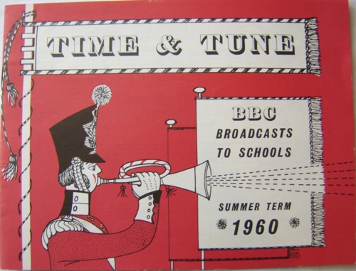
Barbara Jones BBC Schools leaflet

Or, if you want the real deal, this is available from Books and Things.  Take your pick.
A shilling life

I was going to write at length about Barbara Jones this week, but I have a sore throat and no childcare, so it will have to wait.

Instead, either as compensation or to whet your appetite, have this.

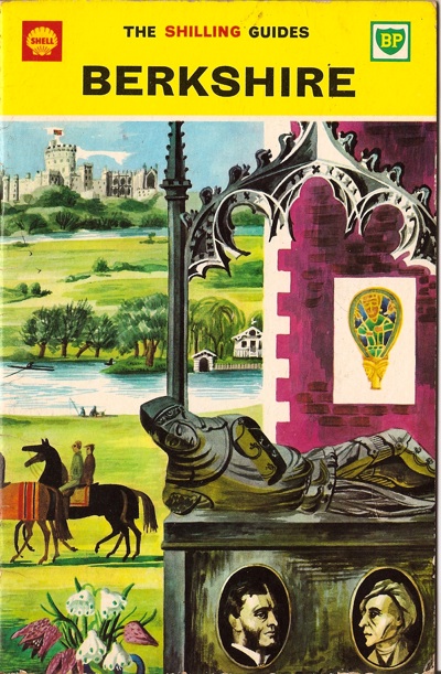
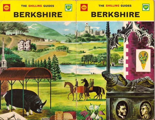
Shell shilling Guide Berkshire - Barbara Jones

The Shell Shilling Guide to Berkshire, cover design by Barbara Jones.

It’s easy to think of the various Shell County artworks as having been produced entirely for the purposes of posters (particularly should you happen to write a blog about posters).  But the illustrations and text were also advertisements and, of course, these rather lovely glove-box sized guides.  Here’s the whole thing across the front and back (although the artworks are cropped top and bottom to fit them onto the guides).

Shell shilling guide to berkshire cover Barbara jones

I am particularly liking the pig.

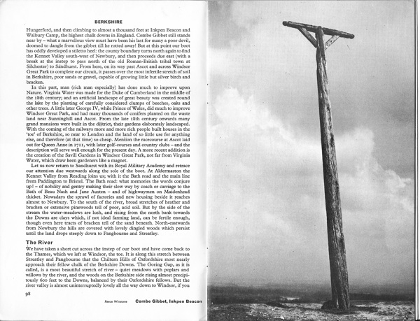
According to the guides themselves, the advertisements came first.  But in some ways these little guides, sold in petrol stations and designed to be used rather than just collected on a bookshelf, are the most satisfying.  Each Shilling Guide manages to cram in a short essay, a map, a list of stately homes and other sites open to the public, a gazetteer of some of the county’s chief places and a bibliography into just twenty pages, along with some evocative photographs.

I’ve never thought of Berkshire as bleak before, but I may have to change my view.

And that’s what I love most about these guides.  They’re not written by a committee; they’re not interested in received opinion.  Instead they point out modern factories, rare flowers, folklore and literary references with equal abandon, not just describing places but making them seem more interesting.  They don’t insult your intelligence (imagine gettting a Further Reading list today), and they are fascinated by local distinctiveness, whether that’s in geology, buildings, traditions, or just the kind of people who live in a county.

Of course, they do owe a lot to the larger Shell Guides, but I think their eccentricity is even more radical for being available for just a shilling over the counter in villages and towns all over Britain.

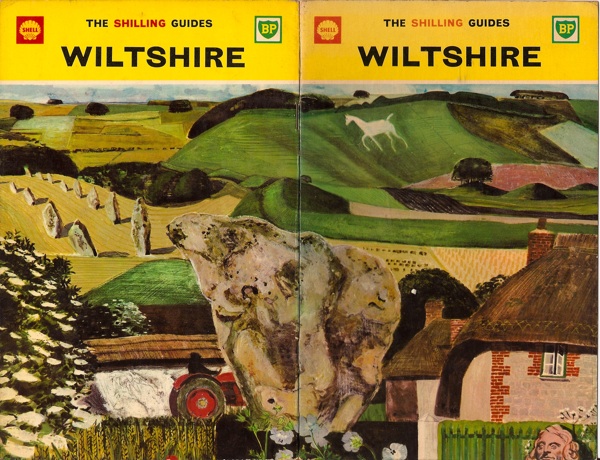
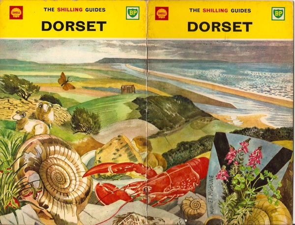
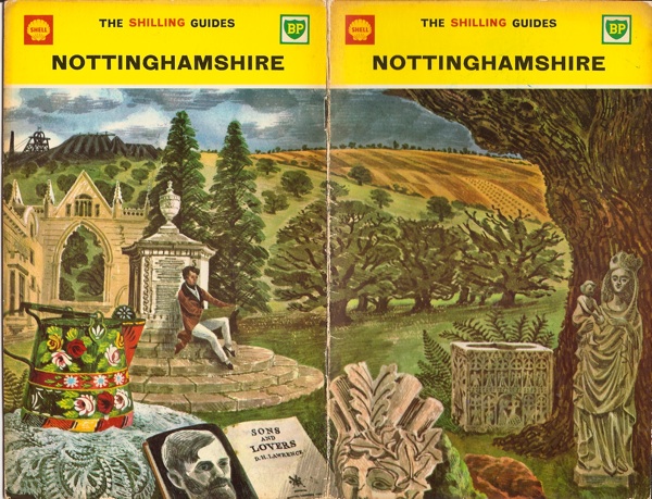
Here are a few more, by Keith Grant, John Nash and David Gentleman respectively.  Imagine if modern guidebooks came with covers as good as this.

Shell Shilling Guide to Wiltshire Keith Grant

Shell Shilling Guide Dorset John Nash

Shell Shilling Guide Notts David Gentleman

If you want to know more, there is a short overview of the Shilling Guides here and an interesting essay on the motivations behind Shell Guides generally here.

But perhaps the best news of all is that these are really affordable collectables, going for between £1-4 on eBay, a bit more at a second-hand bookshop.  Why on earth don’t I have all 48?

Murphy news

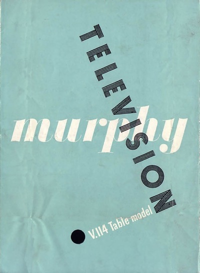
After I wrote the post about James Reeve and his brilliant brochures for Murphy televisioon, Dave Grant who runs the Murphy Radio site emailed with a bit more information.

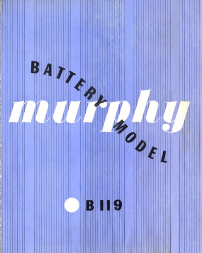
Sadly, he tells me that James Reeve died just a few months ago, so I’m not going to get the chance to quiz him about his wonderful designs.  Here’s another couple from 1949, just because I can.

Murphy brochure cover 1949

Murphy Battery Model brochure 1949

It turns out that James Reeve wasn’t the only force in favour of good design within Murphy.  Co-founder Ted Power (great name if you are going to go into making electrical equipment) was very interested in modern art.  Not only did he collect avant garde art such are Dubuffet and Beuys almost in bulk, he also became a trustee of the Tate Gallery.  (If you want to know more, there’s a fascinating article about him from the Independent here).  So perhaps that’s why Reeve was allowed to go for such adventurous graphics for the company.

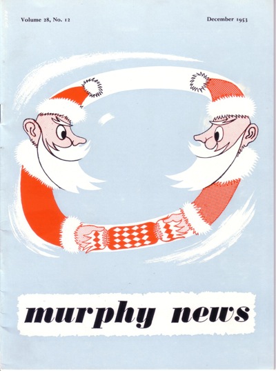
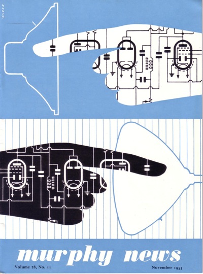
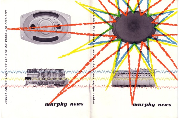
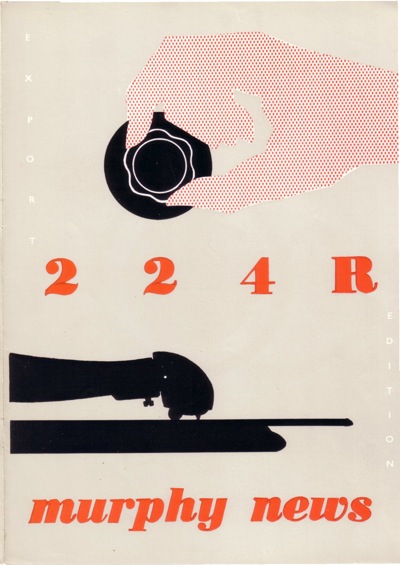
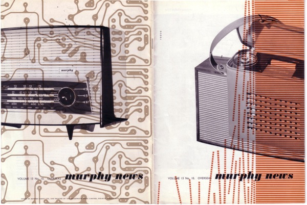
But that’s not all that Dave Grant had to say.  There’s also more stuff – more precisely, Reeve’s covers for Murphy News from the same period.  They’re just as good.  And in some cases – like this pastiche of Abram Games – Reeve is letting himself be a little more playful.

Murphy news Christmas 1953 cover James Reeve

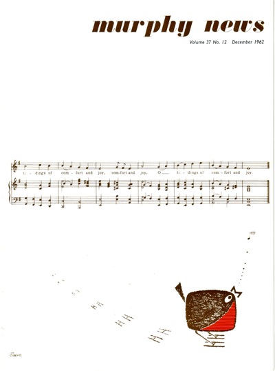
Clearly he let go a bit for Christmas – here’s 1962’s offering

Murphy News Dec 1962 James Reeve

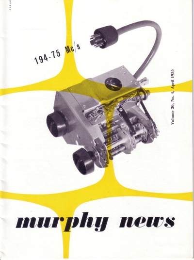
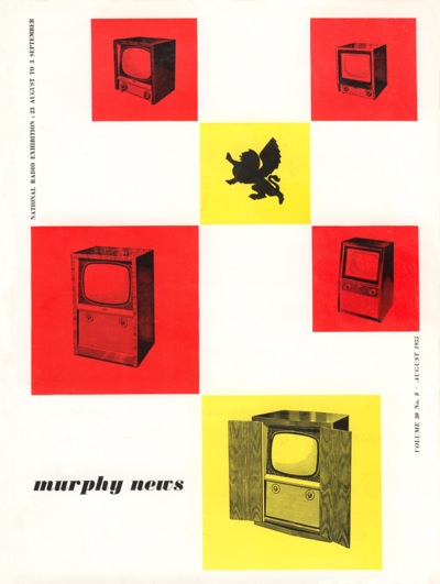
Some of the other covers echo the work that he was doing on the brochures at the time – these two are both from 1955.

Murphy news April 1955 James Reeve

Murphy news August 1955 James Reeve

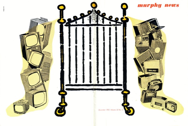
While others are experiments in different styles.

Murphy News Dec 1957 James Reeve

Murphy News Nov 53 James Reeve

Murphy News undated special edition James Reeve

Murphy News TA224R  James Reeve

James Reeve Murphy television news cover

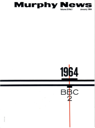
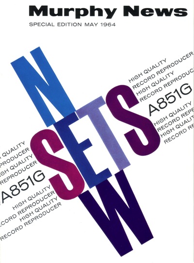
And, lest you think he might be losing his touch as time went on, here are some more typographic efforts from 1964.

Murphy news Cover Jan 1964 James Reeve

Murphy News cover May 1964 James Reeve

Give that man a medal.  Or at very least a posthumous round of applause.

See for yourself

Mr Crownfolio has been doing some searching, in part as a result of the Abram Games Murphy advertisement which I posted last week.  Here’s another, by Reginald Mount, for what it’s worth.
REginald Mount murphy television design

But on the way, Mr Crownfolio came across the Murphy Radio site.  Now, generally, this bears the same relation to poster design as railway name-plate auctions do.  Actually, no, it’s even more frightening; there are circuit diagrams.

A murphy circuit diagram, don't ask me which one

This is for the Murphy A26 RG radiogram for use with AC Mains, since you ask.

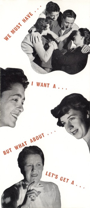
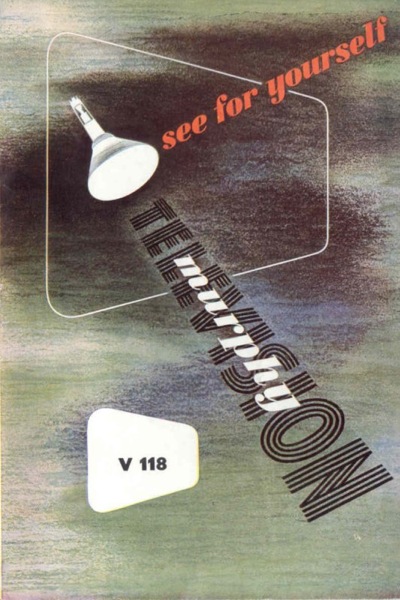
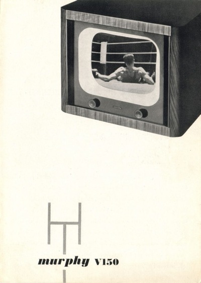
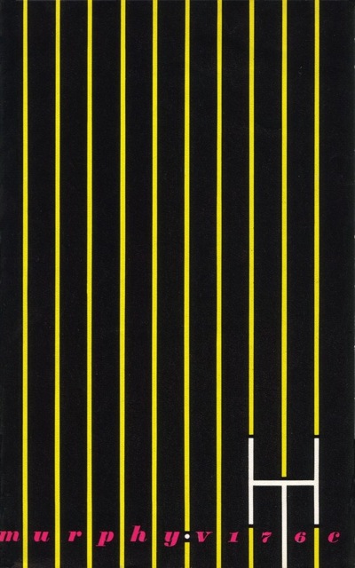
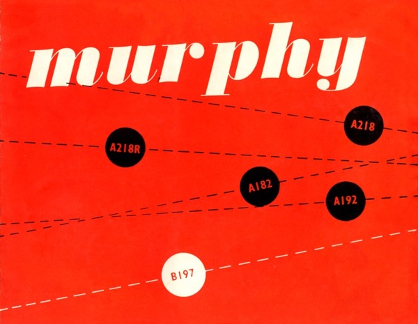
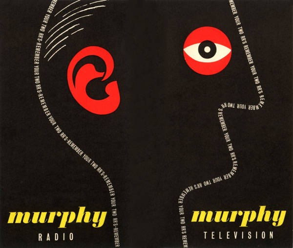
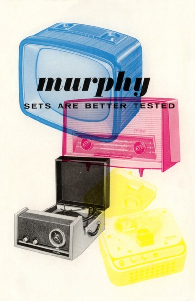
But also on the site are pages and pages of leaflets and brochures.  And they are great.  All of the following are  from 1948-49 and are incredibly sharp for their era.

Murphy leaflet 1

Mprhy leaflet 2

Murphy brochure 3

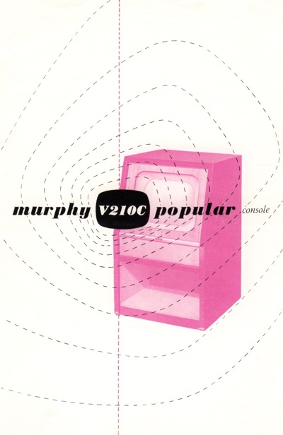
In fact, the graphic design was considerably more modern than the televisions themselves.  This brochure

another Murphy brochure

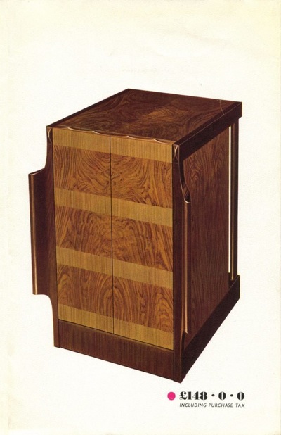
is for this television.

large wooden television not living up to graphic style

Unlike the brochure, the woodwork hasn’t moved on from the 1930s.  In some ways this is surprising, because much of the company’s graphic design was done by James Reeve, who also designed many of the televisions.  I was going to say that I like the brochures better than the products, but then I would say that, wouldn’t I.

There are plenty more great pieces of design as we go into the early to mid 50s.

yet another murphy brochure

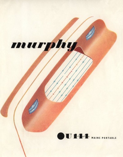
When we also enter the era of the portable (ish) radio.

Another Murphy catalogue cover

Murphy Irish catalogue

best bit of design there is here

I swear, it’s almost like looking at European posters it’s that good.

The great work continues until 1960.

1950 murphy television brochure

What I find extraordinary, apart from the fact that I haven’t seen these before, is that an internal employee, whose main job was designing television sets, produced all of the above. He clearly knew his graphic design – especially considering that the likes of Abram Games and Reginald Mount were designing posters for Murphy television – but that can’t account for all of it.  James Reeve was certainly a very clever man, bordering on undiscovered genius.

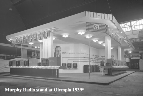
Furthermore, he is definitely hiding his light under a bushel.  He’s written an ebook about his designs – which you can find here – and it’s all about televisions.  Although I can give you this wonderful image of the Murphy stand at Olympia in 1939 – I’m guessing for the Ideal Home Show.

Murphy stand Olympia 1939

But it is possible to find out more.  There’s an exhibition at Mill Green Museum in Hatfield, all about Reeve’s work and including some of his poster designs.  So if someone could pop over and tell me if the rest of his work is as good as this stuff, I’d be very grateful.

Be discerning

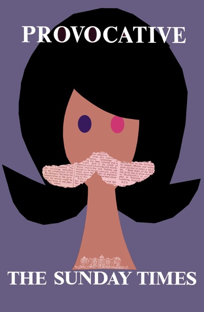
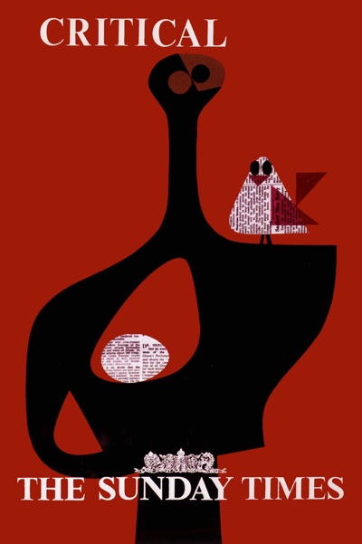
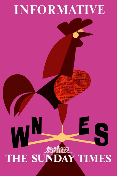
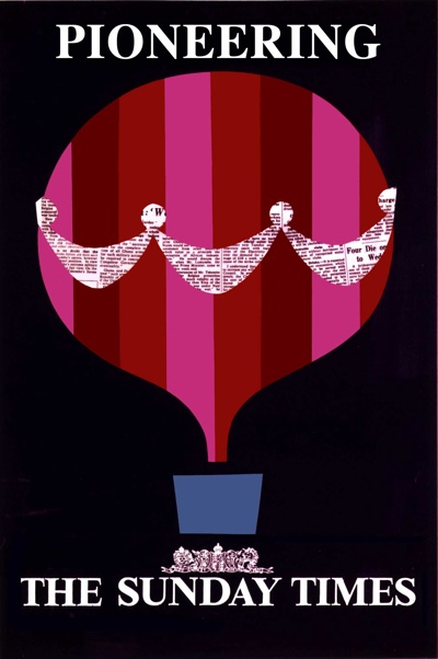
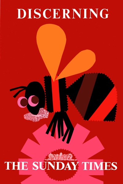
When I first mentioned Artist Partners, I included a couple of the posters that Patrick Tilley had designed for the Sunday Times.

Patrick Tilley Sunday Times poster Provocative

Pleasingly, Patrick got in touch to tell me the story behind the posters .

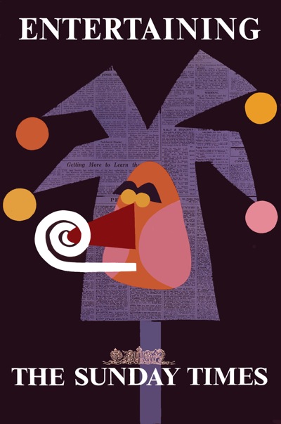
BBDO – the agency – commissioned me to design one poster using the line “You are more interesting to know when you read the Sunday Times”.

I thought this was a bit of a mouthful so came up with the idea of illustrating a desirable quality possessed by the newspaper and its readers and offered six roughs which were all commissioned.

Patrick Tilley Sunday Times poster Entertaining

They were reduced to their simplest form and made with cut out paper. BBDO won a prize. My name was removed from the printed versions. But they made quite an impact at the time.

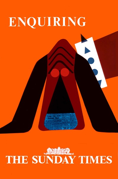
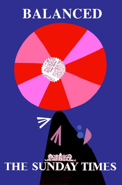
But there is a sequel.  He was also commissioned to produce a further set of six posters, which were paid for but never used.  So here they are, for the very first time.

Sunday Times poster dog Patrick Tilley

Sunday Times poster seal Patrick Tilley

Sunday Times poster statue and bird Patrick Tilley

Sunday Times poster cockerel Patrick Tilley

Sunday Times poster balloon Patrick Tilley

Sunday Times poster Patrick Tilley bee

What on earth were they thinking of?  They’re better than the first set.  The colours, in particular, are stunning.

I wonder how many other unused but brilliant posters there are out there?  Anyone got any thoughts?

Trouble with Harry

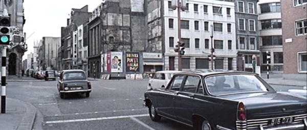
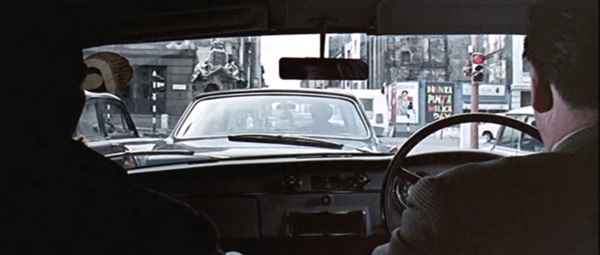
When I posted the still from the Ipcress File with Patrick Tilley’s Drinka Pinta Milka Day poster in it, I thought it was just an amusing chance to see a poster in situ.

Ipcress File screen shot 1

What I didn’t know was that I’d stumbled on a coincidence of hilarious and ironic proportions.  Patrick Tilley wrote to give me the full story.

Thanks for your last two posts. Who was the sharp-eyed fan who noticed the poster in the Ipcress File? Clever stuff.

Just by the by, I was at the time and for several years later closely involved with Len Deighton who I chummed up with when he was briefly represented by Artist Partners – and involved somewhat disastrously with the Ipcress File in its scripting stage.

Len had received the draft script which he hated and asked me to write an assessment of it (as withering as possible). I did so on the promise that it would be “for his eyes only”. So I took a fairly strong line but still a professional one.

What I did not expect was that he would pass it to Harry Salzman (then a movie mogul and partner in the Bond Films with Cubby Broccoli. They didn’t come bigger). I got a call from Harry to come and see him that evening at his house in Mayfair re the script and went with high hopes of a promising career in the industry.

Wheeled in to his presence I was confronted by Harry in statesman-like mode who demanded how “a member of the public” (me) had obtained a copy of the script to which I had no right and that he, the director and scriptwriter had been so offended by my critique that they had no wish to work with me and prophesied I would never ever work in the industry again!

Taken totally by surprise I was lost for words but felt unable to defend myself by saying Len had given me the script and asked me to critique it. (Industry phrase). Basically because with Len – having cut a three-picture deal – was on the verge of making it big.  I didn’t want to jeopardise his position. Result, I was ushered out into the night – feeling I had been run over by a bus. Bla, bla, bla…

With hindsight, the situation was completely illogical. Since Len had given him my assessment, he obviously knew how I had acquired the script. I think it was some kind of a test. What I should have done was to stand my ground and respond with a few expletives to show I wasn’t prepared to take any s***.

Looking back, it is hard to understand the awe in which he and Cubby were held by anyone connected with the industry. There’s an  ironic postscript to this story  The screenplay as filmed incorporated several of the recommendations I made in my report to Len.

But, hey – that’s showbiz. I did go on to write screenplays but those stills from the Ipcress File brought back the memories of that encounter. Definitely a night to remember.

I wonder how impressed Harry Salzman would be to know that he’d immortalised one of Patrick’s posters in the film.  Not very, I suspect.

Ipcress File screenshot 2