Collect Posters Carefully

These thoughts are the result of what was quite literally fall out from my previous musings about poster sizes.  When I was scanning Eckersley’s illustrations, his obituary (from The Times, August 18 1997) dropped out of Poster Design.  And it told me something I didn’t know.

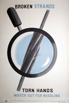
I’d always been aware of his being Tom Eckersley, O.B.E., but I had no idea that he’d got the honour in 1948, at the age of just 34.  It was in recognition of his contribution to the war effort.  Which looked like this.

Tom Eckersley Rospa poster

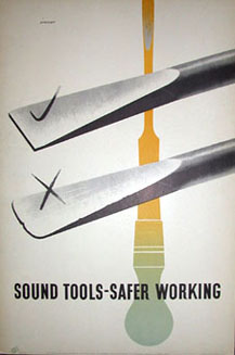
And also this, amongst many, many others.

Tom Eckersley Wartime ROSPA poster

He was awarded the honour for all of his posters for the Royal Society for the Prevention of Accidents – and possibly also for the fact that he designed all of these posters while at the same time drawing maps for the RAF as his day job.  I find it really interesting – particularly in light of the current backlash against ‘Health and Safety’ – that this campaign was seen as such a central part of wartime propaganda, to the extent that Eckersley was, as far as I know, the only wartime poster designer to be honoured in this way.  Although please do correct me if that’s wrong.

But I’m not just telling you this because it’s an interesting snippet.  ROSPA, who commissioned all of these posters, have als0 put up an interesting archive of all of their World War Two Safety Posters, with images from Abram Games and Arnold Rothholz as well.  So there are lots of lovely images for you to look at, and a bit of history as well.  (If you want to follow the trail any further, it leads, with a certain inevitability, to Rennies who have many more posters on their site).

Mr Huveneers, I presume

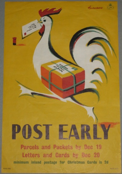
Unless you have studied GPO posters with a rather unnatural intensity, you probably wouldn’t know the name of Peter (or possibly Pieter) Huveneers.  But it’s worth making his acquaintance.  He designed a whole series of delightful posters for the Post Office throughout most of the 1950s.

Huveneers vintage GPO poster post early

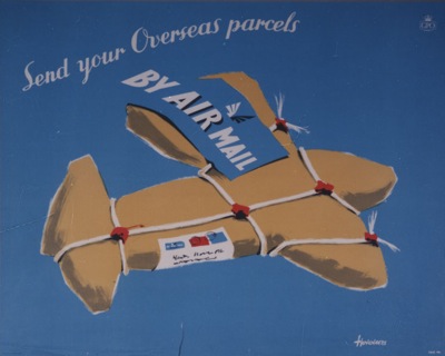
The BPMA have about 20 of his designs catalogued, including this gem.

Huveneers air mail GPO poster from BPMA

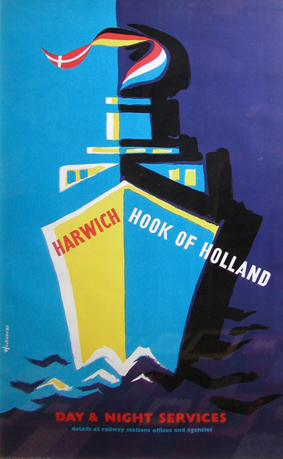
And he also worked for British Railways into the early 60s.

Huveneers Harwich Hook of Holland poster

Until 1963, when the last piece of design I can track down is a British Railways poster in the National Railway Museum collection.  And then he disappears.

Fast forward to 1968, when another designer called Pieter Huveneers sets up a design company in Australia.  Now, if you’re Australian and of a certain age, Pieter Huveneers is a big name.  He’s the down-under equivalent of Wim Crowel or Hans Schleger, a designer who shaped the fabric of everyday life.

Huveneers’ work is still written all over Australia.  He designed the logos and identities for two of Australia’s national institutions, Australia Post and Telecom Australia when they were created in 1975.

an australian stamp

telecom australia sign

(The Australia Post logo, with its neatly incorporated post-horn is still in use, although slightly rejigged in recent years.  Telecom Australia rebranded itself as Telstra in 1995).

He not only designed the logo but also created the name of the bank which emerged from Australia’s biggest ever bank merger in 1981, when the Commercial Bank of Australia and the Bank of New South Wales became something much more modern and international.

oz bank logo

And completely rebranded one of Australia’s iconic breweries, Tooth – this is his logo design from 1981.

tooth brewery logo

And that’s just what I’ve been able to find out about from the other side of the world, I’m sure there’s more as well.

The thing is, I have no way of proving that this is the same person.  The dates add up, and the Australian Pieter Huveneers was born in c1926, which gives him plenty of time to be designing GPO posters before emigrating to Australia, and the chances of there being two of them in the design world at the same time have to be pretty slim anyway.  But is it or not?  I can’t say for sure.

But I seem to have reached the limits of what I can find out without being either a) Australian or  b) within easy reach of the British Library.  So if there are any Australian design historians out there who are able to tell me a bit more about him and his design studio, I’d really love to hear from them.  As far as I can tell, he’s still alive too, so perhaps he might be able to answer the question of whether or not he designed those posters himself.  Hope so.

Something fishy going on

Now here’s a thing.  To be precise, it’s a website about Macfisheries, full of pictures of pre-war shops and employee reminiscences.  But it’s also got a fair smattering of the work of Hans Schleger, who designed pretty much the entire corporate identity for the food chain throughout the 1950s, from shop layout to packaging design and advertising.

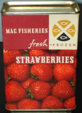
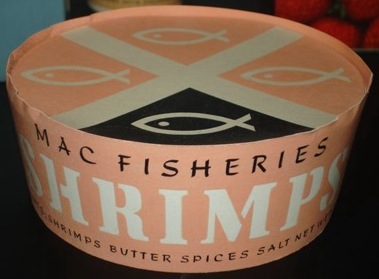
To whet your appetite, here are some packaging designs (photos from the Hans Schleger exhibition at the V&A in 2007).

Hans Schleger strawberries packaging Macfisheries

Hans Schleger shrimp packaging Macfisheries

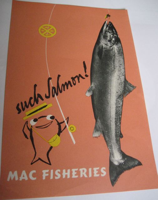
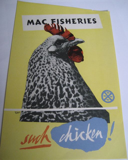
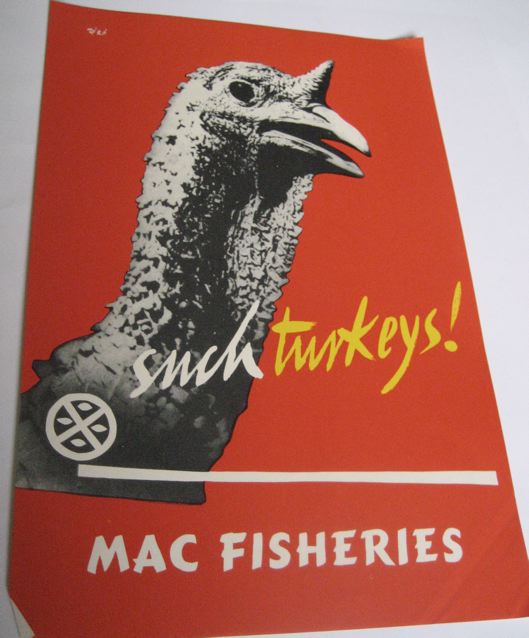
But what I really wanted to draw your attention to are the brilliant in-store posters that Schleger and his studio designed to be displayed in the shops.

Hans Schleger salmon Macfisheries poster

Hans Schleger chicken vintage poster Macfisheries

Macfisheries Hans Schleger turkey poster

I want to buy salmon, turkey and chicken right this minute.  From a beautifully-designed shop please.

But these posters have got me thinking.  Because I have never, ever seen one of these in the wild – at an auction or on eBay (and if anyone has, there’s a comments link below where you can tell me all about it at the bottom of this post).

One of the reasons, I suppose, that railway posters and London Underground posters have ended up being so collectable is that they are out there to be collected in the first place.  Both the railway companies and London Transport did sell contemporary editions of their posters*.  So pristine copies – however few – were kept and framed and had at least a fighting chance of surviving for longer than the duration of the advertising campaign.

Whereas, I’m guessing, the Macfisheries posters were put into a wet and rather smelly bin at the end of the week or month.  And so now next to none survive, apart from perhaps the few above and those that Schleger himself kept and which are now at the National Archive of Art and Design (about whom I am going to grumble at length one of these days as they are absolutely inaccessible online).  I’d imagine that as a result, they are quite valuable; then again, it might work the other way, as there’s no established market in them.  I rather doubt that though.

* I once saw on eBay a 1930s poster advertising that London Transport posters could be bought at their 55, Broadway headquarters.  Not only did I fail to buy it, I didn’t even keep an image of it, and now I can’t track it down at the London Transport Museum.  Any clues, anyone?

Dekk hands

This great little GPO poster (a Crown Folio, naturally) was recently on eBay
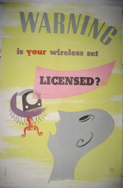
Dorrit Dekk vintage GPO poster wireless licence

as a Buy It Now (for £20, it didn’t last long).

From 1949, it’s by Dorrit Dekk, who, despite designing some iconic COI posters like this one
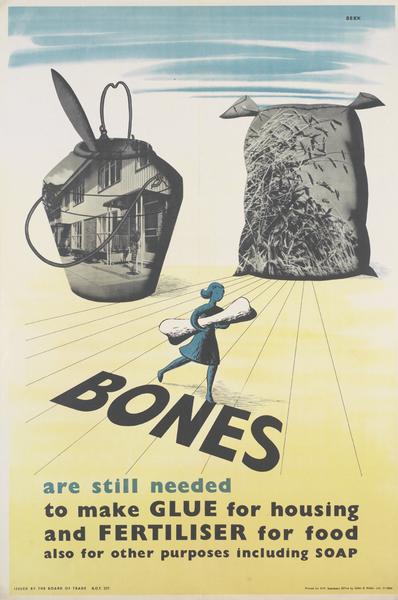
Dorrit Dekk vintage post war poster

and some very smart later stuff too, such as this P&O menu design
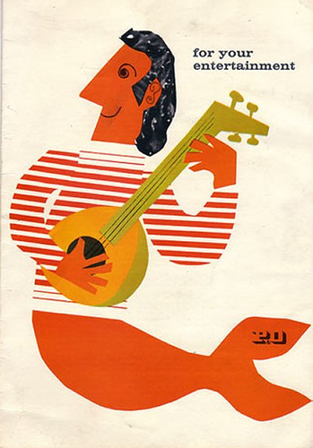
dorrit dekk P&O menu from flickr

isn’t as well known as she rightly ought to be.

But more than just posting some lovely images of her work (there are plenty more of her later designs on a nice Flickr set here), I also wanted to point you at an interesting, if slightly strange set of interviews with her.

They come from  Your Archives, which is an attempt by the National Archives to create some Wiki-style content.  The Dekk interview is part of a World War Two artists section, although it’s about the only bit of original content that I’ve managed to find in there.  Most of the articles are just standard bios with link to relevant artworks in the archives.  Which would be alright if the National Archives had any thumbnail images in there, but they don’t.

There’s a perfectly servicable biography of Dorrit Dekk included, so I won’t repeat what they can perfectly well tell you themselves, but her career included an apprenticeship in the COI under Reginald Mount and Eileen Evans, as well as designing for the Festival of Britain.

Amongst other things, she explains how Reginald Mount gave her the pen-name Dekk:

Now one day, when the printer came back to collect the art work for the first poster I did and I was still finishing it off. He said “Well, you haven’t signed it” and so I said “I hadn’t thought about signing it.” And then I had a problem. I said “My married name was Klatzow” – which was a Russian name – and in those days a foreign name would have been difficult and unpronounceable. K-L-A-T-Z-O-W: that would be fashionable now! I didn’t like my maiden name, Fuhrmann. So then, Reggie said “So what are your initials?” and I said “DKK” and so he said “There you are: DKK. We put in the E” and Dekk was a good thing because was easy to understand on the telephone. It was not like having to spell Klatzow or Fuhrmann and, written down, it was good for signing. And it looked foreign which was an advantage – I didn’t pretend to be English – but at least it sounded possible.

And how designing for the Festival of Britain was the fast-track to a career after the war,

…the fantastic thing about the Festival was that you met all the great designers because you always had meetings together: Misha Black and Jimmy Holland – of course I knew him by then – Henrion, Abram Games, everybody! Abram I must have met at one of those meetings. And without the Festival I wouldn’t have been successful – it was like a badge of honour. If you had been a designer for the Festival you had arrived. And I was quite young after all and I had no experience – just those two years at the COI. I mean I was green. And then after the festival, all the jobs came in. It was so easy to get commissions after that because I had met everybody and, if I approached people with my portfolio asking “Can I design anything for you?” I got new commissions.

But large swathes of the interview are dull, if not frankly borderline surreal.  Instead of asking her more about what working in the C.O.I was like, or about her later work, the questions are about gouache, Tippex and paper quality instead.

A bit of digging around reveals that the purpose of the whole project (and hence the interview) is for conservators at the National Archives to

identify the paint and drawing materials (media) used by artists for propaganda artwork and illustrations during the Second World War.

Which I am sure is terribly useful for them, but a gigantic missed opportunity for the rest of us.  Although I suppose that the lesson is that I shouldn’t rely on the journalistic nous of archivists and conservators if I want to find out about designers and their work.

Dorrit Dekk is still alive and working, incidentally.  And if you want to buy one of her recent collages, they are available on eBay right now.