Unpeopled
We’re going a bit off-piste today, heading for a change towards those heady days of modernity before the Second World War.
That we’re doing this is all the fault of regular correspondent medieval modernist who pointed me at this particular set of posters a while back.
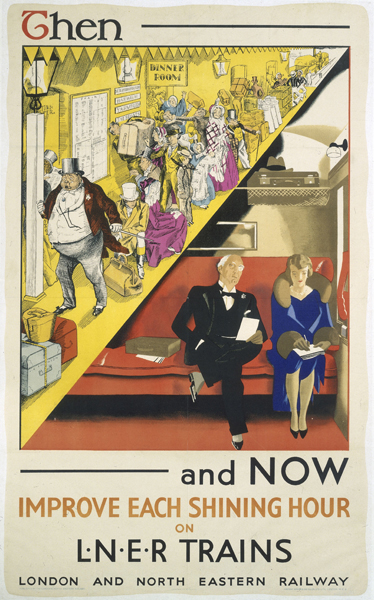
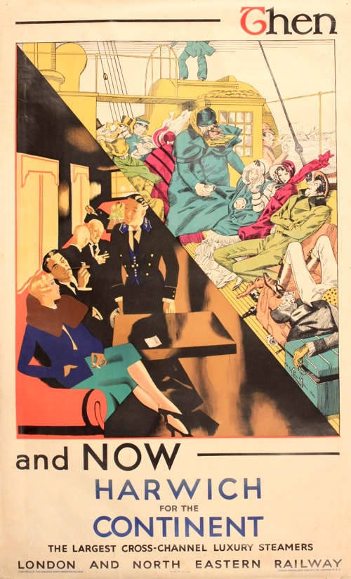
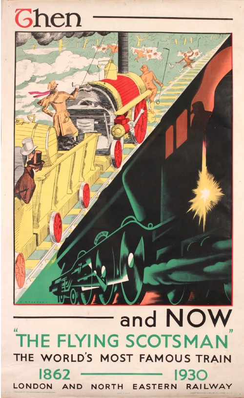
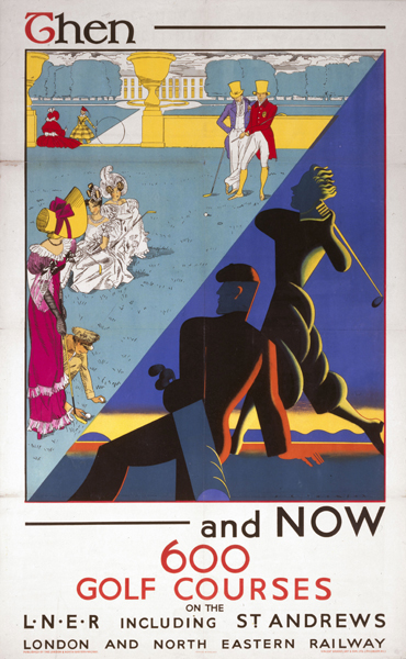
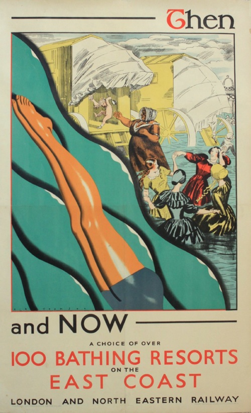
And every since then I haven’t been able to stop thinking about them. But then it’s rare that you get such a set of posters so determined to be object lessons in modernity. In each one of them, the fusty, over-detailed, over-crowded Victorian era is ttransformed, thanks to the potent magic of LNER, into a chic, clean-lined, highly futuristic scene.
A fine advertising message, you might say, and you’d be right. But there’s a lot more going on here than just the steam railway being dragged into an art deco world, so much so that it’s hard to know where to begin.
Let’s start with the artist, A. R. Thomson. Now I’ve only started researching him today, so I’m afraid that this post won’t contain the benefit of the information in his biography, Tommy: A Biography of the Distinguished Deaf Royal Painter A.R.Thomson, which I am about to order for the grand sum of one new pence. There is a clue there in the title, but he does seem to have been a quite extraordinary character.
6ft 5ins tall; He was deaf, and also did not speak, his wife helping as business manager. He spoke through his brush. Conducted conversations by making lightning sketches.Studied under painter illustrator and poster designer John Hassall [died 1948] and historical scenes/portraitist Sir William Quiller Orchardson [died 1910].
Since we’ve been talking about murals recently, here is one that he produced for the Science Museum. It’s fourteen feet long.
Two other things stand out for me though.
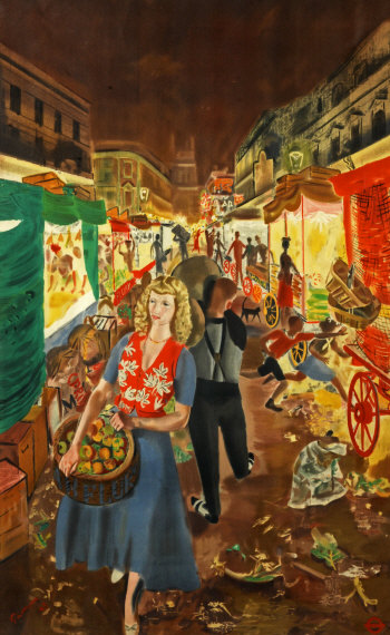
One is that he designed this Street Markets poster for London Transport in 1949 (which means that there is a short bio of him on their site as well). It’s one that I’ve always loved, and occasionally regret not buying at Morphets.
The other is that, at the 1948 London Olympic Games, he was the last-ever winner of the Gold Medal for Painting, which is such a mind-boggling idea that I am unable to process it properly.
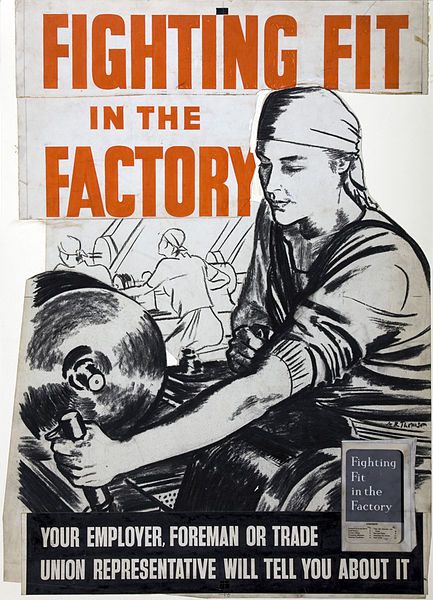
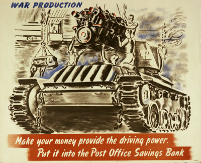
He seems to have done quite a lot of poster work during the war, I imagine that he wasn’t called up because of his disability.
All of which is a massive, but fascinating detour from the point at which westarted, so let’s return to his very peculiar set of posters for the LNER.
Because despite the modern tour de force that is the Flying Scotsman, there is a deep anxiety underlying these posters. The trips to the seaside, the carriages, the outdoors games – even the very railway itself – are all old ideas. The job that he pictures want to do is to persuade us that these institutions have all changed with the times. There is an interesting incongruity here. Perhaps the most committed users of modernity are those who feel that they have something to prove, that their product might, in fact, date from the past. Whereas if you are producing a car or a washing machine, it can look exactly how it wants, because it is modern in its very existence.
What’s also absolutely fascinating for me, though, is how this modernity is represented. The smooth streamlining of this period of modernism/modern design is a vlsual cliche now, we all know what it looks like and it has been revived and reused so many times that it is no longer exciting or surprising. But here, butted up against the visual clutter that it wants to replace, we can start to see it as it would have been felt back then – stark, surprising, and, for me at least, quite chilly.
When we were discussing these posters in the comments before, medieval modernist suggested that
there seems to be new higher order in the alternative vision, where simplicity and order are prized over chaos
This is true. And I think that there is a big clue in the word chaos there, because one thing that these posters make me feel very strongly is the effect of the First World War on these designs. Modernity was an attempt to impose a very rigid kind of order on the world, one that was felt to be very necessary after the chaos, horrer and ultimate disorder that was the trenches.
Now this isn’t something that can ever be proven, just as we will never be able to say for certain that the slightly simple cheerfulness of much 1950s design was a reaction to the next war.
But the big clue for me is in the people. The Victorian scenes are teeming with humanity, but in contrast modernity requires very few people indeed. And absence was perhaps the biggest legacy left by World War One.
I don’t think this is just because time has made us forget, although this has to be a big part of it. I suspect too that it was something that many people who lived in the 1920s and 1930s could bear to articulate fully either. The reason I think of this is that there is a spine-tingling passage in one of HV Morton’s tours of England, which I can’t lay my hands on right now in which he describes the raw new stone and lettering of the war memorials that are in every village and town that he passes through, and the pain and memories caused every time they are seen.
So the lack of people in these posters – in the posters of this period in general – isn’t just because people clutter up the place and machines are just so much more modern to look at. That is part of it, but the absences are also more profound. People are missing in this modern world, killed by the machines of modern warfare, and by their absences they can be still counted amongst us, without us having to speak of them.
