Give that penguin a fish!
A recent acquisition on eBay was a few copies of Modern Publicity from the late 1950s and early 1960s. I was going to share their delights with you anyway, but when I looked into the archives I realised that I’ve never actually blogged about this properly at all. Then when I looked a bit harder I discovered that Designers in Britain has only ever been mentioned in passing as well. As both are rather fabulous resources, I will endeavour to put at least some of this to rights over the next few weeks. But first, a brief introduction.
Modern Publicity is an international annual, published by The Studio group, which covers what would now be called graphic design – posters, printed material, packaging and trade marks – from around the world. In contrast, Designers in Britain does what it says on the tin and only deals with UK design and designers, but includes everything from letterheads to large pieces of industrial machinery. While both of them suffer from being predominantly printed in black and white, they are nonetheless well worth your attention. Not only do you get to look at lots of wonderful pieces all in one place, but they’re also fascinating insights into what critics and designers thought was good at the time it was produced. Which isn’t always the same as the things we like now.
So, what did people admire in the late 1950s and early 1960s? Or to be more precise, which pieces of graphic design were considered good enough to stand next to the cream of international design? One answer is not the designers that you might expect. Tom Eckersley gets just one poster included in the two Modern Publicity annuals from the 1950s.

You’ll be relieved to hear that he does rather better in 1962, with three designs included, amongst them this Omo poster which I’ve never seen before.

Abram Games also receives a rave review in 1958 for this Guinness poster, which is chosen to open the entire book.

Only where both name and product are already household words is such a method possible. To adopt the plan for an unknown advertiser would be to court disaster.
After that, it all gets a bit more unexpected. I’ve mentioned before that Harry Stevens is very popular in these kinds of publications, and that’s as true in these annuals as it ever was.


Printed in lemon, vermilion, cobalt, orange, pink and black, the caption says. I don’t think black and white is really fair on it, do you? And should you have a copy in colour, please do let me know, I’d love to see it.
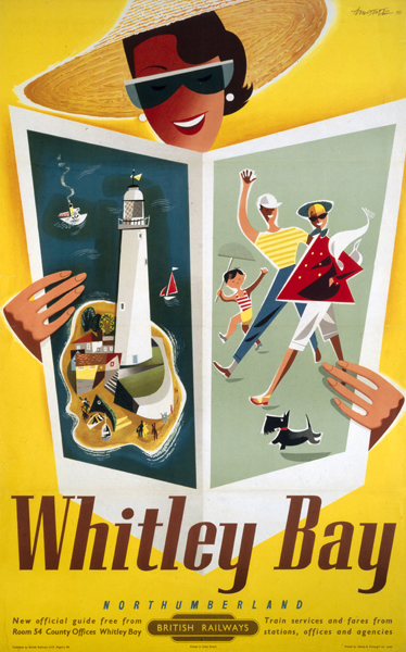
An even more surprising regular is Ken Bromfield. Now he comes up every now and then on here, mostly as a designer of quite nice railway posters. But the editors of Modern Publicity love his work – he gets four pieces of work in the 1959 edition alone, including this poster.

This is the artwork from the NMSI collection, because I can’t find the actual poster anywhere. But he’s clearly an artist I should take a proper look at one of these days.
There are also a few unexpected gems to be discovered, like this poster by Lander.

I can’t find a decent picture of this anywhere, which is really frustrating as it looks great, and must look even better in colour, (and I am getting quite close to having another rant about the inadequacies of the National Railway Museum catalogue as a result of my looking too). Again, any pointers gratefully received. Or indeed copies of the poster.
There are others of this ilk as well – it’s always worth being reminded of this London Transport poster by Edwin Tatum.

I’m also happy to see anything at all by Arpad Elfer, although these penguins are particularly splendid.

There’s plenty more where that came from. Here, just as an example, are Karo and Zero together on one page (did you see what they did there?).

What a world it must have been with those advertisements in it.
Then there are the people I’ve just never heard of before. Who, for example was Petronella Hodges? She did this.

And this too.

But she appears precisely nowhere in Google. A mystery, it seems. But the clue lies in the small print. Both of these designs were produced by J Walter Thompson, so my guess would be that Petronella Hodges was an art director there at the end of the 1950s. Quite apart from conjuring up images of a British version of Mad Men, it’s also a pointer to a very specific change that was going on. The jobbing freelance designer would become an increasingly rare species, with only the very best surviving. More and more, this kind of design would be done in house at the agencies, by this new breed of Art Director.
In amongst all of this, I realise that I’ve hardly even mentioned the 1962 edition, and there’s lots going on in there, as even the British make the move from whimsy to modernism. So that will have to get a post to itself another day. In the meantime, have a couple more rare gems from the late 50s, by Abram Games and E Tatum, again. There’s someone else I’m going to need to find out more about, isn’t it…