Spacing Oddity
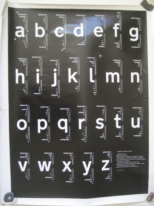
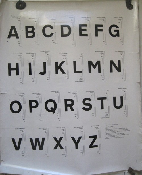
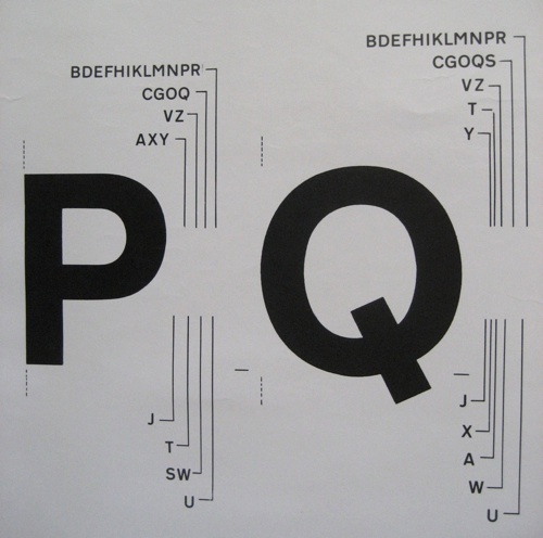
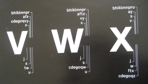
Just in case you thought it was all organised and museum-perfect here, a tale. I discovered a poster tube in Mr Crownfolio’s office, labelled ‘selling’ and in it, quite apart from a poster I could have sworn we’d sold years ago, I found these two oddities which I had also completely forgotten about. But when I took a proper look at them, they turned out to be quite interesting.
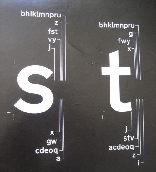
They’re spacing rules for a typeface.
There’s something rather attractive about this kind of very detailed practicality, I think.
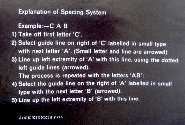
And a bit of research gave me some ideas of what they might be. One clue is on the lower case chart.
For those of you reading on your iThing, these instructions are by the great graphic designer Jock Kinneir. He’s best known for designing the template and typeface for Britain’s road signage along with Margaret Calvert (the Design museum have written an interesting piece about it if you want to know more). But in 1964 they also designed Rail Alphabet, as part of the Design Research Unit‘s rebranding of British Railways.
So that’s what I think this is, particularly as the posters came as part of an assorted lot from the Malcolm Guest sale. I imagine that, given their battered and used state, they were up on the walls of a design office somewhere in the British Railways system.
Now of course rendered obsolete by the computer. But a rather a fascinating bit of graphic design history nonetheless.
What I’ve also discovered in the course of writing this post is that Rail Alphabet wasn’t just used by British Railways, but also by Gatwick Airport and the NHS too, right up until the mid 1990s. So it’s more than just a typeface, it’s the written identity of the post-war British state. That’s quite an achievement by Jock Kinneir and Margaret Calvert, and one that deserves more than just being taken for granted.
Even though Mr Crownfolio spends his working days adjusting type into just the right places, I’m not sure that we’ll ever put these up on the wall. Which begs the question of what to do with them. Might the National Railway Museum want them? Or anyone else? Any thoughts?
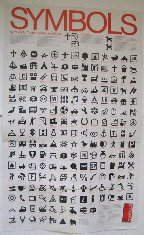
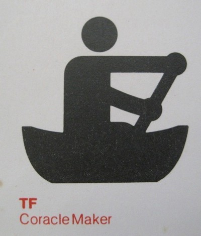
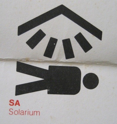
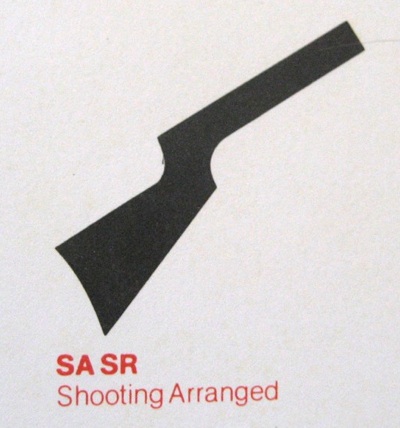
While we’re on the subject of oddities, it also gives me the chance to post this. I’ve always been fond of pictograms anyway, but some of these are particularly choice.
The poster is a chart of symbols for tourist attractions, published by the British Tourist Authority, sometime after decimalisation. I’m guessing it’s meant as a set of suggestions for designers and guide authors. While a few of them are familiar, not all of them caught on.
Some are possibly only required once or twice on any map of the country.
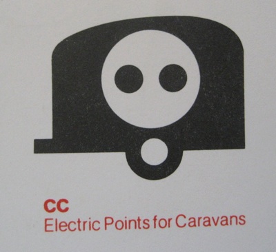
While others were too frightening ever to use at all.
I particularly like the caravan of doom. But there are so many. Anyone for underground disco?
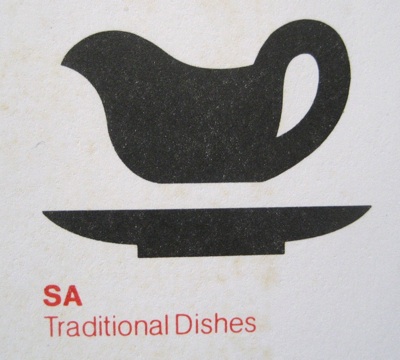
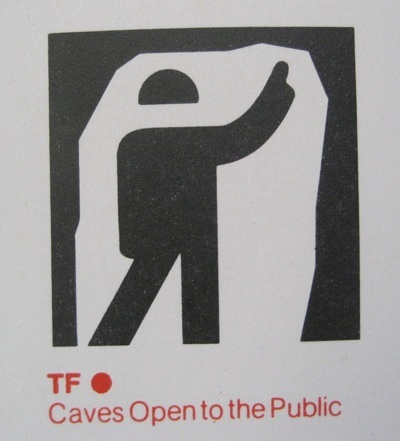
This has to be my favourite, however, and heaven knows I’ve lived in some bits of London where it could have been applied.
